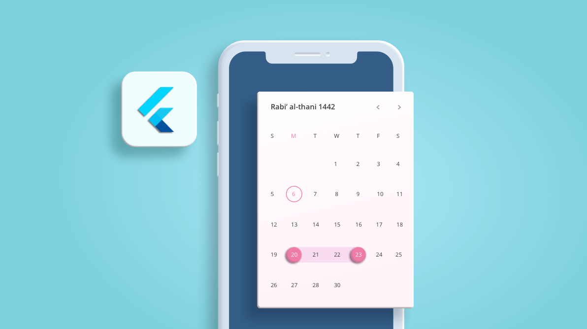
The Islamic or Hijri calendar is a lunar calendar consisting of 12 months in a year of 354 or 355 days. We have added the Hijri date picker in our 2020 Volume 4 release to display the Islamic calendar.
This widget has all the Gregorian calendar functionalities like minimum and maximum dates, the first day of the week, different selection modes, RTL, and customization for special dates.
Multiple picker views
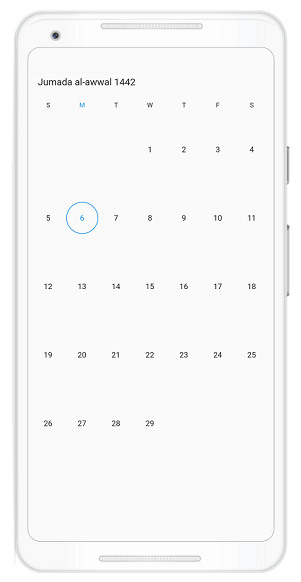
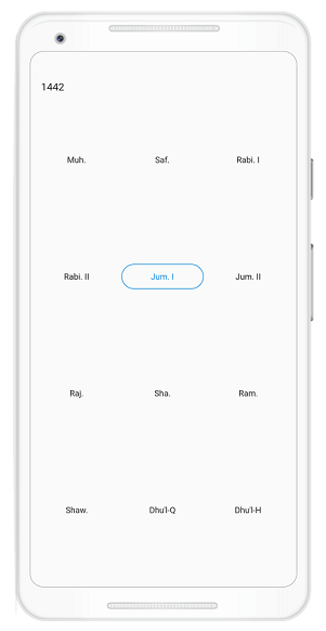
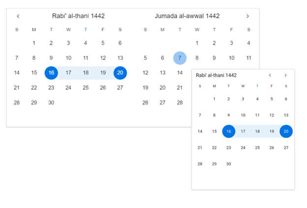
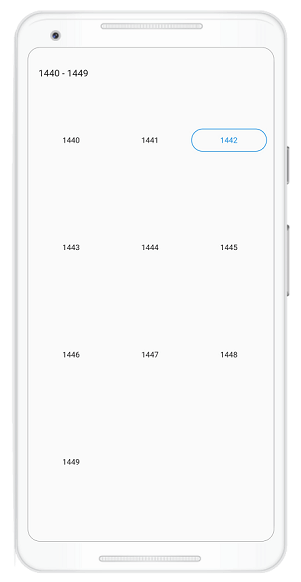
Display month, year, and decade views that allow users to easily select and navigate between built-in views using UI and programmatically.
|
|
Date selection
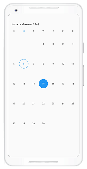
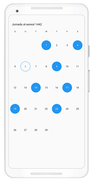
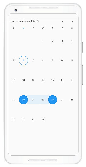
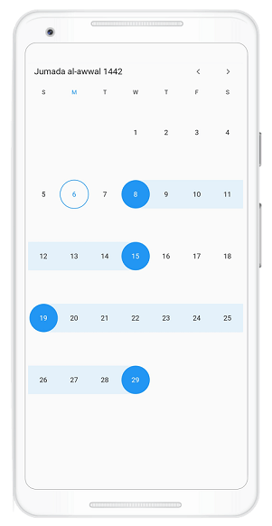
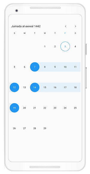
You can select single, multiple, and a range of dates. The widget also supports programmatic selection.
|
|
|
|
Programmatic date selection
Select dates programmatically in the Hijri date-range picker using the selectedDate, selectedDates, selectedRange, and selectedRanges properties in HijriDatePickerController. You can also use the corresponding selectionMode to select the dates programmatically.
class MyAppState extends State<MyApp> {
  HijriDatePickerController _controller;

  @override
  void initState() {
    _controller = HijriDatePickerController();
    _controller.view = HijriDatePickerView.month;
    _controller.selectedRanges = <HijriDateRange>[
      HijriDateRange(HijriDateTime.now().add(Duration(days: 4)),
          HijriDateTime.now().add(Duration(days: 9))),
      HijriDateRange(HijriDateTime.now().add(Duration(days: 11)),
          HijriDateTime.now().add(Duration(days: 16)))
    ];
    super.initState();
  }

  @override
  Widget build(BuildContext context) {
    return MaterialApp(
      home: Scaffold(
          body: SfHijriDateRangePicker(
        selectionMode: DateRangePickerSelectionMode.multiRange,
        controller: _controller,
      )),
    );
  }
}
First day of week
The Date Range Picker widget will be rendered with Sunday as the first day of the week. You can customize it to any day using the firstDayOfWeek property. The following code example illustrates this.
@override
  Widget build(BuildContext context) {
    return MaterialApp(
      home: Scaffold(
          body: SfHijriDateRangePicker(
        view: HijriDatePickerView.month,
        monthViewSettings: HijriDatePickerMonthViewSettings(firstDayOfWeek: 1),
      )),
    );
  }
Appearance customization
Month cell customization
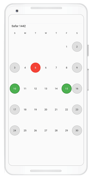
You can customize month dates, today’s date, special dates, weekend dates, blackout dates, and disabled dates in the month view of the Hijri date-range picker using the following properties: textStyle, cellDecoration, todayCellDecoration, todayTextStyle, specialDatesTextStyle, specialDatesDecoration, weekendTextStyle, weekendDatesDecoration, blackoutDatesTextStyle, blackoutDatesDecoration, disabledDatesTextStyle, and disabledDatesTextDecoration from HijriDatePickerMonthCellStyle.
@override
Widget build(BuildContext context) {
  return MaterialApp(
    home: Scaffold(
        body: SfHijriDateRangePicker(
         view: HijriDatePickerView.month,
          monthViewSettings: HijriDatePickerMonthViewSettings(
           blackoutDates: <HijriDateTime>[HijriDateTime(1442, 02, 05)],
           weekendDays: <int>[6, 7],
           specialDates: <HijriDateTime>[
           HijriDateTime(1442, 02, 10),
           HijriDateTime(1442, 02, 15)
        ],
      ),
      monthCellStyle: HijriDatePickerMonthCellStyle(
        blackoutDatesDecoration: BoxDecoration(
            color: Colors.red,
            border: Border.all(color: const Color(0xFFF44436), width: 1),
            shape: BoxShape.circle),
        weekendDatesDecoration: BoxDecoration(
            color: const Color(0xFFDFDFDF),
            border: Border.all(color: const Color(0xFFB6B6B6), width: 1),
            shape: BoxShape.circle),
        specialDatesDecoration: BoxDecoration(
            color: Colors.green,
            border: Border.all(color: const Color(0xFF2B732F), width: 1),
            shape: BoxShape.circle),
        blackoutDateTextStyle: TextStyle(
            color: Colors.white, decoration: TextDecoration.lineThrough),
        specialDatesTextStyle: const TextStyle(color: Colors.white),
      ),
    )),
  );
}
Year cell customization
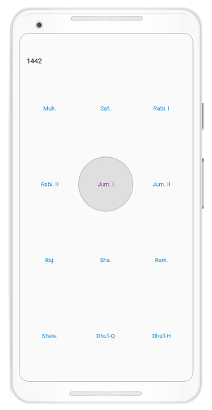
Customize the today cell, disabled cells, and cells in year view using the following properties: textStyle, cellDecoration, todayTextStyle, todayCellDecoration, disabledDatesTextStyle, and disabledDatesDirection from HijriDatePickerYearCellStyle.
 @override
Widget build(BuildContext context) {
  return MaterialApp(
    home: Scaffold(
        body: SfHijriDateRangePicker(
      view: HijriDatePickerView.year,
      yearCellStyle: HijriDatePickerYearCellStyle(
        disabledDatesDecoration: BoxDecoration(
            color: const Color(0xFFDFDFDF),
            border: Border.all(color: const Color(0xFFB6B6B6), width: 1),
            shape: BoxShape.circle),
        disabledDatesTextStyle: const TextStyle(color: Colors.black),
        textStyle: const TextStyle(color: Colors.blue),
        todayCellDecoration: BoxDecoration(
            color: const Color(0xFFDFDFDF),
            border: Border.all(color: const Color(0xFFB6B6B6), width: 1),
            shape: BoxShape.circle),
        todayTextStyle: const TextStyle(color: Colors.purple),
      ),
    )),
  );
}
Conclusion
In this blog post, we had a quick overview of the Hijri date picker’s key features introduced in the Essential Studio® 2020 Volume 4 release. You can explore other features in the Date Range Picker widget’s documentation, where you can find detailed explanations of each feature with code examples.
Please feel free to try out the samples available in our GitHub location, and share your feedback or ask questions in the comments section. You can also contact us through our support forum, Direct-Trac, or feedback portal. We are happy to assist you.
