
 Mohamed Samsudeen
A text box with a floating label is one of the most commonly seen UI in any kind of modern application today, irrespective of if it’s a mobile, web, or desktop application. It provides hints based on expected input in the TextBox. Once focused on, the beautifully animated hints make way for the actual input. This not only modernizes the look of an application, it also enhances the user experience of form-filling by showing hints and error messages in a more intuitive way.
Knowing the usages of this UI component, we have introduced a new component called Text Input Layout for WPF in our 2019 Volume 4 release.
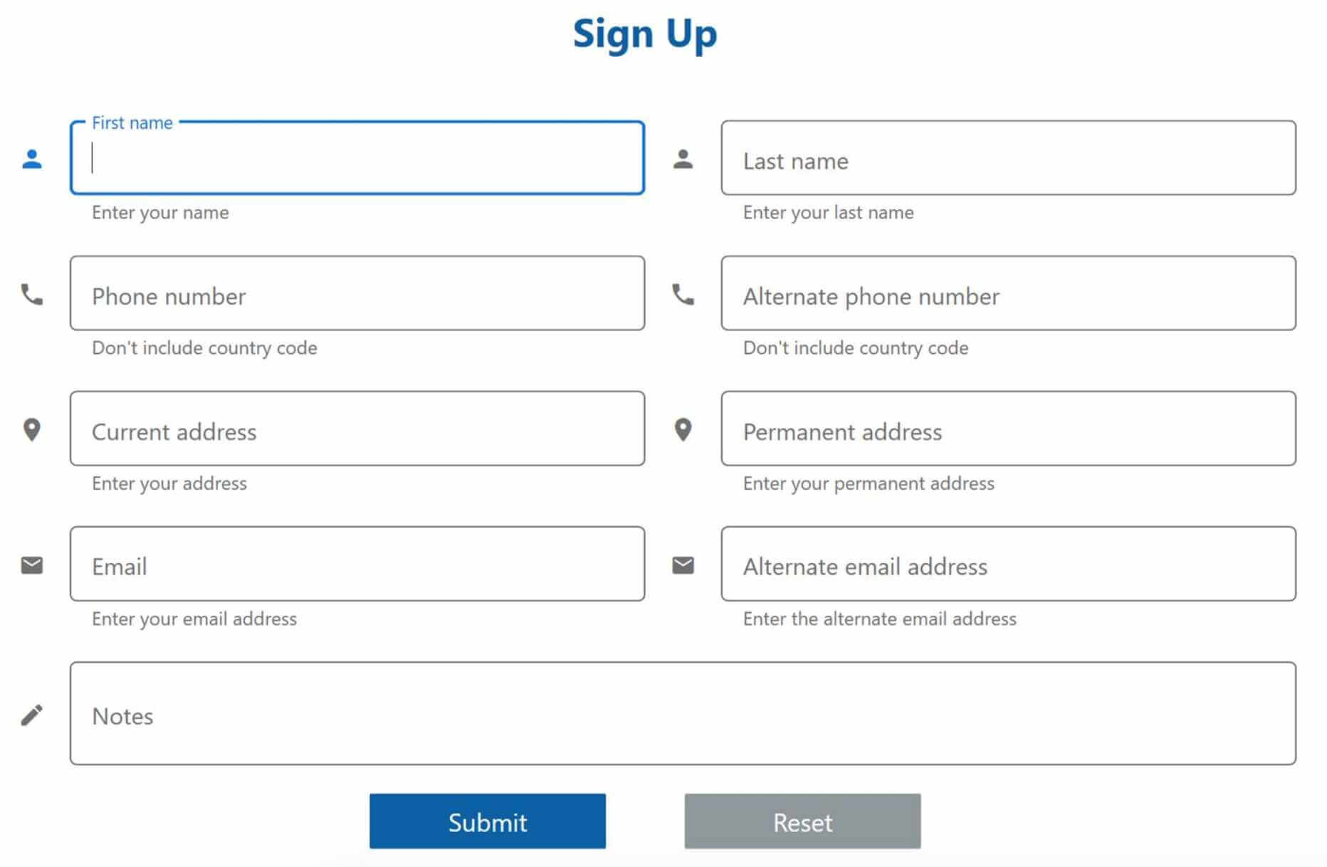 WPF Text Input Layout
Note: You can refer to this link for configuring this control in WPF applications.
Features
Important features of the text input layout are:
- Different container types.
- Helper text, error text and character counter.
- Show error texts.
- Color customizations.
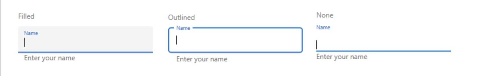
Container types
There are three container types to match the appearance of your application:
- Outlined
- Filled
- None
<inputLayout:SfTextInputLayout Hint="Name"
                               HelperText="Enter your name"
                               ContainerType="Outlined">
    <TextBox />
</inputLayout:SfTextInputLayout>
The default is “Outlined”. It is also possible to set “Filled” and “None” types to get the below appearances.
Helper text, error text, and character counter
Helper and error text are essential to all types of form-filling. It is important to communicate to users what type of input is expected, and it’s important to show error messages when input is not in the expected format.
In the Text Input Layout control, you can provide helper and error messages using the HelperText and ErrorText properties. Initially, the helper message will be shown below the control.
<inputLayout:SfTextInputLayout Hint="Name"
                               HelperText="Enter your name"
                               ContainerType="Outlined">
    <TextBox />
</inputLayout:SfTextInputLayout>
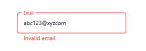
 When the HasError property is updated to true, the helper message will be replaced by an error message.
<inputLayout:SfTextInputLayout Hint="Email"
                               ContainerType="Outlined"
                               HelperText="Enter your email"
                               ErrorText="Invalid email"
                               HasError="true">
    <TextBox />
</inputLayout:SfTextInputLayout>
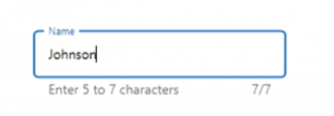
Additionally, you may use CharCountVisibility and CharMaxLength to show the current character count and to specify the maximum characters you expect. When a user inputs more than the maximum characters, an error state will be indicated through a color change.
<inputLayout:SfTextInputLayout Hint="Name"
                               CharCountVisibility="Visible"
                               CharMaxLength="7"
                               HelperText="Enter your name"
                               ContainerType="Outlined">
   <TextBox />
</inputLayout:SfTextInputLayout>
 Leading and trailing views
You can add a leading icon to indicate input types, such as birth date, phone number, or password. You can also add a trailing icon to add a clear button, error icon, voice input icon, drop-down icon, etc.
<inputLayout:SfTextInputLayout Hint="Birth date"
                               HelperText="Enter your date of birth"
                               ContainerType="Outlined"
                               LeadingViewPosition="Outside"
                               TrailingViewPosition="Inside">
    <inputLayout:SfTextInputLayout.LeadingView>
        <Label Content="Some font icon" />
    </inputLayout:SfTextInputLayout.LeadingView>
    <inputLayout:SfTextInputLayout.TrailingView>
        <Label Content="Some font icon" />
    </inputLayout:SfTextInputLayout.TrailingView>
    <TextBox />
</inputLayout:SfTextInputLayout>

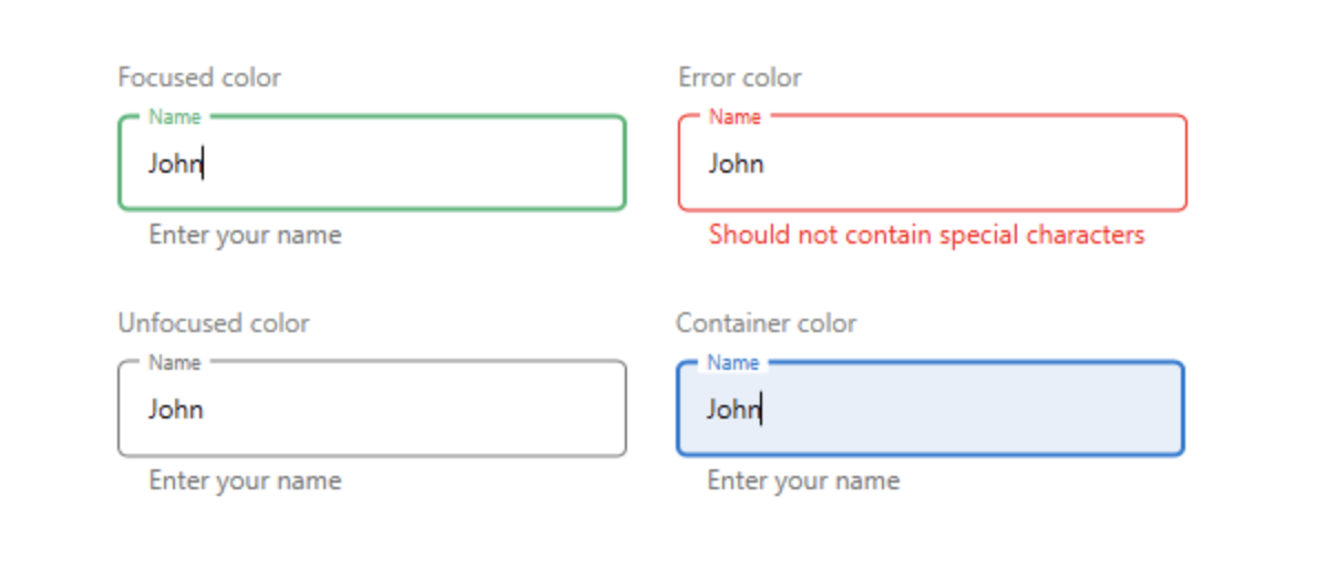
Color customizations
You can also customize the in-focus color, out-of-focus color, error color, and container color to enrich and match the theme of the application.
<inputLayout:SfTextInputLayout Hint="Name"
                               CharCountVisibility="Visible"
                               CharMaxLength="7"
                               HelperText="Enter your name"
                               ContainerType="Outlined"
                               FocusedForeground="Green"
                               Foreground="Gray"
                               ContainerBackground="AliceBlue"
                               ErrorForeground="Red">
    <TextBox />
</inputLayout:SfTextInputLayout>
 Other supported controls
Currently we support WPF TextBox as an input control for SfTextInputLayout. However, we have plans to extend the compatibility support for the following Syncfusion controls in our 2019 Volume 4, SP1 release:
Conclusion
In this post, we walked you through working with the Text Input Layout and its features. We invite you to check out our other WPF components. You can find complete documentation online for all features on our website.
You can always download our free evaluation to see all these components in action. Also, explore samples in our GitHub repository.
If you have any questions, please let us know in the comments section. You can also contact us through our support forum, Direct-Trac, or our feedback portal. As always, we are happy to assist you!


 No spam, just valuable updates.