
 Neelakandan Kannan
Data grids play a vital role in software development in all platforms, and Flutter is not an exception in this. So, we developed a DataGrid widget for the Flutter platform that is very fast and is capable of handling very large amounts of data. This DataGrid widget in Flutter is now available in our 2020 Volume 2 release
The Syncfusion Flutter DataGrid can be used to display and manipulate data in tabular format.
It was built from the ground up to achieve the best possible performance even when loading a large amount of data.
The DataGrid has the following essential features in its initial release:
- Different types of columns
- Real-time updates
- Column sizing
- Row selection
- Styling and conditional styling
- Row height customization
- Theme
Let’s look at these features and the steps to integrate this new widget into your app in this blog post.
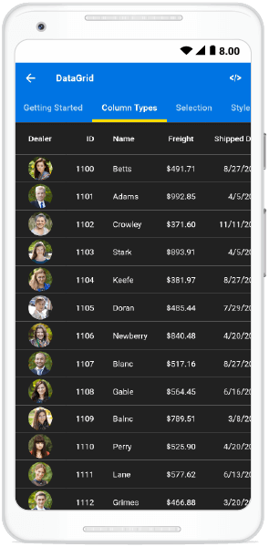
Different types of columns
DataGrid lets you display different data types (int, double, string, and date-time) in different columns. It can load any widget in its columns for data visualization. The following column types are supported:
- GridTextColumn: To display the string data type.
- GridNumericColumn: To display the numeric data types such as int, double.
- GridDateTimeColumn: To display the date-time data type.
- GridWidgetColumn: To load any widget or multiple widgets.
Also, GridNumericColumn and GridDateTimeColumn types provide support to format the values based on the NumberFormat and DateFormat, respectively.
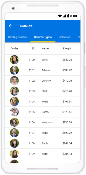
The following screenshot shows the DataGrid with a Dealer column, which is a GridWidgetColumn that loads the Image widget.
Real-time updates
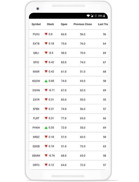
The DataGrid can handle high-frequency updates for demanding scenarios. You can refresh specific cells when the corresponding cells’ data is updated in the underlying data source.
The following .gif image shows the DataGrid updating the real-time stock exchange data with high frequency.
Column sizing
Column width can be adjusted (auto fit) based on the content of any column or column header. All the columns can be made to fit in the viewport of the DataGrid.
It is also possible to hide specific columns based on the device’s resolution. You can customize the width of all the columns or individual columns with the built-in column-sizing options.
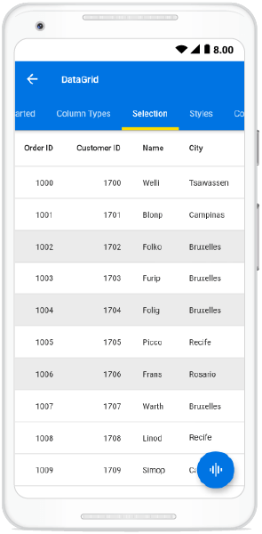
Row selection
DataGrid lets you select a row or multiple rows with the following built-in selection modes:
- Single: Only one row can be selected.
- Single deselect: Only one row can be selected and it can be deselected on tapping again on that row.
- Multiple: Multiple rows can be selected and deselected, as well.
Note: You can use the keyboard to navigate through rows and cells in the web platform.
Refer to the following screenshot.
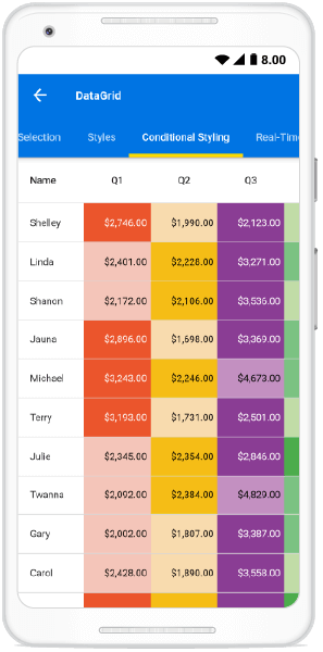
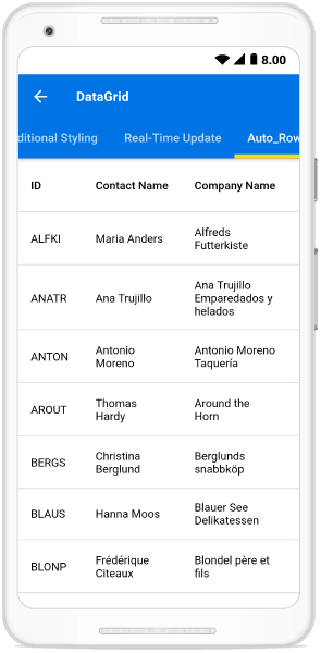
Styling and conditional styling
You can customize element styles such as text style and background color in the DataGrid to display visually appealing data. You can also customize the styles conditionally based on the data.
Refer to the following screenshot.
Row height customization
You can adjust (auto fit) the row height based on the content of any column or certain columns to enhance the readability of the content. It is also possible to set the row height conditionally.
Refer to the following screenshot.
Theme
The DataGrid control has light and dark built-in theme support to adapt the control to the rest of the business application.
Refer to the following screenshot.
Getting started with the DataGrid widget
We have seen the primary features of the Flutter DataGrid widget. This section will explain the steps to add the Flutter DataGrid widget to your application and use its basic features.
Step 1: Add Flutter DataGrid to an application
Create a simple project using the instructions given in the Getting started with your first Flutter app documentation.
Step 2: Add dependency
Add the following Syncfusion Flutter DataGrid dependency to your pubspec.yaml file.
dependencies:
syncfusion_flutter_datagridr: ^xx.x.xx
Note: Here, xx.x.xx denotes the version of the Syncfusion Flutter DataGrid package.
Step 3: Get packages
Run the following command to get the required packages.
$ flutter pub get |
Step 4: Import package
Import the following package in your Dart code.
import 'package:syncfusion_flutter_datagrid/datagrid.dart';
Step 5: Creating data for an application
Create a simple data source for SfDataGrid as shown in the following code example.
Here, we are giving the employee details as the data for the DataGrid.
class Employee {
  Employee(this.id, this.name, this.designation, this.salary);
  final int id;
  final String name;
  final String designation;
  final int salary;
}
Create the collection of employee data with the required number of data objects. The method used to populate the data objects is initialized in the initState().
@override
void initState() {
super.initState();
populateData();
}
void populateData() {
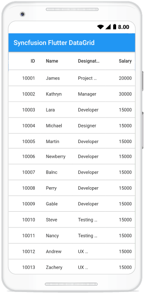
_employees.add(Employee(10001, 'James', 'Project Lead', 20000));
_employees.add(Employee(10002, 'Kathryn', 'Manager', 30000));
_employees.add(Employee(10003, 'Lara', 'Developer', 15000));
_employees.add(Employee(10004, 'Michael', 'Designer', 15000));
_employees.add(Employee(10005, 'Martin', 'Developer', 15000));
_employees.add(Employee(10006, 'Newberry', 'Developer', 15000));
_employees.add(Employee(10007, 'Balnc', 'Developer', 15000));
_employees.add(Employee(10008, 'Perry', 'Developer', 15000));
_employees.add(Employee(10009, 'Gable', 'Developer', 15000));
_employees.add(Employee(10010, 'Steve', 'Testing Engineer', 15000));
_employees.add(Employee(10011, 'Nancy', 'Testing Engineer', 15000));
_employees.add(Employee(10012, 'Andrew', 'UX designer', 15000));
_employees.add(Employee(10013, 'Zachery', 'UX designer', 15000));
}Step 6: Creating a DataSource for DataGrid
DataGridSource is used to obtain the row data for the SfDataGrid. So, create the DataSource from the DataGridSource and override the following APIs in it:
- dataSource: To fetch the number of rows available for data population. Also, it is used to fetch the corresponding data object to process the selection.
- getCellValue: To fetch the value for each cell.
DataGridSource objects are expected to be long-lived, not recreated with each build.
Refer to the following code example.
final List<Employee> _employees = <Employee>[];

final EmployeeDataSource _employeeDataSource = EmployeeDataSource();

class EmployeeDataSource extends DataGridSource {
  @override
  List<Object> get dataSource => _employees;

  @override
  getCellValue(int rowIndex, String columnName) {
    switch (columnName) {
      case 'id':
        return _employees[rowIndex].id;
        break;
      case 'name':
        return _employees[rowIndex].name;
        break;
      case 'salary':
        return _employees[rowIndex].salary;
        break;
      case 'designation':
        return _employees[rowIndex].designation;
        break;
      default:
        return ' ';
        break;
    }
  }
Create an instance of DataGridSource and set this object to the source property of SfDataGrid as in the following code example.
@override
  Widget build(BuildContext context) {
    return Scaffold(
      appBar: AppBar(
        title: Text('Syncfusion DataGrid'),
      ),
      body: SfDataGrid(
                    source: _employeeDataSource,
          ),
      ),
    );
  }
Step 7: Defining columns
As discussed earlier, SfDataGrid lets you show different data types (int, double, string, and date-time) in different types of columns. You can add the column collection to the columns property as illustrated in the following code example.
final EmployeeDataSource _employeeDataSource = EmployeeDataSource();

@override
  Widget build(BuildContext context) {
    return Scaffold(
      appBar: AppBar(
        title: Text('Syncfusion DataGrid'),
      ),
      Body: SfDataGrid(
                    source: _employeeDataSource,
                    columns: [
                      GridNumericColumn(mappingName: 'id',  headerText:'ID'),
                      GridTextColumn(mappingName: 'name', headerText: 'Name'),
                      GridTextColumn(mappingName: 'designation', headerText: 'Designation'),
                      GridNumericColumn(mappingName: 'salary', headerText: 'Salary'),
                    ],
                  ),
          ),
      ),
    );
  }
On executing this code example, we will get output like in the following screenshot.
Coming soon
We are currently working on providing the following features for the DataGrid in our upcoming releases:
- Editing
- Sorting
- Paging
- Column resizing
- Column drag and drop
- Grouping
- Row drag and drop
Conclusion
I hope you enjoyed this blog and got to know about the new Syncfusion Flutter DataGrid and its features. This widget is available in the 2020 Volume 2 release. You can find the user guide here, and you can also check out our samples in this GitHub location. Additionally, you can download and check out our demo app in Google Play and the App Store.
For existing customers, the new version is available for download from the License and Downloads page. If you are not yet a Syncfusion customer, you can try our 30-day free trial to check out our available features.
Also, if you need a new widget for the Flutter framework or new features in our existing widgets, please let us know in the comments section below. You can also contact us through our support forum, Direct-Trac, or feedback portal. We are always happy to assist you!


 No spam, just valuable updates.
Comments (2)
How about including _ all of the code _ altogether ? _ since _ I am having trouble getting this to work.
Hi,
Thank you for referring to the blog. However, it appears that the content is a bit outdated, and the code examples and steps mentioned may no longer reflect the latest approach.
To assist you better, we’ve provided the updated and recommended steps to add the SfDataGrid to your application below. Following these steps should help you get the grid set up correctly.
Steps to Add Flutter SfDataGrid
Step 1: Add Dependency :
Add the Syncfusion Flutter DataGrid dependency in your pubspec.yaml file:
dependencies:
syncfusion_flutter_datagrid: ^xx.x.xx # Replace with the latest version
Import the required package in your Dart file:
import ‘package:syncfusion_flutter_datagrid/datagrid.dart’;
Step 2: Initialize the DataGrid :
Add the SfDataGrid widget as a child to any widget (e.g., inside a Scaffold). It requires two main properties: source and columns.
@override
Widget build(BuildContext context) {
return Scaffold(
body: SfDataGrid(
source: _employeeDataSource,
columns: [
GridColumn(
columnName: ‘id’,
label: Container(
padding: EdgeInsets.symmetric(horizontal: 16.0),
alignment: Alignment.centerRight,
child: Text(‘ID’, overflow: TextOverflow.ellipsis),
),
),
GridColumn(
columnName: ‘name’,
label: Container(
padding: EdgeInsets.symmetric(horizontal: 16.0),
alignment: Alignment.centerLeft,
child: Text(‘Name’, overflow: TextOverflow.ellipsis),
),
),
GridColumn(
columnName: ‘designation’,
label: Container(
padding: EdgeInsets.symmetric(horizontal: 16.0),
alignment: Alignment.centerLeft,
child: Text(‘Designation’, overflow: TextOverflow.ellipsis),
),
),
GridColumn(
columnName: ‘salary’,
label: Container(
padding: EdgeInsets.symmetric(horizontal: 16.0),
alignment: Alignment.centerRight,
child: Text(‘Salary’, overflow: TextOverflow.ellipsis),
),
),
],
),
);
}
Step 3: Create Model Class
Define a data model that represents a row in the grid.
class Employee {
Employee(this.id, this.name, this.designation, this.salary);
final int id;
final String name;
final String designation;
final int salary;
}
Step 4: Prepare Sample Data
Create a method to generate a list of employee data. getEmployeeData() {
List
return [
Employee(10001, ‘James’, ‘Project Lead’, 20000),
Employee(10002, ‘Kathryn’, ‘Manager’, 30000),
Employee(10003, ‘Lara’, ‘Developer’, 15000),
Employee(10004, ‘Michael’, ‘Designer’, 15000),
Employee(10005, ‘Martin’, ‘Developer’, 15000),
Employee(10006, ‘Newberry’, ‘Developer’, 15000),
Employee(10007, ‘Balnc’, ‘Developer’, 15000),
Employee(10008, ‘Perry’, ‘Developer’, 15000),
Employee(10009, ‘Gable’, ‘Developer’, 15000),
Employee(10010, ‘Grimes’, ‘Developer’, 15000),
];
}
Initialize the data in initState(): _employees = [];
late EmployeeDataSource _employeeDataSource;
List
@override
void initState() {
super.initState();
_employees = getEmployeeData();
_employeeDataSource = EmployeeDataSource(employees: _employees);
}
Step 5: Create a DataGridSource
Extend DataGridSource to provide data and customize row widgets. employees}) {((employee) {(columnName: ‘id’, value: employee.id),(columnName: ‘name’, value: employee.name), (columnName: ‘designation’, value: employee.designation),(columnName: ‘salary’, value: employee.salary),
class EmployeeDataSource extends DataGridSource {
EmployeeDataSource({required List
dataGridRows = employees.map
return DataGridRow(cells: [
DataGridCell
DataGridCell
DataGridCell
DataGridCell
]);
}).toList();
}
List dataGridRows = [];
@override get rows => dataGridRows;
List
@override((dataGridCell) {
DataGridRowAdapter? buildRow(DataGridRow row) {
return DataGridRowAdapter(
cells: row.getCells().map
return Container(
alignment: (dataGridCell.columnName == ‘id’ || dataGridCell.columnName == ‘salary’)
? Alignment.centerRight
: Alignment.centerLeft,
padding: EdgeInsets.symmetric(horizontal: 16.0),
child: Text(
dataGridCell.value.toString(),
overflow: TextOverflow.ellipsis,
),
);
}).toList(),
);
}
}
We have included a simple sample to demonstrate the basic setup of the SfDataGrid. Additionally, we recommend referring to the User Guide (UG) documentation to explore more features and capabilities of the SfDataGrid.
UG – Flutter DataGrid (SfDataGrid)
We also appreciate your feedback and will be updating the blog content soon to ensure it is accurate and easier to follow for all users.
If you need any further assistance during the implementation, please don’t hesitate to reach out — we’re happy to help!
Regards,
Farjana Parveen A