
Welcome to our Chart of the Week blog series!
Today, we’ll create a tornado chart to visualize a price comparison of petrol (unleaded gas) and diesel using the Syncfusion .NET MAUI Cartesian Charts control. This control is supported on desktop (Windows and Mac) and mobile platforms (Android and iOS).
A tornado chart is a specialized type of bar chart used for data comparison and visualization. In a tornado chart, horizontal bars are used to represent different categories or data points. These bars are typically extended from a defined baseline, allowing for a clear comparison of data among various categories.
We’ll compare the annual prices of ULSP (ultra-low sulfur petrol) and ULSD (ultra-low sulfur diesel) in the United Kingdom using a tornado chart that resembles a butterfly graph. It will allow us to identify and compare petrol and diesel prices easily.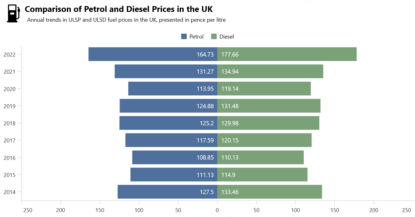
Let’s get started!
Step 1: Collect data on petrol and diesel prices in the UK
First, gather data on ULSP and ULSD prices in the United Kingdom. Table 4.1.2 shows the prices of annual petrol (ULSP) and diesel (ULSD).
Step 2: Prepare data for the chart
Create a Model class that includes properties for storing information about petrol and diesel prices in the United Kingdom.
In a tornado chart, the values will be plotted on both sides (positive and negative) of the x-axis. We’ll plot the price details of petrol in the negative quadrant. For that, we need the original values in their negative form. So, change the sine of the petrol prices and store them in the NegativePetrolPrice property.
Refer to the following code example.
public class Model
{
   public DateTime Date { get; set; }
   public double DieselPrice { get; set; }
   public double PetrolPrice { get; set; }
   public double NegativePetrolPrice { get; set; }

   public Model(DateTime date, double petrolPrice, double dieselPrice)
   {
      Date = date;
      PetrolPrice =  petrolPrice;
      NegativePetrolPrice = - petrolPrice;
      DieselPrice = dieselPrice;
   }

}
Then, configure the ViewModel class to create a collection of annual price details for petrol and diesel and store it in an observable collection using the FuelsPriceDetails property.
Refer to the following code example.
Public class ViewModel
{
     public ObservableCollection<Model> FuelsPriceDetails { get; set; }

     public ViewModel()
     {
         FuelsPriceDetails = new ObservableCollection<Model>()
         {
             new Model (new DateTime(2014,01,01), 127.50, 133.46),
             new Model (new DateTime(2015,01,01), 111.13, 114.90),
             new Model (new DateTime(2016,01,01), 108.85, 110.13),
             new Model (new DateTime(2017,01,01), 117.59, 120.15),
             new Model (new DateTime(2018,01,01), 125.20, 129.98),
             new Model (new DateTime(2019,01,01), 124.88, 131.48),
             new Model (new DateTime(2020,01,01), 113.95, 119.14),
             new Model (new DateTime(2021,01,01), 131.27, 134.94),
             new Model (new DateTime(2022,01,01), 164.73, 177.66)
         };
     }
}
Step 3: Define the layout
Define the layout using a Border element. Inside the border, we’ll utilize a Grid to place our content.
Refer to the following code example.
<Border StrokeShape="RoundRectangle 20"
        StrokeThickness="4"
        Stroke="Gray"
        Margin="20">

  <!--Align Chart-->
  <Grid RowDefinitions="50,*"
       RowSpacing="0">

   <!--Align Header-->
   <Grid Grid.Row="0"
         ColumnDefinitions="50,*" RowDefinitions="50,*">
   </Grid>
  </Grid>
</Border>
Step 4: Configure the Cartesian Charts control
Configure the Syncfusion .NET MAUI Cartesian Charts control using this documentation.
Refer to the following code example.
<chart:SfCartesianChart Grid.Row="1">

 <chart:SfCartesianChart.XAxes>
  <chart:DateTimeAxis>
  </chart:DateTimeAxis>
 </chart:SfCartesianChart.XAxes>

 <chart:SfCartesianChart.YAxes>
  <chart:NumericalAxis>
  </chart:NumericalAxis>
 </chart:SfCartesianChart.YAxes>

</chart:SfCartesianChart>
Step 5: Initialize the tornado chart
To compare the petrol and diesel prices, we’ll use the ColumnSeries instance and set the IsTransposed property to true to initialize the tornado bar chart.
Refer to this code example.
<chart:SfCartesianChart IsTransposed="True">

  <!--Petrol Price Series-->
  <chart:ColumnSeries />
  <!--Diesel Price Series-->
  <chart:ColumnSeries />

</chart:SfCartesianChart>
Step 6: Binding data to the chart
Let’s bind the petrol and diesel price data to the Chart. Set the EnableSideBySideSeriesPalcement to false to avoid series placement side by side.
Refer to this code example.
<chart:SfCartesianChart Grid.Row="1" Grid.Column="0"
                        IsTransposed="True"
                        EnableSideBySideSeriesPlacement="False">

  <!--Petrol Price Series-->
  <chart:ColumnSeries ItemsSource="{Binding FuelsPriceDetails}"
                     XBindingPath="Date"
                     YBindingPath="NegativePetrolPrice">
  </ chart:ColumnSeries >

  <!--Diesel Price Series-->
  <chart:ColumnSeries ItemsSource="{Binding FuelsPriceDetails}"
                      XBindingPath="Date"
                      YBindingPath="DieselPrice">
  </chart:ColumnSeries>

</chart:SfCartesianChart>
In the previous code example, the ItemsSource properties are bound with the proper FuelsPriceDetails properties. The XBindingPath and YBindingPath properties are bound with the date and price details, respectively.
Step 7: Initialize the legend
Refer to the following code example to enable and customize the legend in the tornado chart.
<chart:SfCartesianChart.Legend>
 <chart:ChartLegend />
</chart:SfCartesianChart.Legend>
Step 8: Eliminate negative sine in data label and axis label
The petrol price series will be displayed with negative values on the data labels and y-axis. To eliminate the negative sine, set the Label format as shown in the following code example.
Data Labels
<chart:ColumnSeries>
 <chart:ColumnSeries.DataLabelSettings>
  <chart:CartesianDataLabelSettings>
   <chart:CartesianDataLabelSettings.LabelStyle>
    <chart:ChartDataLabelStyle  LabelFormat="0;#.##"/>
   </chart:CartesianDataLabelSettings.LabelStyle>
  </chart:CartesianDataLabelSettings>
 </chart:ColumnSeries.DataLabelSettings>
</chart:ColumnSeries>
Axis Label
<chart:SfCartesianChart.YAxes>
 <chart:NumericalAxis ShowMajorGridLines="False"
                      RangePadding="Additional">
  <chart:NumericalAxis.LabelStyle>
   <chart:ChartAxisLabelStyle LabelFormat="0;#.##"/>
  </chart:NumericalAxis.LabelStyle>
 </chart:NumericalAxis>
</chart:SfCartesianChart.YAxes>
Step 9: Customize the chart appearance
Let’s enhance the visual appeal of the tornado chart by fine-tuning its elements. We’ll customize the look of the double-sided bar chart by adjusting various properties and styles.
Customizing the title
Customize the chart title like in the following code example.
<Grid Grid.Row="0"
      ColumnDefinitions="50,*"  RowDefinitions="50,*">
 <Image Grid.RowSpan="1"  Grid.Column="0" Source="tank.png"
        HeightRequest="40"
        WidthRequest="40"
        Margin="8"/>
  <VerticalStackLayout Grid.Row="0"
                       Grid.Column="1">
   <Label Text="Comparison of Petrol and Diesel Prices in the UK"
          TextColor="Black"
          FontSize="18"
          FontFamily="TimeSpan"
          FontAttributes="Bold"
          Margin="0,5,0,0"/>

   <Label Text="Annual trends in ULSP and ULSD fuel prices in the UK, presented in pence per litre"
           TextColor="Black"
           FontSize="12"
           FontFamily="TimeSpan"
           Margin="5"/>
  </VerticalStackLayout>
 </Grid>
Customizing the axes
Customize the x- and y-axes using the properties Interval, IntervalType, MajorGrideLines, and RangePadding.
Refer to the code example.
<chart:SfCartesianChart.XAxes>
 <chart:DateTimeAxis Interval="1"
                     ShowMajorGridLines="False"
                     IntervalType="Years">
 </chart:DateTimeAxis>
</chart:SfCartesianChart.XAxes>

<chart:SfCartesianChart.YAxes>
 <chart:NumericalAxis ShowMajorGridLines="False"
                      RangePadding="Additional">
 </chart:NumericalAxis>
</chart:SfCartesianChart.YAxes>
Customizing the series appearance
Customize each series using the Fill, LegendIcon, and Label properties. Refer to the following code example.
<!--Petrol Price Series-->
<chart:ColumnSeries Label="Petrol"
                    Fill="#4F709C"
                    LegendIcon="Rectangle">
</chart:ColumnSeries>

<!--Diesel Price Series-->
<chart:ColumnSeries Label="Diesel"
                    Fill="#7aa178"
                    LegendIcon="Rectangle">
</chart:ColumnSeries>
Customizing the series data labels
Add data labels to the chart and customize them, as shown in the following code example.
<!--Petrol Price Series-->
<chart:ColumnSeries ItemsSource="{Binding FuelsPriceDetails}" XBindingPath="Date" YBindingPath="NegativePetrolPrice" ShowDataLabels="True" Label="Petrol" Fill="#4F709C" LegendIcon="Rectangle">
<chart:ColumnSeries.DataLabelSettings>
<chart:CartesianDataLabelSettings LabelPlacement="Inner" BarAlignment="Bottom" UseSeriesPalette="False">
<chart:CartesianDataLabelSettings.LabelStyle>
<chart:ChartDataLabelStyle FontSize="13" TextColor="White" LabelFormat="0;#.##"/>
</chart:CartesianDataLabelSettings.LabelStyle>
</chart:CartesianDataLabelSettings>
</chart:ColumnSeries.DataLabelSettings>
</chart:ColumnSeries>
<!--Diesel Price Series-->
<chart:ColumnSeries ItemsSource="{Binding FuelsPriceDetails}" XBindingPath="Date" YBindingPath="DieselPrice" Label="Diesel" ShowDataLabels="True" Fill="#7aa178" LegendIcon="Rectangle">
<chart:ColumnSeries.DataLabelSettings>
<chart:CartesianDataLabelSettings LabelPlacement="Inner" UseSeriesPalette="False" BarAlignment="Bottom">
<chart:CartesianDataLabelSettings.LabelStyle>
<chart:ChartDataLabelStyle FontSize="13" TextColor="White"/>
</chart:CartesianDataLabelSettings.LabelStyle>
</chart:CartesianDataLabelSettings>
</chart:ColumnSeries.DataLabelSettings>
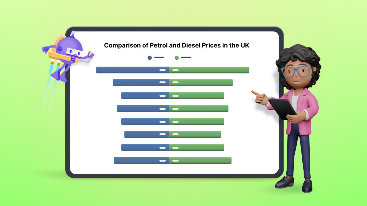
</chart:ColumnSeries>After executing the previous code examples, our output will look like the following image.

GitHub reference
For more information, refer to the project on GitHub.
Conclusion
Thanks for reading! This blog showed how to create a tornado chart using the Syncfusion .NET MAUI Cartesian Charts control to visualize price comparisons between ULSD and ULSP in the United Kingdom. We encourage you to follow the steps and share your thoughts on the experience in the comment section below.
If you require assistance, please don’t hesitate to contact us via our support forum, support portal, or feedback portal. We are always happy to help you!


Related blogs
- Effortless Google Calendar Events Synchronization in .NET MAUI Scheduler
- Chart of the Week: Creating a .NET MAUI Radial Bar Chart for the Most and Least Powerful Passports in 2023
- Load Appointments on Demand via Web Services in .NET MAUI Scheduler Using JSON Data
- Introducing .NET MAUI Pickers for Efficient User Interactions
 No spam, just valuable updates.