We’re thrilled to announce a new addition to Syncfusion’s Essential Studio® 2023 Volume 4 release: a Switch control for the .NET MAUI platform. But it’s not just any switch; it’s a dynamic tool for customization!
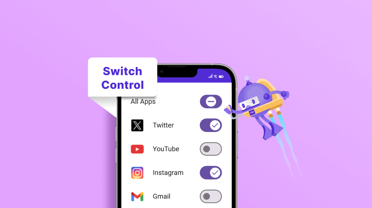
This control allows you to set on and off states and even provides an optional indeterminate state. You can customize the track, thumb stroke, background, and corner edge radii to create a switch that embodies your brand. Also, with the visual state manager, you can tailor the appearance of the different visual states.
Let’s dive into the key features of the .NET MAUI Switch control and cover the steps to get started.
Key features
The .NET MAUI Switch control supports many user-friendly features, including:
- Customizable visual types.
- Indeterminate states.
- Thumb and track customization.
- Customizable path inside the thumb.
- RTL support.
Customizing the visual types
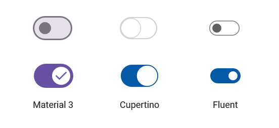
The .NET MAUI Switch control allows you to render the control with themes like Material, Cupertino, and Fluent using a visual state manager that seamlessly allows you to customize the visual states and themes of the control.

Indeterminate state
This feature allows you to represent a state of transition or ongoing process, providing users with a clear visual indication of pending actions.

Thumb and track customization
The .NET MAUI Switch control provides customization options for the thumb and track. You can adjust their width and height with the WidthRequest and HeightRequest properties, respectively. Define the border using the Stroke and StrokeThickness properties, and set the background color through the Background property, all within the SwitchSettings class.

Thumb icon customization
You can customize the thumb icon within the Switch control by assigning a path to the icon and color through the CustomPath and IconColor properties, respectively, in the SwitchSetting class.

RTL support
The .NET MAUI Switch supports changing the flow direction of the control from right to left (RTL).

Note: For more details about features, refer to the .NET MAUI Switch control documentation.
Getting started with the .NET MAUI Switch control
Now, let’s delve into how to integrate the Switch control into your .NET MAUI app and harness its features.
Step 1: Begin by creating a .NET MAUI application. This will serve as the foundation for integrating the Switch control.
Step 2: Syncfusion .NET MAUI controls are readily available on the NuGet Gallery. To incorporate the .NET MAUI Switch control into your project, launch the NuGet package manager in Visual Studio. Search for Syncfusion.Maui.Buttons and install it. This package contains the Switch control.
Step 3: Register the handler for the Syncfusion core in the MauiProgram.cs file. This is an essential step as it allows the app to recognize and utilize the Syncfusion controls. Here’s how you can do it:
using Microsoft.Maui;
using Microsoft.Maui.Hosting;
using Microsoft.Maui.Controls.Compatibility;
using Microsoft.Maui.Controls.Hosting;
using Microsoft.Maui.Controls.Xaml;
using Syncfusion.Maui.Core.Hosting;
namespace SwitchSample
{
  public static class MauiProgram
  {
	public static MauiApp CreateMauiApp()
	{
		var builder = MauiApp.CreateBuilder();
		builder
		.UseMauiApp<App>()
		.ConfigureSyncfusionCore()
		.ConfigureFonts(fonts =>
		{
	           fonts.AddFont("OpenSans-Regular.ttf", "OpenSansRegular");
		});
		return builder.Build();
	 }
  }
}
Step 4: Add the Syncfusion.Maui.Buttons namespace in your XAML page. This namespace contains the Switch control.
xmlns:buttons="clr-namespace:Syncfusion.Maui.Buttons;assembly=Syncfusion.Maui.Buttons"
Step 5: Finally, initialize the Syncfusion .NET MAUI Switch control. Refer to the following code example.
<buttons:SfSwitch x:Name="switch" />
This will create a Switch control, as shown in the following image. Get ready to flip the switch to a more dynamic user interface!

GitHub reference
Check out the complete getting started example for the .NET MAUI Switch control on GitHub.
Conclusion
Thanks for reading! In this blog, we explored the features of the new Syncfusion .NET MAUI Switch control that rolled out in the 2023 Volume 4 release. You can learn more about the latest .NET MAUI advancements on our Release Notes and What’s New pages. Try them out and leave your feedback in the comments section below!
Download Essential Studio® for .NET MAUI to start evaluating them immediately. If you have any questions or need further assistance, please don’t hesitate to contact us through our support forum, support portal, or feedback portal. We are always happy to help you!
Related blogs
- Syncfusion Essential Studio® 2023 Volume 4 Is Here!
- Introducing the 10th Set of .NET MAUI Controls and Features
- Chart of the Week: Creating a .NET MAUI Candle Chart to Analysis Tesla’s (TSLA) Stock Prices
- Chart of the Week: Creating a .NET MAUI Column Chart to Visualize Top Insurance Companies
