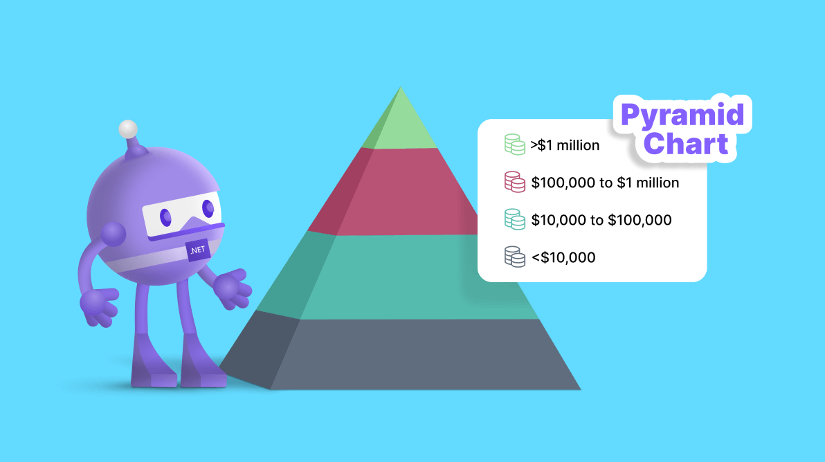
Welcome to our Chart of the Week blog series!
Today, we’ll visualize the global wealth distribution in 2021 using the Syncfusion .NET MAUI Pyramid Chart. This control is cross-platform compatible and adapts seamlessly to desktop (Windows and MacCatalyst) and mobile (Android and iOS) environments, providing consistent functionality.
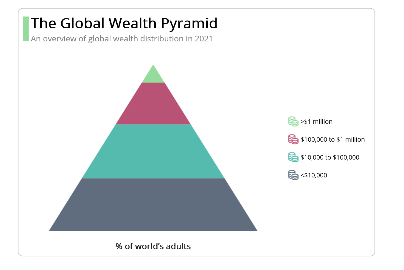
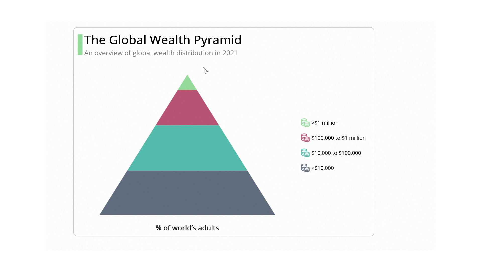
In this example, we will compare the wealth distribution worldwide in 2021. This comparison will help us understand how wealth is distributed among the population and the existing inequalities, as illustrated in the following chart.
 Let’s see the steps to recreate this chart using the Syncfusion .NET MAUI Pyramid Chart control.
Step 1: Gathering the data
Before proceeding, we should gather the data for the chart. For this example, we used the Credit Suisse Global Wealth Report, which provides comprehensive information on global wealth distribution, and extracted data from it. Specifically, we examined page number 21.
Step 2: Populating data for the chart
To visualize the global wealth distribution, define the GlobalWealthModel class with the following properties:
- WealthPercentage: This property holds the percentage of global wealth for a specific population range.
- AdultsCount: This property holds the number of adults within the given population range.
- PopulationRange: This property represents the population range based on the given values.
- Color: This property represents the specific color for each segment.
Refer to the following code example.
public class GlobalWealthModel
{
     public double WealthPercentage { get; set; }
     public double AdultsCount { get; set; }
     public string PopulationRange { get; set; }
     public Color Color { get; set; }
}
Now, generate the data collection containing global wealth using the GlobalWealthPercentage class.
public class GlobalWealthPercentage
{
    public List<GlobalWealthModel> GlobalWealthData { get; set; }

    public GlobalWealthPercentage()
    {

        GlobalWealthData = new List<GlobalWealthModel>()
        {
            new GlobalWealthModel()
            {
                WealthPercentage = 1.2,
                AdultsCount = 62.5,
                PopulationRange = ">$1 million",
                Color = Color.FromHex("#95DB9C")
            },
            new GlobalWealthModel()
            {
                WealthPercentage = 11.8,
                AdultsCount = 627,
                PopulationRange = "$100,000 to $1 million",
                Color = Color.FromHex("#B95375")
            },
            new GlobalWealthModel()
            {
                WealthPercentage = 33.8,
                AdultsCount = 1791,
                PopulationRange = "$10,000 to $100,000",
                Color = Color.FromHex("#56BBAF")
            },
            new GlobalWealthModel()
            {
                WealthPercentage = 53.2,
                AdultsCount = 2818,
                PopulationRange = "<$10,000",
                Color = Color.FromHex("#606D7F")
            }
       };
    }
}
Step 3: Configuring the Syncfusion .NET MAUI Pyramid Chart
Then, configure the Syncfusion .NET MAUI Pyramid Chart control using this documentation.
Refer to the following code example.
<chart: SfPyramidChart>
</chart: SfPyramidChart>
Step 4: Binding data to the chart
Now, bind the global wealth data to the .NET MAUI Pyramid Chart.
Refer to the following code example.
<chart:SfPyramidChart ItemsSource="{Binding GlobalWealthData}" XBindingPath="AdultsCount" YBindingPath="WealthPercentage">
</chart:SfPyramidChart>
In this example, we’ve bound the GlobalWealthData with the ItemSource property. We’ve also specified the XBindingPath and YBindingPath with the AdultsCount and WealthPercentage properties, respectively.
Step 5: Customizing the chart appearance
Let’s enhance the appearance of the .NET MAUI Pyramid Chart.
Refer to the following code example. In it, we’ve assigned the surface mode to the Pyramid Chart. With this, the surface area of the pyramid is accurately rendered, providing a proportional representation of the data values.
<chart: SfPyramidChart Mode="Surface">
</chart: SfPyramidChart>
We can more easily understand the plotted data by adding a title to the chart, as in the following code example.
<chart:SfPyramidChart.Title>
 <Grid>
  <Grid.ColumnDefinitions>
   <ColumnDefinition Width="13"/>
   <ColumnDefinition Width="*"/>
  </Grid.ColumnDefinitions>
  <StackLayout  Grid.RowSpan="2" Margin="0,8,0,6" Orientation="Vertical" BackgroundColor="#95DB9C"/>
   <StackLayout Grid.Column="1" Margin="5,0,0,0" HorizontalOptions="Start" Orientation="Vertical">
    <Label  Text="The Global Wealth Pyramid" FontSize="Large" TextColor="Black" FontAttributes="Bold"/>
    <Label Text="An overview of global wealth distribution in 2021" TextColor="Gray" FontSize="18"/>
   </StackLayout>
 </Grid>
</chart:SfPyramidChart.Title>
Refer to the following code example to configure the pyramid colors.
XML
<chart: SfPyramidChart PaletteBrushes="{Binding PaletteBrushes}">
</chart: SfPyramidChart>
C#
public class GlobalWealthPercentage
{
   public List<Brush> PaletteBrushes { get; set; }

   public GlobalWealthPercentage ()
   {
      PaletteBrushes = new List<Brush>
        {
          new SolidColorBrush(Color.FromArgb("#95DB9C")),
          new SolidColorBrush(Color.FromArgb("#B95375")),
          new SolidColorBrush(Color.FromArgb("#56BBAF")),
          new SolidColorBrush(Color.FromArgb("#606D7F")),
        };
   }
}
Refer to the following code to enable and customize the legend to indicate the meaning of the colors.
<chart:SfPyramidChart.Legend>
 <chart:ChartLegend Placement="Right" >
  <Chart:ChartLegend.ItemTemplate>
   <DataTemplate>
    <Grid ColumnDefinitions="Auto,Auto" Padding="5,0,5,0" Margin="{OnPlatform Android=3.5,iOS=3.5,Default=5}">
     <Path  Grid.Column="0" Data="{StaticResource PathData}" Stroke="{Binding IconBrush,Converter={StaticResource brushToColor}}" VerticalOptions="Center" HorizontalOptions="Center"/>
     <Label Grid.Column="1" VerticalTextAlignment="Center"  TextColor="Black"
            Text="{Binding Item.PopulationRange}" HorizontalOptions="Start"
            FontSize="{OnPlatform Android=9,iOS=9,Default=14}" Padding="5"
            HorizontalTextAlignment="Center" />
    </Grid>
   </DataTemplate>
  </Chart:ChartLegend.ItemTemplate>
 </Chart:ChartLegend>
</chart:SfPyramidChart.Legend>
Let’s customize the plot area of the chart, as shown in the following code example.
<chart:SfPyramidChart.PlotAreaBackgroundView>
  <AbsoluteLayout>
     <Label Text="% of world's adults"
            FontSize="{OnPlatform iOS=13,Android=13,Default=Subtitle}"
            FontAttributes="Bold" AbsoluteLayout.LayoutBounds="0.5,1,-1,-1"
            AbsoluteLayout.LayoutFlags="PositionProportional"/>
  </AbsoluteLayout>
</chart:SfPyramidChart.PlotAreaBackgroundView>
Step 6: Adding interactivity support
We can enhance the interactivity of our Pyramid Chart by adding tooltip support. The tooltips help us to display additional information or metadata when a segment is tapped or hovered over. We can also personalize the appearance of the tooltip using the TooltipTemplate property.
Refer to the following code example.
<chart: SfPyramidChart EnableTooltip="True">
 <chart:SfPyramidChart.TooltipTemplate>
  <DataTemplate>
   <Grid ColumnDefinitions="*" RowDefinitions="Auto,Auto,Auto">
    <Label Grid.Row="0" HorizontalTextAlignment="Center" FontSize="13"
           Text="{Binding Item.WealthPercentage, StringFormat='({0}%)'}"
           TextColor="White" FontAttributes="Bold"/>
    <BoxView  Grid.Row="1"  HeightRequest="1" Color="Gray" Margin="1"/>
     <HorizontalStackLayout Spacing="5" Grid.Row="2" >
      <Rectangle HeightRequest="12" WidthRequest="12"
                 Fill="{Binding Item.Color}"/>
      <Label Text="{Binding Item.AdultsCount,StringFormat='{0}M'}"
              FontSize="Caption" TextColor="White" />
     </HorizontalStackLayout>
   </Grid>
  </DataTemplate>
 </chart:SfPyramidChart.TooltipTemplate>
</chart:SfPyramidChart>
After executing the previous code examples, we will get output like in the following image.
GitHub reference
For more details, refer to the project on GitHub.
Conclusion
Thanks for reading! In this blog, we’ve seen how to visualize the global wealth distribution in 2021 using the Syncfusion .NET MAUI Pyramid Chart. We encourage you to try the steps discussed and share your thoughts in the comments section below.
You can also contact us through our support forum, support portal, or feedback portal. Our team would be happy to assist you!