

Welcome to our Chart of the Week series.
This blog will use the Syncfusion .NET MAUI pie chart to visualize U.S. methane gas emission data for the year 2021.
A pie chart is an effective way to represent data as a percentage of a whole. It can be utilized in various scenarios, such as analyzing sales distribution among different product categories, managing personal finances or business budgets, and performing market share analysis.
The following pie chart demonstrates the United States’ methane gas emissions from various sources in 2021.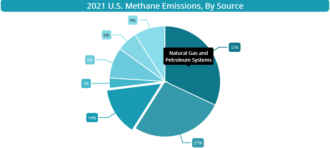
Let’s see the steps to recreate this pie chart.
Step 1: Gather the data
First, we need to gather the data. We are using the US Landfill Methane Outreach Program data as a reference. The data regarding methane gas emissions from various sources was obtained through a survey conducted as part of the reference study.
Step 2: Prepare the data for the pie chart
Define the PieChartModel class. This class will serve as a container to store the details of the emissions source and its corresponding percentage. The EmissionSource property will hold the name of the emissions source, while the EmissionPercentage property will store the corresponding percentage value.
Refer to the following code example.
public class PieChartModel
{
    public string EmissionSource { get; set; }
    public double EmissionPercentage{ get; set; }
}
Then, generate the data collection to demonstrate the methane emissions with respect to the source using the PieChartViewModel class.
public class PieChartViewModel
{
    public PieChartViewModel()
    {
        Data = new List<PieChartModel>()
        {
            new PieChartModel() { EmissionSource = "Natural Gas and Petroleum Systems", EmissionPercentage = 32},
            new PieChartModel() { EmissionSource = "Enteric Fermentation", EmissionPercentage = 27},
            new PieChartModel() { EmissionSource = "MSW Landfills", EmissionPercentage = 14 },
            new PieChartModel() { EmissionSource = "Other Landfills", EmissionPercentage = 3 },
            new PieChartModel() { EmissionSource = "Manure Management", EmissionPercentage = 9 },
            new PieChartModel() { EmissionSource = "Coal Mining", EmissionPercentage = 6 },
            new PieChartModel() { EmissionSource = "Other", EmissionPercentage = 9 }
         };
    }

   public List<PieChartModel> Data { get; set; }
}
Step 3: Configure Syncfusion .NET MAUI Circular Charts
Now, configure the Syncfusion .NET MAUI Circular Charts control referring to this documentation.
The code to include Circular Charts in the XAML page will look like the following.
<Chart:SfCircularChart>
</Chart:SfCircularChart>
Step 4: Bind methane gas emissions data to the pie chart
To display the methane emissions rate in our chart, utilize the Syncfusion PieSeries instance. The chart series configuration involves specifying the XBindingPath to indicate the emissions source and the YBindingPath to represent the percentage of methane emissions.
Here’s an example showcasing how to add the pie series to our chart.
<Chart:PieSeries XBindingPath="EmissionSource" YBindingPath="EmissionPercentage" ItemsSource="{Binding Data}">
</Chart:PieSeries>
In this example, we’ve bound the ItemSource property of the chart series to a collection that contains the methane emissions data for the year 2021. This data is sourced from the PieChartViewModel class.
Step 5: Customize the chart appearance
Let’s enhance the appearance of our pie chart by customizing the series appearance, setting the chart title, highlighting specific segments, and more.
Refer to the following code example to add a title to the chart. This will provide quick context to the plotted data.
<Chart:SfCircularChart.Title>
 <Border StrokeShape="{OnPlatform WinUI='RoundRectangle 8', Android='RoundRectangle 5', MacCatalyst='RoundRectangle 15', iOS='RoundRectangle 8'}" Stroke="#199CB3" BackgroundColor="#199CB3" StrokeThickness="3">
  <Label Text="2021 U.S. Methane Emissions, By Source" HorizontalTextAlignment="Center" TextColor="White" FontSize="{OnPlatform WinUI='Medium', MacCatalyst='35', iOS='Medium', Android='Medium'}" FontAttributes="Bold" BackgroundColor="#199CB3"/>
 </Border>
</Chart:SfCircularChart.Title>
Next, customize the appearance of series elements by defining the series’s StartAngle and EndAngle and using custom PaletteBrushes properties. Also, draw attention by highlighting a specific chart segment using the ExplodeIndex property.
XAML
<Chart:PieSeries ExplodeIndex="2" Stroke="White" StrokeWidth="2" PaletteBrushes="{Binding CustomBrushes}" StartAngle="270" EndAngle="630">
</Chart:PieSeries>
C#
public class PieChartViewModel
{
   public PieChartViewModel()
   {
       CustomBrushes = new List<Brush>();
       CustomBrushes.Add(new SolidColorBrush(Color.FromArgb("#0E778A")));
       CustomBrushes.Add(new SolidColorBrush(Color.FromArgb("#3499AB")));
       CustomBrushes.Add(new SolidColorBrush(Color.FromArgb("#199CB3")));
       CustomBrushes.Add(new SolidColorBrush(Color.FromArgb("#42B6CB")));
       CustomBrushes.Add(new SolidColorBrush(Color.FromArgb("#6BCBDC")));
       CustomBrushes.Add(new SolidColorBrush(Color.FromArgb("#84D7E6")));
       CustomBrushes.Add(new SolidColorBrush(Color.FromArgb("#89DCEb")));
   }

   public List<Brush> CustomBrushes { get; set; }
}
Then, show data labels in the chart using the ShowDataLabels property. Customize the data label placement, style, and connector line type using the DataLabelSettings property of the chart series.
<Chart:PieSeries ShowDataLabels="True">
 <Chart:PieSeries.DataLabelSettings>
  <Chart:CircularDataLabelSettings UseSeriesPalette="True" LabelPlacement="Outer">
   <Chart:CircularDataLabelSettings.LabelStyle>
    <Chart:ChartDataLabelStyle LabelFormat="0.##'%"/>
   </Chart:CircularDataLabelSettings.LabelStyle>
  </Chart:CircularDataLabelSettings>
 </Chart:PieSeries.DataLabelSettings>
</Chart:PieSeries>
Step 6: Add tooltip interaction
Finally, add the tooltip feature to display additional information or metadata when a chart segment is tapped or hovered over. We can also customize the appearance of the tooltip using the TooltipTemplate property.
Refer to the following code example.
<Chart:PieSeries EnableTooltip="True">

 <Chart:PieSeries.TooltipTemplate>
  <DataTemplate>
   <Grid ColumnDefinitions="{OnPlatform iOS='160', MacCatalyst='200'}" RowDefinitions="Auto">
    <Label Grid.Row="0" Grid.Column="0" Text="{Binding Item.EmissionSource}" FontAttributes="Bold" FontSize="{OnPlatform MacCatalyst='Large'}" TextColor="White" MaximumWidthRequest="{OnPlatform WinUI='140', Android='130'}" LineBreakMode="WordWrap" HorizontalOptions="Fill" VerticalTextAlignment="Center" VerticalOptions="Fill" HorizontalTextAlignment="Center"/>
   </Grid>
  </DataTemplate>
 </Chart:PieSeries.TooltipTemplate>

</Chart:PieSeries>
After executing these code examples, we’ll get an output chart like in the following image.
GitHub reference
For more details, refer to the project Pie chart illustrating U.S. methane emissions on GitHub.
Conclusion
Thanks for reading! In this blog, we’ve seen how to visualize the U.S. methane gas emissions data for the year 2021 using the Syncfusion .NET MAUI pie chart. We encourage you to try these steps to visualize your desired data and share your feedback in the comments section below.
You can also reach us through our support forum, support portal, or feedback portal. We are always happy to assist you!


 No spam, just valuable updates.