
Welcome to our Chart of the Week blog series!
Today, we’ll delve into creating a Pareto Chart to identify key areas of customer complaints using the Syncfusion .NET MAUI Charts control.
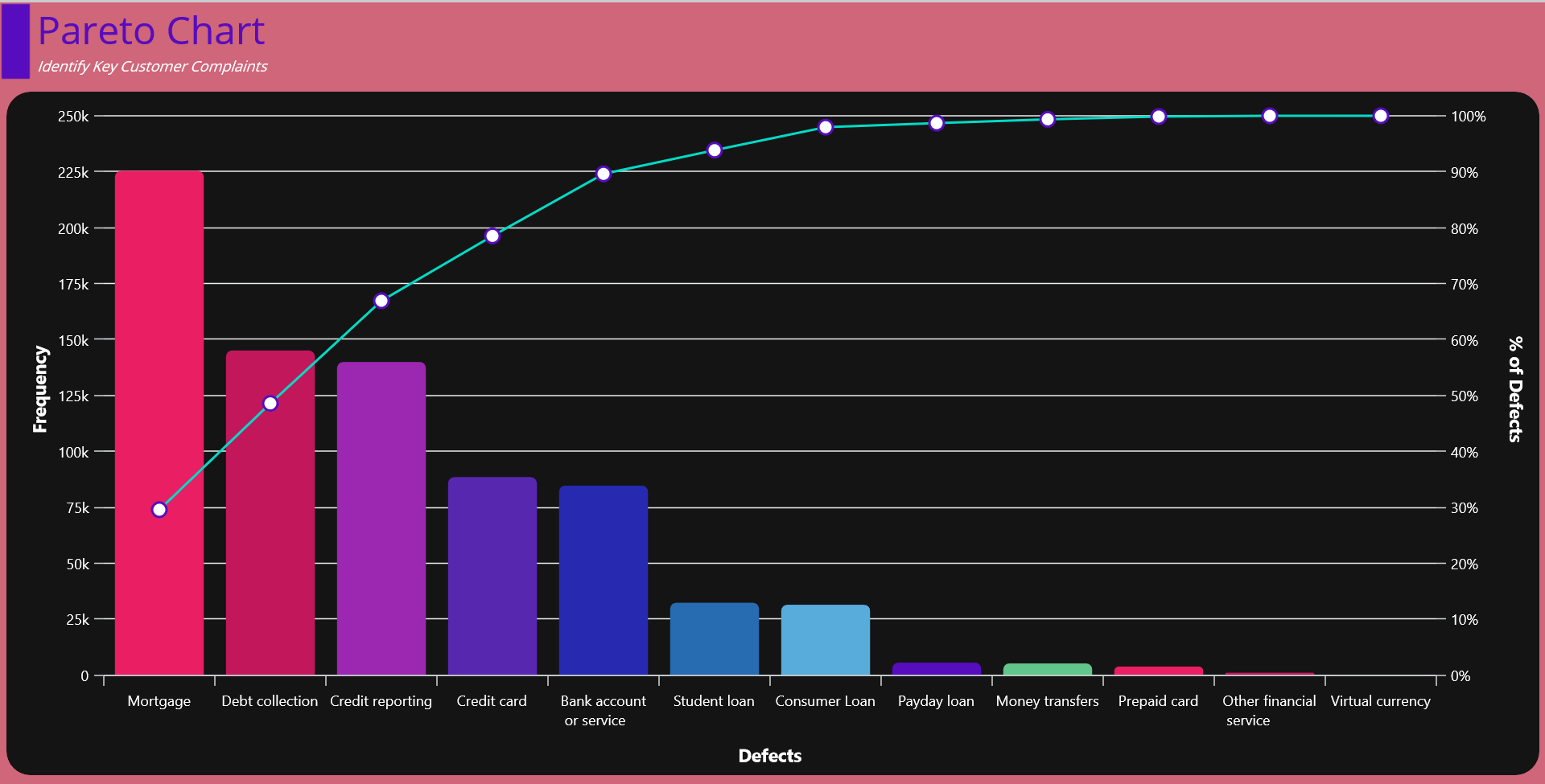
Imagine you are the manager of some financial products and have been receiving customer complaints about various issues. You have collected data on the complaints and categorized them into different types over a period. Your goal is to identify the most significant problems to prioritize your improvement efforts. In that case, the Pareto chart comes in handy.
Refer to the following image.
Let’s see how to build a Pareto chart for customer complaints step by step using Syncfusion .NET MAUI Charts.
Step 1: Gathering the customer complaints data
Before creating the chart, we need to gather the consumer complaints data from the model source. We need the complaint count in each category.
Categories | Number of Complaints |
Mortgage | 225394 |
Debt collection | 145071 |
Credit reporting | 139929 |
Credit card | 88471 |
Bank account or service | 84643 |
Student loan | 32315 |
Consumer Loan | 31411 |
Payday loan | 5523 |
Money transfers | 5155 |
Prepaid card | 3774 |
Other financial service | 1031 |
Virtual currency | 17 |
Step 2: Preparing the data for the chart
The Pareto chart combines column and line series. Here, we’ll configure the columns to represent the defect count and the lines to denote the cumulative percentage. To achieve this, create separate model classes (ComplaintsModel and CumulativeModel) to hold these values.
Refer to the following code example.
public class ComplaintsModel
{
    public string Defect { get; set; }
    public double Frequency { get; set; }
}


public class CumulativeModel
{
    public string Defect { get; set; }

    public double YValues { get; set; }

    public double CumulativeCount { get; set; }

    public double CumulativeFrequency { get; set; }
}
Then, generate the data collection in the class ConsumerComplaintsViewModel using the DataValues property.
public class ConsumerComplaintsViewModel: INotifyPropertyChanged
{
    private ObservableCollection<ComplaintsModel> data;

    public ObservableCollection<ComplaintsModel> DataValues
    {
        get {return data;}
        set
        {
            data = value;
        }
    }

    public ConsumerComplaintsViewModel()
    {
        DataValues = new ObservableCollection<ComplaintsModel>()
        {
            new ComplaintsModel(){Defect = "Mortgage", Frequency=225394 },
            new ComplaintsModel(){Defect = "Debt collection", Frequency=145071},
            new ComplaintsModel(){Defect = "Credit reporting", Frequency=139929},
            new ComplaintsModel(){Defect = "Credit card", Frequency=88471},
            new ComplaintsModel(){Defect = "Bank account or service", Frequency=84643},
            new ComplaintsModel(){Defect = "Student loan", Frequency=32315},
            new ComplaintsModel(){Defect = "Consumer Loan", Frequency=31411},
            new ComplaintsModel(){Defect = "Payday loan", Frequency=5523},
            new ComplaintsModel(){Defect = "Money transfers", Frequency=5155},
            new ComplaintsModel(){Defect = "Prepaid card", Frequency=3774},
            new ComplaintsModel(){Defect = "Other financial service", Frequency=1031},
            new ComplaintsModel(){Defect = "Virtual currency", Frequency=17},
        };
    }
    . . .
}
Step 3: Preparing the cumulative data source
Let’s calculate the cumulative frequency for the Pareto chart using the formula (Defect count / Sum of defects) * 100. Then, we’ll update the CumulativeSource property with the calculated value.
Refer to the following code example.
public class ConsumerComplaintsViewModel : INotifyPropertyChanged
{
    private ObservableCollection<ComplaintsModel> data;

    public ObservableCollection<ComplaintsModel> DataValues
    {
        get { return data; }
        set
        {
            if (value != data)
            {
                data = value;
                CalculateCumulative(data);
            }

            OnPropertyChanged("DataValues");
        }
    }

    public ObservableCollection<CumulativeModel> CumulativeSource { get; set; }

    private void CalculateCumulative(object source)
    {
        var dataSource = source as ObservableCollection<ComplaintsModel>;
        if (dataSource != null && dataSource.Count > 0)
        {
            CumulativeSource.Clear();
            var orderedList = dataSource.OrderByDescending(x => x.Frequency).ToList();
            double cumulativeCount = 0;
            foreach (var data in orderedList)
            {
                cumulativeCount += data.Frequency;
                CumulativeSource.Add(new CumulativeModel() { Defect = data.Defect, YValues = data.Frequency, CumulativeCount = cumulativeCount });
            }

            if (cumulativeCount > 0)
            {
                foreach (var data in CumulativeSource)
                {
                    data.CumulativeFrequency = (data.CumulativeCount / cumulativeCount) * 100;
                }
            }
        }

    }
}
Step 4: Configure the Syncfusion .NET MAUI Charts
Let’s configure the Syncfusion .NET MAUI Cartesian Charts control using this documentation.
Refer to the following code example.
<chart:SfCartesianChart Margin="10">
 <chart:SfCartesianChart.XAxes>
  <chart:CategoryAxis>
  </chart:CategoryAxis>
 </chart:SfCartesianChart.XAxes>

 <chart:SfCartesianChart.YAxes>
  <chart:NumericalAxis>
  </chart:NumericalAxis>
 </chart:SfCartesianChart.YAxes>
</chart:SfCartesianChart>
Step 5: Binding data to the chart
As mentioned previously, the Pareto chart comprises of both column and line series. To design the chart, we’ll use the Syncfusion ColumnSeries and LineSeries instances.
Make sure to configure the ConsumerComplaintsViewModel class to bind its properties to the Charts BindingContext.
Refer to the following code example. Here, in the ColumnSeries, we’ve bound the Label, ItemsSource, XBindingPath, and YBindingPath properties with the Count, DataValues, Defect, and Frequency properties, respectively.
In the LineSeries, we’ve bound the Label, ItemsSource, XBindingPath, and YBindingPath properties with the Cumulative%, CumulativeSource, Defect, and CumulativeFrequency properties, respectively.
<ContentPage.BindingContext>
 <local:ConsumerComplaintsViewModel x:Name="viewModel"/>
</ContentPage.BindingContext>

<chart:SfCartesianChart>
 . . .
 <chart:ColumnSeries Label="Count"
                    ItemsSource="{Binding DataValues}"
                    XBindingPath="Defect"
                    YBindingPath="Frequency"/>
 <chart:LineSeries Label="Cumulative %"
                  ItemsSource="{Binding CumulativeSource}"
                  XBindingPath="Defect"
                  YBindingPath="CumulativeFrequency"/>
 . . .
</chart:SfCartesianChart>
Step 6: Customizing the chart appearance
Let’s customize the chart’s appearance by customizing the axis elements and column colors, adding titles, enabling markers, and adjusting the column width.
Refer to the following code example.
<Grid RowSpacing="10">
 <Grid.RowDefinitions>
  <RowDefinition Height="1*"/>
  <RowDefinition Height="9*"/>
 </Grid.RowDefinitions>

 <HorizontalStackLayout Grid.Row="0" Spacing="5">
  <Border Background="#570CBE" WidthRequest="25"
          VerticalOptions="Fill" Stroke="transparent">
  </Border>
  <VerticalStackLayout>
   <Label Text="Pareto Chart" TextColor="#570CBE"
          FontSize="Large" HorizontalOptions="Start" />
   <Label Text="Identify Key Customer Complaints"
          TextColor="White" FontSize="Caption" FontAttributes="Italic" HorizontalOptions="Start" />
  </VerticalStackLayout>
 </HorizontalStackLayout>
 <BoxView Grid.Row="1" CornerRadius="20" Margin="5,0,5,10"
          HorizontalOptions="FillAndExpand" VerticalOptions="FillAndExpand"/>

 <chart:SfCartesianChart x:Name="chart" Grid.Row="1" Margin="10"
                         HorizontalOptions="FillAndExpand" VerticalOptions="FillAndExpand">

  <chart:SfCartesianChart.XAxes>
   <chart:CategoryAxis ShowMajorGridLines="False"
                       LabelPlacement="{OnPlatform Android= OnTicks, iOS= OnTicks, Default=BetweenTicks}"
                       LabelRotation="{OnPlatform Android=45,iOS=45}">
    <chart:CategoryAxis.Title>
     <chart:ChartAxisTitle Text="Defects" TextColor="White"
                           FontSize="15" FontAttributes="Bold" />
    </chart:CategoryAxis.Title>
    <chart:CategoryAxis.LabelStyle>
     <chart:ChartAxisLabelStyle TextColor="White"/>
    </chart:CategoryAxis.LabelStyle>
   </chart:CategoryAxis>
  </chart:SfCartesianChart.XAxes>

  <chart:SfCartesianChart.YAxes>
   <chart:NumericalAxis ShowMinorGridLines="False"
                        PlotOffsetEnd="10" Interval="25000"
                        EdgeLabelsDrawingMode="Center" ShowMajorGridLines="True"
                        LabelCreated="NumericalAxis_LabelCreated">
    <chart:NumericalAxis.Title>
     <chart:ChartAxisTitle Text="Frequency"
                           TextColor="White"
                           FontSize="15" FontAttributes="Bold" />
    </chart:NumericalAxis.Title>
    <chart:NumericalAxis.LabelStyle>
     <chart:ChartAxisLabelStyle TextColor="White"/>
    </chart:NumericalAxis.LabelStyle>
    <chart:NumericalAxis.AxisLineStyle>
     <chart:ChartLineStyle Stroke="Transparent" StrokeWidth="0"/>
    </chart:NumericalAxis.AxisLineStyle>
   </chart:NumericalAxis>

   <chart:NumericalAxis Name="CumulativeAxis" EdgeLabelsDrawingMode="Center"
                        Interval="10" ShowMajorGridLines="False"
                        ShowMinorGridLines="False" Minimum="0" Maximum="100"
                        PlotOffsetEnd="10" CrossesAt="{x:Static x:Double.MaxValue}">
    <chart:NumericalAxis.Title>
     <chart:ChartAxisTitle Text="% of Defects" TextColor="White"
                           FontSize="15" FontAttributes="Bold" />
    </chart:NumericalAxis.Title>
    <chart:NumericalAxis.AxisLineStyle>
     <chart:ChartLineStyle Stroke="Transparent" StrokeWidth="0"/>
    </chart:NumericalAxis.AxisLineStyle>
    <chart:NumericalAxis.LabelStyle>
     <chart:ChartAxisLabelStyle LabelFormat="0'%'" TextColor="White"/>
    </chart:NumericalAxis.LabelStyle>
   </chart:NumericalAxis>
  </chart:SfCartesianChart.YAxes>
  <chart:ColumnSeries Label="Count"
                      ItemsSource="{Binding DataValues}"
                      XBindingPath="Defect"
                      YBindingPath="Frequency"
                      PaletteBrushes="{Binding CustomPalette}"
                      Width="0.8"
                      CornerRadius="5,5,0,0"/>
   <chart:LineSeries Label="Cumulative %"
                     ItemsSource="{Binding CumulativeSource}"
                     XBindingPath="Defect"
                     YBindingPath="CumulativeFrequency"
                     StrokeWidth="2" Fill="#03DAC5"
                     YAxisName="CumulativeAxis"
                     ShowMarkers="True">
    <chart:LineSeries.MarkerSettings>
     <chart:ChartMarkerSettings Width="12"
                                Height="12"
                                Fill="white"
                                StrokeWidth="2"
                                Stroke="#570CBE"/>
    </chart:LineSeries.MarkerSettings>
   </chart:LineSeries>
 </chart:SfCartesianChart>
</Grid>
After executing the previous code examples, the output will look like the following image:
GitHub reference
For more details, refer to the demo on GitHub.
Conclusion
Thanks for reading! In this blog, we’ve seen how to create a Pareto chart to visualize consumer complaints using Syncfusion’s .NET MAUI Charts control. We encourage you to follow the steps discussed and share your thoughts in the comments below.
You can also contact us via our support forum, support portal, or feedback portal. We are always happy to assist you!