
 Naveenkumar Sanjeevirayan
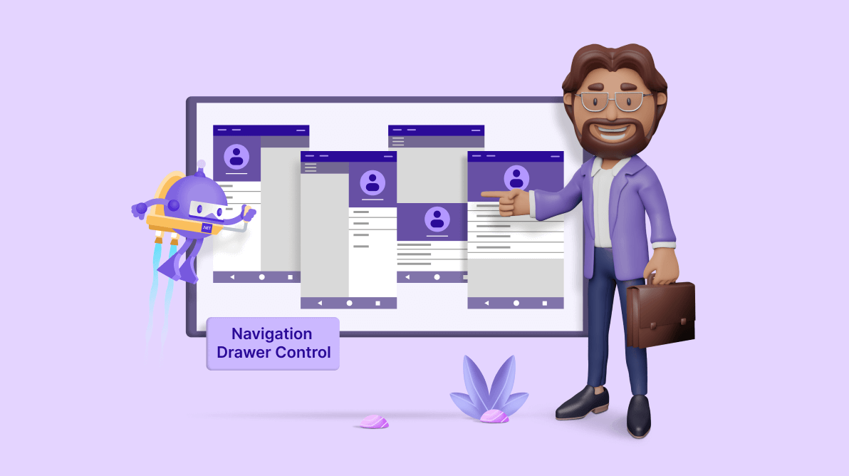
We are excited to announce the latest addition to our Syncfusion .NET MAUI toolkit: the Navigation Drawer control in Essential Studio 2023 Volume 4.
The .NET MAUI Navigation Drawer is a control designed to facilitate the creation of a navigation pane in an application. Comprising a content area and a sliding pane, this control can be effortlessly opened either by swiping the edges of the screen or through programmatic invocation.
Let’s explore the features of the new .NET MAUI Navigation Drawer control and the steps to get started with it.
Key features
The .NET MAUI Navigation Drawer control provides support for the following key features:
Let’s take a closer look at these features.
Drawer position
The Navigation Drawer control offers a variety of options to tailor the location of your navigation drawer to suit your app’s layout. Whether positioned on the left, right, top, or bottom, the Navigation Drawer provides the flexibility to seamlessly adapt to your design preferences.
 |  |
 |  |
Customizing Drawer Position in .NET MAUI Navigation Drawer
Animated transition
The Navigation Drawer smoothly glides into view, adding a layer of elegance to your app’s navigation. It allows you to set different animation types by using the Transition property.
- Slide on top – The navigation pane overlays the main content area when opened.
- Push – The navigation pane is hidden. When opened, it will push the main content area on the opposite side up to the width of the drawer.
- Reveal – The navigation pane is hidden behind the main content. The main content moves away on the opposite side up to the width of the drawer to show the drawer content.
Refer to the following images.
 |  | |

Custom Animated Transitions in .NET MAUI Navigation Drawer
Customizing animation duration
You can fine-tune the speed of your animated transitions with customizable animation durations. Adjusting these durations allows you to strike the perfect balance between responsiveness and aesthetics.
Customizing drawer size
You have the power to define the size of the sliding pane by using the following properties:
- DrawerHeight – It allows you to adjust the height of the side pane when the Position is set to Top or Bottom.
- DrawerWidth – It allows you to adjust the width of the side pane when the Position is set to Left or Right.
Set main content
You can set the main content of the Navigation Drawer by using the ContentView property, which is always visible.
Note: Setting the ContentView property for NavigationDrawer on initializing is mandatory.
Set side-pane content
The side-pane content is only viewable when the drawer is in the open state. The side pane contains the following sections:
- Drawer content – You can set the drawer content by using the DrawerContentView It will be displayed between the header and footer content.
- Header content – You can set the header content of the drawer by using the DrawerHeaderView property. It will be displayed at the top of the drawer.
- Footer content – You can set the footer content of the drawer by using the DrawerFooterView property. It will be displayed at the bottom of the drawer.
Note: For more details, refer to the .NET MAUI Navigation Drawer documentation.
Getting started with .NET MAUI Navigation Drawer control
You have seen the top features of the .NET MAUI Navigation Drawer control. Now, let’s see how to add it to your app.
Step 1: Create a .NET MAUI app
First, create a .NET MAUI application.
Step 2: Add the required NuGet package
Syncfusion .NET MAUI controls are available on the NuGet Gallery. Open the NuGet package manager in Visual Studio. Search for Syncfusion.Maui.NavigationDrawer and then install it.
Step 3: Register the handler
Register the handler for the Syncfusion core in the MauiProgram.cs file.
using Microsoft.Maui;
using Microsoft.Maui.Hosting;
using Microsoft.Maui.Controls.Compatibility;
using Microsoft.Maui.Controls.Hosting;
using Microsoft.Maui.Controls.Xaml;
using Syncfusion.Maui.Core.Hosting;
namespace NavigationDrawerSample
{
  public static class MauiProgram
  {
	public static MauiApp CreateMauiApp()
	{
	   var builder = MauiApp.CreateBuilder();
	   builder
	      .UseMauiApp<App>()
	      .ConfigureSyncfusionCore()
	      .ConfigureFonts(fonts =>
	      {
	         fonts.AddFont("OpenSans-Regular.ttf", "OpenSansRegular");
	      });
	   return builder.Build();
        }
   }
}
Step 4: Add the namespace
Add the Syncfusion.Maui.NavigationDrawer namespace in your XAML page.
xmlns:navigationDrawer="clr-namespace:Syncfusion.Maui. NavigationDrawer;assembly=Syncfusion.Maui.NavigationDrawer"
Step 5: Initialize the Syncfusion .NET MAUI Navigation Drawer control
Now, initialize the Syncfusion .NET MAUI Navigation Drawer control. Refer to the following code example.
<navigationdrawer:SfNavigationDrawer x:Name="navigationDrawer" />
Step 6: Set the main content and side-pane content
Refer to the following code example to set the main content and side pane content to the Navigation Drawer.
<navigationdrawer:SfNavigationDrawer x:Name="navigationDrawer">
<navigationdrawer:SfNavigationDrawer.DrawerSettings>
<navigationdrawer:DrawerSettings DrawerWidth="250"
DrawerHeaderHeight= “160”>
<navigationdrawer:DrawerSettings.DrawerHeaderView>
<Grid BackgroundColor="#1aa1d6" RowDefinitions="120,40">
<Image Source= "user.png"
HeightRequest= "110"
Margin="0,10,0,0"
BackgroundColor="#1aa1d6"
VerticalOptions="Center"
HorizontalOptions="Center"/>
<Label Text="James Pollock"
Grid.Row= "1"
HorizontalTextAlignment= "Center"
HorizontalOptions="Center"
FontSize= "20"
TextColor= "White"/>
</Grid>
</navigationdrawer:DrawerSettings.DrawerHeaderView>
<navigationdrawer:DrawerSettings.DrawerContentView>
<ListView x:Name="listView"
ItemSelected="listView_ItemSelected">
<ListView.ItemTemplate>
<DataTemplate>
<ViewCell>
<VerticalStackLayout HeightRequest="40">
<Label Margin="10,7,0,0"
Text="{Binding}"
FontSize= "16"/>
</VerticalStackLayout>
</ViewCell>
</DataTemplate>
</ListView.ItemTemplate>
</ListView>
</navigationdrawer:DrawerSettings.DrawerContentView>
</navigationdrawer:DrawerSettings>
</navigationdrawer:SfNavigationDrawer.DrawerSettings>
<navigationdrawer:SfNavigationDrawer.ContentView>
<Grid x:Name="mainContentView" BackgroundColor="White" RowDefinitions="Auto,*">
<HorizontalStackLayout BackgroundColor="#1aa1d6" Spacing="10" Padding="5,0,0,0">
<ImageButton x:Name="hamburgerButton"
HeightRequest= "50"
WidthRequest= "50"
HorizontalOptions="Start"
Source="hamburgericon.png"
BackgroundColor="#1aa1d6"
Clicked="hamburgerButton_Clicked"/>
<Label x:Name="headerLabel"
HeightRequest= "50"
HorizontalTextAlignment= "Center"
VerticalTextAlignment= "Center"
Text="Home" FontSize="16"
TextColor= "White"
BackgroundColor="#1aa1d6"/>
</HorizontalStackLayout>
<Label Grid.Row= "1"
x:Name= "contentLabel"
VerticalOptions="Center"
HorizontalOptions="Center"
Text= "Content View"
FontSize= "14"
TextColor= "Black"/>
</Grid>
</navigationdrawer:SfNavigationDrawer.ContentView>
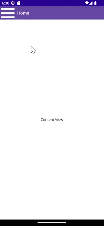
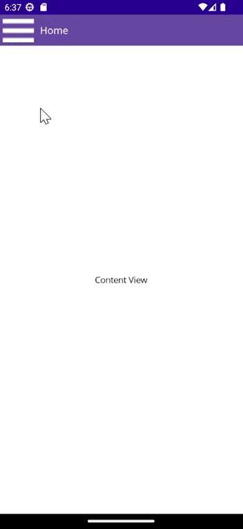
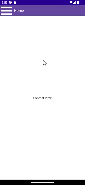
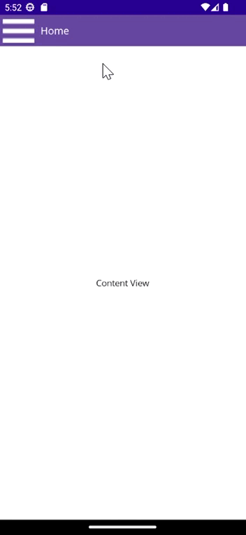
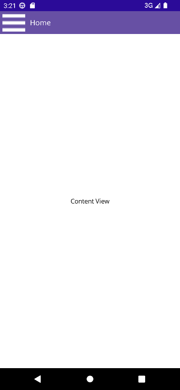
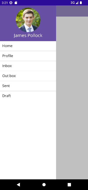
</navigationdrawer:SfNavigationDrawer>After executing the previous code examples, you’ll get the output shown in the following image.

GitHub references
For more details, refer to the .NET MAUI Navigation Drawer control demo on GitHub.
Conclusion
Thanks for reading! In this blog, we’ve explored the features of the new Syncfusion .NET MAUI Navigation Drawer control that rolled out in the 2023 Volume 4 release. You can learn more about the latest .NET MAUI advancements on our Release Notes and What’s New pages. Try them out and leave your feedback in the comments section below!
Download Essential Studio for .NET MAUI to start evaluating them immediately.
If you have any questions, contact us through our support forum, support portal, or feedback portal. We are always happy to help you!
 No spam, just valuable updates.