
TL;DR: Let’s visualize wage trends in the Texas oil and gas extraction industry over the last fifteen years using the Syncfusion .NET MAUI Line Chart. Discover how to gather and link data to the chart while enhancing visualization by customizing elements such as title, axis, and tooltip.
Welcome to our Chart of the Week blog series!
In the heart of Texas lies an industry that has long been synonymous with prosperity and innovation: oil and gas extraction. As we delve into the present landscape of this sector, one question looms large: What do the current wage trends reveal about its state?
In this article, we embark on a journey of data exploration, harnessing the power of Syncfusion .NET MAUI Line Chart to analyze current wage trends in the Texas oil and gas extraction industry.
These current wage trends hold significant implications for various stakeholders within and beyond the Texas oil and gas extraction industry. Employers gain valuable insights into current labor market dynamics, informing their hiring and compensation strategies. Policymakers glean insights to craft policies that support workforce development and economic growth. Meanwhile, workers themselves can better understand current wage trends to make informed career decisions.
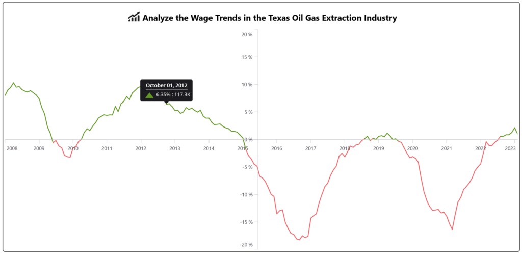
Let’s examine the percentage of employment growth or decline over the last fifteen years in the Texas oil and gas extraction industry. The following image shows the chart we’re going to build.
Step 1: Gathering the data
Before proceeding, let’s collect data on wage trends from employment profiles in Texas’s oil and gas extraction industry.
Step 2: Preparing the data for the chart
Create the OilGasEmploymentModel class to hold employment details using the EmploymentPercent, EmploymentCount, Date, and other properties.
Refer to the following code example.
public class OilGasEmploymentModel
{
    public OilGasEmploymentModel(DateTime month, double employmentCount, double employmentGrowth)
    {
        Month = month;
        EmploymentPercent = employmentCount;
        EmploymentCount = employmentGrowth;
    }

    public DateTime Date { get; set; }
    public double EmploymentPercent { get; set; }
    public double EmploymentCount { get; set; }
    public Geometry? Path { get; set; }
    public Brush FillPath { get; set; }
}
Then, we generate the employment count and percentage collection using the OilGasEmploymentViewModel class and its EmploymentDetails property. Assign the CSV data to the EmploymentDetails data collection using the ReadCSV method and store it in the EmploymentDetails property.
Refer to the following code example.
public class OilGasEmploymentViewModel
{
    public ObservableCollection<OilGasEmploymentModel> EmploymentDetails { get; set; }
    public ObservableCollection<Brush> CustomBrushes { get; set; }
    public Geometry? Green { get; set; } = (Geometry?)(new PathGeometryConverter().ConvertFromInvariantString("M16.000016,0L24.000008,10.7 32,21.399999 16.000016,21.399999 0,21.399999 7.9999928,10.7z"));
    public Geometry? Red { get; set; } = (Geometry?)(new PathGeometryConverter().ConvertFromInvariantString("M0.87499046,0L31.12499,0C31.92399,0,32.22299,0.49899435,31.82399,0.9979887L16.648991,21.064764C16.24999,21.563759,15.65099,21.563759,15.250991,21.064764L0.1759901,0.9979887C-0.22300911,0.49899435,0.075990677,0,0.87499046,0z"));

    public OilGasEmploymentViewModel()
    {

        EmploymentDetails = new ObservableCollection<OilGasEmploymentModel>(ReadCSV());

        CustomBrushes = new ObservableCollection<Brush>();

        foreach (var item in EmploymentDetails)
        {
            if (item.EmploymentCount >= 0)
            {
                item.Path = Green;
                item.FillPath = new SolidColorBrush(Color.FromHex("#619624"));
                CustomBrushes.Add(new SolidColorBrush(Color.FromHex("#619624")));
            }
            else if (item.EmploymentCount < 0)
            {
                item.Path = Red;
                item.FillPath = new SolidColorBrush(Color.FromHex("#eb6569"));
                CustomBrushes.Add(new SolidColorBrush(Color.FromHex("#eb6569")));
            }
        }
    }

    private IEnumerable<OilGasEmploymentModel> ReadCSV()
    {
        Assembly executingAssembly = typeof(App).GetTypeInfo().Assembly;
        Stream inputStream = executingAssembly.GetManifestResourceStream("OilGasExtraction.Resources.Raw.data.csv");

        string? line;
        List<string> lines = new List<string>();

        using StreamReader reader = new StreamReader(inputStream);
        while ((line = reader.ReadLine()) != null)
        {
            lines.Add(line);
        }

        lines[0].Remove(0);
        return lines.Select(line =>
        {
            string[] data = line.Split(',');
            DateTime day = DateTime.Parse(data[0]);

         return new OilGasEmploymentModel(day, Convert.ToDouble(data[1]), Convert.ToDouble(data[2]));

        });
    }
}
Step 3: Configuring the Syncfusion .NET MAUI Cartesian Charts
Now, configure the Syncfusion .NET MAUI Cartesian Charts control using this documentation.
Refer to the following code example.
<chart:SfCartesianChart>

  <chart:SfCartesianChart.XAxes>
        <chart:DateTimeAxis>
        </chart:DateTimeAxis>
  </chart:SfCartesianChart.XAxes>

  <chart:SfCartesianChart.YAxes>
      <chart:NumericalAxis>
       </chart:NumericalAxis>
  </chart:SfCartesianChart.YAxes>

</chart:SfCartesianChart>
Step 4: Initialize the BindingContext for the chart
Now, configure the OilGasEmploymentViewModel class to bind its properties to the BindingContext of the SfCartesianChart.
Refer to the following code example.
<chart:SfCartesianChart.BindingContext>
                <local:OilGasEmploymentViewModel/>
</chart:SfCartesianChart.BindingContext>
Step 5: Bind the wage trends data to the .NET MAUI Line Chart
We’ll use the Syncfusion LineSeries instance to analyze wage trends in the oil and gas extraction industry over time.
Refer to the following code example.
<chart:LineSeries ItemsSource="{Binding EmploymentDetails}"
                  XBindingPath="Month" YBindingPath="EmploymentPercent">
</chart:LineSeries>
In the above code example, we’ve bound the ItemSource property to the EmploymentDetails property. We’ve also bound the XBindingPath and YBindingPath properties to the Month and EmploymentPercent properties, respectively.
Step 6: Customizing the chart appearance
Let’s customize the appearance of the .NET MAUI Line Chart for better data visualization.
Adding chart title
We can use the Title property to customize the .NET MAUI Line Chart title. As per the documentation, you can also add any view to the Title property.
Refer to the following code example.
<chart:SfCartesianChart.Title>
    <Grid>
        <HorizontalStackLayout Margin="{OnPlatform Default='10' ,iOS='5',Android='2'}"
                               HorizontalOptions="Center" VerticalOptions="Center">
            <Image Source="growth.png"  HeightRequest="40" WidthRequest="40"/>
            <Label  TextColor="Black" FontFamily="TimeSpan"
                    FontSize="{OnPlatform WinUI='20',Default='20', Android='16', iOS='16'}"
                    FontAttributes="Bold" HorizontalOptions="Center"
                    Margin="{OnPlatform Default='0,8,0,0',Android='0,4,0,0',iOS='0,4,0,0'}"
                    VerticalTextAlignment="Center"
          Text="Analyze the Wage Trends in the Texas Oil Gas Extraction Industry"/>
        </HorizontalStackLayout>
    </Grid>
</chart:SfCartesianChart.Title>
Customize the axis crossing and tick line styles
We can adjust the axis position anywhere in the chart area using the CrossesAt property. Additionally, we can determine whether the crossing axis should be placed at the crossing position or not using the RenderNextToCrossingValue property. We can use the ShowMajorGridLines and ShowMinorGridLines properties to turn the grid lines on or off.
Then, customize the axis tick styles using the MajorTickStyle property and change the color and width of the ticks using the Stroke and StrokeWidth properties, respectively.
Refer to the following code example.
<chart:SfCartesianChart.Xaxes>
    <chart:DateTimeAxis ShowMajorGridLines="False" RenderNextToCrossingValue="True"
                   CrossesAt="0" ShowMinorGridLines="False">

        <chart:DateTimeAxis.MajorTickStyle>
            <chart:ChartAxisTickStyle Stroke="LightGray" StrokeWidth="1"/>
        </chart:DateTimeAxis.MajorTickStyle>
    </chart:DateTimeAxis>
</chart:SfCartesianChart.Xaxes>
Customize the axis label
Let’s customize the axis LabelFormat in the LabelStyle. Then, set the Minimum and Maximum range for the axis.
<chart:NumericalAxis  ShowMajorGridLines="False" CrossesAt="{Binding CrossesAt}"
                      RenderNextToCrossingValue="True" ShowMinorGridLines="False"
                      Minimum="-20" Maximum="20"
                      x:Name="yAxis">

    <chart:NumericalAxis.MajorTickStyle>
        <chart:ChartAxisTickStyle StrokeWidth="1" Stroke="LightGray"/>
    </chart:NumericalAxis.MajorTickStyle>

    <chart:NumericalAxis.LabelStyle>
        <chart:ChartAxisLabelStyle LabelFormat="0' %"/>
    </chart:NumericalAxis.LabelStyle>
</chart:NumericalAxis>
Customize the line series appearance
You can set the stroke width for the line series using the StrokeWidth property. To display information about the count and percentage details of employed people, you can enable the EnableTooltip property and customize the appearance of the tooltip using the TooltipTemplate property.
You can also set a palette to the series to apply pre-defined brushes to the line series segments using the PaletteBrushes property. This can help analyze the trend more effectively.
Refer to the following code example.
<chart:LineSeries StrokeWidth="2" ItemsSource="{Binding EmploymentDetails}"
                  EnableTooltip="True" PaletteBrushes="{Binding CustomBrushes}"
                  XbindingPath="Month"  YbindingPath="EmploymentPercent"
                  TooltipTemplate="{StaticResource tooltip}">
</chart:LineSeries>
Step 7: Customize tooltip behavior
Finally, specify the duration time in seconds for which the tooltip should be displayed using the Duration property.
<chart:SfCartesianChart.TooltipBehavior>
    <chart:ChartTooltipBehavior Duration="3"/>
</chart:SfCartesianChart.TooltipBehavior>
After executing the above code examples, we will get the output that resembles the following image.
GitHub reference
For more details, refer to the Creating a .NET MAUI Line Chart to visualize wage trends GitHub Demo.
Conclusion
Thanks for reading! We have demonstrated how to visualize the data on employed individuals in the Texas oil and gas extraction industry using the Syncfusion .NET MAUI Line Chart. We encourage you to try the steps discussed and share your thoughts in the comments below.
The existing customers can download the latest version of Essential Studio from the License and Downloads page. If you are new, try our 30-day free trial to explore our incredible features.
If you require assistance, please don’t hesitate to contact us via our support forums, support portal, or feedback portal. We are always eager to help you!


Related
- Introducing the New .NET MAUI Polar Charts Control
- Chart of the Week: Creating a .NET MAUI Sunburst Chart to Visualize the Most Popular Wikipedia Articles
- Elegantly Visualize Data with Interactive Features in .NET MAUI Charts
- Simplify Data Visualization with Multi-Axis Charts in .NET MAUI


