Welcome to our Chart of the Week blog series!
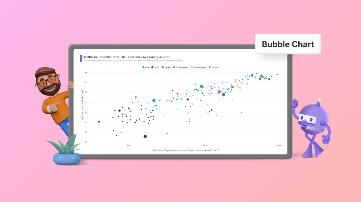
Today, we delve into healthcare expenditure and life expectancy data, two pivotal indicators of a nation’s well-being. A country’s healthcare spending significantly influences its citizens’ health and lifespans. We’ll plot this correlation using a bubble chart.
Like a scatter plot, a bubble chart is an effective tool for visualizing the relationship between three numeric variables. Each data point is represented by a bubble. The x- and y-values determine the bubbles’ positions, while their size represents the z-value. This allows for easy comparison and a comprehensive view of the data. The chart, composed of closely packed circles proportional to the quantities they represent, uses value axes instead of a category axis, enhancing its effectiveness for data analysis.
In this blog, we’ll use the Syncfusion .NET MAUI Bubble Chart to visually present the relationship between healthcare expenditure and life expectancy in various countries. This will shed light on diverse healthcare scenarios around the globe.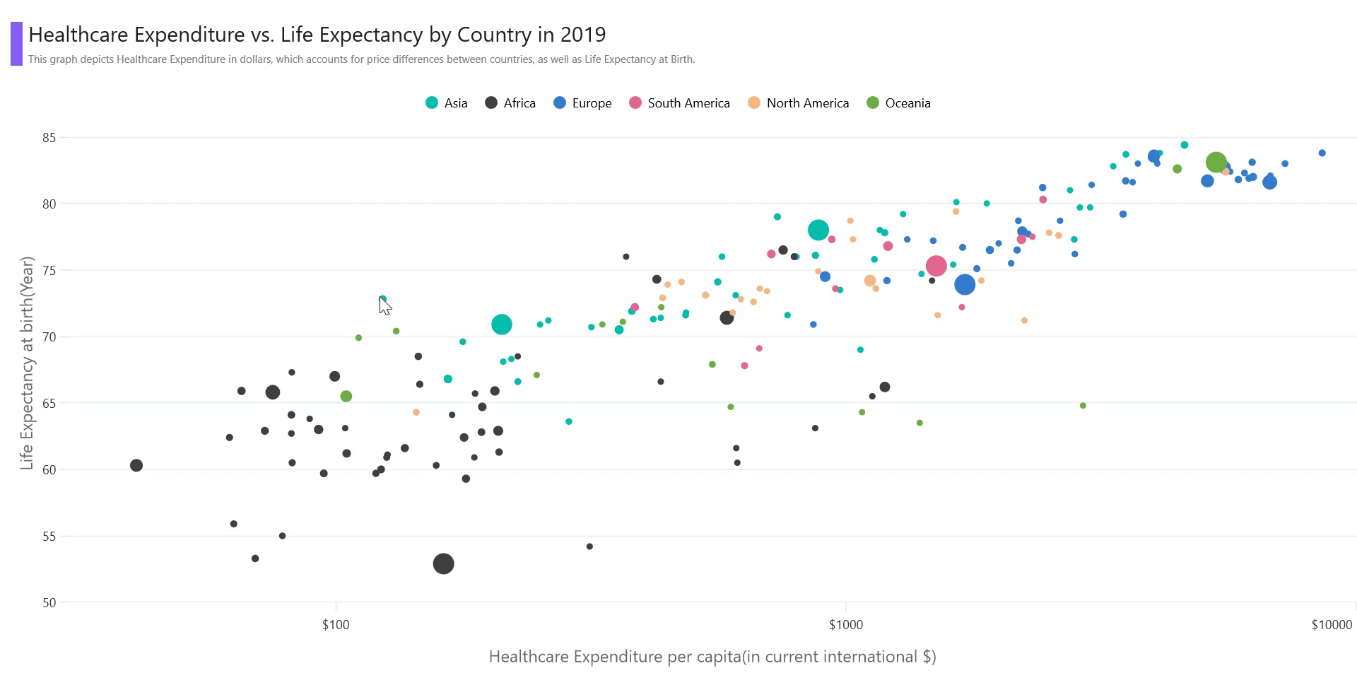
Let’s get started!
Step 1: Gathering the data
Before proceeding, we need to gather the data. We’ll get the data on Life Expectancy and Healthcare Expenditure for various countries in 2019 from Our World in Data.
Step 2: Preparing the data for the chart
Create the LifeExpectancyModel class with Country, LifeExpectancy, HealthExpenditure, Population, and Continent properties to store the life expectancy and health expenditure data in different countries.
Refer to the following code example.
public class LifeExpectancyModel
{
    public string Country { get; set; }
    public double LifeExpectancy { get; set; }
    public double HealthExpenditure { get; set; }
    public double Population { get; set; }
    public string Continent { get; set; }
}
Then, store the data by generating the life expectancy data collection using the LifeExpectancyData class and AllCountriesData properties. Assign the CSV data to the life expectancy data collection using the ReadCSV method and store it in the AllCountriesData property.
Additionally, expose the AsianCountries, AfricanCountries, SouthAmerica, NorthAmerica, Europe, and Oceania properties to store the countries’ data respective to their continents.
Refer to the following code example.
public class LifeExpectancyData
{

    List<LifeExpectancyModel> allCountriesdata;

    public List<LifeExpectancyModel> AllCountriesData
    {
        get
        {
            return allCountriesdata;
        }
        set
        {
            allCountriesdata = value;
        }
    }

    List<LifeExpectancyModel> asianCountries;
    public List<LifeExpectancyModel> AsianCountries
    {
        get
        {
            return asianCountries;
        }
        set
        {
            asianCountries = value;
        }
    }

    List<LifeExpectancyModel> africanCountries;
    public List<LifeExpectancyModel> AfricanCountries
    {
        get
        {
            return africanCountries;
        }
        set
        {
            africanCountries = value;
        }
    }

    List<LifeExpectancyModel> southAmerica;
    public List<LifeExpectancyModel> SouthAmerica
    {
        get
        {
            return southAmerica;
        }
        set
        {
            southAmerica = value;
        }
    }

    List<LifeExpectancyModel> northAmerica;
    public List<LifeExpectancyModel> NorthAmerica
    {
        get
        {
            return northAmerica;
        }
        set
        {
            northAmerica = value;
        }
    }

    List<LifeExpectancyModel> oceania;
    public List<LifeExpectancyModel> Oceania
    {
        get
        {
            return oceania;
        }
        set
        {
            oceania = value;
        }
    }

    List<LifeExpectancyModel> europe;
    public List<LifeExpectancyModel> Europe
    {
        get
        {
            return europe;
        }
        set
        {
            europe = value;
        }
    }

    public LifeExpectancyData()
    {
        AllCountriesData = new List<LifeExpectancyModel>(ReadCSV());
        AsianCountries = AllCountriesData.Where(d => d.Continent == "Asia").ToList();
        AfricanCountries = AllCountriesData.Where(d => d.Continent == "Africa").ToList();
        Europe = AllCountriesData.Where(d => d.Continent == "Europe").ToList();
        SouthAmerica = AllCountriesData.Where(d => d.Continent == "South America").ToList();
        NorthAmerica = AllCountriesData.Where(d => d.Continent == "North America").ToList();
        Oceania = AllCountriesData.Where(d => d.Continent == "Oceania").ToList();
    }
    public static IEnumerable<LifeExpectancyModel> ReadCSV()
    {
        Assembly executingAssembly = typeof(App).GetTypeInfo().Assembly;
        Stream inputStream = executingAssembly.GetManifestResourceStream("LifeExpectancy.Resources.Raw.data.csv");

        string line;
        List<string> lines = new();

        using StreamReader reader = new(inputStream);
        while((line = reader.ReadLine())!= null)
        {
            lines.Add(line);
        }

        return lines.Select(line =>
        {
            string[] data = line.Split(',');
            return new LifeExpectancyModel(data[0], Convert.ToDouble(data[1]), Convert.ToDouble(data[2]), Convert.ToDouble(data[3]), data[4]);
        });
     }
}
Step 3: Configuring the Syncfusion .NET MAUI Cartesian Charts control
Now, configure the Syncfusion .NET MAUI Cartesian Charts control using this documentation.
Refer to the following code example.
<chart:SfCartesianChart>
 <chart:SfCartesianChart.XAxes>
  <chart:LogarithmicAxis/>
 </chart:SfCartesianChart.XAxes>
 <chart:SfCartesianChart.YAxes>
  <chart:NumericalAxis/>
 </chart:SfCartesianChart.YAxes>
</chart:SfCartesianChart>
Step 4: Bind the data to the chart
To visualize the relation between healthcare spending and life expectancy data, we’ll use the bubble series.
Refer to the following code example.
<chart:BubbleSeries ItemsSource="{Binding AsianCountries}"
                    XBindingPath="HealthExpenditure"
                    YBindingPath="LifeExpectancy"
                    SizeValuePath="Population"/>

<chart:BubbleSeries ItemsSource="{Binding AfricanCountries}"
                    XBindingPath="HealthExpenditure"
                    YBindingPath="LifeExpectancy"
                    SizeValuePath="Population"/>

<chart:BubbleSeries ItemsSource="{Binding Europe}"
                    XBindingPath="HealthExpenditure"
                    YBindingPath="LifeExpectancy"
                    SizeValuePath="Population"/>

<chart:BubbleSeries ItemsSource="{Binding SouthAmerica}"
                    XBindingPath="HealthExpenditure"
                    YBindingPath="LifeExpectancy"
                    SizeValuePath="Population"/>

<chart:BubbleSeries ItemsSource="{Binding NorthAmerica}"
                    XBindingPath="HealthExpenditure"
                    YBindingPath="LifeExpectancy"
                    SizeValuePath="Population"/>

<chart:BubbleSeries ItemsSource="{Binding Oceania}"
                    XBindingPath="HealthExpenditure"
                    YBindingPath="LifeExpectancy"
                    SizeValuePath="Population"/>
In this example, we bound the bubble chart with the AsianCountries, AfricanCountries, NorthAmerica, SouthAmerica, Europe, and Oceania data collections with the ItemsSource property, which contains the information on life expectancy, health expenditure, and population for different countries. Additionally, we’ve specified the XBindingPath, YBindingPath, and SizeValuePath with the HealthExpenditure, LifeExpectancy, and Population properties, respectively.
The SizeValuePath is used to indicate the quantitative value associated with each data point. This quantitative value could be anything relevant to the dataset, such as population size, revenue, or sales volume. Here, the size of the bubble will correspond to the country’s population, allowing us to compare healthcare and life expectancy with the additional context of the scale of the healthcare system.
Step 5: Customizing the chart appearance
Now, we’ll customize the Syncfusion .NET MAUI Bubble Chart appearance to enhance the readability of the chart data.
Customizing the chart title
Let’s improve the readability of the plotted data by including a title with a description in the chart.
Refer to the following code example.
<chart:SfCartesianChart.Title>
 <Grid>
  <Grid.ColumnDefinitions>
   <ColumnDefinition Width="1*"/>
   <ColumnDefinition Width="59*"/>
  </Grid.ColumnDefinitions>
  <VerticalStackLayout Background="#FF855FF2" Margin="10,35,0,15" Grid.Column="0" Grid.RowSpan="2"/>
  <VerticalStackLayout Grid.Column="1" Margin="5">
   <Label Text="Healthcare Expenditure vs. Life Expectancy by Country in 2019" FontSize="Subtitle" FontFamily="centurygothic" Padding="0,30,5,5" HorizontalTextAlignment="Start"/>
   <Label Text="This graph depicts Healthcare Expenditure in dollars, which accounts for price differences between countries, as well as Life Expectancy at Birth." HorizontalTextAlignment="Start" FontSize="10" FontFamily="centurygothic" TextColor="Grey" Padding="0,0,0,10"/>
  </VerticalStackLayout>
 </Grid>

</chart:SfCartesianChart.Title>
Customizing the legend
Customize the chart legend by adding a Label for each chart series and providing the corresponding label text. Then, use the ToggleSeriesVisibility property to show or hide the continents’ countries in the chart.
Refer to the following code example.
<chart:SfCartesianChart.Legend>
 <chart:ChartLegend ToggleSeriesVisibility="True"/>
</chart:SfCartesianChart.Legend>

<chart:BubbleSeries Label="Asia"/>
<chart:BubbleSeries Label="Africa"/>
<chart:BubbleSeries Label="Europe"/>
<chart:BubbleSeries Label="South America"/>
<chart:BubbleSeries Label="North America"/>
<chart:BubbleSeries Label="Oceania"/>
Customizing the chart axis
Next, customize the x- and y-axes with the Minimum, Maximum, EdgeLabelsDrawingMode, and ShowMajorGridLines properties, as well as the Title, LabelStyle, LineStyle, and TickStyle.
Refer to the following code example.
<chart:SfCartesianChart.XAxes>
 <chart:LogarithmicAxis Minimum="30" Maximum="10000" EdgeLabelsDrawingMode="Shift" ShowMajorGridLines="False">
  <chart:LogarithmicAxis.Title>
   <chart:ChartAxisTitle Text="Healthcare Expenditure per capita(in current international $)" FontSize="16"/>
  </chart:LogarithmicAxis.Title>
  <chart:LogarithmicAxis.LabelStyle>
   <chart:ChartAxisLabelStyle LabelFormat="$0"/>
  </chart:LogarithmicAxis.LabelStyle>
  <chart:LogarithmicAxis.AxisLineStyle>
   <chart:ChartLineStyle StrokeWidth="0"/>
  </chart:LogarithmicAxis.AxisLineStyle>
  <chart:LogarithmicAxis.MajorTickStyle>
   <chart:ChartAxisTickStyle Stroke="#e6e6e6"/>
  </chart:LogarithmicAxis.MajorTickStyle>
 </chart:LogarithmicAxis>
</chart:SfCartesianChart.XAxes>

<chart:SfCartesianChart.YAxes>
 <chart:NumericalAxis EdgeLabelsDrawingMode="Center" Maximum="86" Minimum="50">
  <chart:NumericalAxis.Title>
   <chart:ChartAxisTitle Text="Life Expectancy at birth(Year)" FontSize="16"/>
  </chart:NumericalAxis.Title>
  <chart:NumericalAxis.AxisLineStyle>
   <chart:ChartLineStyle StrokeWidth="0"/>
  </chart:NumericalAxis.AxisLineStyle>
  <chart:NumericalAxis.MajorTickStyle>
   <chart:ChartAxisTickStyle Stroke="#e6e6e6"/>
  </chart:NumericalAxis.MajorTickStyle>
 </chart:NumericalAxis>
</chart:SfCartesianChart.YAxes>
Adding Interactivity to the chart
We can enhance the readability of the data series by enabling tooltips with the TooltipTemplate property. This will allow us to show the details of each country.
Refer to the following code example.
<chart:SfCartesianChart.Resources>
 <ResourceDictionary>
  <model:PopulationValueConver x:Key="populationValueConverter"/>
  <DataTemplate x:Key="template">
   <StackLayout>
    <Label Text="{Binding Item.Country}" HorizontalTextAlignment="Center" HorizontalOptions="Center" VerticalTextAlignment="Center" TextColor="White" FontAttributes="Bold" FontFamily="Helvetica" Margin="0,2,0,2" FontSize="12" Grid.Row="0" Padding="0,1"/>
    <BoxView Color="Gray" HeightRequest="1" HorizontalOptions="Fill" Margin="2,0,2,0"/>
    <Grid Padding="3">
     <Grid.RowDefinitions>
      <RowDefinition Height="*"/>
      <RowDefinition Height="*"/>
      <RowDefinition Height="*"/>
     </Grid.RowDefinitions>
     <Label Grid.Row="0" Text="{Binding Item.HealthExpenditure,StringFormat='Health Expenditure  : ${0}'}" TextColor="white" FontFamily="Helvetica" FontSize="12"/>
     <Label Grid.Row="1" Text="{Binding Item.LifeExpectancy,StringFormat='Life Expectancy        : {0} years'}" TextColor="white" FontFamily="Helvetica" FontSize="12"/>
     <Label Grid.Row="2" Text="{Binding Item.Population,Converter={StaticResource populationValueConverter},StringFormat='Population: {0}'}" TextColor="white" FontFamily="Helvetica" FontSize="12"/>
    </Grid>
   </StackLayout>
  </DataTemplate>
 </ResourceDictionary>
</chart:SfCartesianChart.Resources>

<chart:BubbleSeries EnableTooltip="True" TooltipTemplate="{StaticResource template}"/>
<chart:BubbleSeries EnableTooltip="True" TooltipTemplate="{StaticResource template}"/>
<chart:BubbleSeries EnableTooltip="True" TooltipTemplate="{StaticResource template}"/>
<chart:BubbleSeries EnableTooltip="True" TooltipTemplate="{StaticResource template}"/>
<chart:BubbleSeries EnableTooltip="True" TooltipTemplate="{StaticResource template}"/>
<chart:BubbleSeries EnableTooltip="True" TooltipTemplate="{StaticResource template}"/>
After executing these code examples, the output we get will look like the following GIF image.
GitHub reference
For more details, refer to the complete project on GitHub.
Conclusion
Thanks for reading! In this blog, we have seen how to visualize countries’ life expectancy and healthcare expenditure data using the Syncfusion .NET MAUI Bubble Chart. We hope you’ll follow the steps discussed in this blog and share your thoughts in the comments below.
For current Syncfusion customers, the newest version of Essential Studio is available from the License & Downloads page. If you are not a customer, try our 30-day free trial to check out the latest features.
You can contact us through our support forums, support portal, or feedback portal if you require assistance. We are always happy to help you!
See you in our next blog!


Related blogs
- Chart of the Week: Creating a .NET MAUI Tornado Chart for Comparing Petrol and Diesel Prices in the UK
- Effortless Google Calendar Events Synchronization in .NET MAUI Scheduler
- Chart of the Week: Creating a .NET MAUI Radial Bar Chart for the Most and Least Powerful Passports in 2023
- Load Appointments on Demand via Web Services in .NET MAUI Scheduler Using JSON Data