
Welcome to our Chart of the Week blog series!
Today, we’ll visualize the top 10 countries in terms of world population from 1960 to 2021 using a bar race chart, also called an animated bar chart.
Bar race charts are effective tools for demonstrating changes in data over time. The Syncfusion .NET MAUI Cartesian Charts control can be used to create a dynamic and interactive bar race chart that captivates viewers and conveys valuable information by summarizing a large dataset in a live visual bar graph, with bars racing to the end based on rankings.
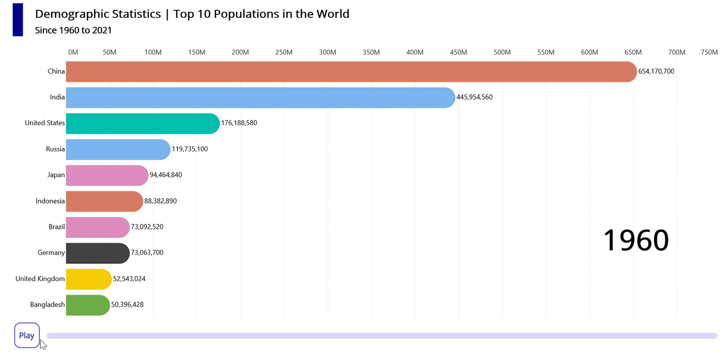
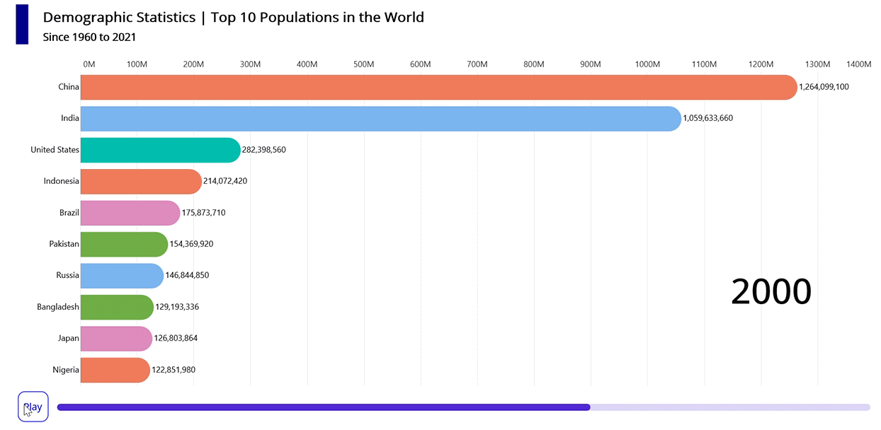
Refer to the following image.
Let’s get started!
Step 1: Gather data for the world population
Before creating the chart, we need to gather the world population data. For this demo, we are getting data from 1960 to 2021.
Step 2: Prepare the data for the bar race chart
Create the Model class for holding the population data with the help of the XValue, YValue, Index, XString, and other properties.
Refer to the following code example.
public Model(int i, string xName, double x, double y)
{
    Index = i;
    XString = xName;
    XValue = x;
    YValue = y;
    ItemColor = brush[i % brush. Count];
}
Generate the data collection with the help of the ViewModel class and Data property. Then, convert the CSV data to a collection of population data using the ReadCSV method.
Public Ienumerable<Model> ReadCSV()
{
    Assembly executingAssembly = typeof(App).GetTypeInfo().Assembly;
    Stream inputStream = executingAssembly.GetManifestResourceStream(“BarRaceChart.Resources.Raw.populationdata.csv”);

    if (inputStream == null)
    {
        return new List<Model>();
    }

    string? Line;
    List<string> lines = new List<string>();

    using StreamReader reader = new StreamReader(inputStream);
    while ((line = reader.ReadLine()) != null)
    {
        lines.Add(line);
    }
    int index = -1;
    double previousYear = 0;
    string previousString = string.Empty;

    return lines.Select(line =>
    {
        string[] data = line.Split(‘,’);
        string currentString = data[0];
        double currentYear = Convert.ToDouble(data[1]);
        if (currentString != previousString)
        {
            if (currentYear == previousYear)
            {
                index = -1;
            }
            index = index + 1;
            previousString = currentString;
        }

        return new Model(index, data[0], currentYear, Convert.ToDouble(data[2]));
    });
}
Data on the populations of all nations is divided, filtered by year, and stored in the dataCollection field. Refer to the following code example.
Public ViewModel()
{
    var models = new List<Model>(ReadCSV());
    dataCollection = new List<List<Model>>();
    StartYear = models.First().Xvalue;
    EndYear = models.Last().Xvalue;
    int count = 0;
    var previousData = new List<Model>();
    for (double I = StartYear; I <= EndYear; i++)
    {
        Ienumerable<Model> data = models.Where(x => x.Xvalue == i).OrderByDescending(x => x.Yvalue).Take(11);
        dataCollection.Insert(count, UpdateDataIndex(I, previousData, data));
        count++;
        previousData = data.ToList();
    }

    Data = dataCollection[0];
    Year = dataCollection[0].First().Xvalue;
}
Step 3: Configure Syncfusion .NET MAUI Cartesian Charts
Next, configure the Syncfusion .NET MAUI Cartesian Charts control using this documentation.
Refer to the following code example.
<chart:SfCartesianChart IsTransposed="True" >
 <chart:SfCartesianChart.Xaxes>
  <chart:NumericalAxis />
 </chart:SfCartesianChart.Xaxes>

 <chart:SfCartesianChart.Yaxes>
  <chart:NumericalAxis />
 </chart:SfCartesianChart.Yaxes>
</chart:SfCartesianChart>
Step 4: Create a bar race chart
Let’s create a BarRaceSegment class inherited from the ColumnSegment class of .NET MAUI Cartesian Charts, using the segment’s Draw method to animate the bar race chart.
public class BarRaceSegment : ColumnSegment
{

    protected override void Draw(ICanvas canvas)
    {

      // Do animating bar racing customization here
      var series = (Series as BarRaceSeries);

      if (series != null)
      {
        var index = series.ChartSegments.IndexOf(this);

        if (index >= 0 && series.PreviousSegments != null)
        {
            var previousSegment = series.PreviousSegments[index] as BarRaceSegment;
            if (previousSegment != null)
            {
                float previousTop = previousSegment.Top;
                float previousBottom = previousSegment.Bottom;
                float previousLeft = previousSegment.Left;
                float previousRight = previousSegment.Right;

                if (AnimatedValue > 0)
                {
                    float rectTop = GetColumnDynamicAnimationValue(AnimatedValue, previousTop, Top == 0 ? previousTop : Top);
                    float rectBottom = GetColumnDynamicAnimationValue(AnimatedValue, previousBottom, Bottom);
                    float rectLeft = GetColumnDynamicAnimationValue(AnimatedValue, previousLeft, Left);
                    float rectRight = GetColumnDynamicAnimationValue(AnimatedValue, previousRight, Right);

                    if (!float.IsNaN(rectLeft) && !float.IsNaN(rectTop) && !float.IsNaN(rectRight) && !float.IsNaN(rectBottom))
                    {

                        canvas.Alpha = Opacity;
                        CornerRadius cornerRadius = series.CornerRadius;

                        var rect = new Rect() { Left = rectLeft, Top = rectTop, Right = rectRight, Bottom = rectBottom };

                        canvas.SetFillPaint(AnimatedValue >= 0.5 ? Item.ItemColor : previousSegment.Item.itemColor, rect);

                        if (cornerRadius.TopLeft > 0 || cornerRadius.TopRight > 0 || cornerRadius.BottomLeft > 0 || cornerRadius.BottomRight > 0)
                        {
                            canvas.FillRoundedRectangle(rect, cornerRadius.TopLeft, cornerRadius.TopRight, cornerRadius.BottomLeft, cornerRadius.BottomRight);
                        }
                        else
                        {
                            canvas.FillRectangle(rect);
                        }

                        canvas.DrawString(xString, (float)rect.Left - 5, (float)Math.Round(rect.Center.Y), HorizontalAlignment.Right);

                        if (AnimatedValue == 1)
                            canvas.DrawString(Item.YValue.ToString("#,###,###,###"), (float)rect.Right + 2, (float)rect.Center.Y + 2, HorizontalAlignment.Left);
                        else
                            canvas.DrawString(GetColumnDynamicAnimationValue(AnimatedValue, previousSegment.Item.YValue, Item.YValue).ToString("#,###,###,###"), (float)rect.Right + 2, (float)rect.Center.Y + 2, HorizontalAlignment.Left);

                   }
              }
           }
    }

    private float GetColumnDynamicAnimationValue(float animationValue, double oldValue, double currentValue)
    {
        if (!double.IsNaN(oldValue) && !double.IsNaN(currentValue))
        {
            return (float)((currentValue > oldValue) ?
                oldValue + ((currentValue - oldValue) * animationValue)
                : oldValue - ((oldValue - currentValue) * animationValue));
        }
        else
        {
            return double.IsNaN(oldValue) ? (float)currentValue * animationValue : (float)(oldValue - (oldValue * animationValue));
        }
    }

}
Then, create a BarRaceSeries class inherited from the ColumnSeries class of .NET MAUI Cartesian Charts to visualize the DemoGraphics statistic data.
public class BarRaceSeries : ColumnSeries
{
    public List<ChartSegment> PreviousSegments { get; set; }

    public List<ChartSegment> ChartSegments { get; set; }

    public BarRaceSeries()
    {

    }

    protected override ChartSegment CreateSegment()
    {
        return new BarRaceSegment();
    }

}
Step 5: Bind data to the bar race chart
To visualize the top 10 countries in the world by population statistics for a given year, implement the BarRaceSeries instance and bind the data to it.
Refer to the following code example.
<local:BarRaceSeries CornerRadius="0,100,0,100" EnableAnimation="True" ItemsSource="{Binding Data}" XBindingPath="Ranking" YBindingPath="YValue" >
</local:BarRaceSeries>
In the previous code example, we’ve bound the Data with the ItemsSource property. Then, the XBindingPath and YBindingPath are bound with the Ranking and YValue properties, respectively.
Step 6: Customize the chart appearance
We can enhance the appearance of the chart by changing the axis elements and adding a title.
Refer to the following code example to customize the chart title.
<chart:SfCartesianChart.Title>
 <HorizontalStackLayout Margin="10,10,0,10">
  <Border Margin="10,0,0,10" Stroke="Transparent" BackgroundColor="DarkBlue" WidthRequest="20" HeightRequest="70"/>
  <VerticalStackLayout HeightRequest="70" Margin="10,0,0,10">
   <Label VerticalOptions="Start" Text="Demographic Statistics | Top 10 Populations in the World" Padding="10,5,5,0" FontSize="20" FontAttributes="Bold" />
   <Label VerticalOptions="Start" Text="Since 1960 to 2021"  Padding="10,5,5,0" FontSize="15" FontAttributes="Bold" />
  </VerticalStackLayout>
 </HorizontalStackLayout>
</chart:SfCartesianChart.Title>
Then, configure the axis and modify the axis elements, as shown in the following code example.
<chart:SfCartesianChart.XAxes>
 <chart:NumericalAxis IsInversed="True" IsVisible="False"  AutoScrollingDelta="10" AutoScrollingMode="Start" Interval="1" ShowMajorGridLines="False"  />
</chart:SfCartesianChart.XAxes>
<chart:SfCartesianChart.YAxes>
 <chart:NumericalAxis  PlotOffsetStart="110" LabelCreated="NumericalAxis_LabelCreated"  RangePadding="AppendInterval"  >
  <chart:NumericalAxis.MajorTickStyle>
   <chart:ChartAxisTickStyle TickSize="0" />
  </chart:NumericalAxis.MajorTickStyle>
  <chart:NumericalAxis.AxisLineStyle>
   <chart:ChartLineStyle StrokeWidth="0" />
  </chart:NumericalAxis.AxisLineStyle>
 </chart:NumericalAxis>
</chart:SfCartesianChart.YAxes>
Step 7: Configure the play/pause function for animating the bar race chart
Render a pause (play/stop) button and an interactive progress bar using the following code.
XAML
<Border Stroke="Transparent"  Margin="20,0,0,10" Grid.Row="1" Padding="5">
 <Grid>
  <Grid.ColumnDefinitions>
   <ColumnDefinition Width="50" />
   <ColumnDefinition />
  </Grid.ColumnDefinitions>

  <Border Grid.Column="0" WidthRequest="45" HeightRequest="45" Stroke="Blue" BackgroundColor="White" >
   <Border.GestureRecognizers>
    <TapGestureRecognizer Tapped="TapGestureRecognizer_Tapped"/>
   </Border.GestureRecognizers>
   <Border.StrokeShape>
    <RoundRectangle CornerRadius="10" />
   </Border.StrokeShape>
   <Label x:Name="text" Text="{Binding ProgressString}" TextColor="Blue" HorizontalOptions="Center" VerticalOptions="Center" />
  </Border>
  <progress:SfLinearProgressBar Margin="10,20,0,0" Grid.Column="1" Minimum="{Binding StartYear}" Maximum="{Binding EndYear}" Progress="{Binding Year}" TrackHeight="10" TrackCornerRadius="5" ProgressHeight="10" ProgressCornerRadius="5" />
 </Grid>
</Border>
C#
public void Pause()
{
     canStopTimer = true;
     ProgressString = "Play";
}

public async void Play()
{
     ProgressString = "Pause";
     await Task.Delay(500);

     if (Application.Current != null)
        Application.Current.Dispatcher.StartTimer(new TimeSpan(0, 0, 0, 1, 500), UpdateData);

        canStopTimer = false;
}
Finally, we can use the BarRaceSeries’ ItemsSource property to continuously update the chart with population data from the top 10 countries for each year.
private bool UpdateData()
{
    if(dataCollection.Count < count + 1)
    {
        ProgressString = "Play";
        count = 0;
        return false;
    }

    if (canStopTimer) return false;

    MainThread.InvokeOnMainThreadAsync(() =>
    {
        Data = dataCollection[count];
        Year = dataCollection[count].First().XValue;
        count++;
    });

    return true;
}
After executing the previous code examples, the output will look like the following image.
GitHub reference
For more details, refer to the complete project on GitHub.

Conclusion
Thanks for reading! In this blog, we’ve created a dynamic bar race chart to visualize the top 10 populations in the world using Syncfusion .NET MAUI Cartesian Charts. We encourage you to follow the steps outlined in this blog and share your feedback in the comments section below.
If you require any assistance, please don’t hesitate to contact us via our support forum, support portal, or feedback portal. We are always eager to help you!