TL;DR: Want to give your Blazor PDF Viewer a makeover? This blog unlocks the hidden customization power of the toolbar. Craft a user-friendly experience with a streamlined interface, mobile optimization, and even custom functionalities!
The default toolbar in Syncfusion’s Blazor PDF Viewer offers a range of functionalities for navigating and interacting with PDF documents. But what if you want a more streamlined experience specific to your application’s needs?
In that scenario, you can use the toolbar customization options in the Syncfusion Blazor PDF Viewer (NextGen). It allows you to present only the essential tools and enhance user experience. This feature is available in our Essential Studio 2024 Volume 1 release.
Let’s explore this new user-friendly feature!
Why customize the toolbar?
There are several compelling reasons to customize the toolbar:
- Improved user experience: Provide a focused set of tools relevant to your app’s use case. This avoids overwhelming users with unnecessary options and streamlines the interaction with the PDF document.
- Enhanced workflow efficiency: Prioritize frequently used tools for quicker access, boosting user productivity.
- Brand consistency: Align the toolbar’s appearance with your app’s overall design for a cohesive user experience.
Customizing the toolbar in Syncfusion Blazor PDF Viewer
Syncfusion Blazor PDF Viewer offers various toolbar customization options. Let’s explore them with code examples.
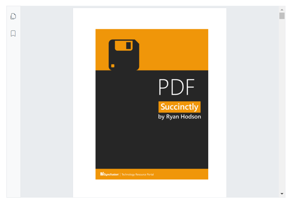
Disable the default toolbar
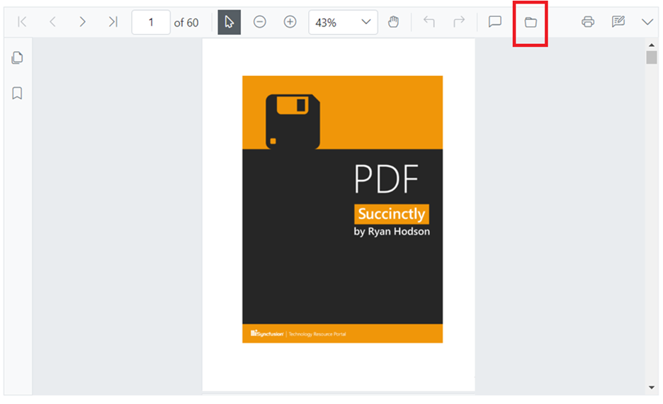
The toolbar will appear when the EnableToolbar option is turned on. If you want to disable the toolbar in the PDF Viewer, then set the EnableToolbar property as false. Refer to the following code example.
@* Disable the primary toolbar using the EnableToolbar property *@
<SfPdfViewer2 EnableToolbar="false" Height="100%" Width="100%">
</SfPdfViewer2>
Refer to the following image.
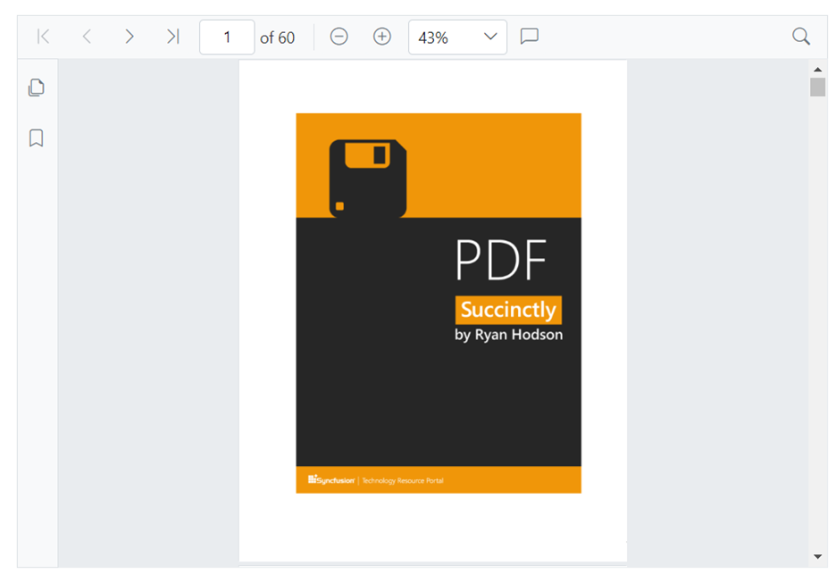
Enable/disable individual tools
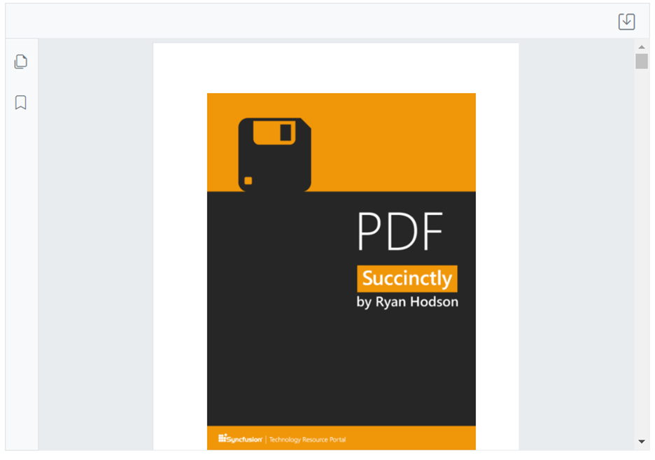
First, choose the default tools (Ex, zoom, navigation, and search) that need to be displayed in the toolbar.
Using the ToolbarItems property, we can display or hide the default toolbar items within the PDF Viewer. Refer to the following code example.
<SfPdfViewer2 Height="100%" Width="100%">
    <PdfViewerToolbarSettings ToolbarItems="ToolbarItems"></PdfViewerToolbarSettings>
</SfPdfViewer2>
@code {
    public string DocumentPath { get; set; } = "wwwroot/data/PDF_Succinctly.pdf";

    // Enable only zooming, navigation, and search-related toolbar items in the primary toolbar.
    List<ToolbarItem> ToolbarItems = new List<ToolbarItem>()
    {
        ToolbarItem.PageNavigationTool,
        ToolbarItem.MagnificationTool,
        ToolbarItem.CommentTool,
        ToolbarItem.SearchOption
    };
}
Refer to the following image.
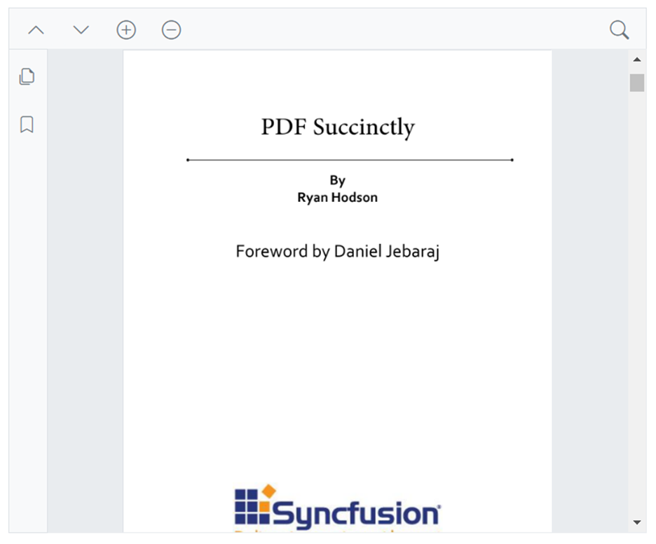
Rearrange toolbar items’ order
Let’s arrange the toolbar items in a specific order based on their significance or frequency of use.
By employing the following code example, we can modify the arrangement of ToolbarItems by rearranging their order. Here, we will relocate the open option to the last position within the list of center-aligned items in the toolbar.
<SfPdfViewer2 Height="100%" Width="100%">
    <PdfViewerToolbarSettings ToolbarItems="ToolbarItems">
    </PdfViewerToolbarSettings>
</SfPdfViewer2>

@code {
    List<ToolbarItem> ToolbarItems = new List<ToolbarItem>()
    {
       // The position of the print and open buttons have been changed.
        ToolbarItem.PageNavigationTool,
        ToolbarItem.PrintOption,
        ToolbarItem.SelectionTool,
        ToolbarItem.MagnificationTool,
        ToolbarItem.PanTool,
        ToolbarItem.UndoRedoTool,
        ToolbarItem.CommentTool,
        ToolbarItem.AnnotationEditTool,
        ToolbarItem.SearchOption,
        ToolbarItem.DownloadOption,
        ToolbarItem.OpenOption
    };
}
Refer to the following image.
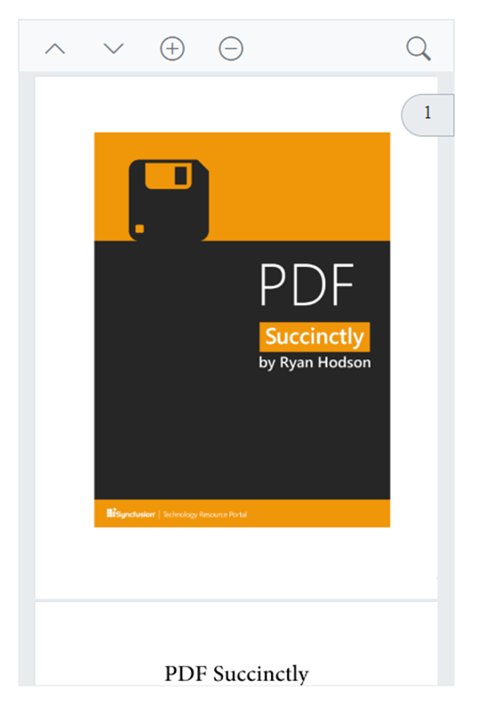
Add custom tools
We can also integrate custom functionalities beyond the default options. This could involve buttons to trigger specific actions within your Blazor app.
In the following code example, we’ve eliminated all pre-existing toolbar items and introduced a custom button for saving the PDF document.
@using Syncfusion.Blazor.SfPdfViewer;
@using Syncfusion.Blazor.Navigations;

<SfPdfViewer2 @ref="@Viewer" DocumentPath="@DocumentPath" Height="100%" Width="100%">
    <PdfViewerToolbarSettings CustomToolbarItems="@CustomToolbarItems" ToolbarItems=null />
    <PdfViewerEvents ToolbarClicked="ClickAction"></PdfViewerEvents>
</SfPdfViewer2>

@code {
    SfPdfViewer2 Viewer;
    MemoryStream stream;

    private string DocumentPath { get; set; } = "https://cdn.syncfusion.com/content/pdf/pdf-succinctly.pdf";

    // List that provides the position and element for the custom toolbar items.
    public List<PdfToolbarItem> CustomToolbarItems = new List<PdfToolbarItem>()
    {
        new PdfToolbarItem (){  Template = @GetTemplate("Save")}
    };

    // Get the render fragment element for the custom toolbar items in the primary toolbar.
    private static RenderFragment GetTemplate(string name)
    {
        return __builder =>
            {
                if (name == "Save")
                {
                    <ToolbarItem PrefixIcon="e-icons e-save"
                                 Text="Save"
                                 TooltipText="Save Document"
                                 Id="save"
                                 Align="ItemAlign.Right">
                    </ToolbarItem>
                }
            };
    }

    // Action for the custom toolbar items in the primary toolbar.
    public async void ClickAction(ClickEventArgs Item)
    {
        if (Item.Item.Id == "save")
        {
            //Gets the loaded PDF document with the changes.
            byte[] data = await Viewer.GetDocumentAsync();

            //Save the PDF document to a MemoryStream.
            stream = new MemoryStream(data);
        }
    }
}
Refer to the following image.
Note: For more details, refer to the toolbar customization in Blazor PDF Viewer documentation.
Use case: Simplifying PDF reading experience
Imagine a Blazor app designed for casual reading of e-books in PDF format. Here’s how toolbar customization can be applied:
- Disable unnecessary tools: Features like annotation tools, printing, and download options are not required for reading. Disabling these tools declutters the toolbar.
Refer to the following code example.
@* Eliminating all the default options by setting the ToolbarItems property to null. *@

<SfPdfViewer2 @ref="@Viewer" DocumentPath="@DocumentPath" Height="100%" Width="100%">
    <PdfViewerToolbarSettings ToolbarItems="null"/>
</SfPdfViewer2>
@code {
    private string DocumentPath { get; set; } = "https://cdn.syncfusion.com/content/pdf/pdf-succinctly.pdf";
}
- Prioritize navigation: Increase the prominence of navigation buttons (previous/next page) for easy scrolling through the e-book.
In the following code example, we’ve integrated custom buttons to build the e-book reader.
@code {
    protected override void OnInitialized()
    {
        AddCustomToolbarItems();
    }

    private void AddCustomToolbarItems()
    {
        CustomToolbarItems.Add(new PdfToolbarItem() { Index = 1, Template = GetTemplate("PreviousPage") });
        CustomToolbarItems.Add(new PdfToolbarItem() { Index = 2, Template = GetTemplate("NextPage") });
        CustomToolbarItems.Add(new PdfToolbarItem() { Index = 4, Template = GetTemplate("ZoomIn") });
        CustomToolbarItems.Add(new PdfToolbarItem() { Index = 5, Template = GetTemplate("ZoomOut") });
    }


    // Get the RenderFragment element for the custom toolbaritems in the primary toolbar.
    private RenderFragment GetTemplate(string templatename)
    {
        return __builder =>
        {
            if (templatename == "PreviousPage")
            {
                <ToolbarItem Text="Previous Page" Disabled="@PreviousPageDisable" PrefixIcon="e-icons e-chevron-up" TooltipText="Previous Page" Id="previousPage" Align="ItemAlign.Left" CssClass="e-pv-previous-page-navigation-container" TabIndex="@GetTabIndex(PreviousPageDisable)">
                </ToolbarItem>
            }
            else if (templatename == "NextPage")
            {
                <ToolbarItem Text="Next Page" Disabled="@NextPageDisable" PrefixIcon="e-icons e-chevron-down" TooltipText="Next Page" id="nextPage" Align="ItemAlign.Left" CssClass="e-pv-next-page-navigation-container" TabIndex="@GetTabIndex(NextPageDisable)">
                </ToolbarItem>
            }
            else if (templatename == "ZoomIn")
            {
                <ToolbarItem Text="Zoom In" PrefixIcon="e-icons e-circle-add" Id="zoomin" TooltipText="Zoom In" Align="ItemAlign.Left" CssClass="e-pv-zoom-in-container" TabIndex="0">
                </ToolbarItem>
            }
            else if (templatename == "ZoomOut")
            {
                <ToolbarItem Text="Zoom Out" PrefixIcon="e-icons e-circle-remove" Id="zoomout" TooltipText="Zoom Out" Align="ItemAlign.Left" CssClass="e-pv-zoom-out-container" TabIndex="0">
                </ToolbarItem>
            }
        };
    }
}- Consider search: The e-books might contain many pages. We can add search functionality to quickly find specific content in that scenario.
@using Syncfusion.Blazor.SfPdfViewer;
@using Syncfusion.Blazor.Navigations;


<SfPdfViewer2 @ref="@Viewer" DocumentPath="@DocumentPath" Height="100%" Width="100%">
    <PdfViewerToolbarSettings CustomToolbarItems="@CustomToolbarItems" ToolbarItems="null" MobileToolbarItems="null" />
    <PdfViewerEvents ToolbarClicked="@ClickAction"></PdfViewerEvents>
</SfPdfViewer2>

@code {
    private string DocumentPath { get; set; } = "https://cdn.syncfusion.com/content/pdf/pdf-succinctly.pdf";
    SfPdfViewer2 Viewer;

    private List<PdfToolbarItem> CustomToolbarItems = new List<PdfToolbarItem>();
    protected override void OnInitialized()
    {
        AddCustomToolbarItems();
    }

    private void AddCustomToolbarItems()
    {
        CustomToolbarItems.Add(new PdfToolbarItem() { Index = 1, Template = GetTemplate("PreviousPage") });
        CustomToolbarItems.Add(new PdfToolbarItem() { Index = 2, Template = GetTemplate("NextPage") });
        CustomToolbarItems.Add(new PdfToolbarItem() { Index = 3, Template = GetTemplate("ZoomIn") });
        CustomToolbarItems.Add(new PdfToolbarItem() { Index = 4, Template = GetTemplate("ZoomOut") });
        CustomToolbarItems.Add(new PdfToolbarItem() { Index = 5, Template = GetTemplate("TextSearch") });
    }

    // Get the renderfragment element for the custom toolbaritems in the primary toolbar
    private RenderFragment GetTemplate(string templatename)
    {
        return __builder =>
        {
            if (templatename == "PreviousPage")
            {
                <ToolbarItem Text="Previous Page" PrefixIcon="e-icons e-chevron-up" TooltipText="Previous Page" Id="previousPage" Align="ItemAlign.Left" CssClass="e-pv-previous-page-navigation-container">
                </ToolbarItem>
            }
            else if (templatename == "NextPage")
            {
                <ToolbarItem Text="Next Page" PrefixIcon="e-icons e-chevron-down" TooltipText="Next Page" id="nextPage" Align="ItemAlign.Left" CssClass="e-pv-next-page-navigation-container">
                </ToolbarItem>
            }
            else if (templatename == "ZoomIn")
            {
                <ToolbarItem Text="Zoom In" PrefixIcon="e-icons e-circle-add" Id="zoomin" TooltipText="Zoom In" Align="ItemAlign.Left" CssClass="e-pv-zoom-in-container" TabIndex="0">
                </ToolbarItem>
            }
            else if (templatename == "ZoomOut")
            {
                <ToolbarItem Text="Zoom Out" PrefixIcon="e-icons e-circle-remove" Id="zoomout" TooltipText="Zoom Out" Align="ItemAlign.Left" CssClass="e-pv-zoom-out-container" TabIndex="0">
                </ToolbarItem>
            }
            else if (templatename == "TextSearch")
            {
                <ToolbarItem Text="Text Search" PrefixIcon="e-pv-text-search-icon e-pv-icon" TooltipText="Text Search" Id="textsearch" Align="ItemAlign.Right" CssClass="e-pv-text-search-container" TabIndex="0">
                </ToolbarItem>
            }
        };
    }
    // Click for the custom toolbaritems in the primary toolbar
    private async void ClickAction(ClickEventArgs Item)
    {
        if (Item.Item.Id == "previousPage")
        {
            await Viewer.GoToPreviousPageAsync();
        }
        else if (Item.Item.Id == "nextPage")
        {
            await Viewer.GoToNextPageAsync();
        }

        else if (Item.Item.Id == "zoomin")
        {
            await Viewer.ZoomInAsync();
        }
        else if (Item.Item.Id == "zoomout")
        {
            await Viewer.ZoomOutAsync();
        }
    }
}
Refer to the following image.
The provided code snippet will hide the default toolbar items, displaying only the customized ones due to setting ToolbarItems as null.
To ensure consistent functionality on mobile devices, we also need to hide MobileToolbarItems as null. This way, only the custom toolbar items will be shown in mobile mode. As a result, the app will seamlessly operate on mobile devices, effectively serving as an e-book reader app.
Refer to the following image.
These customizations ensure a clean and focused interface, optimizing the user experience for a pleasant reading experience.
GitHub reference
Also, check out the Blazor PDF Viewer toolbar customization demos on GitHub.
Conclusion
Thanks for reading! Syncfusion Blazor PDF Viewer’s toolbar customization empowers you to create a tailored user experience within your Blazor apps. Understanding the customization options and considering your specific use case allows you to streamline workflows, boost user productivity, and deliver a more intuitive interaction with PDF documents.
To discover more about the features available in the 2024 Volume 1 release, please visit our Release Notes and What’s New pages.
If you are an existing customer, you can access the new version of Essential Studio from the License and Downloads page. For new customers, we offer a 30-day free trial so you can experience the full range of available features.
If you have questions, contact us through our support forum, support portal, or feedback portal. We are always happy to assist you!