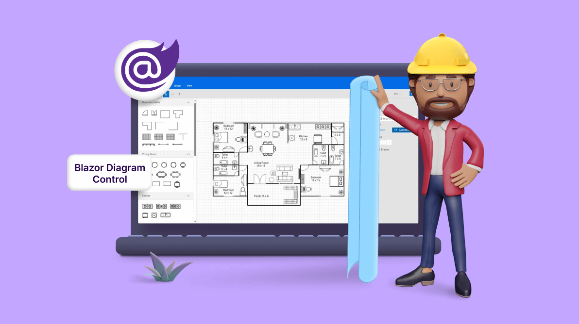
TLDR: Create intuitive floor planners for interior design, real estate, and more with the versatile features of the Syncfusion Blazor Diagram Library. Uncover its drag-and-drop functionality, copy-and-paste tools, and seamless import/export features, which streamline the floor planning process.
A floor planner is a tool for creating floor plans and room layouts for various purposes, including interior design, architecture, real estate, and facility management. With this, users can arrange and visualize rooms, walls, furniture, appliances, and other objects within a given space.
The Blazor Diagram component is a fast and powerful library for visualizing, creating, and editing interactive diagrams. It supports creating flowcharts, organizational charts, mind maps, and more.
Let’s see how to use the Blazor Diagram Library to create an interactive user interface that empowers designers to swiftly and effortlessly create floor planners.
Refer to the following image.
Configuring the Blazor Diagram Library
Follow these steps to configure the Syncfusion Blazor Diagram component:
- First, create a Blazor WebAssembly or server app.
- Then, install the Syncfusion.Blazor.Diagram the NuGet package in the app using the NuGet package manager.
- Add the scripts and style resources through CDN or from the NuGet package in the head element of your index.html page in the ~/wwwroot/ directory.
<head> ……… ……… <link href="_content/Syncfusion.Blazor.Themes/bootstrap5.css" rel="stylesheet" /> <script src="https://cdn.syncfusion.com/blazor/20.4.38/syncfusion-blazor.min.js" type="text/javascript"></script> </head> - Open the ~/_Imports.Blazorfile and import the Syncfusion.Blazor.Diagram package in it.
@using Syncfusion.Blazor.Diagram
- In the Program.cs file, add the services required for the Syncfusion components using the builder.Services.AddSyncfusionBlazor() extension method.
using Syncfusion.Blazor;
var builder = WebAssemblyHostBuilder.CreateDefault(args);
. . . . .
. . . . .
builder.Services.AddSyncfusionBlazor();
await builder.Build().RunAsync();
- Finally, add the Blazor Diagram component to the Pages folder in the Razor file.
<SfDiagramComponent @ref="@Diagram" @bind-Width="@DiagramWidth" @bind-Height="@DiagramHeight" >
  </SfDiagramComponent>
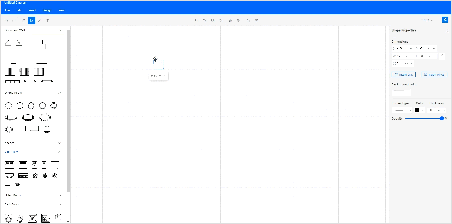
After executing the above code examples, the Blazor Diagram Library will be integrated into your app. The following image shows the basic canvas of the Blazor Diagram component.

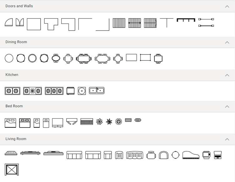
Floor planner diagram symbols
The floor planner designer offers a variety of symbols, such as doors, walls, dining, kitchen, living rooms, and other components, to help design comprehensive floor planner diagrams.
Creating reusable floor planner symbols
The Blazor Diagram control offers a gallery of reusable nodes and connectors called SymbolPalette. These palettes display a collection of shapes, and each palette showcases a set of nodes and connectors. You can easily drag and drop these symbols onto the diagram canvas as needed.
Now, let’s see the steps to create a diagram symbol palette with the floor planner shapes:
- First, create an HTML div element to act as the container for the diagram’s symbol palette.
<div class="db-palette-parent">
</div>
- Initialize the Syncfusion Diagram’s symbol palette with the collection of symbols to be included in the palette. Also, configure the properties such as Height, Width, SymbolHeight, SymbolWidth and more to define uniform dimensions for all shapes in the palette.
<SfSymbolPaletteComponent @ref="@PaletteInstance" Width="100%" Height="100%" SymbolHeight="@symbolSizeHeight" SymbolWidth="@symbolSizeWidth" GetSymbolInfo="GetSymbolInfo" Palettes="@Palettes" SymbolDragPreviewSize="@SymbolPreview" SymbolMargin="@SymbolMargin"> </SfSymbolPaletteComponent>
- Then, define your palette symbols and customize them as needed.
SfSymbolPaletteComponent? PaletteInstance { get; set; }

/// <summary>
/// Gets or sets the symbol preview size for an item in the Symbol Palette.
/// </summary>
DiagramSize SymbolPreview = new DiagramSize();
/// <summary>
/// Gets or sets the symbol preview margin for an item in the Symbol Palette.
/// </summary>
SymbolMargin SymbolMargin = new SymbolMargin { Left = 2, Right = 2, Top = 2, Bottom = 2 };
/// <summary>
/// Gets or sets the symbol width for an item in the Symbol Palette.
/// </summary>
double symbolSizeWidth;
/// <summary>
/// Gets or sets the symbol height for an item in the Symbol Palette.
/// </summary>
double symbolSizeHeight;
/// <summary>
/// Reference to the palettes in the symbol palette.
/// </summary>
DiagramObjectCollection<Palette>? Palettes { get; set; }

/// <summary>
/// Gets or sets the Door shape symbols.
/// </summary>
public DiagramObjectCollection<NodeBase> DoorSymbols { get; set; } = new DiagramObjectCollection<NodeBase>();
/// <summary>
/// Gets or sets the DiningRoom shape symbols.
/// </summary>
public DiagramObjectCollection<NodeBase> DiningRoomSymbols { get; set; } = new DiagramObjectCollection<NodeBase>();
/// <summary>
/// Gets or sets the Kitchen shape symbols.
/// </summary>
public DiagramObjectCollection<NodeBase> KitchenSymbols { get; set; } = new DiagramObjectCollection<NodeBase>();
/// <summary>
/// Gets or sets the BedRoom shape symbols.
/// </summary>
public DiagramObjectCollection<NodeBase> BedRoomSymbols { get; set; } = new DiagramObjectCollection<NodeBase>();
/// <summary>
/// Gets or sets the LivingRoom shape symbols.
/// </summary>
public DiagramObjectCollection<NodeBase> LivingRoomSymbols { get; set; } = new DiagramObjectCollection<NodeBase>();
/// <summary>
/// Gets or sets the BathRoom shape symbols.
/// </summary>
public DiagramObjectCollection<NodeBase> BathRoomSymbols { get; set; } = new DiagramObjectCollection<NodeBase>();


protected override void OnInitialized()
{
    symbolSizeWidth = 50;
    symbolSizeHeight = 50;
    SymbolPreview = new DiagramSize();
    SymbolPreview.Width = 50;
    SymbolPreview.Height = 50;
    //Initializes the palette.
    InitializePalettes();
    Palette Door = new Palette() { Symbols = DoorSymbols, Title = "Doors and Walls", ID = "Door", IconCss = "e-ddb-icons e-flow" };
    Palette DiningRoom = new Palette() { Symbols = DiningRoomSymbols, Title = "Dining Room", ID = "DiningRoom", IconCss = "e-ddb-icons e-flow" };
    Palette Kitchen = new Palette() { Symbols = KitchenSymbols, Title = "Kitchen", ID = "Kitchen", IconCss = "e-ddb-icons e-flow" };
    Palette BedRoom = new Palette() { Symbols = BedRoomSymbols, Title = "Bed Room", ID = "BedRoom", IconCss = "e-ddb-icons e-flow" };
    Palette LivingRoom = new Palette() { Symbols = LivingRoomSymbols, Title = "Living Room", ID = "LivingRoom", IconCss = "e-ddb-icons e-flow" };
    Palette BathRoom = new Palette() { Symbols = BathRoomSymbols, Title = "Bath Room", ID = "BathRoom", IconCss = "e-ddb-icons e-flow" };
    Palettes = new DiagramObjectCollection<Palette>();
    if (Palettes != null)
    {
        Palettes.Add(Door);
        Palettes.Add(DiningRoom);
        Palettes.Add(Kitchen);
        Palettes.Add(BedRoom);
        Palettes.Add(LivingRoom);
        Palettes.Add(BathRoom);
    }
}
/// <summary>
/// This method used to render the nodes or connectors in the Symbol Palette.
/// </summary>
        private void InitializePalettes()
        {
            DoorSymbols = new DiagramObjectCollection<NodeBase>()
            {
                new Node()
                {
                    ID = "Doorclose",
                    Width = 25,
                    Height = 25,
                    Tooltip= new DiagramTooltip()
                    {
                        Content="Door close"
                    },
                    Constraints = (NodeConstraints.Default | NodeConstraints.Tooltip),
                    Shape = new PathShape()
                    {
                        Data = "M1 71L1 79L72 79V71M1 71L72 71M1 71C1 32.3401 32.3401 1 71 1H72V71"
                    }
                },
                new Node()
                {
                    ID = "Doubledoorclose",
                    Width = 25,
                    Height = 25,
                    Tooltip= new DiagramTooltip()
                    {
                        Content="Double door close"
                    },
                    Constraints = (NodeConstraints.Default | NodeConstraints.Tooltip),
                    Shape = new PathShape()
                    {
                        Data = "M143 71V79L1 79L1 71M143 71L1 71M143 71V1H142C103.34 1 72 32.3401 72 71M143 71H72M1 71L1 1H2C40.6599 1 72 32.3401 72 71M1 71L72 71M72 78.5V71"
                    }
                },
                new Node()
                {
                    ID = "Room",
                    Width = 45,
                    Height = 38,
                    Tooltip= new DiagramTooltip()
                    {
                        Content="Room"
                    },
                    Constraints = (NodeConstraints.Default | NodeConstraints.Tooltip),
                    Shape = new PathShape()
                    {
                        Data = "M4 4H104V104H4V4Z"
                    }
                }, …
            };
You can get the code for all the reusable symbols used in this sample here.
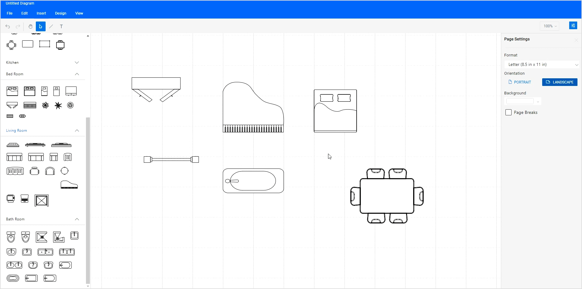
The following screenshot shows the collection of floor planner shapes in the symbol palette.
Note: Refer to the Symbol palette in Blazor Diagram documentation for more details on adding, grouping, and customizing the symbol palette.
Creating a floor planner design using the Blazor Diagram Library
Now, we can easily design the floor planner diagram by adding it to the diagram canvas.
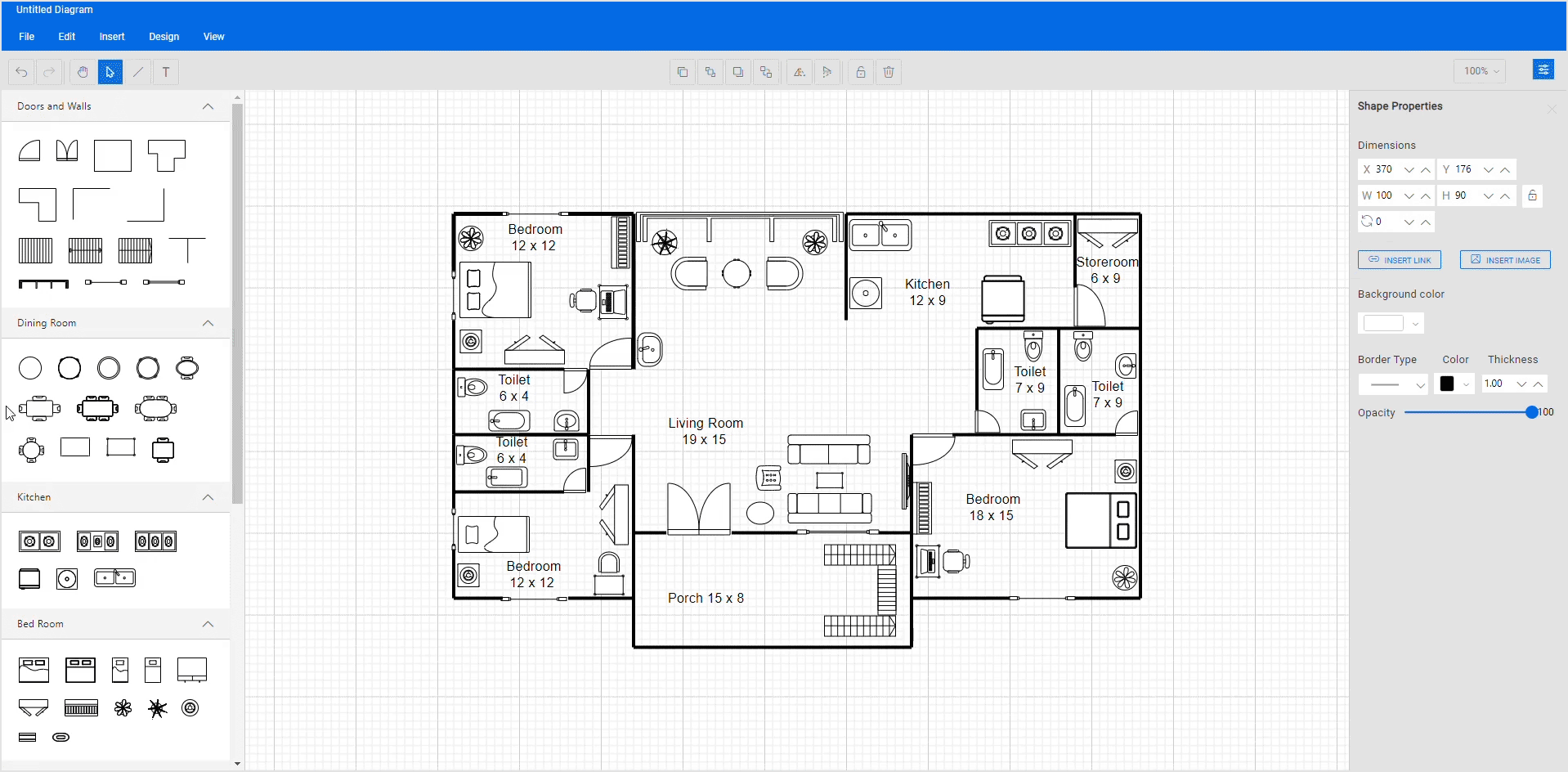
Step #1: Adding floor planner symbols to the editor
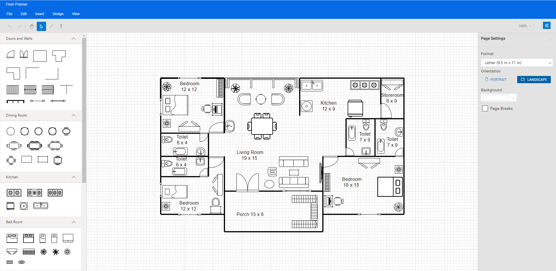
You can create the design by dragging the desired floor planner symbols from the symbol palette and dropping them onto the diagram surface at the desired location.
Refer to the following image.
Step #2: Changing the symbols’ position
You can change the position of the dropped symbol by simply clicking and dragging it to the desired location in the diagram canvas.
Refer to the following image.
Step #3: Loading and saving the diagram
The Blazor Diagram Library provides a useful feature that lets you save your work and resume it later by loading the saved diagram.
To save your current diagram, select Save from the File menu. This action will save your diagram as a file on your local drive.
To load an existing diagram file, navigate to the File -> Open menu. This will open the file dialog box, allowing you to browse and select the saved diagram file you need.
This feature provides great flexibility and convenience, allowing you to easily pick up where you left off on a diagram or make changes to a previously saved diagram. It’s an essential feature for any diagramming app that enables users to create and manage complex diagrams.
Refer to the following GIF image.
Note: For more details, refer to loading and saving diagrams in the Blazor Diagram Library documentation.
Step #4: Undo or redo the diagram action
The Blazor Diagram component supports undo and redo operations, allowing you to track changes made to a diagram. These features are essential for quickly correcting mistakes or restoring the previously undone action.
To undo an action, use the Ctrl + Z keyboard shortcut, or click the Undo button on the toolbar, or use the Undo commands from the Edit menu. This will revert the most recent action performed.
To redo an action, use the Ctrl + Y keyboard shortcut, or click the Redo button on the toolbar, or use the Redo commands from the Edit menu. This will redo the most recently undone action.
Step #5: Exporting the diagram
You can also export the created floor planner diagram as an image file in different formats such as JPEG, PNG, and SVG. By exporting the diagram as an image, you can easily share it via email or other digital means or embed it in a document or presentation.
To export a diagram, click the File menu and select Export. A dialog box will appear, allowing you to specify the name and image file format to save the floor planner diagram. Additionally, you can export only the content area of the diagram by excluding the blank areas or export the entire diagram (including blank areas) based on the width and height specified in the page settings.
Step #6: Printing the diagram
To print a diagram, click the File menu and select Print. The Print dialog box will open, and you can choose your printer and customize the print settings, such as orientation, paper size, and page margins. Then, click the Print button to print the floor planner diagram.
Step #7: Pan and zoom
The Blazor Diagram Library offers various panning and zooming options to navigate through your diagrams efficiently.
- Pan using the scrollbars: The most straightforward way to pan a diagram is by using the scrollbars on the right side and bottom of the diagram canvas. This allows you to scroll the diagram in any direction you need.
- Pan using the mouse wheel: You can pan a diagram by rotating the mouse wheel. To scroll up or down, rotate the mouse wheel forward or backward; to scroll left or right, hold Shift while rotating the scroll wheel forward or backward.
- Pan using the pan tool: You can pan a diagram by selecting the Pan tool from the toolbar. Click and hold down the left mouse button, then drag the mouse to move the diagram in any direction.
- Zoom using keyboard shortcuts: The most efficient way to zoom in and out of the diagram is to use the Ctrl + mouse wheel shortcut.
- Zoom using the toolbar option: You can also zoom in or out in a diagram using the zoom dropdown in the upper-right corner of the app window. In the Zoom dropdown, you can select the Zoom To Fit option to fit the entire floor planner diagram to the window.
GitHub reference
Also, you can download the Blazor floor planner diagram demo on GitHub.
Conclusion
Thanks for reading! In this blog, we’ve learned how to effortlessly create a floor planner diagram using the Syncfusion Blazor Diagram Library. You can also use the Diagram component to create organizational charts, flowcharts, mind maps, network diagrams, or logic circuit diagrams. Try it out and leave your feedback in the comments section below!
If you’re an existing Syncfusion user, download the latest version of Essential Studio from the License and Downloads page. If you’re new to Syncfusion, you can use our 30-day free trial to explore the features and capabilities of our components.
For questions, you can reach us through our support forum, support portal, or feedback portal. We are always happy to assist you!
Related blogs
- Crafting Interactive Digital Logic Circuits Made Easy with Blazor Diagram Component
- Syncfusion Blazor Diagram Library Now Supports Swimlane Diagrams
- Seamlessly Create a Mind Map Using the Blazor Diagram Component
- Create an Org Chart to Elegantly Visualize Hierarchical Data using Blazor Diagram Component


