We tried our best to avoid API breaking changes, but we had no alternative. In this blog post, we are going to look at the various API breaking changes in our Flutter DataGrid rolled out in the Essential Studio®® 2021 Volume 1 release.
We have changed the API structure to make the data row creation process more Flutter-idiomatic and expressive, and to simplify data row customization.
The major change that we have made is that from this release onward, the DataGrid will retrieve the widget required for each cell from the user end. Previously, the DataGrid showed only the built-in Text widget.
Let’s discuss the API breaking changes and go over how to update to the new API structure in the Flutter DataGrid.
API breaking changes
The following APIs will not be available from the 2021 Volume 1 release onward in our Flutter DataGrid.
Properties
| Class | API name | Alternate API |
| SfDataGrid | cellBuilder | Since we are loading the widget ourselves for each cell, we can do necessary customization in the widget itself. Hence, these APIs are not required anymore.
|
| SfDataGrid | headerCellBuilder | |
| SfDataGrid | onQueryCellStyle | |
| SfDataGrid | onQueryRowStyle | |
| GridColumn | cellStyle | |
| GridColumn | headerStyle | |
| GridColumn | textAlignment | |
| GridColumn | headerTextAlignment | |
| GridColumn | softWrap | |
| GridColumn | headerTextOverflow | |
| GridColumn | headerTextSoftWrap | |
| GridColumn | maxLines | |
| GridColumn | overflow | |
| GridColumn | headerText | |
| GridColumn | Padding | |
| GridColumn | headerPadding | |
| DataGridSource | dataSource | rows |
| SfDataGridThemeData | headerStyle | Since we are loading the widget ourselves for each cell, you can do necessary customization in the widget itself. Hence, these APIs are not required anymore.
|
| SfDataGridThemeData | cellStyle | |
| SfDataGridThemeData | selectionStyle | selectionColor |
| SfDataPager | rowsPerPage | pageCount |
| DataPagerDelegate | rowCount | – |
Methods
| Class | API name |
| DataGridSource | getCellValue |
| DataGridSource | getValue |
| GridColumn | getFormattedValue |
| ColumnSizer | getAutoRowHeight |
Typedefs
| TypeDefs |
| QueryCellStyleCallback |
| QueryRowStyleCallback |
| CellBuilderCallback |
| HeaderCellBuilderCallback |
Enum
| Enum | Previous options | Current options |
| ColumnWidthMode | auto cells fill header lastColumnFill none | fill lastColumnFill none |
Type changes of method arguments
| Class | Method name | Previous argument type | New argument type |
| DataGridSource | compare | T a, T b, SortColumnDetails sortColumn | DataGridRow a, DataGridRow b, SortColumnDetails sortColumn |
Type changes of properties
| Class | Name | Previous type | New type |
| DataGridController | selectedRows | List<Object> | List<DataGridRow> |
| DataGridController | selectedRow | Object | DataGridRow |
Type changes of callback arguments
| Class | Callback | Previous type | New type |
| SfDataGrid | selectionChanging | List<Object> addedRows, List< Object > removedRows | List<DataGridRow> addedRows, List< DataGridrow> removedRows |
| SfDataGrid | selectionChanged | List<Object> addedRows, List< Object > removedRows | List<DataGridRow> addedRows, List< DataGridRow > removedRows |
Classes
The following classes will not be available in the Flutter DataGrid in the 2021 Volume 1 release.
| Class | Source |
| DataGridHeaderCellStyle | syncfusion_flutter_core |
| DataGridCellStyle | syncfusion_flutter_core |
| GridWidgetColumn | syncfusion_flutter_datagrid |
| GridDateTimeColumn | syncfusion_flutter_datagrid |
| GridNumericColumn | syncfusion_flutter_datagrid |
| GridCellDateTimeRenderer | syncfusion_flutter_datagrid |
| GridCellNumericFieldRenderer | syncfusion_flutter_datagrid |
| GridCellWidgetRenderer | syncfusion_flutter_datagrid |
| GridNumericColumn | syncfusion_flutter_datagrid |
| GridWidgetColumn | syncfusion_flutter_datagrid |
| GridDateTimeColumn | syncfusion_flutter_datagrid |
Missing features
All the features of the Flutter DataGrid that were available before the Volume 1 release are supported in it as well, except for the following features:
- Autofit columns
- Autofit rows
Note: Since we are getting the widgets directly from the user end, we can’t provide built-in support to autofit the rows and columns. We have already considered this and logged a feature request on our side.
Example with new API structure
Now, let’s see an example of displaying employee details in our Flutter DataGrid with the new API structure.
Points to remember
- The SfDataGrid requires the following configurations to show the data:
- Columns
- DataGridSource
- In this new API structure, we retain only the GridTextColumn and remove all other column types and builder methods, such as:
- GridDateTimeColumn
- GridWidgetColumn
- GridNumericColumn
- cellBuilder
- headerCellBuilder
- We have also removed the following APIs from the DataGridSource:
- dataSource
- getValue()
- getCellValue()
Procedure
Please follow these steps to migrate to the new API structure in the Flutter DataGrid:
Step 1: Create a simple data source for the SfDataGrid as shown in the following code example.
class Employee {
  Employee(this.id, this.name, this.designation, this.salary);
  final int id;
  final String name;
  final String designation;
  final int salary;
}
Step 2: Create the EmployeeDataGridSource class by extending the DataGridSource class. Previously, we had to assign the dataSource property with the employee collection and return the value of each cell by returning it in the getValue method.
But now, the DataGrid requires the DataGridCell and DataGridRow values from the user end.
- DataGridCell: Contains the data for a cell. You should pass the value of a cell to this method and then, based on the value, the DataGrid will process the sorting operations for grid columns.
- DataGridRow: The row configuration. It contains the cell data.
Let’s create a collection of employees as shown in the following code example.
List<Employee> employees = <Employee>[];
@override
void initState() {
    super.initState();
    employees = getEmployees();
  }

  List<Employee> getEmployees() {
    return [
      Employee(10001, 'James', 'Project Lead', 20000),
      Employee(10002, 'Kathryn', 'Manager', 30000),
      Employee(10003, 'Lara', 'Developer', 15000),
      Employee(10004, 'Michael', 'Designer', 15000),
      Employee(10005, 'Martin', 'Developer', 15000),
      Employee(10006, 'Newberry', 'Developer', 15000),
      Employee(10007, 'Balnc', 'Developer', 15000),
      Employee(10008, 'Perry', 'Developer', 15000),
      Employee(10009, 'Gable', 'Developer', 15000),
      Employee(10010, 'Grimes', 'Developer', 15000)
    ];
  }
Then, create a collection of DataGridRow from the underlying employees collection. Each DataGridRow should have the collection of DataGridCell.
DataGridCell should have the values for the corresponding columnName properties. Then, override the rows property from the DataGridSource and set the collection of DataGridRows.
Here, DataGridCell is of generic type. So, you can specify the actual type of the underlying model’s property. You can also avoid the casting while setting the value property.
Refer to the following code.
class EmployeeDataSource extends DataGridSource {
  /// Creates the employee data source class with required details.
  EmployeeDataSource({List<Employee> employees}) {
    _employees = employees
        .map<DataGridRow>((employee) => DataGridRow(cells: [
              DataGridCell<int>(columnName: 'id', value: employee.id),
              DataGridCell<String>(columnName: 'name', value: employee.name),
              DataGridCell<String>(
                  columnName: 'designation', value: employee.designation),
              DataGridCell<int>(columnName: 'salary', value: employee.salary),
            ]))
        .toList();
  }

  List<DataGridRow> _employees;

  @override
  List<DataGridRow> get rows => _employees;
  }
Now, override the buildRow method from the DataGridSource and return the DataGridRowAdapter, which holds the collection of widgets required for each cell. Then, pass the DataGridRow value as an argument to the buildRow method. You can get the cell values by using the getCells method.
@override
DataGridRowAdapter buildRow(DataGridRow row) {
    return DataGridRowAdapter(
        cells: row.getCells().map<Widget>((e) {
      return Container(
        alignment: (e.columnName == 'id' || e.columnName == 'salary')
            ? Alignment.centerRight
            : Alignment.centerLeft,
        padding: EdgeInsets.all(16.0),
        child: Text(e.value.toString()),
      );
    }).toList());
  }
Step 3: Create an instance of the EmployeeDataGridSource class and set the source property of SfDataGrid. Then, create the columns and set the columns property of the SfDataGrid.
Previously, the grid had built-in support to show the header text based on the mappingName and headerText. Now, the GridTextColumn has the following properties and users are required to load the required widget in the header itself:
- columnName: Displays the name of a column.
- Label: Displays the label of a column header. Typically, this will be a Text widget.
Refer to the following code.
EmployeeDataSource employeeDataSource;

  @override
  void initState() {
    super.initState();
    employees = getEmployees();
    employeeDataSource = EmployeeDataSource(employees: employees);
  }

 @override
 Widget build(BuildContext context) {
    return Scaffold(
      appBar: AppBar(
        title: const Text('Syncfusion Flutter DataGrid'),
      ),
      body: SfDataGrid(
        source: employeeDataSource,
        columns: <GridColumn>[
          GridTextColumn(
              columnName: 'id',
              label: Container(
                  padding: EdgeInsets.all(16.0),
                  alignment: Alignment.centerRight,
                  child: Text(
                    'ID',
                  ))),
          GridTextColumn(
              columnName: 'name',
              label: Container(
                  padding: EdgeInsets.all(16.0),
                  alignment: Alignment.centerLeft,
                  child: Text('Name'))),
          GridTextColumn(
              columnName: 'designation',
              width: 120,
              label: Container(
                  padding: EdgeInsets.all(16.0),
                  alignment: Alignment.centerLeft,
                  child: Text(
                    'Designation'))),
          GridTextColumn(
              columnName: 'salary',
              label: Container(
                  padding: EdgeInsets.all(16.0),
                  alignment: Alignment.centerRight,
                  child: Text('Salary'))),
        ],
      ),
    );
  }
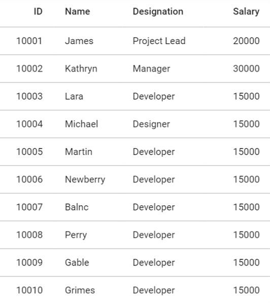
Now, we have configured our Flutter DataGrid to the new API structure. After executing the above code, the Flutter DataGrid will display the employee details as shown in the following screenshot.

Conclusion
In this blog post, we discussed the API breaking changes in the Flutter DataGrid, along with how to migrate to the new API structure. These changes are effective starting in our Essential Studio®® 2021 Volume 1 release. Please feel free to leave a comment if you have any feedback or need clarification on this.
You can also contact us through our support forums, feedback portal, or Direct-Trac support system. We are always happy to assist you!


