- Home
- Forum
- Angular - EJ 2
- Stacked group chart with dynamic response
Stacked group chart with dynamic response
Hi Team,
I have response something like below -
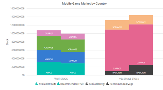
For each source name on X axis I would have available and recommended bars. Further, the available and recommended bars would stack based on category. For instance, Fruit stock will have Available and recommended bars and each of these bars would be split based on category (how many are apples, mango etc.)
How can we transform this response to show it in stacked group? Also, the categories should be color coded. I do not know how many source name or categories would be there beforehand. Thanks in advance.
"InventorySummary": [
{
"sourceName": "FRUIT STOCK",
"category": "APPLE",
"available": 322863369.39567536,
"recommended": 288060444.7157002
},
{
"sourceName": "VEGETABLE STOCK",
"category": "RADDISH",
"available": 91302197.82,
"recommended": 44437332.9
},
{
"sourceName": "FRUIT STOCK",
"category": "MANGO",
"available": 278946730.6608295,
"recommended": 270552545.95190006
},
{
"sourceName": "VEGETABLE STOCK",
"category": "CARROT",
"available": 9941687.568088097,
"recommended": 9764205.674899999
},
{
"sourceName": "VEGETABLE STOCK",
"category": "SPINACH",
"available": 227006193.11418274,
"recommended": 222311874.73494303
},
{
"sourceName": "FRUIT STOCK",
"category": "ORANGE",
"available": 33834441.706323504,
"recommended": 30037541.716289997
},
{
"sourceName": "FRUIT STOCK",
"category": "GRAPES",
"available": 740635.462,
"recommended": 740635.462
}
]
SIGN IN To post a reply.
7 Replies
SM
Srihari Muthukaruppan
Syncfusion Team
November 15, 2019 11:16 AM UTC
Hi Samir,
Greetings from Syncfusion.
We have analyzed your query. From that we would like to let you know that we can achieve your requirement using multilevel labels. Based on that we have prepared a sample for your reference. Please find below code snippet, screenshot and sample.
Code Snippet:
|
public primaryXAxis: Object = {
valueType: 'Category', labelRotation: 90,
border: { width: 1, type: 'Rectangle' },
isIndexed: false, interval: 1, majorGridLines: { width: 0 },
multiLevelLabels: [{
border: { type: 'Rectangle' },
textStyle: { fontWeight: 'Bold' },
categories: [
{ start: -0.5, end: 3.5, text: 'FRUIT STOCK', },
{ start: 3.5, end: 6.5, text: 'VEGETABLE STOCK', },
]
}]
}; |
Screenshot:
Let us know, if you have any concerns.
Regards,
Srihari M.
SM
Samir Modi
November 17, 2019 06:17 AM UTC
Hi Srihari,
Attachment: Image_d6dd4554.zip
Thanks for quick reply. However, I need something like attached image. I need vertical stacking with your blue (available) and black bar (recommended) should come side by side and those should be stacked grouped by category. Category can be just color coded labels and not to be shown on x axis. Also, in your markerLables, I see you have hardcoded Fruits and Vegetable stock but this would be dynamic in my case.
Can you tell you how to achieve this -
Attachment: Image_d6dd4554.zip
SM
Srihari Muthukaruppan
Syncfusion Team
November 18, 2019 11:30 AM UTC
Hi Samir,
We have analyzed your query. From that we would like to let you know that we have prepared a sample based on your requirement. Please find below code snippet, screenshot and sample.
Code Snippet:
|
public Stackingdata: Object[] = [
{
"sourceName": "FRUIT STOCK",
"category": "APPLE",
"available": 322863369.39567536,
"recommended": 288060444.7157002,
"color": "#00bdae"
},
{
"sourceName": "VEGETABLE STOCK",
"category": "RADDISH",
"available": 101302197.82,
"recommended": 244373320.9,
"color": "#404041"
},
{
"sourceName": "FRUIT STOCK",
"category": "MANGO",
"available": 278946730.6608295,
"recommended": 270552545.95190006,
"color": "#357cd2"
},
{
"sourceName": "VEGETABLE STOCK",
"category": "CARROT",
"available": 994168700.568088097,
"recommended": 976420500.674899999,
"color": "#e56590"
},
{
"sourceName": "VEGETABLE STOCK",
"category": "SPINACH",
"available": 227006193.11418274,
"recommended": 222311874.73494303,
"color": "#f8b883"
},
{
"sourceName": "FRUIT STOCK",
"category": "ORANGE",
"available": 338344410.706323504,
"recommended": 300375410.716289997,
"color": "#70ad47"
},
{
"sourceName": "FRUIT STOCK",
"category": "GRAPES",
"available": 140635000.462,
"recommended": 140635000.462,
"color": "#dd8abd"
}];
public data1: Object[] = [];
public data2: Object[] = [];
public load(args: ILoadedEventArgs): void {
for(let i=0; i < this.Stackingdata.length; i++) {
if(this.Stackingdata[i]['sourceName'] === 'FRUIT STOCK') {
this.data1.push(this.Stackingdata[i]);
} else {
this.data2.push(this.Stackingdata[i]);
}
}
}; |
Screenshot:
If this is not your requirement, kindly revert us.
Regards,
Srihari M.
SM
Samir Modi
November 21, 2019 07:28 AM UTC
Tried your example. I am getting below error -
ERROR TypeError: Cannot read property 'calculateRangeAndInterval' of undefined
at CartesianAxisLayoutPanel.push../node_modules/@syncfusion/ej2-charts/src/chart/axis/cartesian-panel.js.CartesianAxisLayoutPanel.measureDefinition (cartesian-panel.js:104)
at CartesianAxisLayoutPanel.push../node_modules/@syncfusion/ej2-charts/src/chart/axis/cartesian-panel.js.CartesianAxisLayoutPanel.measureColumnAxis (cartesian-panel.js:81)
at CartesianAxisLayoutPanel.push../node_modules/@syncfusion/ej2-charts/src/chart/axis/cartesian-panel.js.CartesianAxisLayoutPanel.measureAxis (cartesian-panel.js:35)
at ChartComponent.push../node_modules/@syncfusion/ej2-charts/src/chart/chart.js.Chart.calculateBounds (chart.js:618)
SM
Srihari Muthukaruppan
Syncfusion Team
November 22, 2019 05:43 AM UTC
Hi Samir,
We have analyzed your query. From that, we suspect that the issue occurs since the modules are not injected properly. Please refer the below code snippet for reference.
Code Snippet:
App.module.ts:
|
import { ChartAllModule } from '@syncfusion/ej2-angular-charts';
import { DatePickerModule } from '@syncfusion/ej2-angular-calendars';
import { NumericTextBoxModule } from '@syncfusion/ej2-angular-inputs';
import { ButtonModule } from '@syncfusion/ej2-angular-buttons';
import { HttpModule } from '@angular/http';
import { FormsModule, ReactiveFormsModule } from '@angular/forms';
import { RouterModule } from '@angular/router';
import { CommonModule } from '@angular/common';
import { BrowserModule } from '@angular/platform-browser';
import { NgModule } from '@angular/core';
import { AppComponent } from '../app.component';
@NgModule({ declarations: [ AppComponent ], imports: [ ChartAllModule, BrowserModule, ButtonModule], providers: [],
bootstrap: [AppComponent]
})
export class AppModule { }
}
|
If you are still facing the issue, kindly revert us your sample to check from our end.
Regards,
Srihari M.
SM
Samir Modi
November 29, 2019 09:42 AM UTC
Hi Srihari,

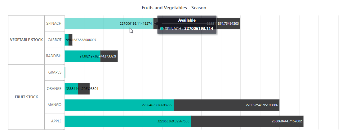
Your solution certainly help. However, one follow-up question - The data labels on the bar graph are overlapping and sometimes not even visible when the range is less.
Sample below -
IS there any way to show all labels without overlapping each other . Also the blue partition between C & B category is not visible at all due to very less space I believe.
Thanks!
SM
Srihari Muthukaruppan
Syncfusion Team
December 2, 2019 11:52 AM UTC
Hi Samir,
We have analyzed your query. From that, we would like to let you know that as of now we don’t have support to show the datalabel even if the label text are overlapped. We consider this scenario as improvement and we have logged a feature request on this . It can be tracked through our feedback portal below.
Feedback Portal: https://www.syncfusion.com/feedback/10448/need-to-provide-support-to-show-data-label-even-when-it-gets-intersected
Due to release work, this improvement will be considered after our main release. We appreciate your patience until then.
Let us know if you have any concerns.
Regards,
Srihari M
SIGN IN To post a reply.
- 7 Replies
- 2 Participants
-
SM Samir Modi
- Nov 14, 2019 04:06 PM UTC
- Dec 2, 2019 11:52 AM UTC
