- Home
- Forum
- JavaScript - EJ 2
- Axis colour
Axis colour
Hi,
Attachment: Syncfusion_aa816cd.zip
I'm using the Syncfusion chart control to display real time waveform data. I need to make the following changes:
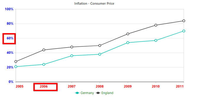
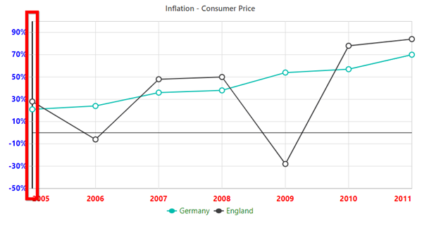
1. The numbers on x and y axis are light grey and small. I need to change the color, font size and make it bold.
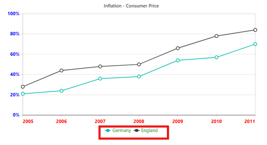
2. The legend is also small and light grey. I need to change the color, font size and make it bold.
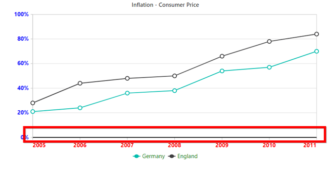
3. The line at y=0, meaning the x axis, needs to be dark black while the other lines in the graph can remain gray.
Please let me know how I can do them. I have attached the code snippet that I used along with an image of the chart.
Thanks,
Muhammad
Attachment: Syncfusion_aa816cd.zip
SIGN IN To post a reply.
7 Replies
SM
Srihari Muthukaruppan
Syncfusion Team
October 16, 2019 06:49 AM UTC
Hi Muhammad,
Greetings from syncfusion.
Please find the chart related query response.
>>>>>>>>>>>>>>>>>>>>>>>>>>>>>>>>>>>>>>>>>>>>>>>>>>>>>>>>>>>>>>>>>>>>>>>>>>>>>>>>>>>>>>>>>>>>>>>>>>>>>>>>>>>>>>
Query #1: The numbers on x and y axis are light grey and small. I need to change the color, font size and make it bold?
We have analyzed your query. From that, we would like to let you know that we can customize the x and y axis labels using “labelStyle” property of the chart Axis. Please find the below code snippet and sample for reference.
Code Snippet:
|
primaryXAxis: {
labelStyle: { size: "15", color: "Red", fontWeight: "Bold" },
},
primaryYAxis: {
labelStyle: { size: "15", color: "Blue", fontWeight: "Bold" }
}, |
Screenshot:
Query #2: The legend is also small and light grey. I need to change the color, font size and make it bold?
We have analyzed your query. From that, we can customize the legend shape using “shapeWidth” and “shapeHeight” property in legendSettings. And also we can customize the legend text using “textStyle” property in legendSettings. Please find the below code snippet and sample for reference.
Code Snippet:
|
legendSettings: {
shapeWidth: 20,
shapeHeight: 15,
textStyle: { size: "15", color: "Green" }
}, |
Screenshot:
Query #3: The line at y=0, meaning the x axis, needs to be dark black while the other lines in the graph can remain gray?
We have analyzed your query. From that, we can achieve your requirement using “lineStyle” property in primaryXAxis. Similarly, we could also customize the y axis line using “lineStyle” property in primaryYAxis. Please find the below code snippet and sample for reference.
Code Snippet:
|
primaryXAxis: {
lineStyle: { color: "Black" }
} |
Screenshot:
To know more information about the chart. Please refer our UG link shown below
>>>>>>>>>>>>>>>>>>>>>>>>>>>>>>>>>>>>>>>>>>>>>>>>>>>>>>>>>>>>>>>>>>>>>>>>>>>>>>>>>>>>>>>>>>>>>>>>>>>>>>>>>>>>>>
Let me know if you need further assistance.
Regards,
Srihari.
MS
Muhammad Safwat
October 16, 2019 03:18 PM UTC
Hi Srihari,
Attachment: Syncfusion_chart2_876e0143.zip
Thanks for your help. I solved most of the issues. I have one small update to be made:
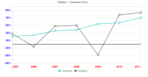
3. The line at y=0, meaning the x axis, needs to be dark black while the other lines in the graph can remain gray.
When I mentioned the above point, I always need the y=0 line to have a thicker shade than the other lines, not the x-axis. I tried to do that by using lineStyle as you had recommended along with crossesAt = 0 to have a thicker line. But that is not very helpful as the x-axis labels are overlapped by the waveforms at times. If you can suggest a better way to do this, it will be helpful.
Thanks,
Muhammad
Attachment: Syncfusion_chart2_876e0143.zip
SM
Srihari Muthukaruppan
Syncfusion Team
October 17, 2019 12:00 PM UTC
Hi Muhammad,
Please find the chart related query response.
>>>>>>>>>>>>>>>>>>>>>>>>>>>>>>>>>>>>>>>>>>>>>>>>>>>>>>>>>>>>>>>>>>>>>>>>>>>>>>>>>>>>>>>>>>>>>>>>>>>>>>>>>>>>>>
Query #1: The x-axis labels are overlapped by the waveforms at times. If you can suggest a better way to do this, it will be helpful?
We have analyzed your query. From that, we would like to let you know that we can avoid overlapping of xaxis labels with waveforms by setting “placeNextToAxisLine” property to false in primaryXAxis. Please find the below code snippet and sample for reference.
Code Snippet:
|
primaryXAxis: {
crossesAt: 0,
placeNextToAxisLine: false,
} |
Screenshot:
Query #2: I always need the y=0 line to have a thicker shade than the other lines, not the x-axis?
We have analyzed your query. We are not clear about the exact requirement, we suspect that you want to highlight the gridline never to 0. For this we can go with the above solution by moving the axis line at zero and placing the label below. If this solution doesn’t meet the requirement, kindly revert us with more information.
Code Snippet:
|
primaryYAxis: {
lineStyle: { color: "Black" }
} |
Screenshot:
>>>>>>>>>>>>>>>>>>>>>>>>>>>>>>>>>>>>>>>>>>>>>>>>>>>>>>>>>>>>>>>>>>>>>>>>>>>>>>>>>>>>>>>>>>>>>>>>>>>>>>>>>>>>>>
Let me know if you need further assistance.
Regards,
Srihari M
MS
Muhammad Safwat
October 22, 2019 04:33 PM UTC
Hi Srihari,
Attachment: Chart_with_trendlines_8650c0f.zip
Thanks for your support. I completed the design of the charts and they work fine. I have two questions for you:
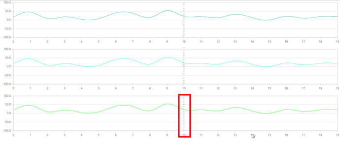
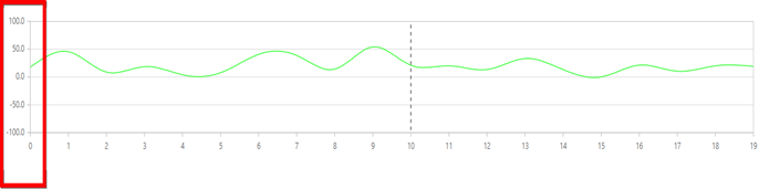
1. In the image I have attached, the black vertical line moves in real time when new data comes in. As seen in the graph, the vertical line is hidden behind the negative values in Chart 3, but not in Chart 2. I hope you can suggest a way to fix this.
2. As seen in the image, the limits of the graph 3 are from 40 to -62. That is the exact height of the black line. I want to make the black line go from 500 to -500, so that it can cover all the possible ranges in my case. Having said that, I don't want the chart to auto-scale based on the height of the black line but only based on the height of the flow data. The graph should have a height of the maximum and minimum of the flow data alone. The height of the black line should not change the height of the graph and re-scale it.
Please let me know how this can be done.
Thanks,
Muhammad
Attachment: Chart_with_trendlines_8650c0f.zip
SM
Srihari Muthukaruppan
Syncfusion Team
October 23, 2019 01:11 PM UTC
Hi Muhammad,
Please find the chart related query response.
>>>>>>>>>>>>>>>>>>>>>>>>>>>>>>>>>>>>>>>>>>>>>>>>>>>>>>>>>>>>>>>>>>>>>>>>>>>>>>>>>>>>>>>>>>>>>>>>>>>>>>>>>>>>>>
Query #1: the vertical line is hidden behind the negative values in Chart 3, but not in Chart 2?
We have analyzed your query. From that, we suspect that the binding of series might be the problem. Unfortunately, we are unable to reproduce the reported issue. We have prepared a sample based on your requirement. In that we have added a line series with data values ranges from -100 to 100 and the chart works fine. Please find the below sample used for testing.
Screenshot:
Query #2: I don't want the chart to auto-scale based on the height of the black line but only based on the height of the flow data?
We have analyzed your query. From that, we suggest you to use “minimum” and “maximum” property in primaryYAxis to achieve your requirement. We have prepared a sample based on your requirement in which the values of black line go from 500 to -500. But the chart scale remains the same based on the flow data. If this solution doesn’t meet the requirement, kindly revert us with more information which will be more helpful for further analysis and provide you the solution sooner.
Code Snippet:
|
primaryYAxis: {
minimum: -100,
maximum: 100,
}, |
Screenshot:
>>>>>>>>>>>>>>>>>>>>>>>>>>>>>>>>>>>>>>>>>>>>>>>>>>>>>>>>>>>>>>>>>>>>>>>>>>>>>>>>>>>>>>>>>>>>>>>>>>>>>>>>>>>>>>
Let me know if you need further assistance.
Regards,
Srihari M
MS
Muhammad Safwat
October 23, 2019 01:54 PM UTC
Hi Srihari,
Attachment: Chart_with_trendlines_f87fa8be.zip
Thanks for your response. I am performing data binding on chart 2 and chart 3 in the same manner. So I can't find out the reason why this is happening. In case you can reproduce the result at any time, please do let me know.
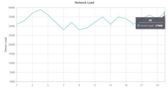
Also, the x-axis currently has 1280 data points. These correspond to data collected in exactly 20 seconds. So I would to display 0 - 20 on the x-axis instead of the data point number. In you can suggest a way to do, it will be helpful.
Thanks,
Muhammad
Attachment: Chart_with_trendlines_f87fa8be.zip
KC
Kalaimathi Chellaiah
Syncfusion Team
October 30, 2019 08:40 AM UTC
Hi Muhammad,
Thanks for the update.
We have analysed your query. From that, we suggest you to use lazy loading to achieve your requirement. In lazy load we can show specific data based on provided dataSource count using pointsLength property in scrollbarSettings. We have prepared a sample for your reference. Please find below sample and code snippet,
Code Snippet:
|
primaryXAxis: {
scrollbarSettings: {
pointsLength: 1280
}
},
series: [{
dataSource: GetNumericData(1, 20),
xName: 'x', yName: 'y',
type: 'Line', animation: { enable: false },
}], |
Screenshot:
Also here we have attached UG link for your reference,
Kindly check the above sample and revert us, if this is not your exact requirement.
Regards,
Kalai.
SIGN IN To post a reply.
- 7 Replies
- 3 Participants
-
MS Muhammad Safwat
- Oct 15, 2019 03:51 PM UTC
- Oct 30, 2019 08:40 AM UTC
