- Home
- Forum
- ASP.NET Core - EJ 2
- Compare multiple series
Compare multiple series
Hi,
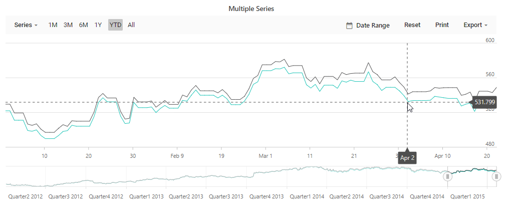
Thanks for a quick reply but this is not what the provided
link is showing. I want to compare two or more stocks with the y-axis showing
loss/gain in percent (%). Just plotting two stock data time series is often meaningless
since one stock can have a value of $1000 and another stock a value of $1.
Regards,
/Stefan
|
<div class="control-section" align="center">
<ejs-stockchart id="stockchartmultiple" load="chartLoad" indicatorType="indicator" trendlineType="line" title="Compare Stock data values">
<e-stockchart-primaryxaxis>
<e-crosshairtooltip enable="true"></e-crosshairtooltip>
</e-stockchart-primaryxaxis>
<e-stockchart-tooltipsettings enable="true" format="<b>${series.name} : ${point.y}</b>">
</e-stockchart-tooltipsettings>
<e-stockchart-crosshairsettings enable="true" lineType="Vertical"></e-stockchart-crosshairsettings>
<e-stockchart-series-collection>
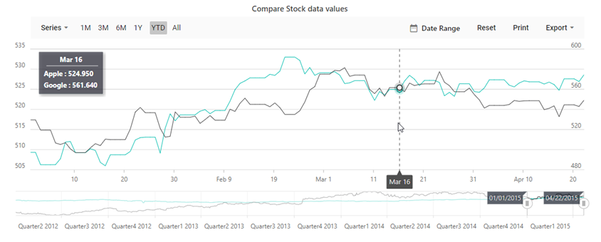
<e-stockchart-series type='Line' xName='x' yName='close' name='Apple'>
</e-stockchart-series>
<e-stockchart-series type='Line' xName='x' yName='close' name='Google'></e-stockchart-series>
</e-stockchart-series-collection>
</ejs-stockchart>
<div> |
Hi again,
If you look at the chart in the link below you see that the y-axis
is percentage. I want a stock chart that shows gains/losses in percentage over
the chosen period on the y-axis. Even if it's only one stock in the chart I want to show the performance
of the stock in percentage over the chosen period.
Regards,
/Stefan
|
<div class="control-section" align="center">
<ejs-stockchart id="stockchartmultiple" tooltipRender="tooltipRender" axisLabelRender="axisLabelRender" title="Compare Stock data values">
<e-stockchart-border width="0"></e-stockchart-border>
<e-stockchart-primaryxaxis >
<e-majorgridlines width="0"></e-majorgridlines>
<e-crosshairtooltip enable="true"></e-crosshairtooltip>
</e-stockchart-primaryxaxis>
<e-stockchart-primaryyaxis >
<e-linestyle color="transparent"></e-linestyle>
<e-majorticklines width="0" color="transparent"></e-majorticklines>
</e-stockchart-primaryyaxis>
<e-stockchart-tooltipsettings enable="true" ></e-stockchart-tooltipsettings>
<e-stockchart-crosshairsettings enable="true" lineType="Vertical"></e-stockchart-crosshairsettings>
<e-stockchart-series-collection>
<e-stockchart-series type='Line' xName='x' yName='close' name='Apple'>
</e-stockchart-series>
</e-stockchart-series-collection>
</ejs-stockchart>
<div>
<script>
function tooltipRender(args) {
var maximum = 0;
var percentage;
var average;
maximum = args.series.yAxis.visibleRange.max;
average = (args.series.yAxis.visibleRange.min + args.series.yAxis.visibleRange.max) / 2;
percentage = parseFloat(((args.point.close - average) / maximum * 100).toFixed(2));
args.text = "yValue:" + percentage + '%';
}
function axisLabelRender(args) {
if (args.axis.name === 'primaryYAxis') {
var maximum = 0;
var percentage;
var average;
maximum = args.axis.visibleRange.max;
average = (args.axis.visibleRange.min + args.axis.visibleRange.max) / 2;
percentage = Math.round(((args.value - average) / maximum)* 100);
args.text = percentage + '%';
}
}
</script> |
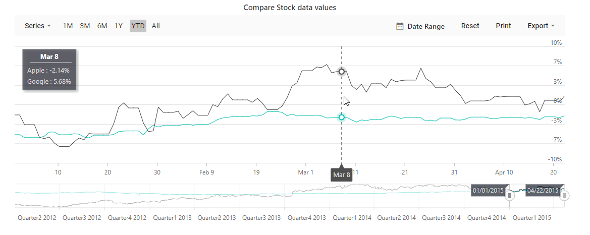
Hi again
Now we're close. I want the first value to the left to be 0%.
All series should start at the same point to the left at 0%. See attached image.
To achieve that I need the first visible value in each series.
Is this possible?
Regards,
Stefan

- 7 Replies
- 2 Participants
-
ST Stefan
- Oct 6, 2019 03:57 PM UTC
- Oct 11, 2019 10:01 AM UTC
