- Home
- Forum
- Xamarin.Forms
- Customizing navigation drawer
Customizing navigation drawer


<navigationdrawer:SfNavigationDrawer x:Name="navigationDrawer">
<navigationdrawer:SfNavigationDrawer.ContentView>
<StackLayout Orientation="Horizontal" BackgroundColor="Transparent" HeightRequest="600" WidthRequest="350">
<StackLayout BackgroundColor="#1aa1d6"
Orientation="Horizontal"
VerticalOptions="Center">
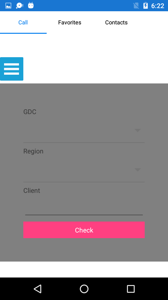
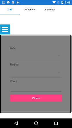
<Button x:Name="hamburgerButton"
HeightRequest="30"
WidthRequest="30"
HorizontalOptions="Start"
FontSize="20"
BackgroundColor="#1aa1d6"
Text="B"
Clicked="hamburgerButton_Clicked"/>
</StackLayout>
<tabview:SfTabView OverflowMode="Scroll" Margin="10" VisibleHeaderCount="3" x:Name="SLATabs" SelectionChanged="SLATabs_SelectionChanged">
...
</tabview:SfTabView>
</StackLayout>
</navigationdrawer:SfNavigationDrawer.ContentView>
<ScrollView>
<StackLayout>
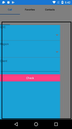
<Label Text="GDC"></Label>
<combobox:SfComboBox x:Name="comboGDC">
<combobox:SfComboBox.ComboBoxSource>
<sys:List x:TypeArguments="x:String">
<x:String>GDC 1</x:String>
<x:String>GDC 2</x:String>
</sys:List>
</combobox:SfComboBox.ComboBoxSource>
</combobox:SfComboBox>
<Label Text="Region"></Label>
<combobox:SfComboBox x:Name="comboRegion">
<combobox:SfComboBox.ComboBoxSource>
<sys:List x:TypeArguments="x:String">
<x:String>AP</x:String>
<x:String>EU</x:String>
<x:String>AM</x:String>
<x:String>MEA</x:String>
</sys:List>
</combobox:SfComboBox.ComboBoxSource>
</combobox:SfComboBox>
<Label Text="Client"></Label>
<Entry />
<buttons:SfButton Text="Check"/>
</StackLayout>
</ScrollView>
</navigationdrawer:SfNavigationDrawer.DrawerContentView>
</navigationdrawer:SfNavigationDrawer>
UG Link:
Kanimozhi G


|
<Grid>
<Grid.RowDefinitions>
<RowDefinition Height="100" />
<RowDefinition Height="600" />
<RowDefinition />
</Grid.RowDefinitions>
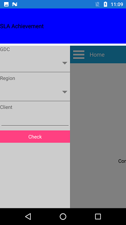
<StackLayout Grid.Row="0">
<Label
Text="SLA Achievement"
FontSize="16"
TextColor="Black"
HeightRequest="100"
VerticalTextAlignment="Center"
BackgroundColor="Blue" />
</StackLayout>
<navigationdrawer:SfNavigationDrawer Grid.Row="1" x:Name="navigationDrawer" DrawerWidth ="200" DrawerHeaderHeight="0" Transition="Reveal">
<navigationdrawer:SfNavigationDrawer.ContentView>
<Grid x:Name="mainContentView" BackgroundColor="White">
<Grid.RowDefinitions>
<RowDefinition Height="auto"/>
<RowDefinition/>
</Grid.RowDefinitions>
<StackLayout BackgroundColor="#1aa1d6" Orientation="Horizontal">
<Button x:Name="hamburgerButton" HeightRequest="50" WidthRequest="50" HorizontalOptions="Start" FontSize="20" BackgroundColor="#1aa1d6" Clicked="hamburgerButton_Clicked"/>
<Label x:Name="headerLabel" HeightRequest="50" HorizontalTextAlignment="Center" VerticalTextAlignment="Center" Text="Home" FontSize="16" TextColor="White" BackgroundColor="#1aa1d6"/>
</StackLayout>
<Label Grid.Row="1" x:Name="contentLabel" VerticalOptions="Center" HorizontalOptions="Center" Text="Content View" FontSize="14" TextColor="Black"/>
</Grid>
</navigationdrawer:SfNavigationDrawer.ContentView>
<navigationdrawer:SfNavigationDrawer.DrawerContentView>
<ScrollView>
<StackLayout>
<Label Text="GDC"></Label>
<combobox:SfComboBox x:Name="comboGDC">
<combobox:SfComboBox.ComboBoxSource>
<ListCollection:List x:TypeArguments="x:String">
<x:String>GDC 1</x:String>
<x:String>GDC 2</x:String>
</ListCollection:List>
</combobox:SfComboBox.ComboBoxSource>
</combobox:SfComboBox>
<Label Text="Region"></Label>
<combobox:SfComboBox x:Name="comboRegion">
<combobox:SfComboBox.ComboBoxSource>
<ListCollection:List x:TypeArguments="x:String">
<x:String>AP</x:String>
<x:String>EU</x:String>
<x:String>AM</x:String>
<x:String>MEA</x:String>
</ListCollection:List>
</combobox:SfComboBox.ComboBoxSource>
</combobox:SfComboBox>
<Label Text="Client"></Label>
<Entry />
<buttons:SfButton Text="Check"/>
</StackLayout>
</ScrollView>
</navigationdrawer:SfNavigationDrawer.DrawerContentView>
</navigationdrawer:SfNavigationDrawer>
</Grid> |


- 10 Replies
- 3 Participants
-
BE Benjamin
- Sep 17, 2019 01:48 PM UTC
- Sep 24, 2019 08:59 AM UTC
