- Home
- Forum
- Angular - EJ 2
- Stacked bar chart with line chart
Stacked bar chart with line chart
Hi all,
I want to create stacked bar chart with line chart. My requirement as below,
1. This chart will use a stacked bar chart and left Y-axis represent numeric values with no specific interval.
Right Y-axis represent percentage and both Y-axises max set based on the value.
2. X-axis represent the date for each of the past 365 days, including today, with the oldest date on the left and the newest date on the right. (Interval should use monthly)
3. This chart also will include a line chart to represent two dashed-lines align with above mapped axises. (Note: One line should be represent the percentage right Y-axis and other one will represent left Y-axis with normal numeric value and both lines will use shared X-axis)
4. This chart will include a legend to the left side of the chart and displaying the color and data name of each of the represented data.
(Note: The maximum number of supported data is 10 without two lines of chart (All 12 legends) and legend name can be displayed 20 characters with horizontal scroll bar)
Data format
function getChartData(): Object[] {
let chartData: Object[] = [{
'date': new Date(704692800000),
'stackedData1': 2.5,
'stackedData2': 3.0,
'stackedData3': 1.0,
'stackedData4': null,
'stackedData5': null,
'stackedData6': null,
'stackedData7': null,
'stackedData8': 3.5,
'stackedData9': null,
'stackedData10': 2.5,
'lineData1': 1.2,
'lineData2': 25, // Percentage value
},
{
'date': new Date(1273185387),
'stackedData1': null,
'stackedData2': null,
'stackedData3': 1.5,
'stackedData4': 2.5,
'stackedData5': 1.0,
'stackedData6': null,
'stackedData7': null,
'stackedData8': 4.0,
'stackedData9': 1.0,
'stackedData10': null,
'lineData1': 1.8,
'lineData2': 50, // Percentage value
}
// Other rows here
];
return chartData;
}
Please be kind enough to give me a stackblitz example for my convenience.
Thank you...
SIGN IN To post a reply.
3 Replies
KC
Kalaimathi Chellaiah
Syncfusion Team
July 31, 2019 10:34 AM UTC
Hi Neo,
Greetings from Syncfusion.
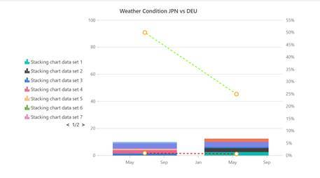
We have analyzed your queries. We have prepared a sample with your data based on your all queries. Also we would like to let you know that, In EJ2 we have used legend paging instead of legend scrollbar support. Please find below sample and screenshot,
Screenshot:
Also here we have attached UG and demo links for your reference,
UG: https://ej2.syncfusion.com/angular/documentation/chart/axis-customization/?no-cache=1#multiple-axis
Hope this helps.
Regards,
Kalai.
NE
Neo
August 13, 2019 01:52 PM UTC
Hi,
It's working perfectly. I have few things to do further. My requirement as below,
* I want to enable drill-down in the chart. The chart X-axis should be separated into two sections which are divided from the 365 days. These two sections are clickable.
Left section contains 182 days and right section contains 183 days. If either side is clicked then the display will be redrawn the chart in full screened dialog modal with the new time period being set by the duration of the section being selected. In the next level that selected section (Assume left 182 section) can be clickable which separated into 6 section indicating monthly. Lastly, if user selected one of sections 6 that duration of the section should be represent in the chart.
Original chart - [182 Days][183 Days]
New chart in the Dialog - [30 Days][30 Days][31 Days][31 Days][30 Days][30 Days] - Section 1,
[30 Days][30 Days][31 Days][31 Days][31 Days][30 Days] - Section 2
Same chart in the Dialog - [30 Days] - Some selected month
Note: - X-axis represent the date for past 365 days, including today, with the oldest date on the left and the newest date on the right.
- Open dialog modal for first level only. Other levels should be show in the same chart.
Highly appreciate your support.
Thank you.
KM
Kesavan Muthusamy
Syncfusion Team
August 14, 2019 12:47 PM UTC
Hi Isanka,
We have analyzed your query. We have prepared a sample for your requirements. While clicking on the chart, based on the range in x axis, another chart with required range will be opened in dialog. Again clicking on the chart which is rendered in dialog, it re rendered in the same chart.
Sample link:
We have prepared the stackblitz sample link.
And also please refer the sample link for single level drill down on point on the chart.
Kindly revert us if this sample, doesn’t meet your requirement.
Regards,
Kesavan
SIGN IN To post a reply.
- 3 Replies
- 3 Participants
-
NE Neo
- Jul 30, 2019 12:23 PM UTC
- Aug 14, 2019 12:47 PM UTC
