keep selected a button when I click on it. And select a button programmatically
Good morning.
First question:
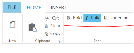
I have a project of Angular 6 with typescript. I would like to keep selected a button when I click on it, as you can see in the next image. How can I do it?

Second question:
In the same project, I would like to select this programmatically. Can I use the configuration json for it?
I will be waiting for your reply, thank you in advance.
Regards, Luis Carlos.
SIGN IN To post a reply.
3 Replies
CI
Christopher Issac Sunder K
Syncfusion Team
July 22, 2019 09:10 AM UTC
Hi Luis,
Thank you for contacting Syncfusion support.
We suggest you to add toggle button as item inside Ribbon with toggleState set to “true” which will render the button with selected state initially. Please refer to the below given code
|
content: [{
groups: [{
id: 'bold', toolTip: 'Bold', type: 'togglebutton',
toggleButtonSettings: { contentType: 'imageonly', defaultText: 'Bold', activeText: 'Bold', defaultPrefixIcon: 'e-ribbon e-icon bold', activePrefixIcon: 'e-ribbon e-icon bold' }
}, {
id: 'italic', toolTip: 'Italic', type: 'togglebutton',
toggleButtonSettings: {
contentType: 'imageonly',
defaultText: 'Italic',
activeText: 'Italic',
toggleState: true,
defaultPrefixIcon: 'e-ribbon e-icon e-ribbonitalic',
activePrefixIcon: 'e-ribbon e-icon e-ribbonitalic'
}
},
{
id: 'underline', toolTip: 'Underline', type: 'togglebutton',
toggleButtonSettings: {
contentType: 'imageonly',
defaultText: 'Underline',
activeText: 'Underline',
toggleState: true,
defaultPrefixIcon: 'e-ribbon e-icon e-ribbonunderline',
activePrefixIcon: 'e-ribbon e-icon e-ribbonunderline'
}
}]
}] |
If you need to set this programmatically during tab selection then you can set this via setModel through tabSelect event of Ribbon as shown below
|
onSelect(event)
{
if (event.activeIndex == 1) {
var toggleObj = $("#Default_bold").data("ejToggleButton");
toggleObj.setModel({ toggleState: true })
}
} |
We have attached a sample for your reference which can be downloaded from the below given link
Please get back to us if you require any further assistance.
Thanks,
Christo
LC
Luis Carlos
July 23, 2019 04:14 PM UTC
Thank you for your reply, however your solution was a ToggleButton component and I need a Button component because I need text and image.
In your sample attached I saw Buttons in the Insert tab. I would like to click on one of those buttons and it appears selected, then click on another button and ONLY that button appears selected and the previous button should appears deselected now.
I will be waiting for your reply, thank you in advance.
Regards, Luis Carlos.
CI
Christopher Issac Sunder K
Syncfusion Team
July 24, 2019 10:38 AM UTC
Hi Luis,
We have checked your requirement of including both text and image in button. We suggest you to set contentType as “TextAndImage” to show both text and image content in a toggle button. We have included toggle buttons inside “Home” tab of our example. Please refer to the following code
|
content: [{
groups: [{
id: 'bold', toolTip: 'Bold', type: 'togglebutton',
toggleButtonSettings: { contentType: 'TextAndImage', defaultText: 'Bold', activeText: 'Bold', defaultPrefixIcon: 'e-ribbon e-icon bold', activePrefixIcon: 'e-ribbon e-icon bold' }
}, {
id: 'italic', toolTip: 'Italic', type: 'togglebutton',
toggleButtonSettings: {
contentType: 'TextAndImage',
defaultText: 'Italic',
activeText: 'Italic',
toggleState: true,
defaultPrefixIcon: 'e-ribbon e-icon e-ribbonitalic',
activePrefixIcon: 'e-ribbon e-icon e-ribbonitalic',
}
},
{
id: 'underline', toolTip: 'Underline', type: 'togglebutton',
toggleButtonSettings: {
contentType: 'TextAndImage',
defaultText: 'Underline',
activeText: 'Underline',
toggleState: true,
defaultPrefixIcon: 'e-ribbon e-icon e-ribbonunderline',
activePrefixIcon: 'e-ribbon e-icon e-ribbonunderline'
}
}]
}] |
Now both text and image will be displayed as shown below
To select or deselect this button dynamically , you can use “toggleState” property through button instance as suggested in our previous update.
This contentType is applicable for all type of buttons and you can use the required button type based on your requirement. Please refer to the below demo link for different types of button and if we have misunderstood, please let us know the exact button type you prefer to use in your application.
Thanks,
Christo
SIGN IN To post a reply.
- 3 Replies
- 2 Participants
-
LC Luis Carlos
- Jul 16, 2019 09:35 AM UTC
- Jul 24, 2019 10:38 AM UTC
