Datalabels not displaying well
Hi
I have some problems on displaying data labels on column stacked bars.
Here there is a link with a custom chart with this problem:
I've enabled the "enableSmartLabels" option for all data labels except the blue one where I set it as "false".
in the second chart ("st 2011") the blue label is not displaying well, the top is cut.
If i use "enableSmartLabels" also for the blue label, the blue label in second chart is not displayed.
can you help me?
thank you
SIGN IN To post a reply.
1 Reply
DD
Dharanidharan Dharmasivam
Syncfusion Team
February 14, 2017 07:04 AM UTC
Hi Luca,
Thanks for using Syncfusion product.
We have analyzed your query with the provided sample. We would like to let you know that, only the minimum and maximum values of the data points are considered for axis range calculation. And the data label height or width will not be considered, thus the data label moves out of chart area and will get clipped. This is the current behavior of dataLabel.
But your requirement can be achieved by following any one of the below methods.
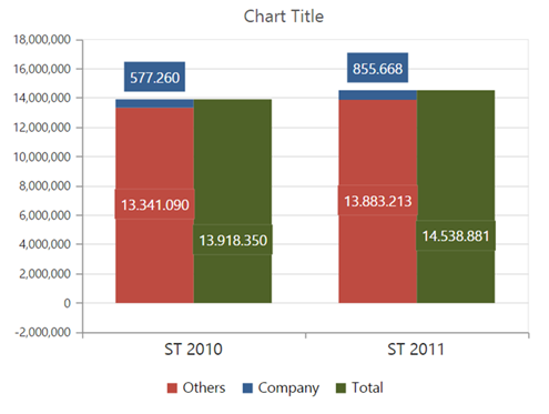
Method 1: You can use rangePadding property to the primaryYAxis. This will add the interval of axis with minimum and maximum values. Kindly find the code snippet below.
| [JS] $("#chart").ejChart( { primaryYAxis: { rangePadding: "additional" }, //... }); |
Screenshot:
For more information about rangePadding, kindly use the below link.
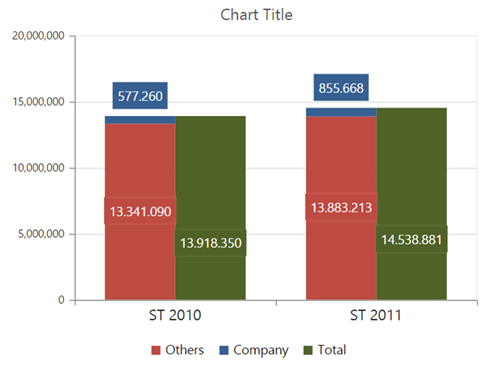
Method 2: As workaround by using axesRangeCalculate event. In this event, you can customize the range of the axis. Find the code snippet below.
| $("#chart").ejChart( { axesRangeCalculate: "axisRange", //... }); function axisRange(sender) { if (sender.data.axis.orientation == "vertical") sender.data.range.max += sender.data.range.interval; } |
Screenshot:
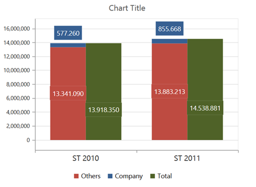
Method 3: You can use plotOffset property for the primaryYAxis. This property will set the padding for the primaryYAxis. Find the code snippet below.
| primaryYAxis: { plotOffset: 20, }, |
Screenshot:
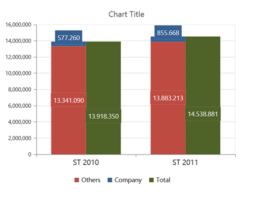
Method 4: You can specify the verticalTextAlignment property of dataLabel to near, so that it won’t get clipped.
| "marker": { "dataLabel": { "textPosition": "top", "verticalTextAlignment" : "near" } } |
Screenshot:
Or else you can specify the offset property of dataLabel with negative value.
| "marker": { "dataLabel": { "textPosition": "top", offset:-10 } } |
For your reference we have attached the sample in the below location.
Sample Link: https://jsplayground.syncfusion.com/qqxbnjq4
Thanks,
Dharani.
SIGN IN To post a reply.
- 1 Reply
- 2 Participants
-
LU Luca
- Feb 13, 2017 06:08 PM UTC
- Feb 14, 2017 07:04 AM UTC
