- Home
- Forum
- ASP.NET MVC
- Need Assistance to Identify the Contextual Charting
Need Assistance to Identify the Contextual Charting
Team,
I have a following data and would like to know which chart would be the best and if some one can help me with configuring the same it would be great.
{"HeartBeatRate":952.0,
"Compensation":1.0,
"CalibratedBreakEven":50.0,
"Configuration":{"ParameterX":{"Bass":0.0,"Double":1.0},
"ParameterY":{"Bass":0.0,"Double":1.0},
"ParameterZ":{"Bass":0.0,"Double":1.0},
"InputX":{"Bass":0.0,"Double":1.0},
"InputY":{"Bass":0.0,"Double":1.0},
"InputZ":{"Bass":0.0,"Double":1.0}
}
}
P X P Y P Z I X I Y I Z Time Index
-0.0699 0.0417 0.5712 280.5176 -205.1392 85.0677 2016-09-08T11:54:18.7316444 0
-0.0605 0.0381 0.6282 496.2769 -474.6552 236.9080 2016-09-08T11:54:18.7316444 1
0.0402 -0.0038 1.0721 99.3500 -112.9608 62.4542 2016-09-08T11:54:18.7496444 2
0.1198 -0.0300 1.3649 -472.7936 432.9681 -229.7211 2016-09-08T11:54:18.7496444 3
SIGN IN To post a reply.
5 Replies
SK
Saravana Kumar Kanagavel
Syncfusion Team
September 29, 2016 12:49 PM UTC
Hi Deepak,
Thanks for contacting Syncfusion Support.
We have analyzed your query and data provided by you. But we need your use case scenario to suggest the series type.
If you wish to showcase a trend of data, then you can use line type charts (line, spline, area)
And if you wish to show high and low comparison between data, then you can use column type series.
If you need to show financial data, you can use financial type of series (Hilo, hiloOpenClose)
And if you wish to show accumulated data you need to use accumulation series (pie, doughnut, pyramid and polar)
So kindly share your use case scenario and data that you are binding to chart. As of now we have prepared a line chart sample for your reference and attached in the below location.
Please find the output of the plotted chart using your provided data from the below
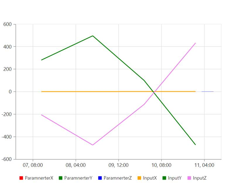
In the above output, first three series values are very less when compared with the other three series values. So, those series point values are invisible. But this can be viewed by zooming the chart.
And if you want to display all the series point values clearly, then you can use multiple axes in chart. Find the output of the sample below
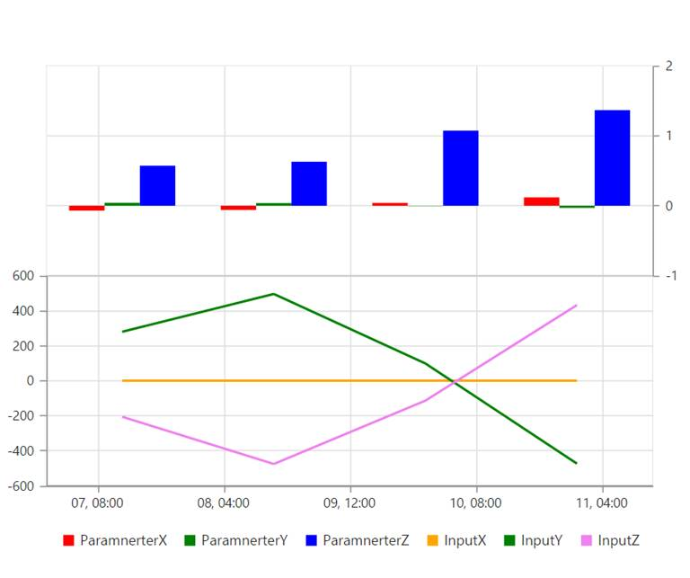
In this we have grouped the series based on its points Y value and bind it to two different axes for clear view.
Please revert us the below details, if your query is misunderstood at our end or if you face any concern on this.
v Detailed explanation about your requirement and your sample
v And also revert us with data source(X and Y values) to bind for each series.
Regards,
Saravana Kumar K
LA
lavanyadeepak
October 3, 2016 11:45 AM UTC
Hello Team,
Attachment: download_343caf61.rar
I would go with the Line Chart. The X-Axis is going to the Time and ParameterX,ParameterY, ParameterZ, InputX, InputY and InputZ would go as lines in the Y Axis. I modified the code you have sent below
<div>
@(Html.EJ().Chart("last30")
.PrimaryXAxis(p=>p.ValueType(AxisValueType.Datetime))
.RowDefinitions(Rowdef =>
{
Rowdef.RowHeight(50).LineColor("gray").LineWidth(0).Unit("percentage").Add();
Rowdef.RowHeight(50).LineColor("#A8A8A8").LineWidth(1).Unit("percentage").Add();
})
.Axes(a=>
a.Name("yAxis1").OpposedPosition(true).Orientation("vertical").RowIndex(1).Add())
.CommonSeriesOptions(c=>c.EnableAnimation(true))
.Series(ser =>
{
ser.Name("ParamnerterX").Fill("red").Type(SeriesType.Line).YAxisName("yAxis1").Add();
ser.Name("ParamnerterY").Fill("green").Type(SeriesType.Line).YAxisName("yAxis1").Add();
ser.Name("ParamnerterZ").Fill("blue").Type(SeriesType.Line).YAxisName("yAxis1").Add();
ser.Name("InputX").Fill("orange").Type(SeriesType.Line).YAxisName("yAxis1").Add();
ser.Name("InputY").Fill("green").Type(SeriesType.Line).YAxisName("yAxis1").Add();
ser.Name("InputZ").Fill("violet").Type(SeriesType.Line).YAxisName("yAxis1").Add();
})
.Load("onChartLoad")
.Legend(lg => lg.Visible(true))
.IsResponsive(true)
.Size(s=>s.Height("450").Width("600"))
)
</div>
And it showed up as:
I would need the series to be populated at runtime. Would the component support it?
Attachment: download_343caf61.rar
SK
Saravana Kumar Kanagavel
Syncfusion Team
October 4, 2016 09:53 AM UTC
Hi Deepak,
Thanks for your update.
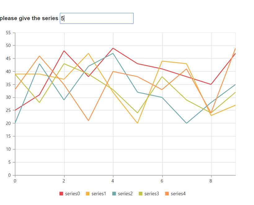
We have analyzed your query and created a sample based on your requirement. In a sample, we can get the user input value with the no. of the series to be rendered and populated the series dynamically in chart based on the user value.
Please refer the code example below
| [JS] function change(sender) //onChange Event triggered { window.val = parseInt(sender.value); if(val > 10) window.val = 10; var chart = $("#container").ejChart("instance"); chart.model.series = []; for (var i = 0; i < window.val; i++) { var points = []; for (var j = 0; j < 10; j++) { var random = parseInt(getRandomInt(20, 50)); points.push({ x: j, y: random }); } chart.model.series.push({ dataSource: points, xName: "x", yName: "y", type: "line" }); } chart.redraw(); } function getRandomInt(min, max) { return Math.floor(Math.random() * (max - min + 1)) + min; } |
In the above code while changing the value in the text box, we have dynamically created series based on the user value and generated a points using random values and redrawing the chart.
Refer a sample from the below location.
Please find the output of the sample below
Please let us know if you have any concern.
Regards,
Saravana Kumar K
LA
lavanyadeepak
October 4, 2016 11:47 AM UTC
Hi Team,
I have modified the application but having issues with the Chart Control. I have created a Incident for the same here:
https://www.syncfusion.com/support/directtrac/incidents/164913
AT
Anandaraj T
Syncfusion Team
October 6, 2016 12:49 PM UTC
Hi Deepak,
Thanks for the update.
We have modified the sample as per your requirement and attached it in the support incident mentioned by you under your direct trac account.
Regards,
Anand
SIGN IN To post a reply.
- 5 Replies
- 3 Participants
-
LA lavanyadeepak
- Sep 28, 2016 10:54 AM UTC
- Oct 6, 2016 12:49 PM UTC
