Chart SDK
Turn complex data into clear, interactive visuals with the Chart SDK
No credit card required.
 React
React Blazor
 Angular
 JavaScript
 Vue
Vue ASP.NET Core
 .NET MAUI
 ASP.NET MVC
 WPF
WPF WinForms
 WinUI
WinUI UWP
UWPTurn complex data into interactive visuals across major frameworks
Trusted by 41K+
organizations worldwide
25+ years
of UI component expertise
3.3K+ Chart
demos and examples
39.6M+ downloads
of the component libraries
Try Our Live Demo
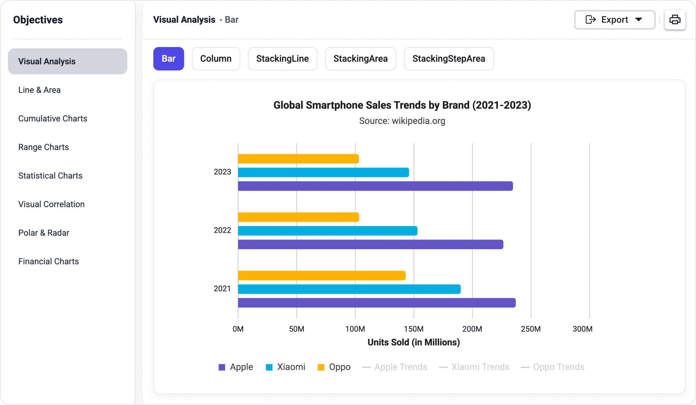



Turn live data into actionable dashboards
Build real-time chart dashboards that help users monitor performance, spot unusual trends, and respond faster to changing application, business, and system metrics.
Try Our Live Demo

Make every chart tell the right story
Customize labels, tooltips, legends, and axes so users can understand trends, compare values, and glean chart insights faster.
- Use custom data labels to highlight values, icons, badges, and key points.
- Add tooltips with richer context for trends, comparisons, and details.
- Style legends to match your product and clarify multiple data series.
- Tailor axis labels for categories, dates, values, and business-specific formats.
Keep every chart visually consistent
Use built-in themes and flexible styling to keep charts visually aligned across dashboards and reports.
- Start with Material, Bootstrap, Tailwind, or Fluent themes.
- Switch between light and dark modes without rebuilding chart styles.
- Align chart colors, typography, spacing, and interaction states with your brand.
- Deliver a consistent visualization experience across devices and dashboards.


Analyze market trends with interactive Stock Charts
Build financial charting experiences with candlestick and OHLC charts. Include technical indicators, range navigation, and interactive tools that help users explore market and time-series data faster.
AI-ready Charts for faster data insights
Use forecasting, anomaly detection, and AI-assisted recommendations to help users spot trends, identify unusual patterns, and choose the right visualization faster.
Available on

Predictive forecasting
Anomaly detection
Smart chart recommendations
Everything teams need to build powerful charting experiences
Build scalable data visualization experiences with a wide variety of chart types, real-time updates, large data rendering, rich interactivity, export options, accessibility, and customization.

Wide range of chart types
Create line, area, column, bar, pie, doughnut, financial, polar, radar, and combination Charts to visualize different business and analytical data scenarios.

High-performance rendering
Render large datasets and frequent updates with optimized chart performance for smooth and responsive visualization experiences.

Real-time data updates
Display live, streaming data with dynamic updates for monitoring dashboards, IoT applications, and operational analytics.

Multiple axis types
Use numeric, category, date-time, logarithmic, and multi-axis configurations to represent complex datasets clearly.

Zooming and panning
Explore large datasets with smooth zooming, panning, scrolling, and range navigation interactions.

Crosshairs and trackball
Enable precise data point analysis with interactive crosshairs and trackball support.

Rich tooltips and data labels
Display contextual values, summaries, and labels to make chart insights easier to glean.

Selection and highlighting
Highlight data points, series, or ranges to focus attention on specific information.

Annotations and custom templates
Add text, shapes, markers, lines, and custom templates to explain key chart data and trends.

Export and print
Export Charts to image, PDF, Excel, or other supported formats and print visualizations for reporting and sharing.

Accessibility and keyboard navigation
Support inclusive data visualization experiences with accessibility features and keyboard navigation.

Globalization and localization
Provide localized formatting, languages, cultures, and chart experiences for global applications.
One SDK for every data visualization need
Build interactive Charts, financial visualizations, Gauges, Maps, HeatMaps, TreeMaps, Sparklines, and Dashboard experiences with the Chart SDK.
Charts
Create Cartesian Charts such as line, area, column, and bar charts with multiple series, axes, legends, tooltips, zooming, animation, and interactive exploration.
Available on
Accumulation Charts
Visualize proportions and part-to-whole relationships using pie, doughnut, funnel, and pyramid charts with labels, legends, and smart layouts.
Available on
Bullet Chart
Compare actual values against targets with compact KPI visualizations, qualitative ranges, and performance indicators.
Available on
3D Charts
Add depth to analytical visualizations with 3D column, bar, line, and area charts.
Available on
3D Circular Chart
Display category distribution with 3D pie and doughnut charts that support rotation, explosion, and engaging visual exploration.
Available on
Stock Chart
Build financial and time-series visualizations with candlestick and OHLC charts, indicators, range selection, and interactive market analysis tools.
Available on
Smith Chart
Plot impedance and admittance data for RF engineering, transmission line analysis, and circuit design workflows.
Available on
Sparkline Chart
Show compact trend visualizations within dashboards, grids, tables, and KPI summaries using line, column, and area sparklines.
Available on
Range Selector
Filter, zoom, and explore large time-series datasets with an interactive range-selection experience.
Available on
Sankey
Visualize flow, movement, and relationships between entities using node-link diagrams where link width represents magnitude.
Available on
Maps
Create geographic data visualizations with layers, markers, shapes, tooltips, and interactive spatial analysis.
Available on
TreeMap
Display hierarchical data as nested rectangles for proportional comparison, category analysis, and drill-down exploration.
Available on
HeatMap
Represent data intensity with color gradients to identify patterns, correlations, anomalies, and density in large datasets.
Available on
Circular Gauge
Display real-time metrics with radial scales, pointers, ranges, and customizable indicators in dashboards and monitoring systems.
Available on
Linear Gauge
Visualize measurements, progress, thresholds, and KPI values using horizontal or vertical scales with markers and ranges.
Available on
Digital Gauge
Show live numeric values with segmented digital displays for control panels, counters, dashboards, and monitoring systems.
Available on
Sunburst Chart
Represent hierarchical data through multilevel radial rings with category segmentation and drill-down exploration.
Available on
Barcode Generator
Generate 1D and 2D barcodes such as Code 128, Code 39, QR Code, and data matrices for business, inventory, retail, and logistics workflows.
Available on
Surface Chart
A Surface Chart is a 3D visualization that shows relationships among three variables using a continuous surface defined by color and height.
Available on
Chart Wizard
Quickly build and configure charts with guided steps. Use the interface to manage data, styling, and all elements to produce accessible, responsive, production ready results.
Available on
Dashboard Layout
Build responsive dashboards with draggable, resizable, and persistent panels for analytics, monitoring, and admin applications.
Available on
Why choose the Syncfusion Chart SDK
Choose the Syncfusion Chart SDK to build high-performance, interactive, and scalable data visualization experiences with broad platform support, rich features, and a highly responsive support team.

Comprehensive visualization SDK
Access Charts, Stock Charts, Gauges, Maps, HeatMaps, TreeMaps, Sparklines, Sankey Diagrams, Barcode Generation, and Dashboard Layout capabilities in one SDK.

High-performance data visualization
Build responsive charting experiences for large datasets, real-time dashboards, and complex analytics workflows.

Better product evaluation
Evaluate charting, dashboard, financial, geographic, and specialized visualization capabilities in one SDK package.

Cross-platform development
Build visualization experiences for popular web, desktop, and mobile platforms with consistent Syncfusion support.

Expert developer support
Access Syncfusion documentation, technical support, product updates, and implementation guidance to keep development and maintenance moving smoothly.
Create chart experiences faster with AI
Use Syncfusion AI tools to turn data visualization requirements into configured chart, dashboard, and analytics experiences with less manual setup and faster implementation.

Agentic UI Builder
Describe the screen you need and generate a ready-to-use Charts layout with Syncfusion components.
Example Prompt: Create a professional business dashboard with a line chart for monthly revenue, a bar chart for product-wise revenue, and a pie chart for regional sales distribution.

Agent Skills
Guide your AI coding agent with verified Syncfusion Charts APIs, setup steps, and implementation patterns.
Example Prompt: Generate an inventory management dashboard with three charts (bar, line, and pie), and a detailed inventory table using the sample data.

AI Coding Assistant
Ask questions in your IDE to generate, configure, integrate, and debug Charts code.
Example Prompt: Show how to bind remote data and enable zooming in Syncfusion React Charts.
Trusted by developers building data visualization apps


Frequently asked questions
What is the Chart SDK?
The Chart SDK is a standalone data visualization package for building interactive Charts, Gauges, Maps, Dashboards, financial visualizations, and specialized analytics experiences in modern applications.
Which platforms and frameworks are supported by the Chart SDK?
The Chart SDK supports: React, Blazor, Angular, JavaScript, Vue, ASP.NET Core, .NET MAUI, ASP.NET MVC, WPF, WinForms, WinUI and UWP. Support varies by component.
Does the Chart SDK support AI visualization experiences?
Yes. The Chart SDK can support AI visualization experiences such as forecasting, anomaly detection, and intelligent insights. Support may vary by platform and visualization type.
How can I get pricing details for the Chart SDK?
Please visit our pricing page to request a quote. Our sales team will contact you shortly to provide further assistance.
Resources
Learn more about our Chart SDK
Explore demos, KB articles, and documentation to get the most out of our Chart SDK.
Documentation
Explore guides, APIs, and quick-start tips
Knowledge base articles
Find solutions and best practices fast
Example demos
See live use cases in action
Contact support
Get expert help when you need it
Community forum
Ask, share, and connect with peers
Feature requests and bug reports
Track issues and suggest improvements
See real success stories
Developers around the world trust Syncfusion’s Essential Studio to simplify complex projects and speed up delivery. With a vast library of UI controls, powerful SDKs, and reliable support, Essential Studio helps teams build enterprise-ready applications with confidence.
Read Our Customer StoriesIndustry
Software development
75% Cost reduction
50% Faster development

Industry
Utilities (oil and gas)

450+ hours saved
Streamlined processes and hours of development effort saved.

Advanced, flexible features
Empowered users through robust and versatile functionality.
Industry
Software and technology
1000+ of hours saved
Accelerated development with enterprise-ready UI components.

Efficient file management
Streamlined workflows with document libraries without building them from scratch.
Industry
Software and technology

2 Years of delay avoided
Two years of delays prevented with proactive planning.

On-time delivery
Projects delivered on schedule using trusted controls.
Industry
IT services and IT consulting

Improved performance
Large datasets handled with easy customization and quick debugging.

Highly customizable
Plug-and-play controls with quick template integration.
Industry
Professional services
Instant access
Quick availability of features and resources.
Reduced dependencies
Fewer dependencies for faster development.
Build better data visualization experiences with the Chart SDK
Build high-performance Charts, financial visualizations, gauges, maps, heat maps, and dashboards. Deliver interactive data experiences for analytics, monitoring, reporting, and enterprise applications.
No credit card required.| 39.6M+ downloads
 React
React Blazor
 Angular
 JavaScript
 Vue
Vue ASP.NET Core
 .NET MAUI
 ASP.NET MVC
 WPF
WPF WinForms
 WinUI
WinUI UWP
UWPRecent activities in the Chart SDK
Stay updated with the latest Chart SDK videos and blogs from Syncfusion, including new content, product updates, and helpful resources.
Awards
Greatness—it’s one thing to say you have it, but it means more when others recognize it. Syncfusion® is proud to hold the following industry awards.