Trusted by the world’s leading companies

Overview
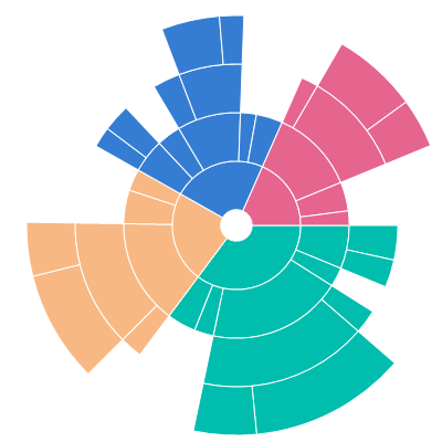
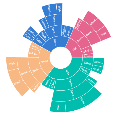
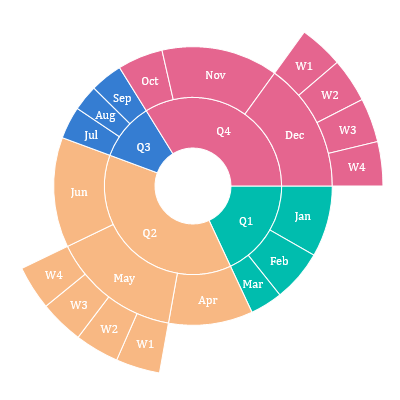
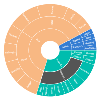
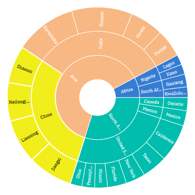
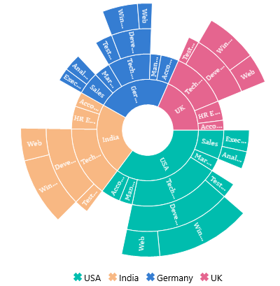
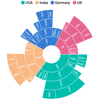
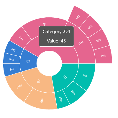
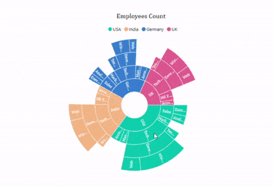
The UWP Sunburst Chart visualizes hierarchical data using a concentric circle layout. The innermost circle represents the root level in the hierarchy. Its rich feature set includes functionalities like data binding, legends, animations, data labels, selection, tooltips, and drill-down.
Sunburst levels
Add more than one hierarchical data level in the levels collection.

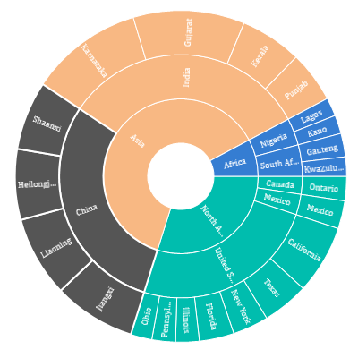
Hierarchical levels
Visualize levels for a hierarchical data collection that contains tree-structured data.
Radius
Customize the inner and outer radii of a sunburst chart.
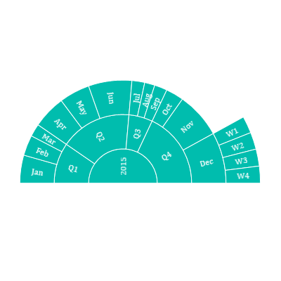
Angle customization
Customize the start and end angles of a sunburst chart to any direction to improve readability.
Data labels
Easily annotate the UWP Sunburst Chart segments with labels to help improve readability of data.
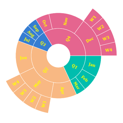
Label customization
Customize the look and feel of the default labels using the font style, size, and color properties.
Label overflow
Handle data overlapping or overflowing out of segments using label trimming and hiding functionalities.
Display mode
Display the data labels in either a normal or rotated direction to enhance readability.
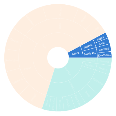
Selection
Interactively select and highlight a segment. This is commonly used to navigate to another page with detailed information from a selected segment or to update the information in a selected segment on the same page.
Highlight with color
Select or highlight segments with color to bring them to the center of attention.
Highlight with opacity
Select or highlight segments by adjusting the opacity of other segments to bring the selection to the center of attention.
Highlight with stroke
Select or highlight the segments with strokes to bring them to the center of attention.
Selection type
Select or highlight segments by color to bring them to the center of attention. The UWP Sunburst Chart control provides options to highlight an entire group of node segments, the parent node of the selected segment, the child node of the selected segment, or the selected segment alone.
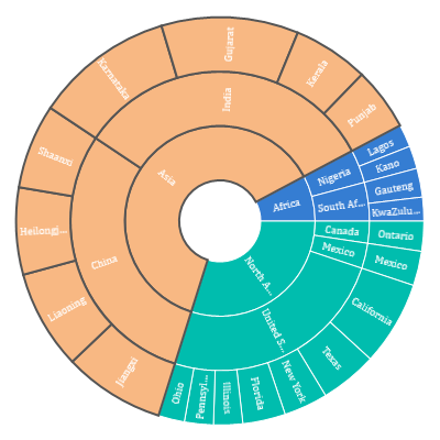
Customization
Selected colors and strokes can be customized.
Legend
Legends are used to provide valuable information for sunburst segments with various colors, shapes, or other identifiers.
Icon types
Change the type of legend icon to built-in shapes such as circles, rectangles, crosses, diamonds, triangles, or pentagons to improve readability.
Customization
Customize the positioning of the legend to anywhere in the chart area. The default legend label font and icon can also be customized.
Tooltip
The tooltip displays a pop-up with additional information when the mouse pointer touches a data point. The tooltip view can be customized with a data template.
Drill down
The UWP Sunburst Chart control provides a drill-down option with animation for visualizing large sets of data in a minimal data view.
110+ UWP CONTROLS
ALL CONTROLS
GRIDS
DATA VISUALIZATION
INPUT CONTROLS
CALENDAR
NAVIGATION
BUSINESS INTELLIGENCE
LISTS & DROPDOWN
NOTIFICATION
MISCELLANEOUS
FILE VIEWERS & EDITORS
Standalone UI SDKs
Integrate the DataGrid, Chart, Scheduler, Gantt, and Diagram UI components into applications to enable rich interaction and visualization, delivering a seamless user experience.
Document Solutions
Integrate the PDF Viewer, DOCX Editor, Spreadsheet Editor, and document-processing libraries into the UWP applications to enable a smooth user experience.
Our Customers Love Us
Having an excellent set of tools and a great support team, Syncfusion® reduces customers’ development time.Here are some of their experiences.

Excellent experience with Syncfusion!
Syncfusion is a product that makes life easier! I use it to create Blazor applications (server side and webassembly) and the controls speed up development a lot. Furthermore, if needed, it is possible to ask for direct support that is never long in coming!

Andrea Scarpante,

Sydea srl
The complete component set
It is the most complete component set available. Also very handy is the fact that there is a community edition, this gives me the opportunity to test thing at home without buying a separate license.

Johan Visser,

H and T Pawnbrokers
See Real Success Stories
Developers around the world trust Syncfusion’s Essential Studio to simplify complex projects and speed up delivery. With a vast library of UI controls, powerful SDKs, and reliable support, Essential Studio helps teams build enterprise-ready applications with confidence.
Read Our Customer StoriesIndustry
Software development
75% Cost reduction
50% Faster development
Industry
Utilities (oil and gas)
450+ hours saved
Streamlined processes and hours of development effort saved.
Advanced, flexible features
Empowered users through robust and versatile functionality.
Industry
Software and technology
1000+ of hours saved
Accelerated development with enterprise-ready UI components.
Efficient file management
Streamlined workflows with document libraries without building them from scratch.
Industry
Software and technology
2 Years of delay avoided
Two years of delays prevented with proactive planning.
On-time delivery
Projects delivered on schedule using trusted controls.
Industry
IT services and IT consulting
Improved performance
Large datasets handled with easy customization and quick debugging.
Highly customizable
Plug-and-play controls with quick template integration.
Industry
Professional services
Instant access
Quick availability of features and resources.
Reduced dependencies
Fewer dependencies for faster development.
Rated by users across the globe
Syncfusion UWP Resources
Learning
 Documentation
 Documentation


Awards
Greatness—it’s one thing to say you have it, but it means more when others recognize it. Syncfusion® is proud to hold the following industry awards.

