.NET MAUI Radial Gauge - Highly Customizable UI Control
- Display numerical values and ranges on a radial scale.
- Customize a radial gauge to simulate a speedometer, temperature monitor, or progress indicator.
- Use built-in animations and interactive pointers.
Trusted by the world’s leading companies

Overview
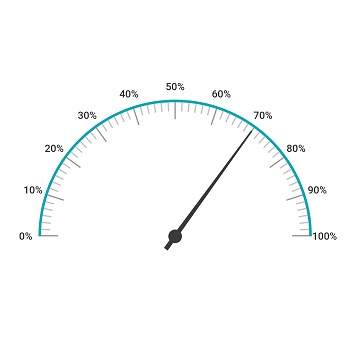
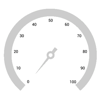
The Radial Gauge control for .NET MAUI is a multipurpose data visualization control that displays numerical values on a circular scale. It has a rich set of features such as axes, ranges, pointers, and annotations that are fully customizable and extendable. It has many use cases such as speedometers, temperature monitors, multi-axis clocks, circular progress indicators, watches, compasses, and more.
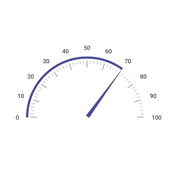
.NET MAUI Radial Gauge Code Example
Easily get started with the .NET MAUI Radial Gauge using few lines of XAML code example as demonstrated below. Also explore our .NET MAUI Radial Gauge Example that shows you how to render and configure .NET MAUI Radial Gauge.
<ContentPage xmlns="http://schemas.microsoft.com/dotnet/2021/maui"
xmlns:x="http://schemas.microsoft.com/winfx/2009/xaml"
x:Class="RadialGaugeGettingStarted.MainPage"
xmlns:gauge="http://schemas.syncfusion.com/maui"
BackgroundColor="{DynamicResource SecondaryColor}">
<ContentPage.Content>
<gauge:SfRadialGauge>
<gauge:SfRadialGauge.Axes>
<gauge:RadialAxis Interval="10"
Maximum="150" >
<gauge:RadialAxis.Ranges>
<gauge:RadialRange StartValue="0"
EndValue="50"
Fill="Red" />
<gauge:RadialRange StartValue="50"
EndValue="100"
Fill="Orange" />
<gauge:RadialRange StartValue="100"
EndValue="150"
Fill="Green" />
</gauge:RadialAxis.Ranges>
<gauge:RadialAxis.Pointers>
<gauge:NeedlePointer Value="90" />
</gauge:RadialAxis.Pointers>
<gauge:RadialAxis.Annotations>
<gauge:GaugeAnnotation x:Name="annotation"
DirectionUnit="Angle"
DirectionValue="90"
PositionFactor="0.5">
<gauge:GaugeAnnotation.Content>
<Label Text="90"
FontSize="25"
FontAttributes="Bold"
TextColor="Black"/>
</gauge:GaugeAnnotation.Content>
</gauge:GaugeAnnotation>
</gauge:RadialAxis.Annotations>
</gauge:RadialAxis>
</gauge:SfRadialGauge.Axes>
</gauge:SfRadialGauge>
</ContentPage.Content>
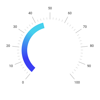
</ContentPage>Radial axis
The axis of the .NET MAUI Radial Gauge control is an easily customizable radial arc in which a set of values can be plotted based on business logic.
Label customization
Customize the look and feel of the default labels using various font properties. You can also add prefix or suffix text to a label.
Ticks customization
Define your own style for minor and major ticks with the help of the various style customization properties.
Offset
To enhance readability and maintain the size ratio on various devices, change the default axis position by setting the offset value for labels, ticks, and the axis line.

Axis line
The axis line is used to add a radial border to the .NET MAUI Radial Gauge. You can customize the default axis line style with dashed lines.
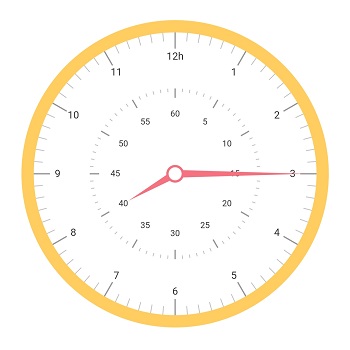
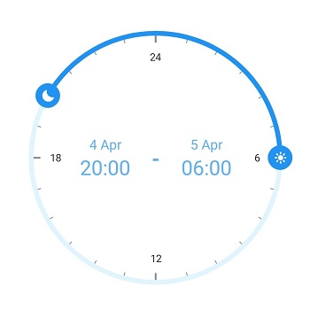
Multiple axis
Add multiple axes to the Radial Gauge to give it the appearance of a clock, speedometer, tachometer, etc.
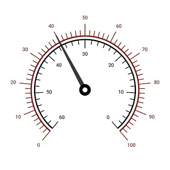
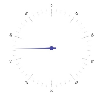
Direction
Set the radial axis direction to clockwise or counterclockwise.

Custom scale
Display a set of values along the scale in a linear or custom order. This allows flexible and precise visualization of data.

Background content
Enhance the radial charts’ visual appeal and clarity by setting a custom background frame content for the radial axis to improve readability and make your data stand out.
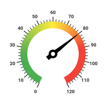
Color customization
Customize the default look and feel of an axis line’s appearance with a color gradient.
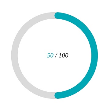
Radial range
A range in the .NET MAUI Radial Gauge is a visual element that helps you quickly visualize where a value falls on the radial axis.

Range label
The range label is used to insert text annotations in a radial range to improve readability. You can also customize the label style.

Range position
Change the range position to any place inside the Radial Gauge.
Range width
The radial range width varies based on the range values to enhance usage and readability.
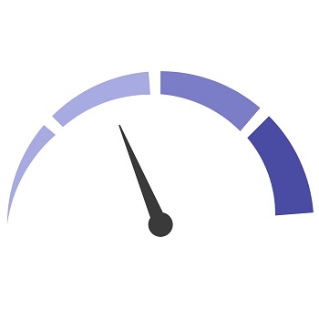
Multiple ranges
The .NET MAUI Radial Gauge control allows you to add multiple ranges inside the radial axis to provide color variation.
Gradient range
A range of colors can gradually change based on set values to create a smooth color transition.
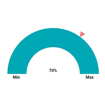
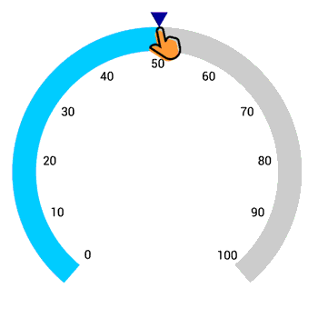
Radial Gauge pointer
Add any number of pointer types such as needle pointers, range pointers, and marker pointers inside the radial axis to indicate a value.

Needle pointer
Indicate a current value by using the highly customizable needle-type element.
Marker pointer
To highlight values, set the marker pointer type to a built-in shape, such as a triangle, inverted triangle, circle, or square.
Custom view pointer
Highlight values using icons, images, or text instead of built-in marker shapes.
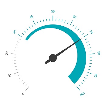
Range pointer
A range pointer is a radial arc used to indicate the current value relative to the start value of a radial axis. You can also customize its corner styles.

Color customization
Customize the default color of the pointer with solid or gradient colors.
Annotations
Annotations display metadata about a .NET MAUI Radial Gauge at specific points of interest in the plotting area.

Image annotations
Add any image over the Radial Gauge control with respect to an angle or axis value. You can add multiple images in a single control.

Text annotations
Add any text over the Radial Gauge control to enhance its readability. You can also add multiple text instances in a single control.
Pointer animation
The .NET MAUI Radial Gauge control provides visual appeal when the pointer moves from one value to another. The control supports various types of easing animations.

Initial loading animation
The .NET MAUI Radial Gauge control allows all its elements to be animated when it first loads. The loading motion gives the user the impression that work is being done in the background.
Pointer interaction
Allows users to drag or tap the pointers to interact with them at runtime. This gives customers the option to directly explore data points on the gauge or select specific settings.
 95+ UI controls
200+ interactive .NET MAUI demos
3.2M+ downloads
95+ UI controls
200+ interactive .NET MAUI demos
3.2M+ downloads
Not sure how to create your first .NET MAUI Radial Gauge? Our tutorial videos and documentation can help.
I’d love to watch it now I’d love to read it now.NET MAUI DataViz & UI Controls
Standalone UI SDKs
Integrate the DataGrid, Chart, Scheduler, and Rich Text Editor UI components into applications to enable rich interaction and visualization, delivering a seamless user experience.
Document Solutions
Integrate the PDF Viewer, DOCX Editor, Spreadsheet Editor, and document-processing libraries into the .NET MAUI applications to enable a smooth user experience.
Frequently Asked Questions
Why should you choose Syncfusion .NET MAUI Radial Gauge?
Create a circular arc with easily customizable axis elements like labels, ticks, and axis lines that meet diverse design needs.
Enhance data interpretation with radial ranges, visually representing where specific values fall along the axis.
Choose from needle, shape, content, and range pointers in the Radial Gauge, all customizable.
Enjoy a visually appealing experience as pointers smoothly transition between values, adding a dynamic touch.
Real-time value changes are facilitated through interactive pointer dragging, providing a responsive user experience.
Add text and image annotations to highlight points of interest, enriching data interpretation in the Radial Gauge.
- Display numerical values and ranges on a radial scale.
- Customize a radial gauge to simulate a speedometer, temperature monitor, or progress indicator.
- Use built-in animations and interactive pointers.
- One of the best .NET MAUI Radial Gauge in the market that offers feature-rich UI to interact with the software.
Extensive demos, documentation, and videos to let you get started quickly with the .NET MAUI Radial Gauge.
Where can I find the Syncfusion .NET MAUI Radial Gauge demo?
You can find our .NET MAUI Radial Gauge demo, which demonstrates how to render and configure the Radial Gauge.
Can I download and utilize the Syncfusion .NET MAUI Radial Gauge for free?
No, this is a commercial product and requires a paid license. However, a free community license is also available for companies and individuals whose organizations have less than $1 million USD in annual gross revenue, 5 or fewer developers, and 10 or fewer total employees.
How do I get started with the Syncfusion .NET MAUI Radial Gauge?
A good place to start would be our comprehensive getting started documentation.
Our Customers Love Us


See Real Success Stories
Developers around the world trust Syncfusion’s Essential Studio to simplify complex projects and speed up delivery. With a vast library of UI controls, powerful SDKs, and reliable support, Essential Studio helps teams build enterprise-ready applications with confidence.
Read Our Customer StoriesIndustry
Software development
75% Cost reduction
50% Faster development
Industry
Utilities (oil and gas)
450+ hours saved
Streamlined processes and hours of development effort saved.
Advanced, flexible features
Empowered users through robust and versatile functionality.
Industry
Software and technology
1000+ of hours saved
Accelerated development with enterprise-ready UI components.
Efficient file management
Streamlined workflows with document libraries without building them from scratch.
Industry
Software and technology
2 Years of delay avoided
Two years of delays prevented with proactive planning.
On-time delivery
Projects delivered on schedule using trusted controls.
Industry
IT services and IT consulting
Improved performance
Large datasets handled with easy customization and quick debugging.
Highly customizable
Plug-and-play controls with quick template integration.
Industry
Professional services
Instant access
Quick availability of features and resources.
Reduced dependencies
Fewer dependencies for faster development.
Rated by users across the globe


Awards
Greatness—it’s one thing to say you have it, but it means more when others recognize it. Syncfusion® is proud to hold the following industry awards.

