Trusted by the world’s leading companies

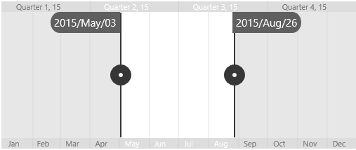
Overview
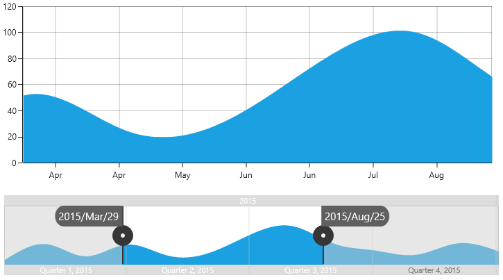
The range selector control provides an intuitive interface for selecting a smaller range from a larger collection. It is commonly used in financial dashboards to filter a date range for which the data needs to be visualized.
Scales
The major and minor scales display the range with different intervals and are placed at the top and bottom of the range selector. A required date-time component can be configured to be shown in major and minor scales.

Content
Add any view as the content of the range selector to provide a glimpse of the bound data and provide a detailed view of the selected range in a separate view.
Binding selected data
Bind the selected data from the range selector to other data visualization controls to visualize the filtered data.
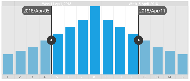
Range selection
The range selector provides three ways to select a range:
- Select the range from major and minor scales.
- Drag the left thumb and right thumb.
- Drag the selected range to maintain the same delta.
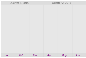
UI customization
All the elements of the range selector are highly customizable.
Labels
The size, color, font family, font attribute, and alignment of the minor and major labels are customizable.

Thumb
The entire appearance of the left and right thumbs can be customized.
Gridlines
The color, stroke width, dash array, and visibility of the major and minor gridlines are customizable.
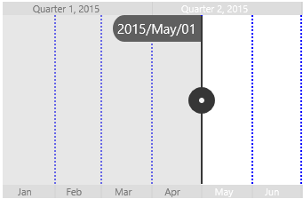
Tooltip
Tooltips display the start and end values of the selected range to make choosing the required range easier for users.
Deferred scrolling
Deferred scrolling allows you to defer the selected range to be updated until the user stops dragging the thumbs. This provides a smooth scrolling experience.
Localization
All static text within the range selector can be localized to any desired language.

110+ UWP CONTROLS
ALL CONTROLS
GRIDS
DATA VISUALIZATION
INPUT CONTROLS
CALENDAR
NAVIGATION
BUSINESS INTELLIGENCE
LISTS & DROPDOWN
NOTIFICATION
MISCELLANEOUS
FILE VIEWERS & EDITORS
Standalone UI SDKs
Integrate the DataGrid, Chart, Scheduler, Gantt, Rich Text Editor, File Manager, and Diagram UI components into applications to enable rich interaction and visualization, delivering a seamless user experience.
Document Solutions
Integrate the PDF Viewer, DOCX Editor, Spreadsheet Editor, and document-processing libraries into the UWP applications to enable a smooth user experience.
Our Customers Love Us
Having an excellent set of tools and a great support team, Syncfusion® reduces customers’ development time.Here are some of their experiences.

Excellent experience with Syncfusion!
Syncfusion is a product that makes life easier! I use it to create Blazor applications (server side and webassembly) and the controls speed up development a lot. Furthermore, if needed, it is possible to ask for direct support that is never long in coming!

Andrea Scarpante,

Sydea srl
The complete component set
It is the most complete component set available. Also very handy is the fact that there is a community edition, this gives me the opportunity to test thing at home without buying a separate license.

Johan Visser,

H and T Pawnbrokers
See Real Success Stories
Developers around the world trust Syncfusion’s Essential Studio to simplify complex projects and speed up delivery. With a vast library of UI controls, powerful SDKs, and reliable support, Essential Studio helps teams build enterprise-ready applications with confidence.
Read Our Customer StoriesIndustry
Software development
75% Cost reduction
50% Faster development
Industry
Utilities (oil and gas)
450+ hours saved
Streamlined processes and hours of development effort saved.
Advanced, flexible features
Empowered users through robust and versatile functionality.
Industry
Software and technology
1000+ of hours saved
Accelerated development with enterprise-ready UI components.
Efficient file management
Streamlined workflows with document libraries without building them from scratch.
Industry
Software and technology
2 Years of delay avoided
Two years of delays prevented with proactive planning.
On-time delivery
Projects delivered on schedule using trusted controls.
Industry
IT services and IT consulting
Improved performance
Large datasets handled with easy customization and quick debugging.
Highly customizable
Plug-and-play controls with quick template integration.
Industry
Professional services
Instant access
Quick availability of features and resources.
Reduced dependencies
Fewer dependencies for faster development.
Rated by users across the globe
Syncfusion UWP Resources
Learning
 Documentation
 Documentation


Awards
Greatness—it’s one thing to say you have it, but it means more when others recognize it. Syncfusion® is proud to hold the following industry awards.

