Trusted by the world’s leading companies

Overview
Avatar is a pure CSS component used to add initials, icons, or images in different shapes and sizes to represent people or objects. The Avatar component can be easily integrated with ListView, Card, Badge, and other container components.
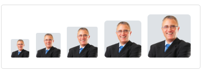
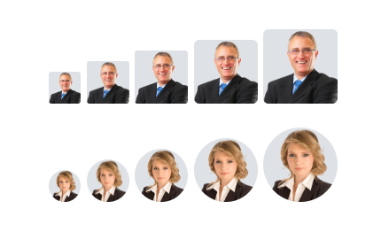
Profile or image avatar
The Blazor Avatar component supports various types of images for representing user profile images like those in applications such as Gmail, Outlook, GitHub, and StackOverflow.
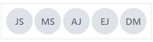
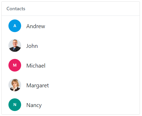
Initials avatar
Displays a user’s initials in different sizes.
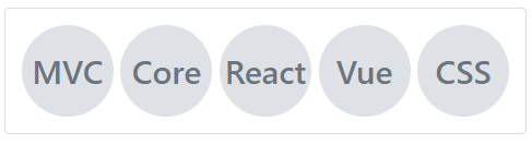
Text or word avatar
Creates word or text avatars from user names.
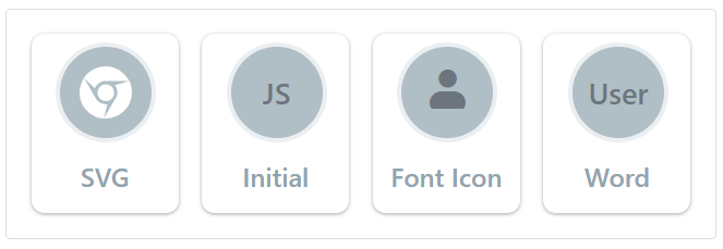
Media types
The Blazor Avatar component supports well-known media types, icons, SVG, font icons, and text.
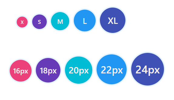
Shapes and sizes
The Blazor Avatar component can be either square or circular in one of five sizes: extra small, small, medium, large, and extra large. By default, avatars are created in a square shape with a medium size.
UI customization
Completely customize the avatar attributes, including its dimensions and colors.
Integration with other components
Easily integrate the Blazor Avatar component with layout components, specifically ListView and Card, to achieve UIs like mobile contact lists, Gmail, Outlook, and more. Also, integrate with the Badge component to represent notification counts in messaging apps.
Other supported frameworks
The Avatar component is also available for the Angular, React, and Vue frameworks. Check out the Avatar component on different platforms from the following links:
 145+ UI components
1200+ interactive Blazor demos
8.7M+ downloads
145+ UI components
1200+ interactive Blazor demos
8.7M+ downloads

Not sure how to create your first Blazor Avatar? Our video tutorial and documentation can help.
I’d love to watch it now I’d love to read it nowBlazor Components – 145+ UI and DataViz Components
ALL COMPONENTS
SMART COMPONENTS
GRIDS
DATA VISUALIZATION
FILE VIEWERS & EDITORS
DROPDOWNS
NAVIGATION
INPUTS
BUTTONS
INTERACTIVE CHAT
Standalone UI SDKs
Integrate the DataGrid, Chart, Scheduler, Gantt, Rich Text Editor, File Manager, and Diagram UI components into applications to enable rich interaction and visualization, delivering a seamless user experience.
Document Solutions
Integrate the PDF Viewer, DOCX Editor, Spreadsheet Editor, and document-processing libraries into the Blazor applications to enable a smooth user experience.
Frequently Asked Questions
Why should you choose the Syncfusion® Essential Studio® Blazor Avatar component?
- Delivers a simple, customizable pure HTML5/CSS profile Avatar that supports square and circle shapes.
- Provides widely used avatar sizes (extra small, small, medium, large, and extra large) for various application scenarios.
- Easily integrates with other components such as ListView, Card, and Badge.
- Supports all modern browsers.
Backed by expansive learning resources like demos and documentation to help you get started quickly.
Where can I find the Syncfusion® Blazor Avatar demo?
You can find our Blazor Avatar demo here. It demonstrates how to render and configure the Avatar.
Can I download and utilize the Syncfusion® Blazor Avatar component for free?
No, this is a commercial product and requires a paid license. However, the free Community License is available for companies and individuals whose organizations have less than US $1 million in annual gross revenue, 5 or fewer developers, and 10 or fewer total employees.
How do I get started with the Syncfusion® Blazor Avatar?
A good place to start would be our comprehensive getting started documentation.
Our Customers Love Us
Having an excellent set of tools and a great support team, Syncfusion® reduces customers’ development time.Here are some of their experiences.

Blazor components
The speed how they adding new Blazor controls and update theirs functionality.
I am using Blazor components. Searching for Blazor components I found that Syncfusion very fast adopted theirs controls for new development platform. Tech support is fast and excellent. The best of best is that they provide free controls for small business.

Igor L,

CEO, Small-Business
Syncfusion objects with a Blazor
I have used some of the Syncfusion objects with a Blazor application. The support group has always been very helpful.

Kris B,
Software Development Consultant, Small-Business
See Real Success Stories
Developers around the world trust Syncfusion’s Essential Studio to simplify complex projects and speed up delivery. With a vast library of UI controls, powerful SDKs, and reliable support, Essential Studio helps teams build enterprise-ready applications with confidence.
Read Our Customer StoriesIndustry
Software development
75% Cost reduction
50% Faster development
Industry
Utilities (oil and gas)
450+ hours saved
Streamlined processes and hours of development effort saved.
Advanced, flexible features
Empowered users through robust and versatile functionality.
Industry
Software and technology
1000+ of hours saved
Accelerated development with enterprise-ready UI components.
Efficient file management
Streamlined workflows with document libraries without building them from scratch.
Industry
Software and technology
2 Years of delay avoided
Two years of delays prevented with proactive planning.
On-time delivery
Projects delivered on schedule using trusted controls.
Industry
IT services and IT consulting
Improved performance
Large datasets handled with easy customization and quick debugging.
Highly customizable
Plug-and-play controls with quick template integration.
Industry
Professional services
Instant access
Quick availability of features and resources.
Reduced dependencies
Fewer dependencies for faster development.
Rated by users across the globe
Syncfusion Blazor Resources
Learning
 Documentation
 Documentation


Awards
Greatness—it’s one thing to say you have it, but it means more when others recognize it. Syncfusion® is proud to hold the following industry awards.

