Trusted by the world’s leading companies

Overview
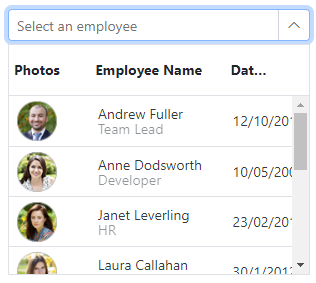
The Blazor MultiColumn ComboBox is a dropdown component that displays items in a detailed, table-like format with multiple columns, providing more information than standard dropdown lists. It enhances user interaction through features such as data binding from various sources, item grouping, and advanced filtering for quick searches. Additionally, it supports sorting, virtualization for large datasets, paging, and customizable templates for headers, footers, and list items.
Data binding
The Blazor MultiColumn ComboBox lets users bind data from various local and remote data sources, such as IEnumerable/List, RESTful services, OData services, and WCF services. It utilizes a data manager to handle data and allows for customization of data requests and processing.


Columns
Customize the appearance of each column with a variety of options. The MultiColumn ComboBox supports auto-generating columns, which simplifies the process by automatically creating columns based on the data source. Additionally, you can modify the column header text to reflect specific data, adjust the column width for clear display, and set the column alignment (left, center, or right) to enhance readability and visual balance according to your application’s needs.
Paging
The Blazor MultiColumn ComboBox offers built-in support to manage large datasets using its paging feature. The component can handle extensive data collections by breaking them into manageable pages, thereby enhancing performance and improving the user experience.


Filtering
The Blazor MultiColumn ComboBox allows users to find what they are looking for quickly with its built-in filtering feature. This functionality enables users to type in search queries and see results in the dropdown, making navigation fast.
Sorting
The Blazor MultiColumn ComboBox allows users to sort rows in either ascending or descending order by simply clicking the header of a column. Users can sort data in multiple columns by holding the Ctrl key while clicking the header. This feature enables users to organize complex datasets more effectively.


Grouping
Organize items into categories within the MultiColumn ComboBox. Grouping related items together allows users to filter and select items more efficiently.
Virtualization
Enhance the performance of the MultiColumn ComboBox by displaying only the items currently in view. Virtualization allows for smooth scrolling and efficient management of large datasets while minimizing load times.

Dropdown styles with templates
Customize the appearance of the dropdown list to create a unique look by modifying the header, footer, and list items with templates.

Column header templates
Define custom templates for column headers to align their appearance with the design of your application.
Column templates
Customize the display of data in each column to create a unique look and feel.

Footer templates
Add custom footers to the dropdown. They can include summary information, additional components, or any other content you wish to display.
Custom input value
The MultiColumn ComboBox allows users to input custom values that may not be present in the predefined list. Users can enter new or unique values directly into the input field, thereby broadening the range of possible entries beyond the original options.


Floating labels
The MultiColumn ComboBox includes floating label functionality, which allows labels to float above the input field when the user interacts with the component or when a value is selected. This feature enhances form usability by providing clear context without occupying additional space.
Edit form support
Seamlessly integrate the MultiColumn ComboBox with the Blazor edit form component. This integration ensures that the component can be used within forms, enabling smooth data entry, validation, and submission workflows.

Pop-up dimensions
The MultiColumn ComboBox offers customizable pop-up dimensions, allowing you to define the width and height of the dropdown to suit your application’s layout and data requirements. This feature ensures that the dropdown displays enough data without overwhelming the user interface.
Built-in themes
The MultiColumn ComboBox component includes several built-in themes, such as Material, Bootstrap, Fabric (Office 365), Tailwind CSS, and high contrast. Users can customize these built-in themes or create new ones by overriding Sass variables or using the Theme Studio application.
Accessibility
The MultiColumn ComboBox is designed with accessibility in mind, ensuring compliance with the latest web accessibility standards, such as WAI-ARIA. It supports full keyboard navigation and screen reader compatibility, making the component usable for individuals with disabilities.
Blazor MultiColumn ComboBox code example
Easily get started with the Blazor MultiColumn ComboBox using a few simple lines of C# code, as demonstrated in the following example. Also explore this Blazor MultiColumn ComboBox example, which shows you how to render and configure the Blazor MultiColumn ComboBox component.
@using Syncfusion.Blazor.MultiColumnComboBox

<SfMultiColumnComboBox @bind-Value="@Value" DataSource="@Products" ValueField="Name" TextField="Name" Placeholder="Select a product"></SfMultiColumnComboBox>

@code {
    public class Product
    {
        public string Name { get; set; }
        public decimal Price { get; set; }
        public string Availability { get; set; }
        public string Category { get; set; }
        public double Rating { get; set; }
    }
    private List<Product> Products = new List<Product>();
    private string Value { get; set; } = "Smartphone";
    protected override Task OnInitializedAsync()
    {
        Products = new List<Product>
        {
            new Product { Name = "Laptop", Price = 999.99m, Availability = "In Stock", Category = "Electronics", Rating = 4.5 },
            new Product { Name = "Smartphone", Price = 599.99m, Availability = "In Stock", Category = "Electronics", Rating = 4.3 },
            new Product { Name = "Tablet", Price = 299.99m, Availability = "In Stock", Category = "Electronics", Rating = 4.2 },
            new Product { Name = "Headphones", Price = 49.99m, Availability = "In Stock", Category = "Accessories", Rating = 4.0 },
            new Product { Name = "Smartwatch", Price = 199.99m, Availability = "Limited Stock", Category = "Wearables", Rating = 4.4 },
            new Product { Name = "Monitor", Price = 129.99m, Availability = "In Stock", Category = "Electronics", Rating = 4.6 },
            new Product { Name = "Keyboard", Price = 39.99m, Availability = "In Stock", Category = "Accessories", Rating = 4.1 },
            new Product { Name = "Mouse", Price = 19.99m, Availability = "Out of Stock", Category = "Accessories", Rating = 4.3 },
            new Product { Name = "Printer", Price = 89.99m, Availability = "In Stock", Category = "Office Supplies", Rating = 4.2 },
            new Product { Name = "Camera", Price = 499.99m, Availability = "In Stock", Category = "Electronics", Rating = 4.7 }
        };
        return base.OnInitializedAsync();
    }
} 145+ UI components
1200+ interactive Blazor demos
8.7M+ downloads
145+ UI components
1200+ interactive Blazor demos
8.7M+ downloads

Blazor Components – 145+ UI and DataViz Components
ALL COMPONENTS
SMART COMPONENTS
GRIDS
DATA VISUALIZATION
FILE VIEWERS & EDITORS
DROPDOWNS
NAVIGATION
INPUTS
BUTTONS
INTERACTIVE CHAT
Standalone UI SDKs
Integrate the DataGrid, Chart, Scheduler, Gantt, Rich Text Editor, File Manager, and Diagram UI components into applications to enable rich interaction and visualization, delivering a seamless user experience.
Document Solutions
Integrate the PDF Viewer, DOCX Editor, Spreadsheet Editor, and document-processing libraries into the Blazor applications to enable a smooth user experience.
Our Customers Love Us
Having an excellent set of tools and a great support team, Syncfusion® reduces customers’ development time.Here are some of their experiences.

Blazor components
The speed how they adding new Blazor controls and update theirs functionality.
I am using Blazor components. Searching for Blazor components I found that Syncfusion very fast adopted theirs controls for new development platform. Tech support is fast and excellent. The best of best is that they provide free controls for small business.

Igor L,

CEO, Small-Business
Syncfusion objects with a Blazor
I have used some of the Syncfusion objects with a Blazor application. The support group has always been very helpful.

Kris B,
Software Development Consultant, Small-Business
See Real Success Stories
Developers around the world trust Syncfusion’s Essential Studio to simplify complex projects and speed up delivery. With a vast library of UI controls, powerful SDKs, and reliable support, Essential Studio helps teams build enterprise-ready applications with confidence.
Read Our Customer StoriesIndustry
Software development
75% Cost reduction
50% Faster development
Industry
Utilities (oil and gas)
450+ hours saved
Streamlined processes and hours of development effort saved.
Advanced, flexible features
Empowered users through robust and versatile functionality.
Industry
Software and technology
1000+ of hours saved
Accelerated development with enterprise-ready UI components.
Efficient file management
Streamlined workflows with document libraries without building them from scratch.
Industry
Software and technology
2 Years of delay avoided
Two years of delays prevented with proactive planning.
On-time delivery
Projects delivered on schedule using trusted controls.
Industry
IT services and IT consulting
Improved performance
Large datasets handled with easy customization and quick debugging.
Highly customizable
Plug-and-play controls with quick template integration.
Industry
Professional services
Instant access
Quick availability of features and resources.
Reduced dependencies
Fewer dependencies for faster development.
Rated by users across the globe
Syncfusion Blazor Resources
Learning
 Documentation
 Documentation


Awards
Greatness—it’s one thing to say you have it, but it means more when others recognize it. Syncfusion® is proud to hold the following industry awards.

