Trusted by the world’s leading companies

Overview
The Blazor Chips is a feature-rich component that provides small blocks of text information. Blazor Chips can also contain avatars, images, letters, and close icons. They can be used as tags when filtering contacts and mail inbox, selecting single or multiple choices from available options, and providing input to an application.
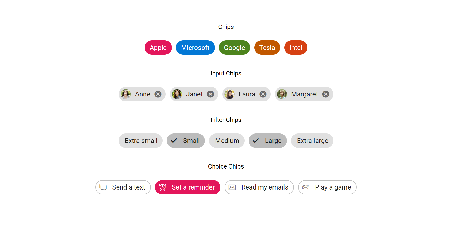
Action Chips
Blazor Chips are compact elements for representing simple content and can also trigger actions when selected.


Choice Chips
Blazor Chips can be grouped together as a collection of choices. Choice chips allow users to select from available options.
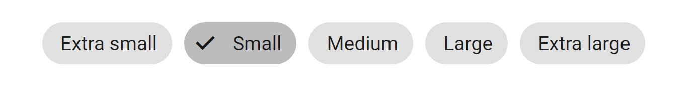
Filter Chips
Filter chips are a collection of Blazor chips that allow users to filter the view items based on a specified parameter.
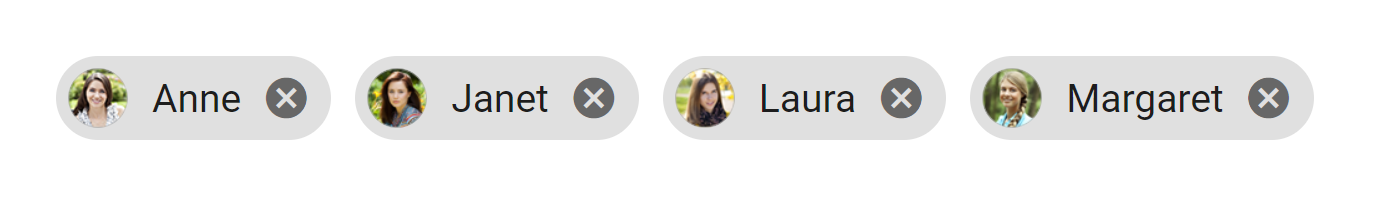
Input Chips
Input chips allow Blazor chips to be added or removed. A chips can be created from text provided by the user in an input box or deleted as needed.
UI Customization
You can customize the Blazor chips appearance with avatars, close icons, and more using the built-in options.
Web accessibility
- Fully supports WAI-ARIA accessibility practices to work with screen readers and assistive devices.
- Follows WAI-ARIA best practices for implementing keyboard interaction.
- Follows WCAG 2.0 standards in the design of UI element visuals such as foreground color, background color, line spacing, text, and images.
Blazor Chips Code Example
Easily get started with the Blazor Chips using a few simple lines of C# code as demonstrated below. Also explore our Blazor Chips Example that shows you how to render and configure the Chips in Blazor.
@using Syncfusion.Blazor
@using Syncfusion.Blazor.Buttons

<SfChip>
    <ChipItems>
        <ChipItem Text="Janet Leverling"></ChipItem>
    </ChipItems>
</SfChip>
Other supported frameworks
Chips is also available in Angular, React, Vue and JavaScript frameworks that are built from their own TypeScript libraries. Check out the different Chips platforms from the links below,
 145+ UI components
1200+ interactive Blazor demos
8.7M+ downloads
145+ UI components
1200+ interactive Blazor demos
8.7M+ downloads

Not sure how to create your first Blazor Chip? Our documentation can help.
I’d love to read it nowBlazor Components – 145+ UI and DataViz Components
ALL COMPONENTS
SMART COMPONENTS
GRIDS
DATA VISUALIZATION
FILE VIEWERS & EDITORS
DROPDOWNS
NAVIGATION
INPUTS
BUTTONS
INTERACTIVE CHAT
Standalone UI SDKs
Integrate the DataGrid, Chart, Scheduler, Gantt, Rich Text Editor, File Manager, and Diagram UI components into applications to enable rich interaction and visualization, delivering a seamless user experience.
Document Solutions
Integrate the PDF Viewer, DOCX Editor, Spreadsheet Editor, and document-processing libraries into the Blazor applications to enable a smooth user experience.
Frequently Asked Questions
Why should you choose Syncfusion Blazor Chips?
- Chips are small blocks of information used to represent text, actions, choices, and contact tags in phones and email inbox.
- Chips are compact elements that represent simple content.
Chip types include action, choice, filter, and input.
Support for customizing chips is built in.
- Offering a feature-rich UI, it’s one of the best chips components for Blazor on the market.
It has a simple configuration and API.-Extensive demos, documentation, and videos are available so that you can quickly learn and get started with Chips.
Where can I find the Syncfusion Blazor Chips demo?
You can find our Blazor Chips demo here.
Can I download and utilize the Syncfusion Blazor Chips for free?
No, this is a commercial product and requires a paid license. However, a free community license is also available for companies and individuals whose organizations have less than $1 million USD in annual gross revenue, 5 or fewer developers, and 10 or fewer total employees.
How do I get started with Syncfusion Blazor Chips?
A good place to start would be our comprehensive getting started documentation.
Our Customers Love Us
Having an excellent set of tools and a great support team, Syncfusion® reduces customers’ development time.Here are some of their experiences.

Blazor components
The speed how they adding new Blazor controls and update theirs functionality.
I am using Blazor components. Searching for Blazor components I found that Syncfusion very fast adopted theirs controls for new development platform. Tech support is fast and excellent. The best of best is that they provide free controls for small business.

Igor L,

CEO, Small-Business
Syncfusion objects with a Blazor
I have used some of the Syncfusion objects with a Blazor application. The support group has always been very helpful.

Kris B,
Software Development Consultant, Small-Business
See Real Success Stories
Developers around the world trust Syncfusion’s Essential Studio to simplify complex projects and speed up delivery. With a vast library of UI controls, powerful SDKs, and reliable support, Essential Studio helps teams build enterprise-ready applications with confidence.
Read Our Customer StoriesIndustry
Software development
75% Cost reduction
50% Faster development
Industry
Utilities (oil and gas)
450+ hours saved
Streamlined processes and hours of development effort saved.
Advanced, flexible features
Empowered users through robust and versatile functionality.
Industry
Software and technology
1000+ of hours saved
Accelerated development with enterprise-ready UI components.
Efficient file management
Streamlined workflows with document libraries without building them from scratch.
Industry
Software and technology
2 Years of delay avoided
Two years of delays prevented with proactive planning.
On-time delivery
Projects delivered on schedule using trusted controls.
Industry
IT services and IT consulting
Improved performance
Large datasets handled with easy customization and quick debugging.
Highly customizable
Plug-and-play controls with quick template integration.
Industry
Professional services
Instant access
Quick availability of features and resources.
Reduced dependencies
Fewer dependencies for faster development.
Rated by users across the globe
Syncfusion Blazor Resources
Learning
 Documentation
 Documentation


Awards
Greatness—it’s one thing to say you have it, but it means more when others recognize it. Syncfusion® is proud to hold the following industry awards.

