Overview
The Syncfusion Blazor Sunburst Chart is an interactive hierarchical data visualization component that represents multi-level data using concentric rings. Each ring represents a level in the hierarchy, helping users understand parent-child relationships, proportional values, and nested data through interactive drill-down.
Installation and quick start
Follow these steps to add and configure the Blazor Sunburst Chart in a Blazor Server, WebAssembly, or Blazor Web App application.
1
Install the Blazor Charts package
Install the Syncfusion Blazor Charts package using NuGet.
Install-Package Syncfusion.Blazor.Charts2
Register the Syncfusion Blazor service
Register the Syncfusion Blazor service in the Program.cs file. Add the Syncfusion.Blazor namespace and call AddSyncfusionBlazor() during service configuration.
builder.Services.AddSyncfusionBlazor();3
Add the required script reference
Add the required script at the end of the <body> section in the Components/App.razor file to enable the component’s functionality.
<script src="_content/Syncfusion.Blazor.Charts/scripts/sf-sunburst-chart.min.js" type="text/javascript"></script>4
Blazor Sunburst Chart code example
Get started with the Blazor Sunburst Chart using the following example. Bind hierarchical data and configure data labels, legends, and tooltips with a few lines of Razor code.
@using Syncfusion.Blazor.Charts

<div style="width: 100%; height: 600px;">
    <SfSunburstChart TItem="SunburstData"
                     DataSource="@DataSource"
                     IdMemberPath="@nameof(SunburstData.Id)"
                     ParentIdMemberPath="@nameof(SunburstData.ParentId)"
                     LabelMemberPath="@nameof(SunburstData.Name)"
                     ValueMemberPath="@nameof(SunburstData.Value)"
                     Title="Sales by Region">
        <SunburstDataLabelSettings Visible="true" LabelOverflowMode="LabelOverflowMode.Trim"></SunburstDataLabelSettings>
        <SunburstLegendSettings Visible="true"></SunburstLegendSettings>
        <SunburstTooltipSettings Enable="true" Format="${point.label}: ${point.value}"></SunburstTooltipSettings>
    </SfSunburstChart>
</div>

@code {
    public class SunburstData
    {
        public string Id { get; set; } = string.Empty;
        public string ParentId { get; set; } = string.Empty;
        public string Name { get; set; } = string.Empty;
        public double Value { get; set; }
    }

    public List<SunburstData> DataSource { get; set; } = new()
    {
        new() { Id = "america", ParentId = string.Empty, Name = "North America" },
        new() { Id = "usa", ParentId = "america", Name = "USA", Value = 200 },
        new() { Id = "canada", ParentId = "america", Name = "Canada", Value = 30  },
        new() { Id = "europe", ParentId = string.Empty, Name = "Europe" },
        new() { Id = "germany", ParentId = "europe", Name = "Germany", Value = 94  },
        new() { Id = "uk", ParentId = "europe", Name = "UK", Value = 66  },
        new() { Id = "asia", ParentId = string.Empty, Name = "Asia" },
        new() { Id = "india", ParentId = "asia", Name = "India", Value = 170 },
        new() { Id = "japan", ParentId = "asia", Name = "Japan", Value = 42  }
    };
}No credit card required.
Why choose the Syncfusion Blazor Sunburst Chart?
Hierarchical visualization
Visualize hierarchical and tree-structured data using concentric rings that clearly show relationships between parent and child items across multiple levels.
Rich feature set
Build interactive hierarchical visualizations with built-in drill-down, selection, highlighting, tooltips, data labels, legends, animation, and extensive appearance customization.
Responsive across devices
The responsive and mobile-friendly layout adapts to desktops, tablets, and smartphones across supported browsers and operating systems.
Elegant animation
Smooth animations enhance visual transitions while users explore different hierarchy levels.
Customizable themes
Apply built-in Fluent, Tailwind CSS, Bootstrap, Material, and Fabric themes. Use the Theme Studio to adjust theme settings.
Easy export and printing
Export the Sunburst Chart in various file formats, including PDF, SVG, PNG, and JPEG. You can also export chart data to Excel and CSV formats, and print the chart for easy sharing, analysis, and reporting.
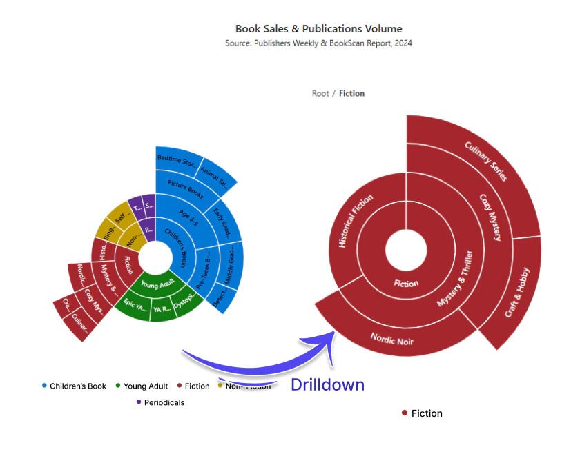
Drill-down
Drill down into a segment to explore its lower hierarchy levels in a focused view. This helps users navigate large hierarchical datasets and move back to higher levels as needed.
Data labels
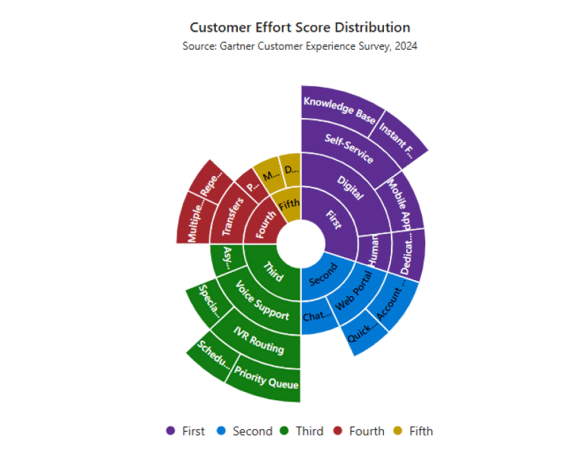
Display segment names and values directly on chart segments to make the visualization easier to read. Customize font, color, rotation, border, and label placement to reduce overlap in dense areas.
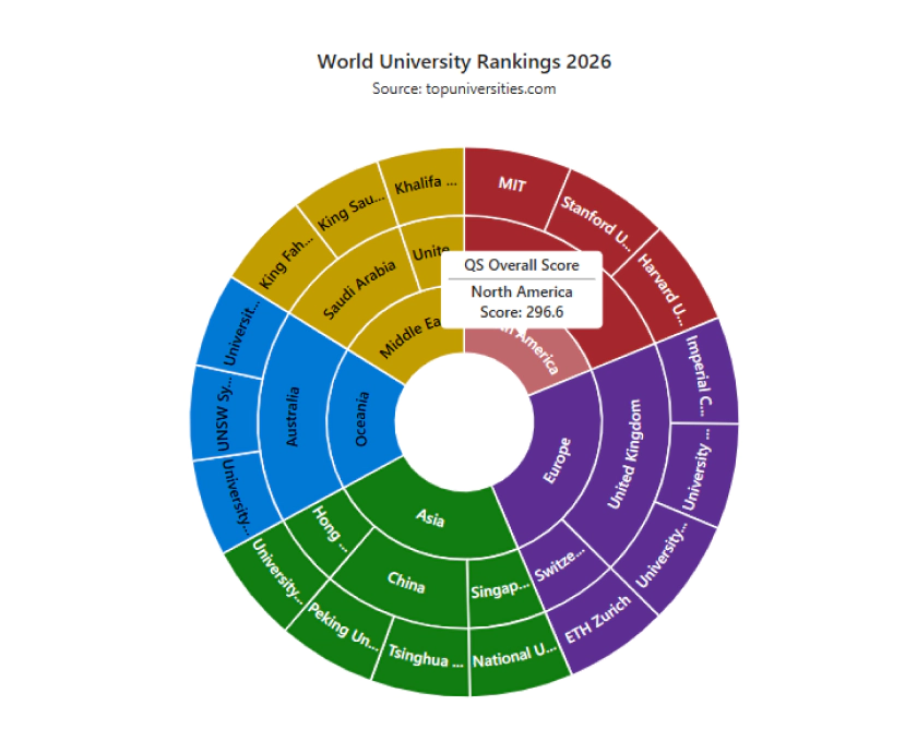
Tooltips
Display additional information when users hover over a segment. Customize the tooltip header and content format, and highlight the corresponding segment to make hierarchical data easier to explore.
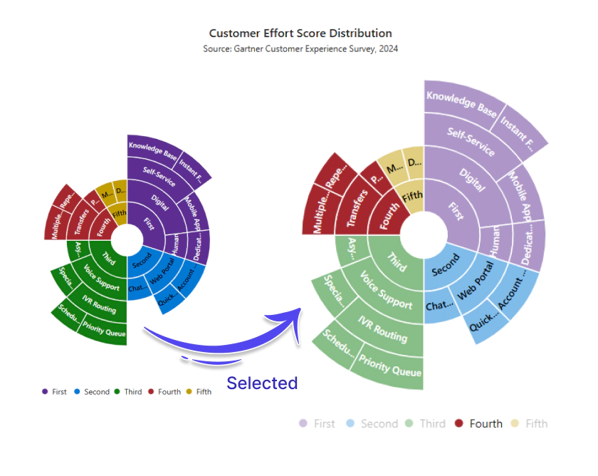
Selection
Select and highlight Sunburst segments to focus on the data that matters. Choose from single, parent, child, or full-path selection modes, and customize highlighting with color, opacity, or stroke.
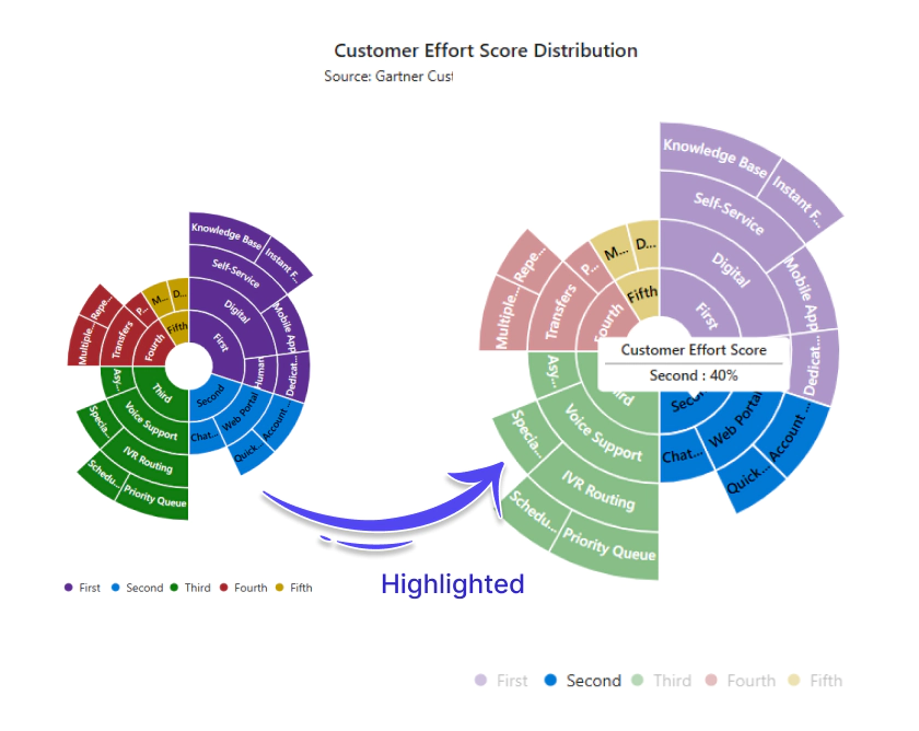
Highlight
Highlight segments on hover or programmatically to focus user attention. Configure the highlight by color, opacity, or stroke, and target a single segment at a time.
Legend
The Blazor Sunburst Chart supports legends that provide additional context for each segment. Configure the legend shape, position it anywhere in the chart area, and toggle segment visibility interactively.
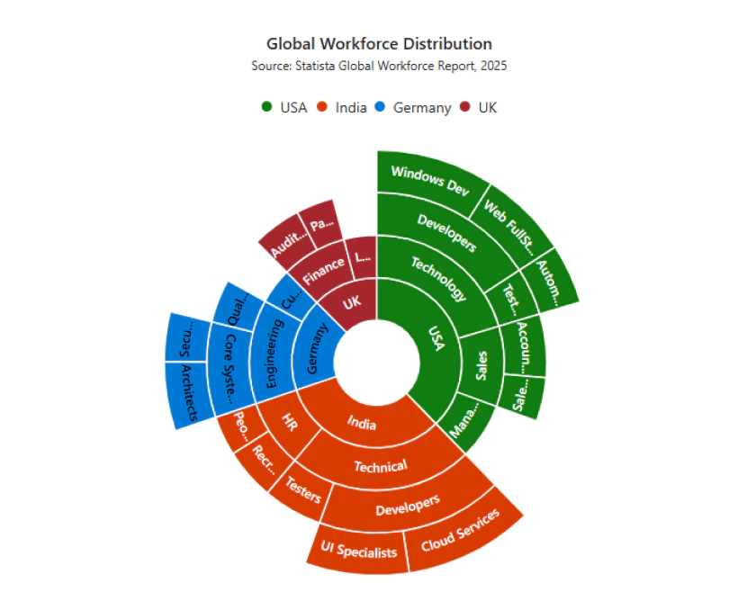
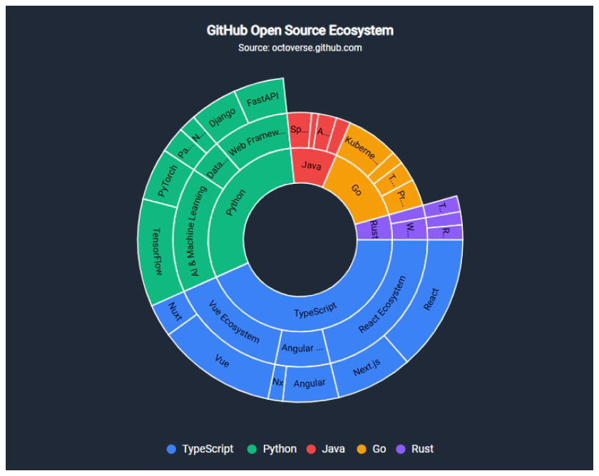
Appearance customization
Customize the Sunburst Chart’s radius, start and end angles, colors, borders, and level-specific appearance to match your application’s design. Apply distinct colors to each hierarchy level to improve visual differentiation.
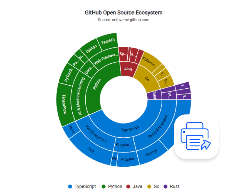
Print and Export Charts Easily
Export the Sunburst Charts as PDF, SVG, PNG, and JPEG files, print directly from the browser, or download underlying data in Excel and CSV formats. Simplify reporting, collaboration, and data sharing across business workflows.
Accessibility
Keyboard navigation
The Blazor Sunburst Chart supports keyboard navigation for segment focus, selection, legend toggling, and drill-down, enabling users to explore data without a mouse.
Screen reader
The Blazor Sunburst Chart includes WAI-ARIA attributes and screen-reader support to help users of assistive technologies understand the chart’s hierarchy, segment values, and the current selection.
Right to left (RTL)
Right-to-left rendering allows displaying the text and layout of Sunburst charts from right to left. This improves the user experience and accessibility for RTL languages.
Not sure how to create your first Blazor Sunburst Chart? Our documentation can help.
I’d love to read it nowFrequently Asked Questions
Why should you choose Syncfusion Blazor Sunburst Chart?
Key benefits of the Syncfusion Blazor Sunburst Chart include:
- Visualization of hierarchical data using concentric circular segments.
- Interactive drill-down for exploring multiple hierarchy levels.
- Rich APIs for customization and interaction.
- Responsive and touch-friendly visualization.
- Support for modern browsers.
Extensive demos, documentation, and learning resources.
Where can I find the Syncfusion Blazor Sunburst Chart demo?
You can find our Blazor Sunburst Chart demo, which demonstrates how to render and configure the hierarchical visualization.
What is a Blazor Sunburst Chart?
A Blazor Sunburst Chart is a hierarchical data visualization that represents multi-level data using concentric rings. Each ring represents a hierarchy level, while individual segments show the relationship between parent and child items.
Can I drill down into hierarchical data in a Blazor Sunburst Chart?
Yes. Drill-down lets users explore deeper hierarchy levels by interacting with individual segments, making it easier to focus on a specific branch without displaying every level at once.
Can I download and utilize Syncfusion Blazor Sunburst Chart for free?
Syncfusion Blazor Sunburst Chart is a commercial component. Eligible developers and organizations can use it through the Syncfusion Community License. Review the current eligibility requirements on the licensing page.
How do I get started with Syncfusion Blazor Sunburst Chart?
A good place to start would be our comprehensive getting started documentation.
When should I use a Sunburst Chart?
Use a Sunburst Chart to visualize nested data, understand parent-child relationships, compare proportions across hierarchy levels, and explore specific branches through drill-down.
What types of data can be visualized using a Blazor Sunburst Chart?
The Blazor Sunburst Chart is designed to visualize hierarchical and tree-structured data with multiple levels. It is commonly used for organizational structures, sales analysis, product categories, budget allocation, file systems, and other parent-child data relationships. The Sunburst Chart helps users explore and understand complex hierarchical datasets through interactive drill-down and visual navigation.
Trusted by the world’s leading companies

Our Customers Love Us




Syncfusion Blazor Sunburst Chart Resources


Blazor Components – 145+ UI and DataViz Components
Standalone UI SDKs
Integrate the DataGrid, Chart, Scheduler, Gantt, Rich Text Editor, File Manager, and Diagram UI components into applications to enable rich interaction and visualization, delivering a seamless user experience.
Document Solutions
Integrate the PDF Viewer, DOCX Editor, Spreadsheet Editor, and document-processing libraries into the Blazor applications to enable a smooth user experience.