Trusted by the world’s leading companies

Overview
The Blazor AppBar, also known as an action bar or nav bar, displays information and actions related to the current application screen. It is used to show branding, screen titles, navigation, and actions. The component supports height mode, color mode, positioning, and more.
Size
Display the AppBar with predefined sizes: normal, longer, and shorter. The size of an AppBar can be changed using the regular, prominent, and dense properties.

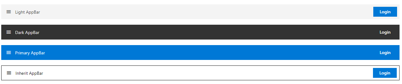
Color
The AppBar has predefined background colors for different visual representations: light, dark, primary, and inherit.
Position
A row of content can be aligned horizontally at the top or bottom of the AppBar.

Sticky
AppBar can stick to the top of a page while scrolling the content.

Content alignment
The Blazor AppBar component aligns the content using the spacer and separator.

Responsive design
The AppBar layout will adjust automatically to the current screen size.

Developer-friendly APIs
Developers can control the appearance and behaviors of the AppBar component using a rich set of APIs.
Built-in themes
The Blazor AppBar component supports built-in themes: Material, Bootstrap, Fabric (Office 365), Tailwind CSS, and high contrast. Users can customize these built-in themes or create new themes to achieve their desired look and feel by either simply overriding SASS variables or using our Theme Studio application.
AppBar code example
Easily get started with the Blazor AppBar using a few simple lines of C# code, as demonstrated below. Also explore our Blazor AppBar example, which shows how to render and configure the Blazor AppBar.
@using Syncfusion.Blazor.Navigations
@using Syncfusion.Blazor.Buttons

<SfAppBar ColorMode="AppBarColor.Primary">
    <SfButton CssClass="e-inherit" IconCss="e-icons e-menu"></SfButton>
    <span class="regular">Blazor AppBar</span>
    <AppBarSpacer></AppBarSpacer>
    <SfButton CssClass="e-inherit" Content="FREE TRIAL"></SfButton>
</SfAppBar>
Other supported frameworks
The AppBar component is also available in Angular, React, Vue, and JavaScript frameworks. Check out the component on other platforms using these links:
 145+ UI components
1200+ interactive Blazor demos
8.7M+ downloads
145+ UI components
1200+ interactive Blazor demos
8.7M+ downloads

Not sure how to create your first Blazor AppBar? Our tutorial videos and documentation can help.
I’d love to read it now.Blazor Components – 145+ UI and DataViz Components
ALL COMPONENTS
SMART COMPONENTS
GRIDS
DATA VISUALIZATION
FILE VIEWERS & EDITORS
DROPDOWNS
NAVIGATION
INPUTS
BUTTONS
INTERACTIVE CHAT
Standalone UI SDKs
Integrate the DataGrid, Chart, Scheduler, Gantt, Rich Text Editor, File Manager, and Diagram UI components into applications to enable rich interaction and visualization, delivering a seamless user experience.
Document Solutions
Integrate the PDF Viewer, DOCX Editor, Spreadsheet Editor, and document-processing libraries into the Blazor applications to enable a smooth user experience.
Our Customers Love Us
Having an excellent set of tools and a great support team, Syncfusion® reduces customers’ development time.Here are some of their experiences.

Blazor components
The speed how they adding new Blazor controls and update theirs functionality.
I am using Blazor components. Searching for Blazor components I found that Syncfusion very fast adopted theirs controls for new development platform. Tech support is fast and excellent. The best of best is that they provide free controls for small business.

Igor L,

CEO, Small-Business
Syncfusion objects with a Blazor
I have used some of the Syncfusion objects with a Blazor application. The support group has always been very helpful.

Kris B,
Software Development Consultant, Small-Business
See Real Success Stories
Developers around the world trust Syncfusion’s Essential Studio to simplify complex projects and speed up delivery. With a vast library of UI controls, powerful SDKs, and reliable support, Essential Studio helps teams build enterprise-ready applications with confidence.
Read Our Customer StoriesIndustry
Software development
75% Cost reduction
50% Faster development
Industry
Utilities (oil and gas)
450+ hours saved
Streamlined processes and hours of development effort saved.
Advanced, flexible features
Empowered users through robust and versatile functionality.
Industry
Software and technology
1000+ of hours saved
Accelerated development with enterprise-ready UI components.
Efficient file management
Streamlined workflows with document libraries without building them from scratch.
Industry
Software and technology
2 Years of delay avoided
Two years of delays prevented with proactive planning.
On-time delivery
Projects delivered on schedule using trusted controls.
Industry
IT services and IT consulting
Improved performance
Large datasets handled with easy customization and quick debugging.
Highly customizable
Plug-and-play controls with quick template integration.
Industry
Professional services
Instant access
Quick availability of features and resources.
Reduced dependencies
Fewer dependencies for faster development.
Rated by users across the globe
Syncfusion Blazor Resources
Learning
 Documentation
 Documentation


Awards
Greatness—it’s one thing to say you have it, but it means more when others recognize it. Syncfusion® is proud to hold the following industry awards.

