Trusted by the world’s leading companies

Overview
The Xamarin.Android Picker control is an item selector control that can be opened as a dialog. It allows users to pick an item from a list that can be modified with custom views. Its rich feature set includes functionalities like data binding, multiple-column layout, cascading selection, and headers and footers with custom views.
Data Sources
Data binding works out of the box for the most popular data sources. The Xamarin.Android Picker control can automatically generate its columns based on the data source structure.

Default
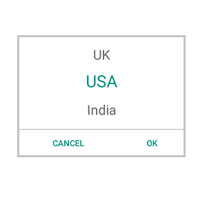
When the Xamarin Picker control populates a collection in a row, it will automatically be assumed to be a single-column picker.

Cascading
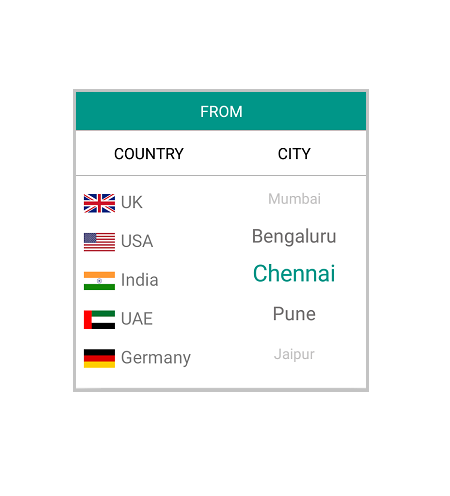
Picker can populate Two or more collections in a row. Also, user can define a column’s data source based on selected items from another column for the use case like to define two columns, “Country” and “State,” where the “State” column’s data source is dependent on the “Country” column’s selected item.
Dialog
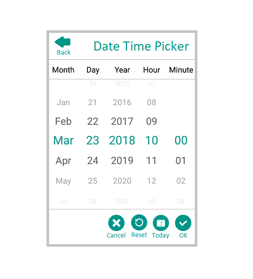
The Xamarin Picker can either be set directly to a layout as stand-alone or can show as a dialog on button click.

Header
Control Header
You can provide the control a heading with a completely customizable font, text color, etc.

Column Header
You can provide a separate heading for each column. Column headers’ font, text colors, etc. are completely customizable.

Footer
The Xamarin.Android Picker control provides validation buttons (OK and Cancel) in the footer, which determines whether or not to perform the selection operation. Also, the footer can hold a custom view.
Default Footer
Footer with validation buttons (OK and Cancel)
Custom View Footer
Footer with custom view.

Custom View
The control accepts a custom view for picker items that helps us to change the look of the item used in it.
Header and Footer Customization
Since Header and Footer accept to hold any view, we can change the header region for our aspect. Apart from this we can change Font size, Font family and color(Background/Text).
150+ XAMARIN CONTROLS
ALL CONTROLS
-
Xamarin.Forms
-
Xamarin.Android
-
Xamarin.iOS
-
GRIDSDATA VISUALIZATIONNAVIGATIONEDITORSPROJECT MANAGEMENTNOTIFICATIONDOCUMENT PROCESSING LIBRARIESVIEWER/EDITORMISCELLANEOUS
-
GRIDSDATA VISUALIZATIONNAVIGATIONEDITORSLAYOUTPROJECT MANAGEMENTNOTIFICATIONVIEWER/EDITORDOCUMENT PROCESSING LIBRARIESMISCELLANEOUS
-
GRIDSDATA VISUALIZATIONNAVIGATIONEDITORSLAYOUTPROJECT MANAGEMENTNOTIFICATIONVIEWER/EDITORDOCUMENT PROCESSING LIBRARIESMISCELLANEOUS
The most downloaded control (based on the nuget.org download count).
Our Customers Love Us
Having an excellent set of tools and a great support team, Syncfusion® reduces customers’ development time.Here are some of their experiences.

A creator of online tutorials for Microsoft technologies, your controls helped to provide a rich user experience. I wanted a look and feel like a Windows Store app and the Tiles are useful for that.
We're using the file formats and Windows/JavaScript list controls a lot. They're fast, easy to use, and the documentation is good and contains examples. Tickets with questions or suggestions were answered within a day, so we're happy to use the Syncfusion libraries.
Rated by users across the globe
Syncfusion Xamarin.Android Resources
Learning
 Documentation
 Documentation


Awards
Greatness—it’s one thing to say you have it, but it means more when others recognize it. Syncfusion® is proud to hold the following industry awards.

