Trusted by the world’s leading companies

Overview
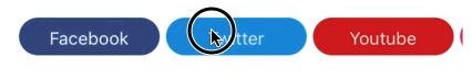
The Xamarin.iOS Segmented control is a linear segment made up of multiple segments with each segment functioning as a button. The segments are the same size and allow users to select between multiple contexts.
Display mode
Depending on your application, different scenarios may require icons, text, or a combination of both for effective communication. The segmented control supports these three options.

Text
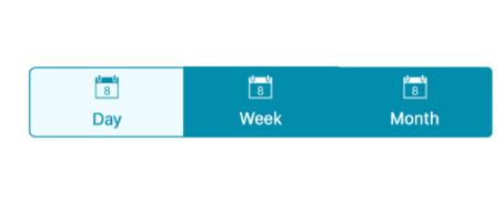
Items populated in the segmented control will be displayed as text by default.

Image
Items populated in the segmented control can be displayed as icons.

Image with text
Items populated in the segmented control can be displayed as icons with accompanying text.
Scrolling
When the available space in the segmented control is not equally distributed, the items beyond the edges of the control can be viewed by scrolling the panel.
Data source
Segments can be populated from a collection of strings, views, or a collection of objects in a built-in class.
String collection
Set a collection of strings as a data source.
View collection
Custom views or images can be added as segments.
Segment item collection
Customize the text or icons, or use other built-in customization options available for the segments. Segment item collections can also be used.
Icon fonts
Use icon fonts to avoid icon scalability issues and reduce the app footprint by avoiding solid images.

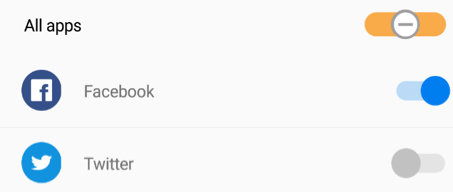
Switch
The segmented control can be customized as switches, i.e., traditional two binary items or with any additional options.
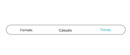
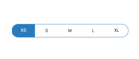
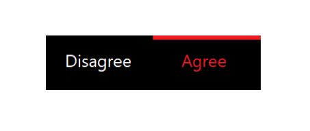
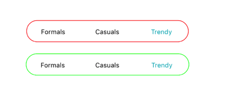
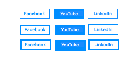
Selection indicators
A selection strip is used to indicate the selected item in the segmented control. The selection strip can be customized in many forms.
Border
The selection strip can be set as a border to highlight the selected item.
Fill
The selection strip can be placed over a segment item to indicate it is selected. You can customize its color to highlight the item.
Top placement
The selection strip can be displayed as a line with customizable color and thickness. It can be positioned at the top of an item.

Bottom placement
The selection strip can be displayed as a line with customizable color and thickness. It can be positioned at the bottom of an item.
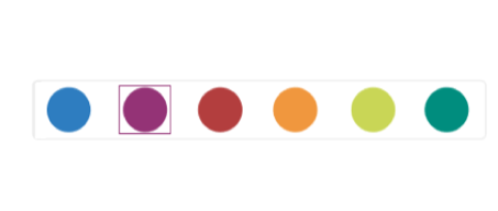
Customization
The segmented control supports customizing the segment color, text color, icon size, selection color, and more, enabling the segments to fit your application’s theme. It can be customized in the following areas.

Font size
The font size can be customized with pixel precision or with standard options such as small, medium, and large.

Font family
The control supports traditional and custom fonts to suit your application. Some iconic fonts are supported too.

Text color
The text color can be customized for normal and selected states with the available color collection or any hex color code.

Item color
The background color of all the items can be customized.
Border color
The border color can be customized for all items.
Border thickness
The border thickness can be customized for all items.
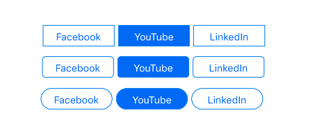
Corner radius
The corner radius can be customized for selection strips and items.

Padding
Spacing between the items in the control can also be customized.
150+ XAMARIN UI CONTROLS
ALL CONTROLS
-
Xamarin.Forms
-
Xamarin.Android
-
Xamarin.iOS
-
GRIDSDATA VISUALIZATIONNAVIGATIONEDITORSPROJECT MANAGEMENTNOTIFICATIONDOCUMENT PROCESSING LIBRARIESVIEWER/EDITORMISCELLANEOUS
-
GRIDSDATA VISUALIZATIONNAVIGATIONEDITORSLAYOUTPROJECT MANAGEMENTNOTIFICATIONVIEWER/EDITORDOCUMENT PROCESSING LIBRARIESMISCELLANEOUS
-
GRIDSDATA VISUALIZATIONNAVIGATIONEDITORSLAYOUTPROJECT MANAGEMENTNOTIFICATIONVIEWER/EDITORDOCUMENT PROCESSING LIBRARIESMISCELLANEOUS
The most downloaded control (based on the nuget.org download count).
Our Customers Love Us
Having an excellent set of tools and a great support team, Syncfusion® reduces customers’ development time.Here are some of their experiences.

A creator of online tutorials for Microsoft technologies, your controls helped to provide a rich user experience. I wanted a look and feel like a Windows Store app and the Tiles are useful for that.
We're using the file formats and Windows/JavaScript list controls a lot. They're fast, easy to use, and the documentation is good and contains examples. Tickets with questions or suggestions were answered within a day, so we're happy to use the Syncfusion libraries.
Rated by users across the globe
Syncfusion Xamarin.iOS Resources
Learning
 Documentation
 Documentation


Awards
Greatness—it’s one thing to say you have it, but it means more when others recognize it. Syncfusion® is proud to hold the following industry awards.

