Trusted by the world’s leading companies

Overview
The Xamarin.Android ComboBox control (drop-down) is a text box component that allows users to type a value or choose an option from a list of predefined options. It has several out-of-the-box features, such as data binding, filtering, UI customization, and custom templates.
Editable and non-editable modes
In editable mode, the combo box allows users to edit in the text box that shows the suggestion in drop-down list based on the input. Non-editable mode is used to prevent users from typing and select from drop-down list.

Filtering
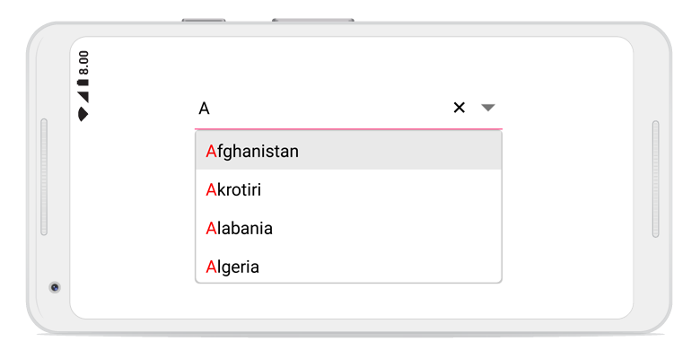
You can pick from various filtering options such as starts with, contains, and ends with. You can also pick whether to filter with or without case sensitivity.

First occurrence
Highlights the matching text that occurs first.

Multiple occurrence
Highlights the matching text that occurs multiple times.

Perform filtering when needed
The combo box control starts offering matches as soon as users start typing. This feature can be changed by setting the number of characters required to start matching.
Auto fill
The combo box component has autofill option. This completes the word that users type from the suggestion text. So, the end users can search for the items easily.It suggests a list of filtered items in a pop-up or appends the rest of the suggested words in the input area. This also appends the matched item and displays the list of filtered items suggested in a pop-up at the same time.


Pop-up placement
If the control is at the bottom of the application, where the default keyboard appears and hides the pop-up, the pop-up can be placed at the top.

Multiple selection
The input field has been designed to address scenarios such as email address bars. You can select multiple items with token representation or simply divide them with a delimiter.

Token representation
Customizable token representation allows users to remove an item with its close button.

Delimiter
Selected items can be divided with desired characters such as “$” for dollar separation or ‘,’ for traditional comma separation.
UI customization
The combobox control can be thoroughly customized in the following areas.

Custom template
The control accepts a template for pop-ups to change the look and feel of the items.

Header and Footer template
You can design your own header and footer for the pop-up list using the header and footer template.

Custom view in text area
The control accepts any custom view in the place of the text box.

Appearance
By default, the customizable appearance of the control is designed to adopt native look and feel of the deployment platform.

Color customization
The color of pop-ups and text can be customized to fit the application design.

Font size
The font size can be customized with pixel precision or with standard options, such as small, medium, and large.

Font family
You will not be limited to use traditional fonts only, but you can also use custom fonts that suit the application. The control renders certain iconic fonts too.
General information
The combo box control provides some additional features that make it more user-friendly.

Clear button
A customizable clear button is available to clear all the text in a single tap. The button can be enabled or disabled.
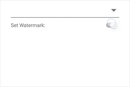
Watermark
Watermark prompts with an information hint when the search box is not in focus and contains an empty string.

MVVM support
Every aspect of the comboBox control has been designed with MVVM pattern in mind.

Localization
All static text can be localized with the required language.

Use real-time object
Along with a list of strings, a real-time object can also be used to direct the search member to search and display.

Bind icons
The pop-up list has a provision to place an icon. A member can also be assigned to form the object.
150+ XAMARIN CONTROLS
ALL CONTROLS
-
Xamarin.Forms
-
Xamarin.Android
-
Xamarin.iOS
-
GRIDSDATA VISUALIZATIONNAVIGATIONEDITORSPROJECT MANAGEMENTNOTIFICATIONDOCUMENT PROCESSING LIBRARIESVIEWER/EDITORMISCELLANEOUS
-
GRIDSDATA VISUALIZATIONNAVIGATIONEDITORSLAYOUTPROJECT MANAGEMENTNOTIFICATIONVIEWER/EDITORDOCUMENT PROCESSING LIBRARIESMISCELLANEOUS
-
GRIDSDATA VISUALIZATIONNAVIGATIONEDITORSLAYOUTPROJECT MANAGEMENTNOTIFICATIONVIEWER/EDITORDOCUMENT PROCESSING LIBRARIESMISCELLANEOUS
The most downloaded control (based on the nuget.org download count).
Our Customers Love Us
Having an excellent set of tools and a great support team, Syncfusion® reduces customers’ development time.Here are some of their experiences.

A creator of online tutorials for Microsoft technologies, your controls helped to provide a rich user experience. I wanted a look and feel like a Windows Store app and the Tiles are useful for that.
We're using the file formats and Windows/JavaScript list controls a lot. They're fast, easy to use, and the documentation is good and contains examples. Tickets with questions or suggestions were answered within a day, so we're happy to use the Syncfusion libraries.
Rated by users across the globe
Syncfusion Xamarin.Android Resources
Learning
 Documentation
 Documentation


Awards
Greatness—it’s one thing to say you have it, but it means more when others recognize it. Syncfusion® is proud to hold the following industry awards.

