
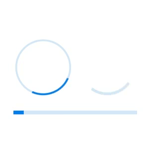
Simple and elegant Xamarin.Forms ProgressBar
- Linear or circular progress bars provide elegance in representing progression.
- Secondary progress can be shown like YouTube buffering.
- Indeterminate state options allow you to show the progress interruption.
Trusted by the world’s leading companies

Overview
The Xamarin ProgressBar is a control that indicates the progress of a task with customizable visual. It includes features to visualize progress in rectangular and circular shapes, determinate and indeterminate states, segments, and customized ranges in different colors. It also supports animation.
Types
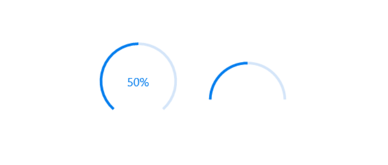
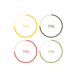
Visualizes progress in different shapes (rectangle, circle, and semi-circle) to give a unique appearance to your app design.


States
Visualizes the progress in different modes.

Determinate
Use the determinate mode progress bar when progress can be estimated.
Indeterminate
Use the indeterminate mode progress bar when progress cannot be estimated or calculated. It can be combined with determinate mode to let users know that the app is estimating the progress before the actual progress starts.

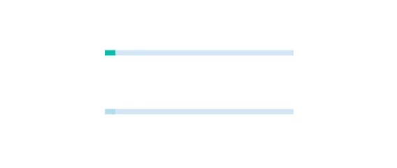
Buffer
Uses a secondary progress indicator when the primary task depends on the secondary task. This will allow users to visualize both primary and secondary tasks’ progress simultaneously.
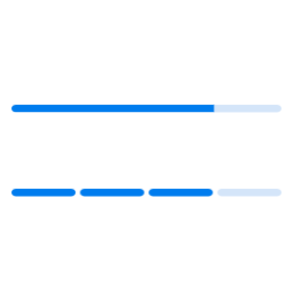
Segments
Avoid writing several lines of code to create and position multiple progress bars: just divide a progress bar into multiple segments using a single API to visualize the progress of multiple sequential tasks.

Angle
Customize the start and sweep angles of circular progress to give a unique style to the circular progress bar.
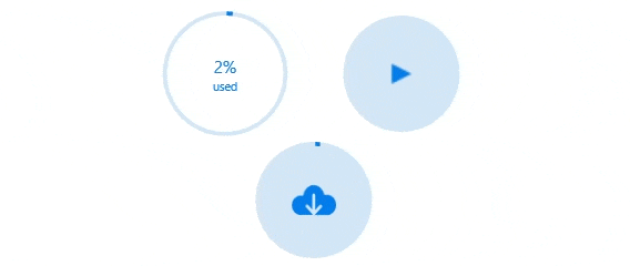
Custom content
Add any view to the center of a circular progress bar to: indicate the completion of the progress; add start, pause, or cancel buttons to control the progress interactively; add an image that indicates the actual task in progress; add custom text that conveys the progress.
Visualize multiple ranges
Along with visualizing the progress of a task, users can also visualize multiple ranges with gradient colors or solid colors that are mapped to each range to enhance the readability.
Appearance
The appearance of a Xamarin.Forms progress bar is highly customizable.

Thickness
Tweak the thickness of the track and progress indicator to render the Xamarin.Forms ProgressBar with different appearances.
Colors
Apply appealing colors to the track and progress indicator to match your app theme.
Corner radius
The corner radius of the Xamarin progress bar can be customized.
Xamarin.Forms ProgressBar Code Example
Easily get started with the Xamarin.Forms ProgressBar using a few simple lines of C# code example as demonstrated below. Also explore our Xamarin.Forms ProgressBar Example that shows you how to render and configure the ProgressBar for Xamarin.Forms.
<!--Using linear progress bar-->
<progressBar:SfLinearProgressBar Progress="75"/>
<!--Using circular progress bar-->
<progressBar:SfCircularProgressBar Progress="75"/>
// Using linear progress bar.
SfLinearProgressBar linearProgressBar = new SfLinearProgressBar { Progress = 75 };
// Using circular progress bar.
SfCircularProgressBar circularProgressBar = new SfCircularProgressBar { Progress = 75 };Not sure how to create your first Xamarin ProgressBar? Our documentation can help.
I’d love to read it now150+ XAMARIN UI CONTROLS
ALL CONTROLS
-
Xamarin.Forms
-
Xamarin.Android
-
Xamarin.iOS
-
GRIDSDATA VISUALIZATIONNAVIGATIONEDITORSLAYOUTPROJECT MANAGEMENTNOTIFICATIONDOCUMENT PROCESSING LIBRARIESVIEWER/EDITORMISCELLANEOUSCHAT
-
GRIDSDATA VISUALIZATIONNAVIGATIONEDITORSLAYOUTPROJECT MANAGEMENTNOTIFICATIONVIEWER/EDITORDOCUMENT PROCESSING LIBRARIESMISCELLANEOUS
-
GRIDSDATA VISUALIZATIONNAVIGATIONEDITORSLAYOUTPROJECT MANAGEMENTNOTIFICATIONVIEWER/EDITORDOCUMENT PROCESSING LIBRARIESMISCELLANEOUS
The most downloaded control (based on the nuget.org download count).
Frequently Asked Questions
Why should you choose Syncfusion Xamarin ProgressBar?
The Syncfusion Xamarin ProgressBar provides the following:
- A customizable visual to indicate the progress of a task.
Features to visualize progress in rectangular and circular shapes, determinate and indeterminate states, segments, and customized ranges in different colors.
- One of the best Xamarin ProgressBar in the market that offers a feature-rich UI.
- Simple configuration and API.
- Touch friendly and responsive.
Extensive demos, documentation to learn quickly and get started with Xamarin ProgressBar.
Where can I find the Syncfusion Xamarin ProgressBar demo?
You can find our Xamarin ProgressBar demo here.
Can I download and utilize the Syncfusion Xamarin ProgressBar for free?
No, this is a commercial product and requires a paid license. However, a free community license is also available for companies and individuals whose organizations have less than $1 million USD in annual gross revenue, 5 or fewer developers, and 10 or fewer total employees.
How do I get started with Syncfusion Xamarin ProgressBar?
A good place to start would be our comprehensive getting started documentation.
Our Customers Love Us
Having an excellent set of tools and a great support team, Syncfusion® reduces customers’ development time.Here are some of their experiences.

Amazing tool, great designs
Using Xamarin templates from Syncfusion I can focus on the code and do not have to worry about design. Very easy to implement.

Dirk F,

Software Development Engineer, Small-Business
Essential for any Xamarin developer!
A large number of components that complement or improve almost everything that does not yet exist in Xamarin. The support is the best I've ever seen! They fix bugs quickly and are always willing to listen to suggestions.

Cezar W,
Co-Founder, Small-Business
Rated by users across the globe
Syncfusion Xamarin.Forms Resources
Learning
 Documentation
 Documentation


Awards
Greatness—it’s one thing to say you have it, but it means more when others recognize it. Syncfusion® is proud to hold the following industry awards.

