Trusted by the world’s leading companies

Overview
The Xamarin.Android Range Selector is a filter control that provides an intuitive interface to select a smaller range from a larger collection. It is commonly used in financial dashboards to filter a date range for which data needs to be visualized.
Scales
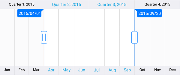
The major and minor scales display a range with different intervals and are placed at the top and bottom of the range selector. A date-time component can be configured to be shown in major and minor scales.
Content
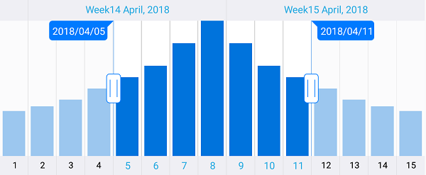
Add any view as the content of the range selector to provide a glimpse of the bound data and provide a detailed view of the selected range in a separate view.
Binding selected data
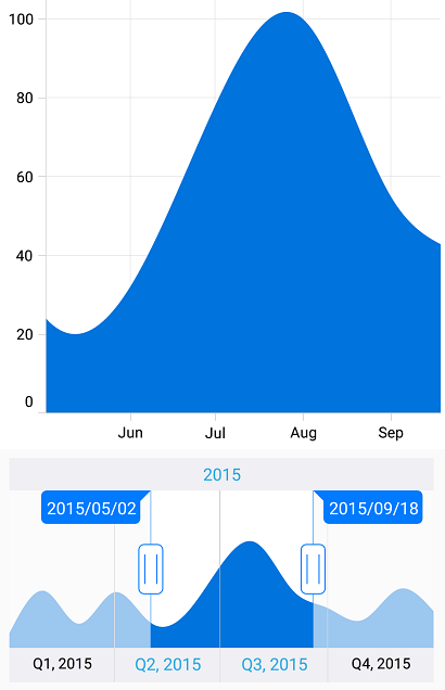
Bind the selected data in the range selector to other data visualization controls to visualize the filtered data.
Range selection
The range selector provides three ways to select a range:
- Select the range from major and minor scales.
- Drag the left thumb and right thumb.
- Drag the selected range to maintain the same delta.
UI customization
All the elements of the range selector are highly customizable.
Labels
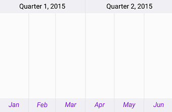
The size, color, font family, font attributes, and alignment of the minor and major labels are customizable.
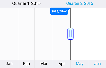
Thumb
The entire appearance of the left and right thumbs can be customized.
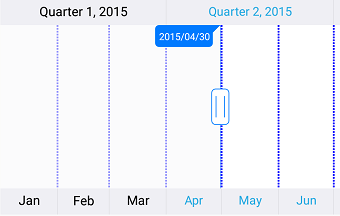
Gridlines
The color, stroke width, dash array, and visibility of the major and minor gridlines are customizable.
Tooltip
Tooltips display the start and end values of the selected range to make choosing the required range easier for users.

Deferred scrolling
Deferred scrolling allows you to defer the updating of a selected range until the user stops dragging the thumbs. This provides a smooth scrolling experience.
Localization
All static text within the range selector can be localized to any desired language.

150+ XAMARIN CONTROLS
-
Xamarin.Forms
-
Xamarin.Android
-
Xamarin.iOS
-
GRIDSDATA VISUALIZATIONNAVIGATIONEDITORSPROJECT MANAGEMENTNOTIFICATIONDOCUMENT PROCESSING LIBRARIESVIEWER/EDITORMISCELLANEOUS
-
GRIDSDATA VISUALIZATIONNAVIGATIONEDITORSLAYOUTPROJECT MANAGEMENTNOTIFICATIONVIEWER/EDITORDOCUMENT PROCESSING LIBRARIESMISCELLANEOUS
-
GRIDSDATA VISUALIZATIONNAVIGATIONEDITORSLAYOUTPROJECT MANAGEMENTNOTIFICATIONVIEWER/EDITORDOCUMENT PROCESSING LIBRARIESMISCELLANEOUS
Our Customers Love Us


 Documentation
Awards
Greatness—it’s one thing to say you have it, but it means more when others recognize it. Syncfusion® is proud to hold the following industry awards.


