
Xamarin.Forms Date Picker Control
- Displays different date formats.
- Supports customizing header text, column header text, and background color.
- Supports minimum and maximum date restrictions.
- Supports stand-alone and dialog modes.
Trusted by the world’s leading companies

Overview
Xamarin Date Picker is a fully customizable component that provides a simple, yet attractive UI to make your application a smooth, touch-friendly experience.
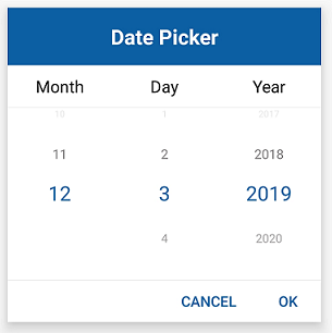
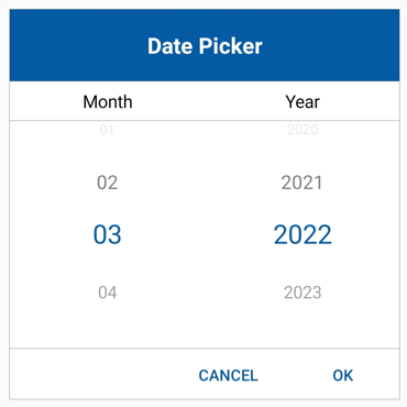
Date format
Xamarin.Forms Date Picker shows date values in the picker with eight predefined date formats.

Xamarin.Forms Date Picker control with format.

Xamarin.Forms Date Picker control with format_dd_mmm_yyyy.
Xamarin.Forms Date Picker control with format_mm_d_yyyy.

Xamarin.Forms Date Picker control with format_mm_dd_yyyy.

Xamarin.Forms Date Picker control with format_dd_mm_yyyy.

Xamarin.Forms Date Picker control with format_dd_mm.
Xamarin.Forms Date Picker control with format_mm_yyyy.

Xamarin.Forms Date Picker control with format_mmm_yyyy.
Dialog
Xamarin.Forms Date Picker comes with a stand-alone mode and a dialog mode that make the app look more impressive in the UI.

Validation
Xamarin.Forms Date Picker can be loaded with a specified date range by setting the maximum and minimum dates to help restrict date selection beyond that range.

Intervals
Date values can be populated with intervals for days, months, and years, individually.

Looping
Values can be looped for all the columns.

Customization
Each part of the control can be customized, like the header text, column header text, colors, fonts, and more.

Header text
The default text “Date Picker” in the header can be customized as shown.

Column header text
Separate headings for each column can be provided. Column headers are completely customizable with different fonts, colors, etc.
Xamarin Date Picker Code Example
Easily get started with the Xamarin Date Picker using a few simple lines of C# code as demonstrated below. Also explore our Xamarin Date Picker Example that shows you how to render and configure the Xamarin Date Picker.
<syncfusion:SfDatePicker x:Name="datepicker"
PickerMode="Dialog"
PickerHeight="300"
PickerWidth="300" />
SfDatePicker datePicker;
public MainPage()
{
InitializeComponent();
datePicker = new SfDatePicker()
{
PickerMode = DatePickerMode.Dialog,
PickerHeight = 300,
PickerWidth = 300
};
this.Content = datePicker
}Not sure how to create your first Xamarin Date Picker? Our documentation can help.
I’d love to read it now150+ XAMARIN UI CONTROLS
ALL CONTROLS
-
Xamarin.Forms
-
Xamarin.Android
-
Xamarin.iOS
-
GRIDSDATA VISUALIZATIONNAVIGATIONEDITORSLAYOUTPROJECT MANAGEMENTNOTIFICATIONDOCUMENT PROCESSING LIBRARIESVIEWER/EDITORMISCELLANEOUSCHAT
-
GRIDSDATA VISUALIZATIONNAVIGATIONEDITORSLAYOUTPROJECT MANAGEMENTNOTIFICATIONVIEWER/EDITORDOCUMENT PROCESSING LIBRARIESMISCELLANEOUS
-
GRIDSDATA VISUALIZATIONNAVIGATIONEDITORSLAYOUTPROJECT MANAGEMENTNOTIFICATIONVIEWER/EDITORDOCUMENT PROCESSING LIBRARIESMISCELLANEOUS
The most downloaded control (based on the nuget.org download count).
Frequently Asked Questions
Why should you choose Syncfusion Xamarin Date Picker?
The Syncfusion Xamarin Date Picker provides the following:
- Display different date formats.
- Customize header text, column header text, and background color.
Minimum and maximum date restrictions.
- Supports stand-alone and dialog modes.
- One of the best Xamarin DatePicker components in the market that offers a feature-rich UI.
- Simple configuration and API.
- Touch friendly and responsive.
Extensive demos and documentation to learn quickly and get started with Xamarin DatePicker.
Where can I find the Syncfusion Xamarin Date Picker demo?
You can find our Xamarin Date Picker demo here.
Can I download and utilize the Syncfusion Xamarin Date Picker for free?
No, this is a commercial product and requires a paid license. However, a free community license is also available for companies and individuals whose organizations have less than $1 million USD in annual gross revenue, 5 or fewer developers, and 10 or fewer total employees.
How do I get started with Syncfusion Xamarin Date Picker?
A good place to start would be our comprehensive getting started documentation.
Our Customers Love Us
Having an excellent set of tools and a great support team, Syncfusion® reduces customers’ development time.Here are some of their experiences.

Amazing tool, great designs
Using Xamarin templates from Syncfusion I can focus on the code and do not have to worry about design. Very easy to implement.

Dirk F,

Software Development Engineer, Small-Business
Essential for any Xamarin developer!
A large number of components that complement or improve almost everything that does not yet exist in Xamarin. The support is the best I've ever seen! They fix bugs quickly and are always willing to listen to suggestions.

Cezar W,
Co-Founder, Small-Business
Rated by users across the globe
Syncfusion Xamarin.Forms Resources
Learning
 Documentation
 Documentation


Awards
Greatness—it’s one thing to say you have it, but it means more when others recognize it. Syncfusion® is proud to hold the following industry awards.

