
Xamarin.Forms Text Input - A Modern Text Box Control
- Provide a modern look to your Entry control with floating labels in iOS, Android, UWP, and WPF (Entry and Editor).
- Show or hide passwords interactively. Never allow users to be stuck with an incorrect password.
- Display more information elegantly with icons, help text, and hint or error messages in a compact space.
Trusted by the world’s leading companies

Overview
Xamarin.Forms Text Input Layout or Label Entry is a container control that allows you add a floating label, a password toggle icon to show or hide passwords, leading and trailing icons, and assistive labels such as error messages and help text on top of input controls.
Supported input controls
Enhance the appearance of the Syncfusion NumericUpDown, Numeric Entry, Masked Entry, Autocomplete and ComboBox controls; the Xamarin.Forms framework’s Entry and Editor; and even the entry and editor controls in Xamarin.Forms for WPF. Add assistive labels and icons to those input views by just wrapping the entry and input views with the Text Input Layout control.
Container types
-
Filled: The background of the input view will be filled with the container color, and the baseline stroke and thickness will be changed based on the state of the input view. -
Outlined: The container will be framed with a rounded border. -
None: The container will have an empty background and space around it.

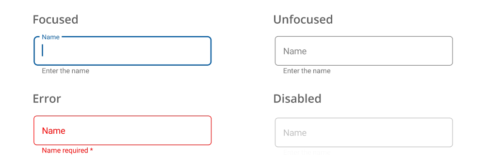
States
Indicate the focused, unfocused, error, and disabled states of the control.
Password visibility toggling
Enable the password toggle icon to show or hide a password interactively.

Assistive labels
Assistive labels provide more information about the input text.

Floating labels and hints
Avoid additional labels by adding hint text, giving the input view more space. The hint text moves from the middle to the top to show a floating label when the input becomes active.

Helper text
The helper text provides additional information about the text to be entered.


Character count
The maximum number of characters that can be entered in the text field can be displayed.
Leading and trailing icons
Add a leading icon to indicate the input type, such as birth date, phone number, or password. Use a trailing icon to add a clear button, error icon, voice input icon, or drop-down icon.

Colors
Apply appealing colors to all the elements of the Text Input Layout control to match your app theme.

Custom fonts
Customize the font family, font size, and font attributes for the hint text, error text, helper text, and counter label.

Padding
Customize the padding around the input view.


Xamarin Text Input Layout Code Example
Easily get started with the Xamarin Text Input Layout using a few simple lines of C# code as demonstrated below. Also explore our Xamarin Text Input Layout Example that shows you how to render and configure the Xamarin Text Input Layout.
<inputLayout:SfTextInputLayout
   Hint="Name">
   <Entry />
</inputLayout:SfTextInputLayout>
var inputLayout = new SfTextInputLayout();
inputLayout.Hint = "Name";
inputLayout.InputView = new Entry();Not sure how to create your first Xamarin Text Input Layout? Our documentation can help.
I’d love to read it now150+ XAMARIN UI CONTROLS
ALL CONTROLS
-
Xamarin.Forms
-
Xamarin.Android
-
Xamarin.iOS
-
GRIDSDATA VISUALIZATIONNAVIGATIONEDITORSLAYOUTPROJECT MANAGEMENTNOTIFICATIONDOCUMENT PROCESSING LIBRARIESVIEWER/EDITORMISCELLANEOUSCHAT
-
GRIDSDATA VISUALIZATIONNAVIGATIONEDITORSLAYOUTPROJECT MANAGEMENTNOTIFICATIONVIEWER/EDITORDOCUMENT PROCESSING LIBRARIESMISCELLANEOUS
-
GRIDSDATA VISUALIZATIONNAVIGATIONEDITORSLAYOUTPROJECT MANAGEMENTNOTIFICATIONVIEWER/EDITORDOCUMENT PROCESSING LIBRARIESMISCELLANEOUS
The most downloaded control (based on the nuget.org download count).
Frequently Asked Questions
Why should you choose Syncfusion Xamarin Text Input Layout?
The Syncfusion Xamarin Text Input Layout provides the following:
- Provide a modern look to your Entry control with floating labels in iOS, Android, UWP, and WPF (Entry and Editor).
Show or hide passwords interactively.
Display more information elegantly with icons, help text, and hint or error messages in a compact space.
- One of the best Xamarin Text Input Layouts in the market that offers a feature-rich UI.
- Simple configuration and API.
- Touch friendly and responsive.
- Extensive [demos] (https://github.com/syncfusion/xamarin-demos/tree/master/Forms/TextInputLayout) and [documentation] (https://help.syncfusion.com/xamarin/text-input-layout/getting-started) to learn quickly and get started with Xamarin Text Input Layout.
Where can I find the Syncfusion Xamarin Text Input Layout demo?
You can find our Xamarin Text Input Layout demo here.
Can I download and utilize the Syncfusion Xamarin Text Input Layout for free?
No, this is a commercial product and requires a paid license. However, a free community license is also available for companies and individuals whose organizations have less than $1 million USD in annual gross revenue, 5 or fewer developers, and 10 or fewer total employees.
How do I get started with Syncfusion Xamarin Text Input Layout?
A good place to start would be our comprehensive getting started documentation.
Our Customers Love Us
Having an excellent set of tools and a great support team, Syncfusion® reduces customers’ development time.Here are some of their experiences.

Amazing tool, great designs
Using Xamarin templates from Syncfusion I can focus on the code and do not have to worry about design. Very easy to implement.

Dirk F,

Software Development Engineer, Small-Business
Essential for any Xamarin developer!
A large number of components that complement or improve almost everything that does not yet exist in Xamarin. The support is the best I've ever seen! They fix bugs quickly and are always willing to listen to suggestions.

Cezar W,
Co-Founder, Small-Business
Rated by users across the globe
Syncfusion Xamarin.Forms Resources
Learning
 Documentation
 Documentation


Awards
Greatness—it’s one thing to say you have it, but it means more when others recognize it. Syncfusion® is proud to hold the following industry awards.

