Trusted by the world’s leading companies

Overview
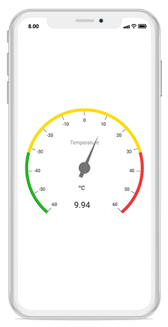
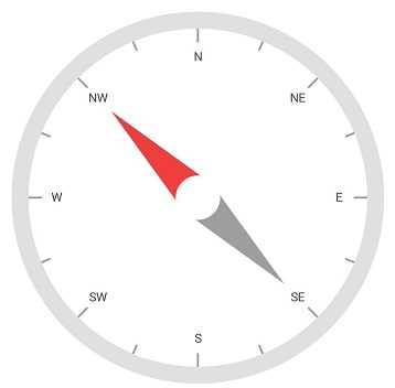
The Xamarin.iOS Circular Gauge, also known as a radial gauge, is a data visualization component that helps display numerical values on a circular scale. It has highly customizable features, such as scales, pointers, ranges, and annotations. It offers an easy way to create a speedometer, temperature monitor, dashboard, meter gauge, multi-axis clock, modern activity gauge, direction compass, and more.
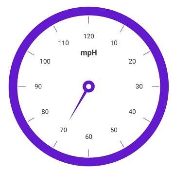
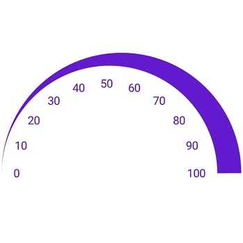
Gauge scales
The scale of a circular gauge is a circular arc where a set of values can be plotted based on any business logic. The appearance of the scale can be customized easily.
Label customization
The look and feel of the default labels can be customized using the font style, size, and color properties. You can also add prefix or suffix text to the labels.
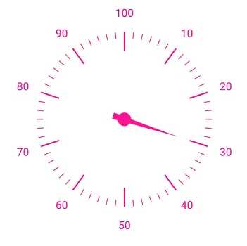
Tick customization
Define your own style for minor and major ticks with the help of the size, color, and thickness properties.
Offset
To enhance gauge readability, change the default scale position by setting an offset value for labels, ticks, and the rim.
Rim
A rim is used to add a circular border to the gauge. You can change the default rim’s appearance to your own style.
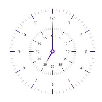
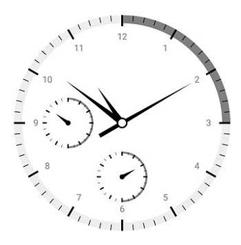
Multiple scales
Add multiple scales to a gauge to design it like a clock, dashboard, speedometer, etc.
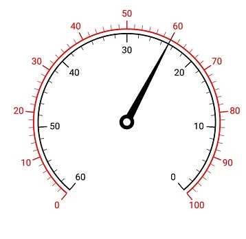
Directions
Change the scale direction to clockwise or counterclockwise.
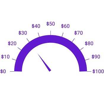
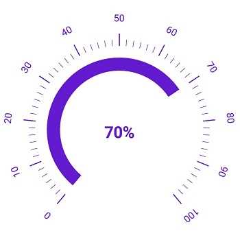
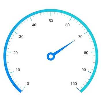
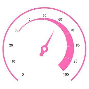
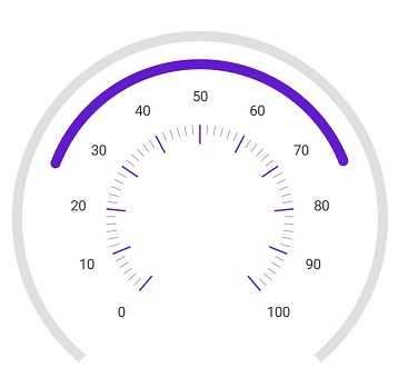
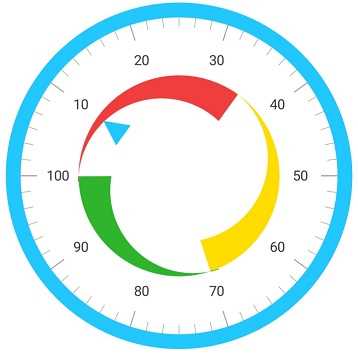
Gauge range
A range in the Circular Gauge is a visual element that helps you quickly visualize where a value falls on the circular scale.
Range position
Range position can be changed or moved to any place inside the gauge.
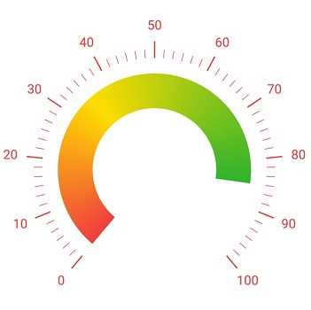
Gradient range color
Range colors vary gradually based on values to provide a smooth color transition effect.
Range thickness
Range thickness varies based on the values to enhance the gauge’s usage and readability.
Multiple ranges
The Circular Gauge allows you to add multiple ranges inside a scale to show color variations.
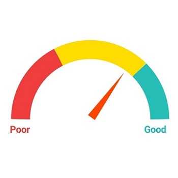
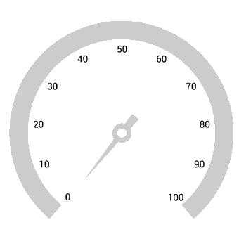
Needle pointer
The current gauge value can be pointed out using a highly customizable needle-type element.
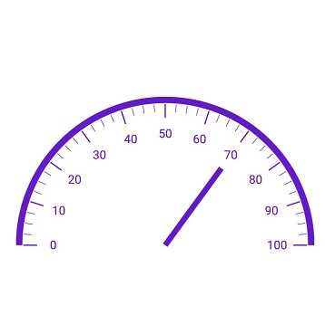
Pointer types
The needle pointer type can be changed to a rectangle or arrow to point out or highlight values.
Knobs
A knob is a rounded ball at the end of the arrow pointer that can also be customized to enhance the pointer’s look.
Tails
A tail can be added to the knob to add an extra element of style.
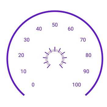
Multiple needle pointers
More than one needle pointer can be added to a scale to indicate multiple values.
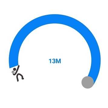
Range pointer
A range pointer is used to point out the current value from the start value of the circular scale.
Pointer position
A range pointer can be changed or moved to any place inside the gauge.
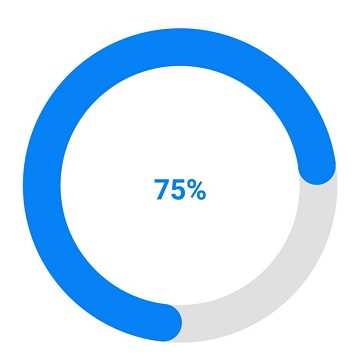
Range cap
You can add a rounded range cap to the start, end, and both sides of the pointer. This provides a rich styling experience for data visualization.
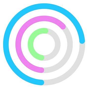
Multiple pointers
Multiple range pointers can be added inside a scale to indicate multiple progress activities.
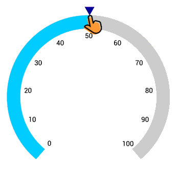
Marker pointers
The current value can be pointed out by using the following different types of marker pointers.
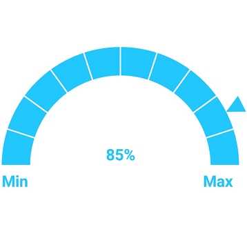
Pointer type
The marker pointer type can be changed to built-in shapes such as a triangles, inverted triangles, squares, or diamonds to highlight the value.
Marker pointer position
Marker pointers can be changed or moved to any place inside the gauge.
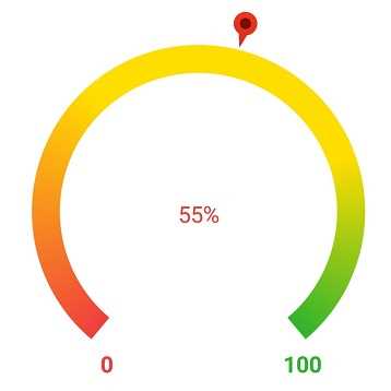
Image pointers
The marker pointer can be customized by adding images to highlight values.
Annotations
Annotations display metadata about a circular gauge at a specific point of interest in the plotting area.
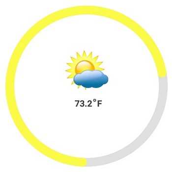
Image annotations
Annotations provide options to add any image over the gauge control with respect to its offset position. You can add multiple images in a single control.
View annotations
You can add any view to the gauge control with respect to its offset position. You can also add multiple views in a single control.
Text annotations
You can add any text over the gauge control to enhance its readability. You can add multiple text instances in a single control.
Pointer animation
Circular Gauge provides a visually appealing way to view pointers with animated transitions over a certain time span. You can see smooth pointer transitions by moving the pointer from one place to another.
Pointer interaction
You can drag the pointer from one place to another. Control it with swipe gestures and change the value at runtime.
150+ XAMARIN UI CONTROLS
ALL CONTROLS
-
Xamarin.Forms
-
Xamarin.Android
-
Xamarin.iOS
-
GRIDSDATA VISUALIZATIONNAVIGATIONEDITORSPROJECT MANAGEMENTNOTIFICATIONDOCUMENT PROCESSING LIBRARIESVIEWER/EDITORMISCELLANEOUS
-
GRIDSDATA VISUALIZATIONNAVIGATIONEDITORSLAYOUTPROJECT MANAGEMENTNOTIFICATIONVIEWER/EDITORDOCUMENT PROCESSING LIBRARIESMISCELLANEOUS
-
GRIDSDATA VISUALIZATIONNAVIGATIONEDITORSLAYOUTPROJECT MANAGEMENTNOTIFICATIONVIEWER/EDITORDOCUMENT PROCESSING LIBRARIESMISCELLANEOUS
The most downloaded control (based on the nuget.org download count).
Our Customers Love Us
Having an excellent set of tools and a great support team, Syncfusion® reduces customers’ development time.Here are some of their experiences.

A creator of online tutorials for Microsoft technologies, your controls helped to provide a rich user experience. I wanted a look and feel like a Windows Store app and the Tiles are useful for that.
We're using the file formats and Windows/JavaScript list controls a lot. They're fast, easy to use, and the documentation is good and contains examples. Tickets with questions or suggestions were answered within a day, so we're happy to use the Syncfusion libraries.
Rated by users across the globe
Syncfusion Xamarin.iOS Resources
Learning
 Documentation
 Documentation


Awards
Greatness—it’s one thing to say you have it, but it means more when others recognize it. Syncfusion® is proud to hold the following industry awards.

