Trusted by the world’s leading companies

Overview
Xamarin.iOS Charts, an easy-to-use, cross-platform charting package, is used to add beautiful charts to mobile and desktop apps. It contains a rich gallery of 30+ charts and graphs, ranging from line to financial charts, that cater to all charting scenarios. Its high performance helps render a large amount of data quickly in your mobile and desktop devices. It also comes with a lot of features such as zooming, panning, tooltip, crosshair, trackball, drill-down, and events to make the charts more interactive.
Chart types
The Charts control includes functionality for plotting more than 25 chart types. Each chart type is easily configured with built-in support for creating stunning visual effects:
-
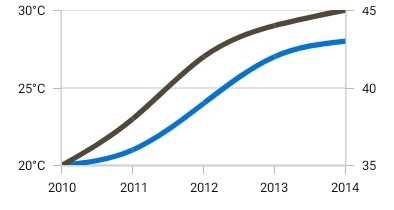
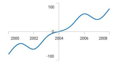
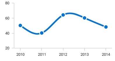
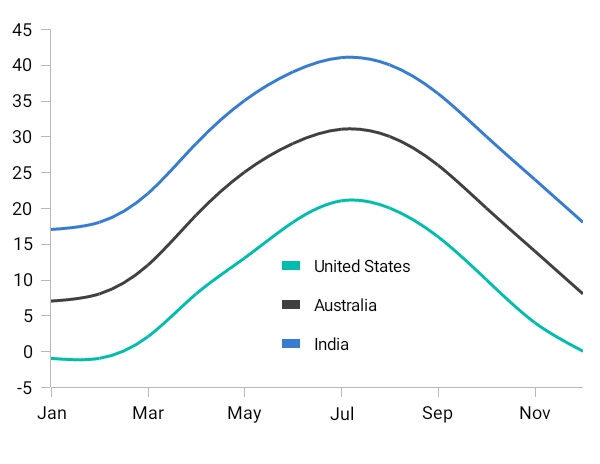
LineorAreatype charts for representing time-dependent data, showing trends in data at equal intervals. -
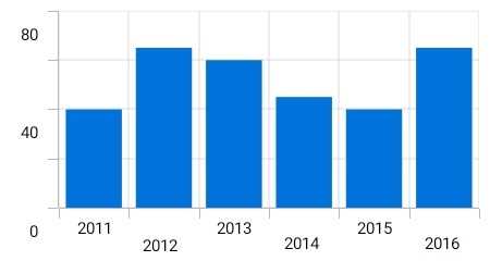
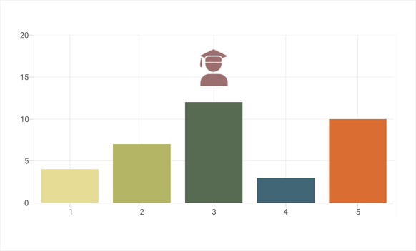
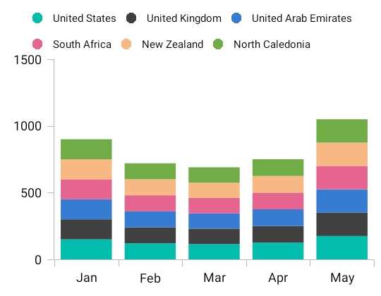
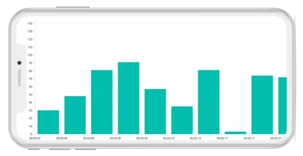
ColumnorBartype charts for comparing the frequency, count, total, or average of data in different categories. They are ideal for showing variations in the value of an item over time. -
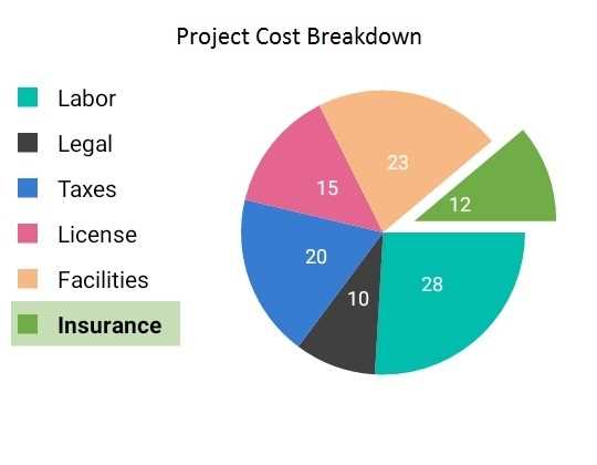
PieorPyramidtype charts to represent data in proportions. -
BubbleorScattercharts to plot financial or scientific data. -
CandleorHilotype charts for stock analysis. -
Rangetype charts to represent high and low values at a point. -
RadarorPolartype charts to plot data points in terms of angles and values.
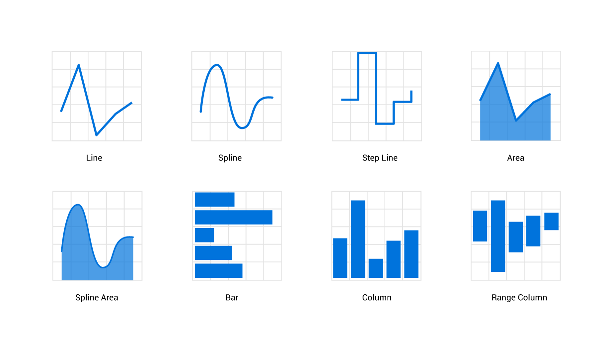
Line, spline, step line, area, spline area, bar, column, and range column in Xamarin.iOS Charts.
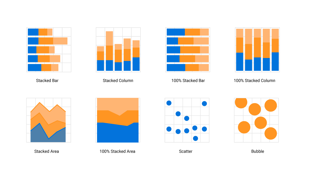
Stacked bar, stacked column, stacked area, scatter, and bubble in Xamarin.iOS Charts.
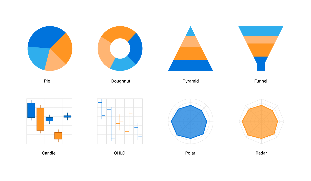
Pie, doughnut, pyramid, funnel, candle, OHLC, polar, and radar in Xamarin.iOS Charts.

Step area, range area, spline range area, histogram, and stacked doughnut in Xamarin.iOS Charts.
High performance
The Charts control includes several data-rendering optimizations to achieve the best possible performance when plotting large volumes of data as well as handling high-frequency real-time data.
Customizable chart axis
The Charts control supports four different types of axes: numerical, categorical, date-time, and logarithmic. The appearance of all elements of the chart axis can be customized with built-in properties.
Multiple axes
Visualize different units of data with multiple axes, which can be placed at either side of the chart.
Smart axis labels
The axis labels can be positioned in multiple rows to avoid collision between two labels.
Automatic range calculation
The best possible axis ranges and intervals are calculated automatically based on the given values. The ranges can be further customized with custom ranges and range padding.

Labels position
Place the axis labels and tick lines inside the chart area to reduce the space consumption of an axis and allow you to plot the data as large as possible.
Label rotation
Axis labels can be rotated to place all the labels within the available space constraint.
Axis crossing
The position of an axis can be moved to anywhere in the chart relative to its associated axis.
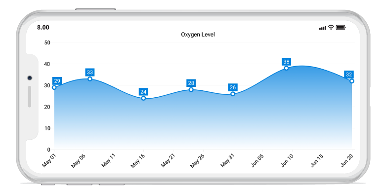
Data labels and markers
Data points can be easily annotated with labels to help improve the readability of data. Readability can be further enhanced by adding markers or customizable symbols.
Data point markers
Data points can be marked with built-in shapes.

Labels and connector lines
Labels can be connected to a data point through a Bezier or straight line.

Labels customization
Data labels can be customized using custom views.
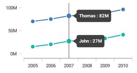
Annotations
Annotations display metadata about a chart or series at a specific point of interest in the plotting area. Multiple annotations can be added to a single chart.
View annotation
Annotate charts with any custom view to provide additional details about a data point. This feature is generally used for displaying images over a data point.
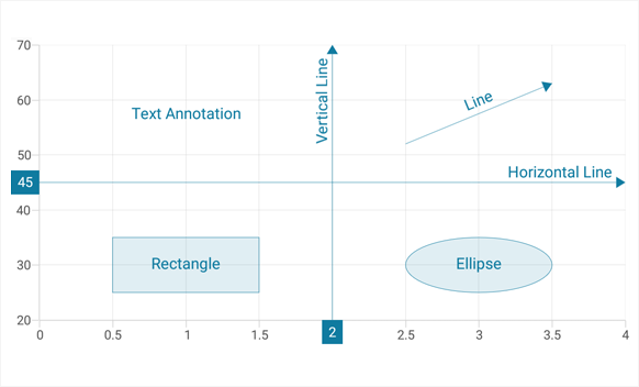
Shape annotation
In addition to the view annotation, all the basic annotation elements like lines, rectangles, ellipses, text, and arrows are available.
Legends
Legends provide additional information that is helpful in identifying individual data or series in a chart.
Custom view
Apply custom views to a legend item to show more information about a series or data point in a legend.
Positioning
Position the legend anywhere in the chart area to make the best fit on the page.
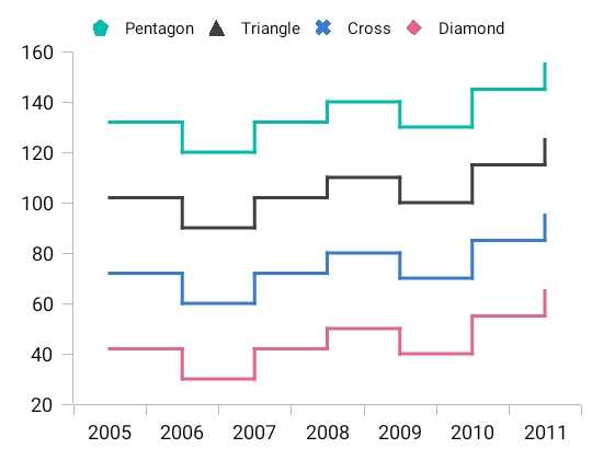
Icon customization
Customize the legend icon with built-in available shapes such as rectangles, circles, diamonds, pentagons, triangles, crosses, and straight lines to improve the readability of the chart.
Wrap the legend items
Display the legend items in multiple rows when it is required to load more of a series in a single chart.
User interactions
The end-user experience is greatly enhanced by a set of user interaction features: zooming, panning, trackball, and tooltip.

Zooming and panning
Zooming and panning are useful when visualizing large amounts of data. Zooming is performed by pinching, selecting the region, and double-tapping at the required position.
Trackball
The trackball control is used to track a data point close to the touch contact point. The trackball label can be customized using custom views.
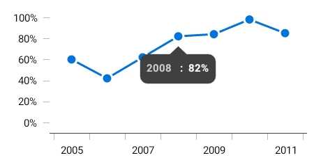
Tooltip
The tooltip control displays a pop-up with additional information when the mouse pointer is touching a data point. The tooltip view can be customized using custom views.
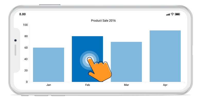
Selection
Interactively select and highlight a data point. This is widely used to navigate to another view controller with the information of a selected data point or to update the other components in the same view controller based on the selected data point in the chart.
Gradient
Apply gradient colors to visualize data in different colors, improving the readability and appearance of a chart.
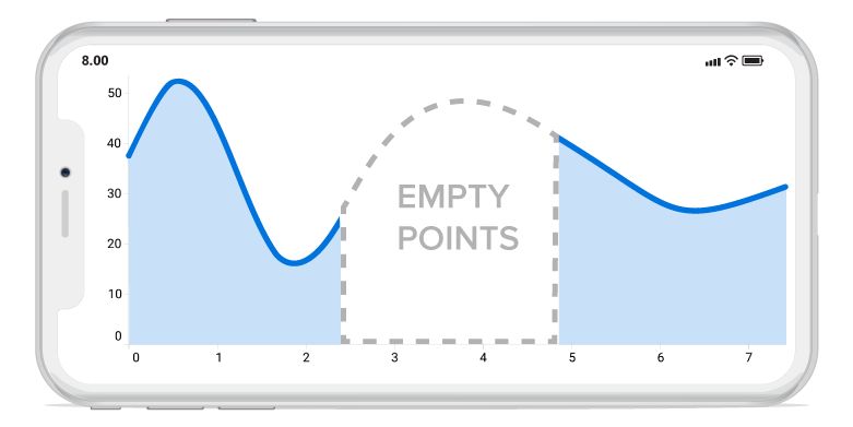
Empty points
Empty point values can be elegantly handled with the available customization options.
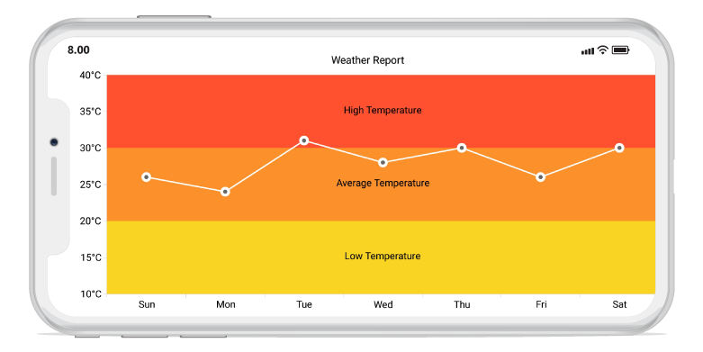
Strip lines
Specific regions in the chart area can be highlighted using strip lines and added text to describe the highlighted area.
Technical indicators
There is built-in support for RSI, momentum, Bollinger bands, accumulation distribution, EMA, SMA, stochastic, ATR, MACD, and TMA indicators.
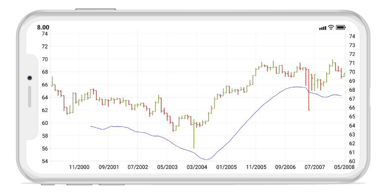
Trendlines
Charts has built-in support for rendering linear, exponential, logarithmic, power, and polynomial trendlines.

Autoscrolling
The autoscrolling feature is used to focus on a minimal set of data points by visualizing only a few items in the UI and viewing the remaining data points by scrolling. It is typically used in real-time updates to view recently added data points.
Vertical charts
Rotate all the series types to plot data in a vertical direction and view data from a different perspective.

Localization
All static text within a chart can be localized to any desired language.

150+ XAMARIN UI CONTROLS
ALL CONTROLS
-
Xamarin.Forms
-
Xamarin.Android
-
Xamarin.iOS
-
GRIDSDATA VISUALIZATIONNAVIGATIONEDITORSPROJECT MANAGEMENTNOTIFICATIONDOCUMENT PROCESSING LIBRARIESVIEWER/EDITORMISCELLANEOUS
-
GRIDSDATA VISUALIZATIONNAVIGATIONEDITORSLAYOUTPROJECT MANAGEMENTNOTIFICATIONVIEWER/EDITORDOCUMENT PROCESSING LIBRARIESMISCELLANEOUS
-
GRIDSDATA VISUALIZATIONNAVIGATIONEDITORSLAYOUTPROJECT MANAGEMENTNOTIFICATIONVIEWER/EDITORDOCUMENT PROCESSING LIBRARIESMISCELLANEOUS
The most downloaded control (based on the nuget.org download count).
Our Customers Love Us
Having an excellent set of tools and a great support team, Syncfusion® reduces customers’ development time.Here are some of their experiences.

A creator of online tutorials for Microsoft technologies, your controls helped to provide a rich user experience. I wanted a look and feel like a Windows Store app and the Tiles are useful for that.
We're using the file formats and Windows/JavaScript list controls a lot. They're fast, easy to use, and the documentation is good and contains examples. Tickets with questions or suggestions were answered within a day, so we're happy to use the Syncfusion libraries.
Rated by users across the globe
Syncfusion Xamarin.iOS Resources
Learning
 Documentation
 Documentation


Awards
Greatness—it’s one thing to say you have it, but it means more when others recognize it. Syncfusion® is proud to hold the following industry awards.