
Xamarin.Forms Segmented control With Efficient Features
- Scrollable items can be used to accommodate more items without occupying more space in a view.
- Can be customized to provide a modern look and supports an additional indeterminate state.
- Elegant display modes such as image, text, and both offer rich customization options.
Trusted by the world’s leading companies

Overview
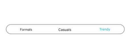
The Xamarin Segmented control is a linear segment made up of multiple segments with each segment functioning as a button. The segments are the same size and allow users to select between multiple contexts.
Display modes
Depending on your application, different scenarios may require icons, text, or a combination of both for effective communication. The Xamarin.Forms Segmented control supports these three options.

Text
Items populated in the Segmented control will be displayed as text by default.

Image
Display items populated in the Segmented control as icons.

Image with text
Display items populated in the Segmented control as icons with accompanying text.
Scrolling
When the available space in the Xamarin.Forms Segmented control is not equally distributed, the items beyond the edges of the control can be viewed by scrolling the panel.

Data source
Segments can be populated from a collection of strings, views, or a collection of objects in a built-in class.
String collection
Set a collection of strings as a data source.

View collection
Add custom views or images as segments.

Segment item collection
Customize the text or icons om segments, or use other built-in customization options available for the segments. Segment item collections can also be used.
Icon fonts
Use icon fonts to avoid icon scalability issues and reduce the app footprint.
Switch
The Xamarin.Forms Segmented control can be customized to behave as a switch with two or more options.

Selection indicators
Use a selection strip to indicate the selected item in the Xamarin.Forms Segmented control. Customize the selection strip into many forms.

Border
Set the selection strip as a border to highlight the selected item.

Fill
Place the selection strip over a segment item to indicate it is selected. You can customize its color to highlight the item.

Top placement
Display the selection strip as a line with customizable color and thickness and it positioned at the top of an item.

Bottom placement
Display the selection strip as a line with customizable color and thickness and it positioned at the bottom of an item.
Customization
The Xamarin.Forms Segmented control supports customizing the segment color, text color, icon size, selection color, and more, enabling the segments to fit your application’s theme.


Xamarin Segmented Control Code Example
Easily get started with the Xamarin Segmented Control using a few simple lines of C# code as demonstrated below. Also explore our Xamarin Segmented Control that shows you how to render and configure the Xamarin Segmented Control.
<buttons:SfSegmentedControl
            HeightRequest="80">
            <segmentCollection:List x:TypeArguments="x:String">
                <x:String>1</x:String>
                <x:String>2</x:String>
                <x:String>3</x:String>
            </segmentCollection:List>
</buttons:SfSegmentedControl>
private SfSegmentedControl segmentedControl;
public MainPage()
{
InitializeComponent();
segmentedControl = new SfSegmentedControl();
segmentedControl.HeightRequest = 80;
List<string> list = new List<string>
{
"1","2","3","4","5","6"
};
segmentedControl.ItemsSource = list;
stack.Children.Add(segmentedControl);
this.Content = stack;
}Not sure how to create your first Xamarin Segmented Control? Our documentation can help.
I’d love to read it now150+ XAMARIN UI CONTROLS
ALL CONTROLS
-
Xamarin.Forms
-
Xamarin.Android
-
Xamarin.iOS
-
GRIDSDATA VISUALIZATIONNAVIGATIONEDITORSLAYOUTPROJECT MANAGEMENTNOTIFICATIONDOCUMENT PROCESSING LIBRARIESVIEWER/EDITORMISCELLANEOUSCHAT
-
GRIDSDATA VISUALIZATIONNAVIGATIONEDITORSLAYOUTPROJECT MANAGEMENTNOTIFICATIONVIEWER/EDITORDOCUMENT PROCESSING LIBRARIESMISCELLANEOUS
-
GRIDSDATA VISUALIZATIONNAVIGATIONEDITORSLAYOUTPROJECT MANAGEMENTNOTIFICATIONVIEWER/EDITORDOCUMENT PROCESSING LIBRARIESMISCELLANEOUS
The most downloaded control (based on the nuget.org download count).
Frequently Asked Questions
Why should you choose Syncfusion Xamarin Segmented Control?
The Syncfusion Xamarin Segmented Control provides the following:
- Xamarin SegmentedControl offers a better experience with a UI that is easy to interact with.
Comes with a bunch of features and customizations suitable for use in large applications.
- Simple APIs.
- Touch-friendly and responsive.
- One of the best Xamarin Segmented Control in the market that offers a feature-rich UI.
Extensive demos and documentation to learn quickly and get started with Xamarin Segmented Control.
Where can I find the Syncfusion Xamarin Segmented Control demo?
You can find our Xamarin Segmented Control demo here.
Can I download and utilize the Syncfusion Xamarin Segmented Control for free?
No, this is a commercial product and requires a paid license. However, a free community license is also available for companies and individuals whose organizations have less than $1 million USD in annual gross revenue, 5 or fewer developers, and 10 or fewer total employees.
How do I get started with Syncfusion Xamarin Segmented Control?
A good place to start would be our comprehensive getting started documentation.
Our Customers Love Us
Having an excellent set of tools and a great support team, Syncfusion® reduces customers’ development time.Here are some of their experiences.

Amazing tool, great designs
Using Xamarin templates from Syncfusion I can focus on the code and do not have to worry about design. Very easy to implement.

Dirk F,

Software Development Engineer, Small-Business
Essential for any Xamarin developer!
A large number of components that complement or improve almost everything that does not yet exist in Xamarin. The support is the best I've ever seen! They fix bugs quickly and are always willing to listen to suggestions.

Cezar W,
Co-Founder, Small-Business
Rated by users across the globe
Syncfusion Xamarin.Forms Resources
Learning
 Documentation
 Documentation


Awards
Greatness—it’s one thing to say you have it, but it means more when others recognize it. Syncfusion® is proud to hold the following industry awards.

