
Xamarin.Forms Cards - Card View control
- Create stacked cards.
- Create a dismissible card.
- Customize the elevation, background, border width, corner radius, border color, and indicator.
Trusted by the world’s leading companies

Overview
Xamarin Cards is a container control that allows you to create a dismissible card or a stack of cards where one card is visible at a time until you swipe to see the next card.
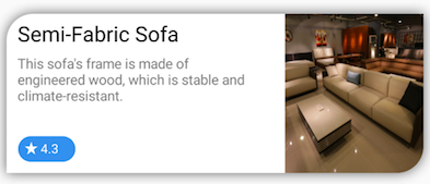
Dismissible card
Implement a dismissible card that can be swiped away from the view. It is also possible to fade out a card while it is being dismissed.
Indicator customization
Indicators can be placed at the edges of a card to indicate certain states based on the current content of the card.
Left
Right
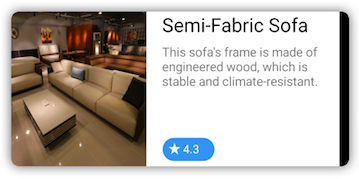
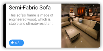
Border customization
The border of a card can easily be customized to the desired color and thickness.
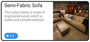
Corner radius
The corner radius can easily be customized to have rounded edges. You can provide different corner radius to different edges.
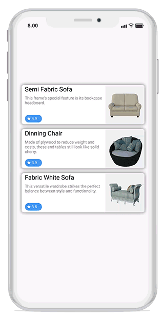
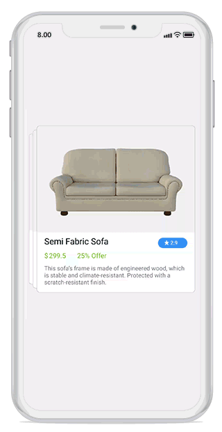
Card layout
Allows you to create a stack of cards where one card is visible at a time until you swipe to see the next card. It is possible to stack the cards in the left or right direction.
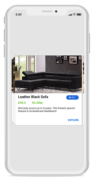
Swipe card to right
Swipe card to left

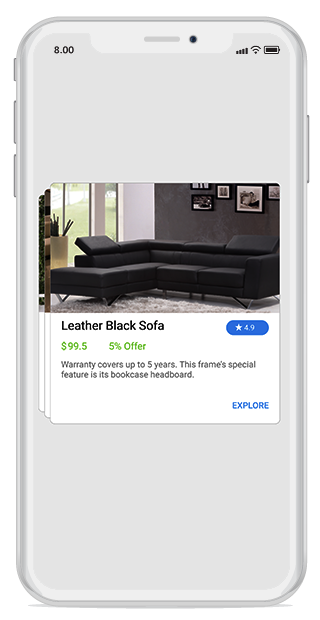
Swiped card at the edge
Swiped cards will be present at the edge to indicate that cards were already swiped.
Swiped card at the edge
Swiped card is not at the edge
Xamarin.Forms Cards Code Example
Easily get started with the Xamarin.Forms Cards using a few simple lines of XAML and, C# code example as demonstrated below. Also explore our Xamarin.Forms Cards Example that shows you how to render and configure the Cards for Xamarin.Forms.
<cards:SfCardLayout SwipeDirection="Left" HeightRequest="500" BackgroundColor="#F0F0F0">
	<cards:SfCardView>
		<Label  Text="Cyan" BackgroundColor="Cyan"/>
	</cards:SfCardView>
	<cards:SfCardView>
		<Label  Text="Yellow" BackgroundColor="Yellow"/>
	</cards:SfCardView>
	<cards:SfCardView>
		<Label  Text="Orange" BackgroundColor="Orange"/>
	</cards:SfCardView>
</cards:SfCardLayout>
SfCardLayout cardLayout = new SfCardLayout();
//Add children for card layout
cardLayout.Children.Add(new SfCardView(){Content = new Label()
{ Text="Cyan", BackgroundColor=Color.Cyan }});
cardLayout.Children.Add(new SfCardView(){Content = new Label()
{ Text="Yellow", BackgroundColor=Color.Yellow }});
cardLayout.Children.Add(new SfCardView()
{Content = new Label(){ Text="Orange", BackgroundColor=Color.Orange }});
this.Content = cardLayout;Not sure how to create your first Xamarin Cards? Our documentation can help.
I’d love to read it now150+ XAMARIN UI CONTROLS
ALL CONTROLS
-
Xamarin.Forms
-
Xamarin.Android
-
Xamarin.iOS
-
GRIDSDATA VISUALIZATIONNAVIGATIONEDITORSLAYOUTPROJECT MANAGEMENTNOTIFICATIONDOCUMENT PROCESSING LIBRARIESVIEWER/EDITORMISCELLANEOUSCHAT
-
GRIDSDATA VISUALIZATIONNAVIGATIONEDITORSLAYOUTPROJECT MANAGEMENTNOTIFICATIONVIEWER/EDITORDOCUMENT PROCESSING LIBRARIESMISCELLANEOUS
-
GRIDSDATA VISUALIZATIONNAVIGATIONEDITORSLAYOUTPROJECT MANAGEMENTNOTIFICATIONVIEWER/EDITORDOCUMENT PROCESSING LIBRARIESMISCELLANEOUS
The most downloaded control (based on the nuget.org download count).
Frequently Asked Questions
Why should you choose Syncfusion Xamarin Cards?
- Create a dismissible card or stack of cards where one card is visible at a time until you swipe to see the next card.
- Customize the elevation, background, border width, corner radius, border color, and indicator.
- Utilize a feature-rich UI.
- Enjoy simple configuration and APIs.
Take advantage of extensive demos and documentation to learn quickly and get started with the Xamarin Cards component.
Where can I find the Syncfusion Xamarin Cards demo?
You can find our Xamarin Cards demo here
Can I download and utilize the Syncfusion Xamarin Cards for free?
No, this is a commercial product and requires a paid license. However, a free community license is also available for companies and individuals whose organizations have less than $1 million USD in annual gross revenue, 5 or fewer developers, and 10 or fewer total employees.
How do I get started with Syncfusion Xamarin Cards?
A good place to start would be our comprehensive getting started documentation.
Our Customers Love Us
Having an excellent set of tools and a great support team, Syncfusion® reduces customers’ development time.Here are some of their experiences.

Amazing tool, great designs
Using Xamarin templates from Syncfusion I can focus on the code and do not have to worry about design. Very easy to implement.

Dirk F,

Software Development Engineer, Small-Business
Essential for any Xamarin developer!
A large number of components that complement or improve almost everything that does not yet exist in Xamarin. The support is the best I've ever seen! They fix bugs quickly and are always willing to listen to suggestions.

Cezar W,
Co-Founder, Small-Business
Rated by users across the globe
Syncfusion Xamarin.Forms Resources
Learning
 Documentation
 Documentation


Awards
Greatness—it’s one thing to say you have it, but it means more when others recognize it. Syncfusion® is proud to hold the following industry awards.

