
Xamarin.Forms Picker - A Versatile Control for Easy Data Selection
- Intuitive interfaces, like multicolumn, supporting cascading selection.
- The only component that automatically generates its columns based on data source structure.
- Customization as a time picker, date picker, language picker, country picker, color picker, etc.
Trusted by the world’s leading companies

Overview
The Xamarin Picker control is an item selector control that can be opened as a dialog. It allows users to pick an item from a list that can be modified with custom views. Its rich feature set includes functionalities like data binding, multiple-column layout, cascading selection, and headers and footers with custom views.
Xamarin.Forms Picker Code Example
Easily get started with the Xamarin.Forms Picker using a few simple lines of XAML and C# code example as demonstrated below. Also explore our Xamarin Picker Example that shows you how to render and configure a Picker in Xamarin.Forms.
<?xml version="1.0" encoding="utf-8" ?>
<ContentPage xmlns="http://xamarin.com/schemas/2014/forms" xmlns:syncfusion="clr-namespace:Syncfusion.SfPicker.XForms;assembly=Syncfusion.SfPicker.XForms"
xmlns:x="http://schemas.microsoft.com/winfx/2009/xaml"
x:Class="GettingStarted.PickerSample">
  <ContentPage.Content>
    <syncfusion:SfPicker x:Name="picker" />
  </ContentPage.Content>
</ContentPage>
using Syncfusion.SfPicker.XForms;
using Xamarin.Forms;
using Xamarin.Forms.Xaml;
namespace GettingStarted
{
[XamlCompilation(XamlCompilationOptions.Compile)]
public partial class PickerSample : ContentPage
{
SfPicker picker;
public PickerSample()
{
InitializeComponent();
picker = new SfPicker();
this.Content = picker;
}
}
}Data binding
Data binding works out of the box for the most popular data sources. The Xamarin.Forms Picker control can automatically generate its columns based on the data source structure.

Default
When the Xamarin Picker control populates a collection in a row, it will automatically be assumed to be a single-column picker.

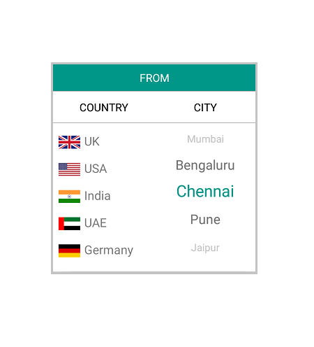
Cascading
The Xamarin.Forms Picker control can populate two or more collections in a row. Also, users can define a column’s data source based on selected items from another column for a particular use case. For example, you can define two columns, “Country” and “State”, where the “State” column’s data source is dependent on the “Country” column’s selected item, thus creating a country-state picker.
Dialog
The Xamarin Picker can either be set directly to a layout as stand-alone or can show as a dialog on button click.


Looping
Looping support is used to automatically loop the list of items after reaching the last item multiple times.
Header

Control header
You can provide the control a heading with a completely customizable font, text color, etc.

Column header
You can provide a separate heading for each column. Column headers’ font, text colors, etc. are completely customizable.
Footer
The Xamarin.Forms Picker control provides validation buttons (OK and Cancel) in the footer, which determines whether or not to perform the selection operation. Also, the footer can hold a custom view.


Custom template
The Xamarin.Forms Picker control accepts a template for picker items that can change their appearance.
Custom picker
With simple customization, the Xamarin.Forms Picker control can be used as a date, time, or language picker.


Language picker
Select a language with the language picker.
Color picker
Pick a color with the color picker.
Localization
By adding the a.resx file to a .NET Standard project, you can localize Xamarin Picker across all platforms.

Not sure how to create your first Xamarin Picker? Our documentation can help.
I’d love to read it now150+ XAMARIN UI CONTROLS
ALL CONTROLS
-
Xamarin.Forms
-
Xamarin.Android
-
Xamarin.iOS
-
GRIDSDATA VISUALIZATIONNAVIGATIONEDITORSLAYOUTPROJECT MANAGEMENTNOTIFICATIONDOCUMENT PROCESSING LIBRARIESVIEWER/EDITORMISCELLANEOUSCHAT
-
GRIDSDATA VISUALIZATIONNAVIGATIONEDITORSLAYOUTPROJECT MANAGEMENTNOTIFICATIONVIEWER/EDITORDOCUMENT PROCESSING LIBRARIESMISCELLANEOUS
-
GRIDSDATA VISUALIZATIONNAVIGATIONEDITORSLAYOUTPROJECT MANAGEMENTNOTIFICATIONVIEWER/EDITORDOCUMENT PROCESSING LIBRARIESMISCELLANEOUS
The most downloaded control (based on the nuget.org download count).
Frequently Asked Questions
Why should you choose Syncfusion Xamarin Picker?
The Syncfusion Xamarin Picker supports the following features:
Intuitive interfaces, like multicolumn, supporting cascading selection.
The only component that automatically generates its columns based on data source structure.
Customization to a time picker, date picker, language picker, country picker, color picker, etc.
- One of the best Xamarin Picker in the market that offers feature-rich UI to interact with the software.
- Simple configuration and API.
- Use a lightweight and truly native control.
Expansive learning resources such as demos and documentation to learn quickly and get started with Xamarin Picker.
Where can I find the Syncfusion Xamarin Picker demo?
You can find our Xamarin Picker demo, which demonstrates how to render and configure Picker.
Can I download and utilize the Syncfusion Xamarin Picker for free?
No, this is a commercial product and requires a paid license. However, a free community license is also available for companies and individuals whose organizations have less than $1 million USD in annual gross revenue, 5 or fewer developers, and 10 or fewer total employees.
How do I get started with Syncfusion Xamarin Picker?
A good place to start would be our comprehensive getting started documentation.
Our Customers Love Us
Having an excellent set of tools and a great support team, Syncfusion® reduces customers’ development time.Here are some of their experiences.

Amazing tool, great designs
Using Xamarin templates from Syncfusion I can focus on the code and do not have to worry about design. Very easy to implement.

Dirk F,

Software Development Engineer, Small-Business
Essential for any Xamarin developer!
A large number of components that complement or improve almost everything that does not yet exist in Xamarin. The support is the best I've ever seen! They fix bugs quickly and are always willing to listen to suggestions.

Cezar W,
Co-Founder, Small-Business
Rated by users across the globe
Syncfusion Xamarin.Forms Resources
Learning
 Documentation
 Documentation


Awards
Greatness—it’s one thing to say you have it, but it means more when others recognize it. Syncfusion® is proud to hold the following industry awards.

