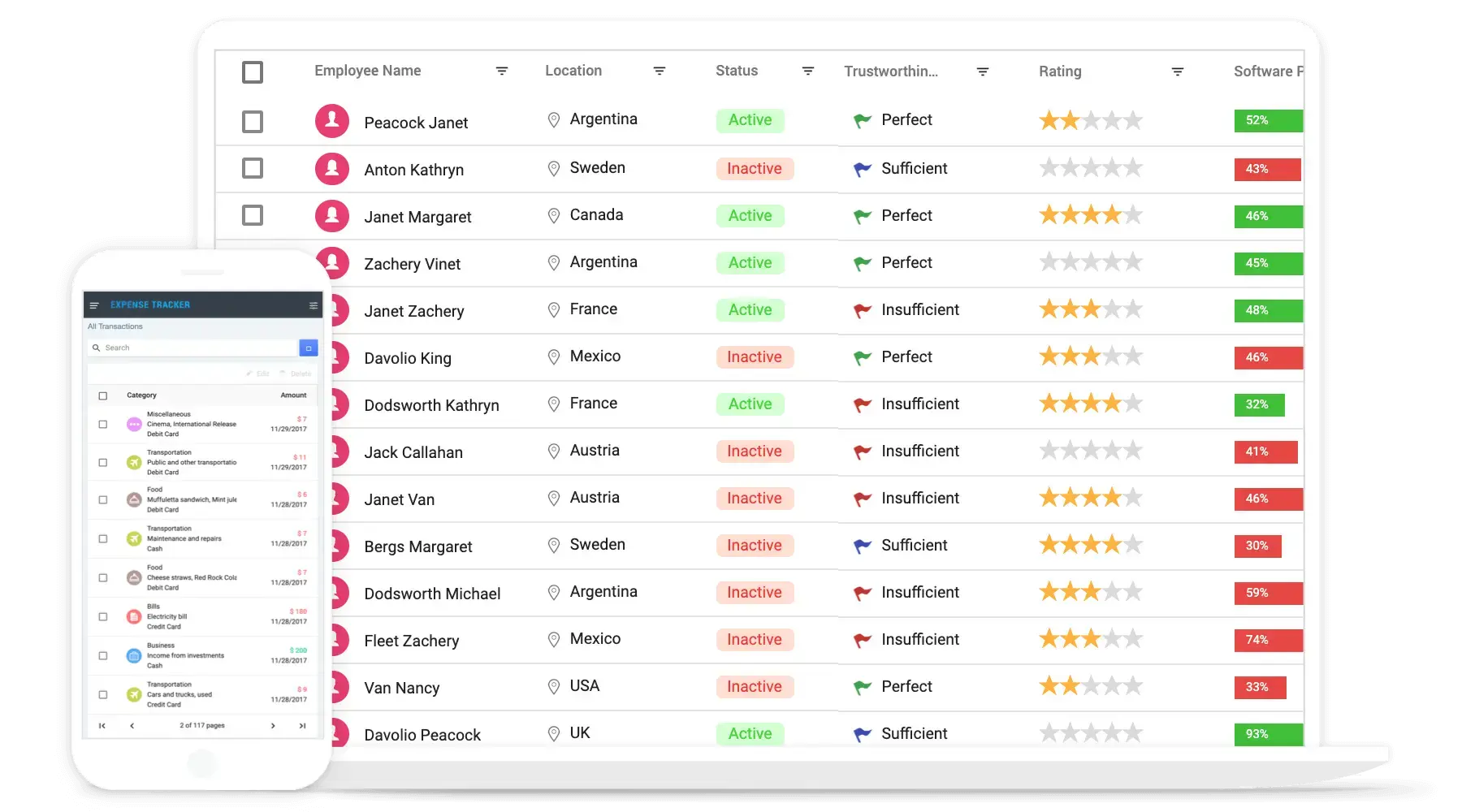
Angular Grid for Handling Large Datasets
The Syncfusion Angular Data Grid is a high-performance data table component for displaying and managing tabular data in Angular applications. It supports local and remote data binding, inline and dialog editing, sorting, Excel-like filtering, grouping, aggregation, column customization, and row selection. Developers can also export data to Excel, CSV, and PDF.
Row and column virtualization render only the data required in the current viewport. Paging, infinite scrolling, virtual scrolling, and server-side data processing help handle large datasets efficiently.
Installation & Quick Start
Follow these four steps to integrate the Data Grid into your Angular application.
1
Install the Angular Data Grid and theme packages
Install the Angular Data Grid and Tailwind3 theme packages using npm.
npm install @syncfusion/ej2-angular-grids @syncfusion/ej2-tailwind3-theme2
Register your trial license key
Include your license key in src/main.ts before initializing any Syncfusion components.
import { registerLicense } from '@syncfusion/ej2-base';
// Registering Syncfusion license key
registerLicense("NAsnBzUROFJ8W251S0VnV1NEdFlfXGNUflJmRGZTf1x6cFNNYlxTQnZWQFRiS3tTdkdhW39Ye3dQ");
3
Add the required CSS reference
Add the required Syncfusion style in the src/styles.css file.
@import '../node_modules/@syncfusion/ej2-tailwind3-theme/styles/grid/index.css';4
Add the DataGrid component
Add the DataGrid component in the src/app/app.ts file.
import { Component } from '@angular/core';
import { GridModule } from '@syncfusion/ej2-angular-grids';

interface Order {
    OrderID: number;
    CustomerName: string;
    OrderDate: Date;
    ShipCountry: string;
    Freight: number;
}

// Defines the data to be displayed in the DataGrid.
const data: Order[] = [
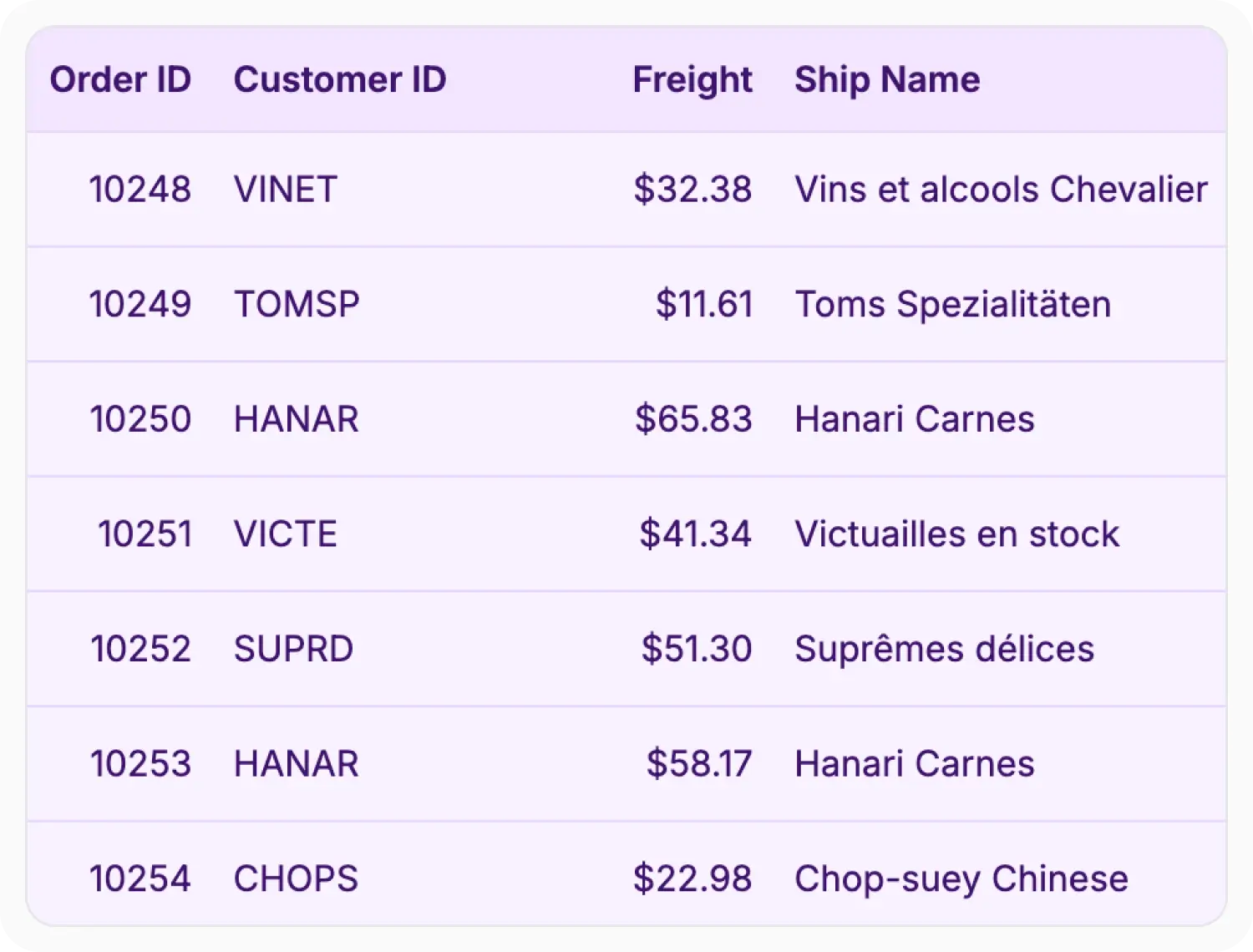
    { OrderID: 10248, CustomerName: 'Ana Trujillo', OrderDate: new Date(2025, 0, 12), ShipCountry: 'France', Freight: 32.38 },
    { OrderID: 10249, CustomerName: 'Martin Sommer', OrderDate: new Date(2025, 0, 15), ShipCountry: 'Germany', Freight: 11.61 },
    { OrderID: 10250, CustomerName: 'Thomas Hardy', OrderDate: new Date(2025, 1, 5), ShipCountry: 'Brazil', Freight: 65.83 },
    { OrderID: 10251, CustomerName: 'Elizabeth Lincoln', OrderDate: new Date(2025, 1, 18), ShipCountry: 'France', Freight: 41.34 },
    { OrderID: 10252, CustomerName: 'Victoria Ashworth', OrderDate: new Date(2025, 2, 10), ShipCountry: 'Belgium', Freight: 51.30 },
    { OrderID: 10253, CustomerName: 'Martine Rance', OrderDate: new Date(2025, 2, 22), ShipCountry: 'Brazil', Freight: 58.17 }
]

@Component({
    imports: [GridModule],
    standalone: true,
    selector: 'app-root',
    template: `
        <ejs-grid [dataSource]='data'>
            <e-columns>
                <e-column field='OrderID' headerText='Order ID' textAlign='Right' width=90></e-column>
                <e-column field='CustomerName' headerText='Customer Name' width=100></e-column>
                <e-column field='OrderDate' headerText='Order Date' textAlign='Right' format='yMd' width=100></e-column>
                <e-column field='Freight' headerText='Freight' textAlign='Right' format='C2' width=120></e-column>
                <e-column field='ShipCountry' headerText='Ship Country' width=100></e-column>
            </e-columns>
        </ejs-grid>
    `
})
export class App {
    public data: Order[] = data;
}No credit card required.
Why Choose the Syncfusion Angular Data Grid Component?
High performance
Render and interact with large datasets efficiently using row and column virtualization for fast loading and responsive scrolling, with optimized data operations such as sorting and filtering.
Seamless data binding
Bind data with various local or remote data sources, including JSON, REST APIs, OData, and custom services. Use the built-in DataManager to handle querying, data operations, and communication with remote endpoints.
AI-Assisted Development
Build sophisticated grid experiences faster with the Agentic UI Builder and Syncfusion Agent Skills. Generate layouts, column configurations, filtering, CRUD workflows, and dashboard interfaces with minimal manual effort.
Attractive customizable themes
Cutting-edge design with built-in themes such as Material 3, Fluent 2, Bootstrap 5.3, and Tailwind 3.4, including dark variants. Utilize the online Theme Studio tool to customize themes easily.
Easy export and printing
Export the Data Grid in various file formats, including Excel, PDF, and CSV. Print all the rows, regardless of the number of pages, as well as just the currently viewed page.
Globalization and localization
Support users across different locales with localized UI text and regional formatting for dates, numbers, and currencies.
AI-ready grid for enterprise data analysis
Accelerate data analysis in Angular apps with a Data Grid designed for AI enhancements. Easily plug in semantic search and anomaly detection for smarter data workflows.
-
Semantic search: Use natural language processing (NLP) models to allow users to search with everyday phrases, improving usability, with no exact keywords required.
- See how to add semantic search
-
Anomaly detection: Add machine learning (ML) tools to highlight data anomalies and ensure consistency automatically.
- See how to add anomaly detection
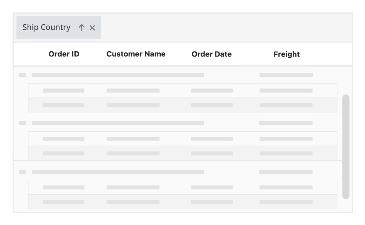
Skeleton loading indicator
The Data Grid shows the shimmer effect as a loading indicator while fetching data and binding it to the grid during initial rendering, refreshing, or after performing grid actions like sorting, filtering, and grouping. The data grid offers two types of loading indicator effects: spinner and shimmer.
Local and remote data binding
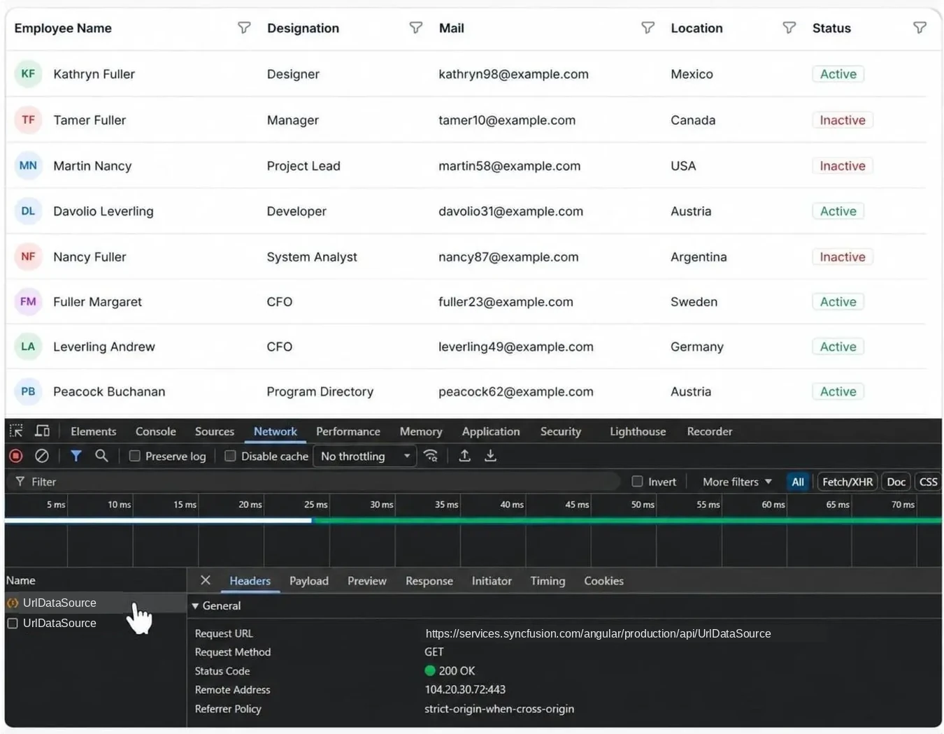
Connect the Angular Data Grid to local arrays, JSON data, RESTful APIs, OData services, GraphQL endpoints, and custom web services. Use the built-in DataManager to handle data retrieval, querying, and remote operations such as paging, sorting, filtering, grouping, and CRUD actions across local and remote data sources.
Sorting, filtering, searching
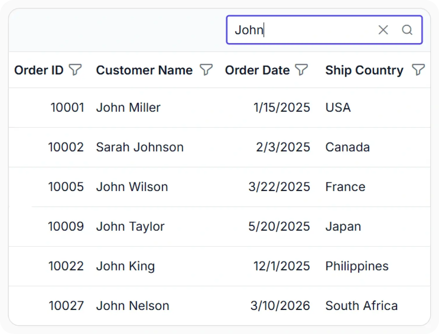
Find and organize records efficiently with built-in sorting, filtering, and search capabilities. Sort single or multiple columns, apply custom sorting logic, and refine data using Excel-like Menu, Check Box, and Filter Bar filtering modes with flexible filter operators and customizable filtering options.
Inline editing: create, edit, delete
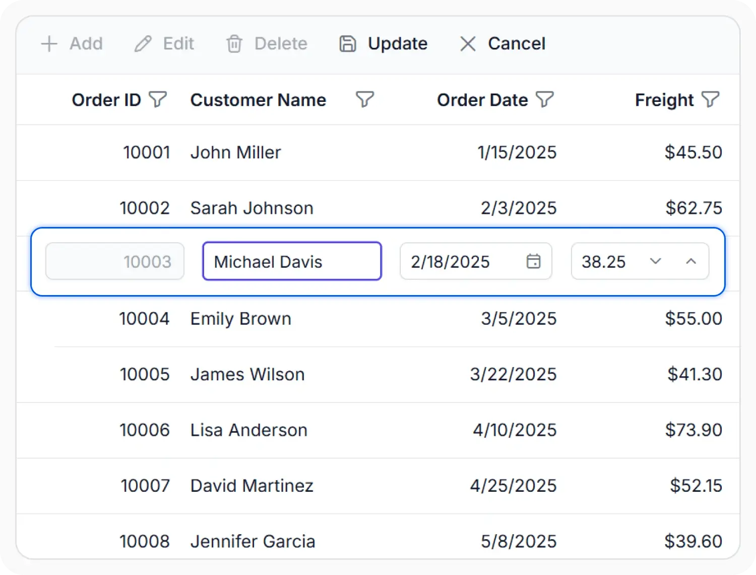
Manage data with built-in create, edit, and delete operations using inline, dialog, batch, or cell editing modes. Customize editors, apply validation rules, and perform CRUD operations seamlessly with local or remote data sources through DataManager integration.
Row grouping and aggregation
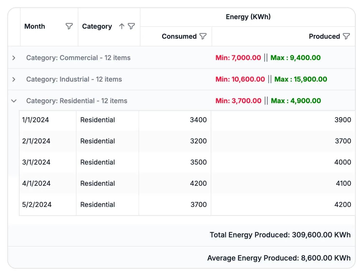
Organize and analyze data with powerful grouping and aggregation features. Group records by one or more columns, display group and footer summaries, and calculate totals, counts, averages, and custom aggregate values to gain insights from large datasets.
Row, cell, and column selection
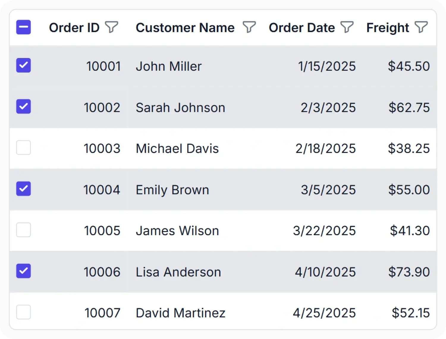
Select rows, cells, or columns with flexible single, multiple, and checkbox selection modes. Preserve selections across sorting, filtering, paging, grouping, and other data operations to simplify data review, comparison, and bulk record management.
Column customization and resizing
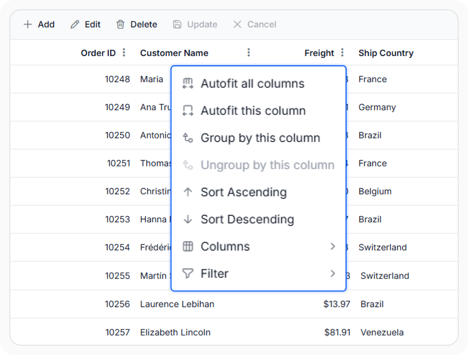
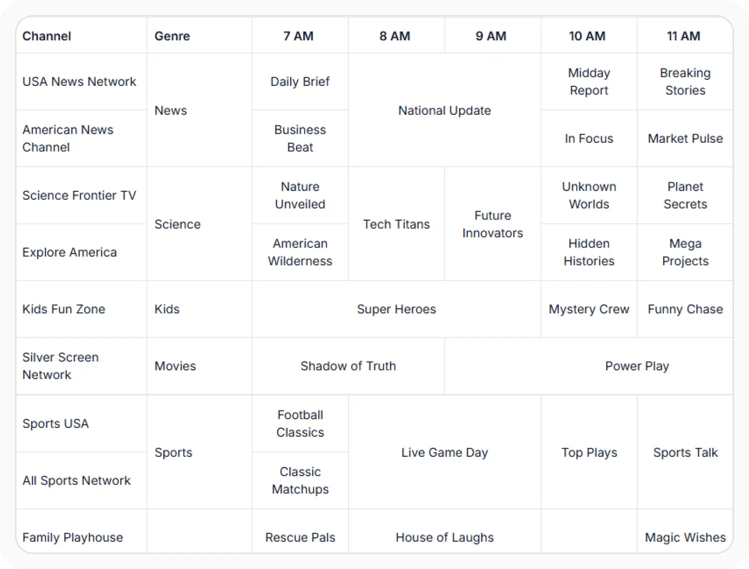
Customize columns with advanced features such as resizing, reordering, freezing, column spanning, templates, column chooser, and multi-level headers. Control column visibility, formatting, and layout to create flexible and responsive data views tailored to your application requirements.
Row customization and detail rows
Customize row layouts with row and detail templates to display rich, application-specific content. Present additional record information in expandable detail rows and tailor the appearance of data records to enhance usability and data visibility.
Cell and column templates
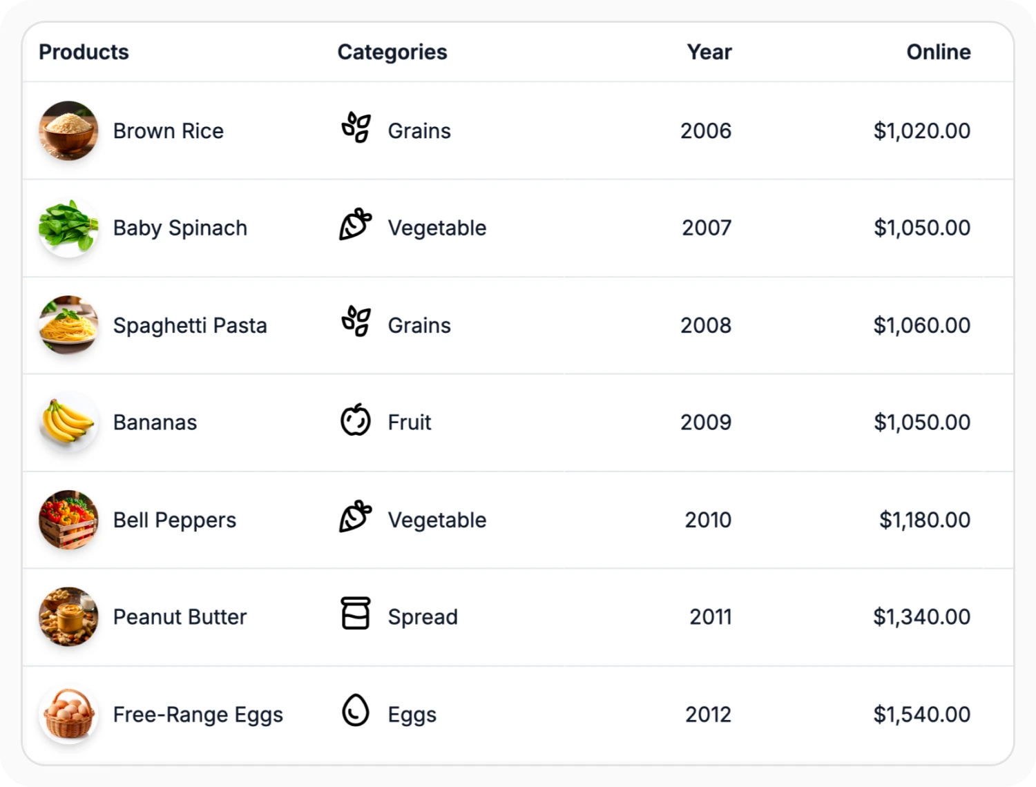
Customize the Angular Data Grid using column, header, detail, and edit templates to display rich content, interactive controls, and custom layouts. Build tailored data experiences with flexible templating options that adapt to a wide range of business scenarios and workflows.
Pinned rows
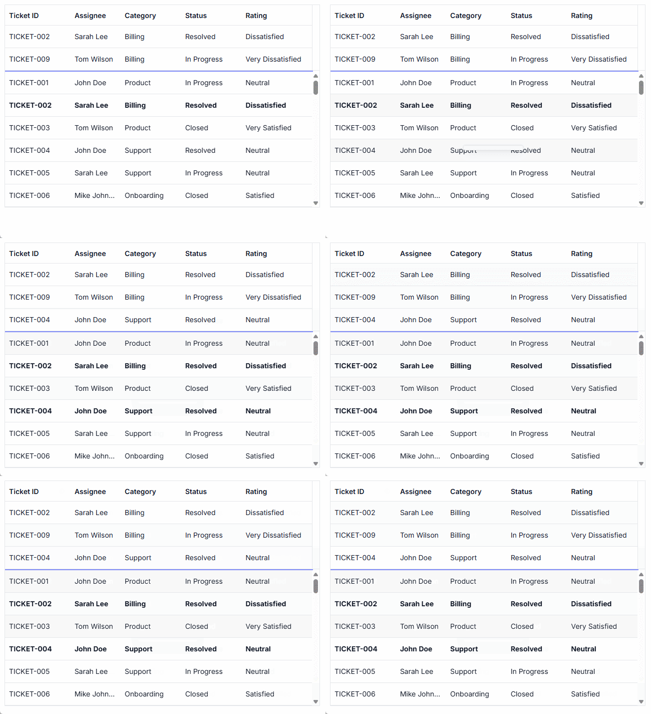
Pinned rows keep specific rows fixed at the top of the grid. This enhancement ensures that key records remain visible during operations such as paging, sorting, and filtering, providing continuous accessibility across all data interactions.
Export to Excel, CSV, and PDF
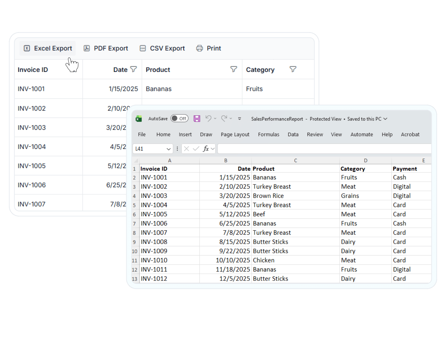
Export Angular Data Grid data to Excel, CSV, and PDF formats or print records directly from the browser. Preserve grouping, summaries, and formatting during export, with flexible customization options for reporting, sharing, and data distribution.
Theming and appearance
Customize the Angular Data Grid with built-in themes such as Material, Bootstrap, Fluent, Tailwind CSS, and more. Easily adapt colors, styles, and layouts to match your brand and create consistent user experiences across desktop, tablet, and mobile applications.
Adaptive and responsive layout
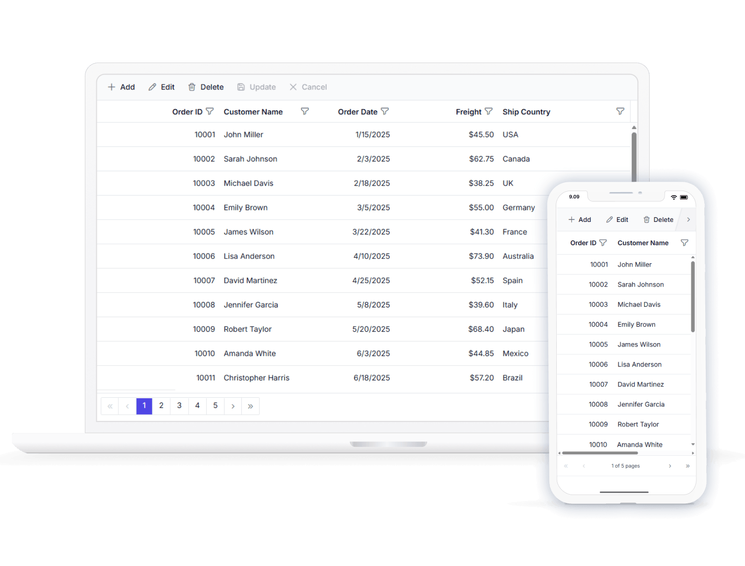
Adapt seamlessly to desktops, tablets, and mobile devices with the Angular Data Grid’s responsive and adaptive UI. Filtering, sorting, searching, editing, column menus, and paging automatically optimize for touch-friendly interactions and smaller screens, ensuring a consistent user experience across all devices.
Localization and globalization
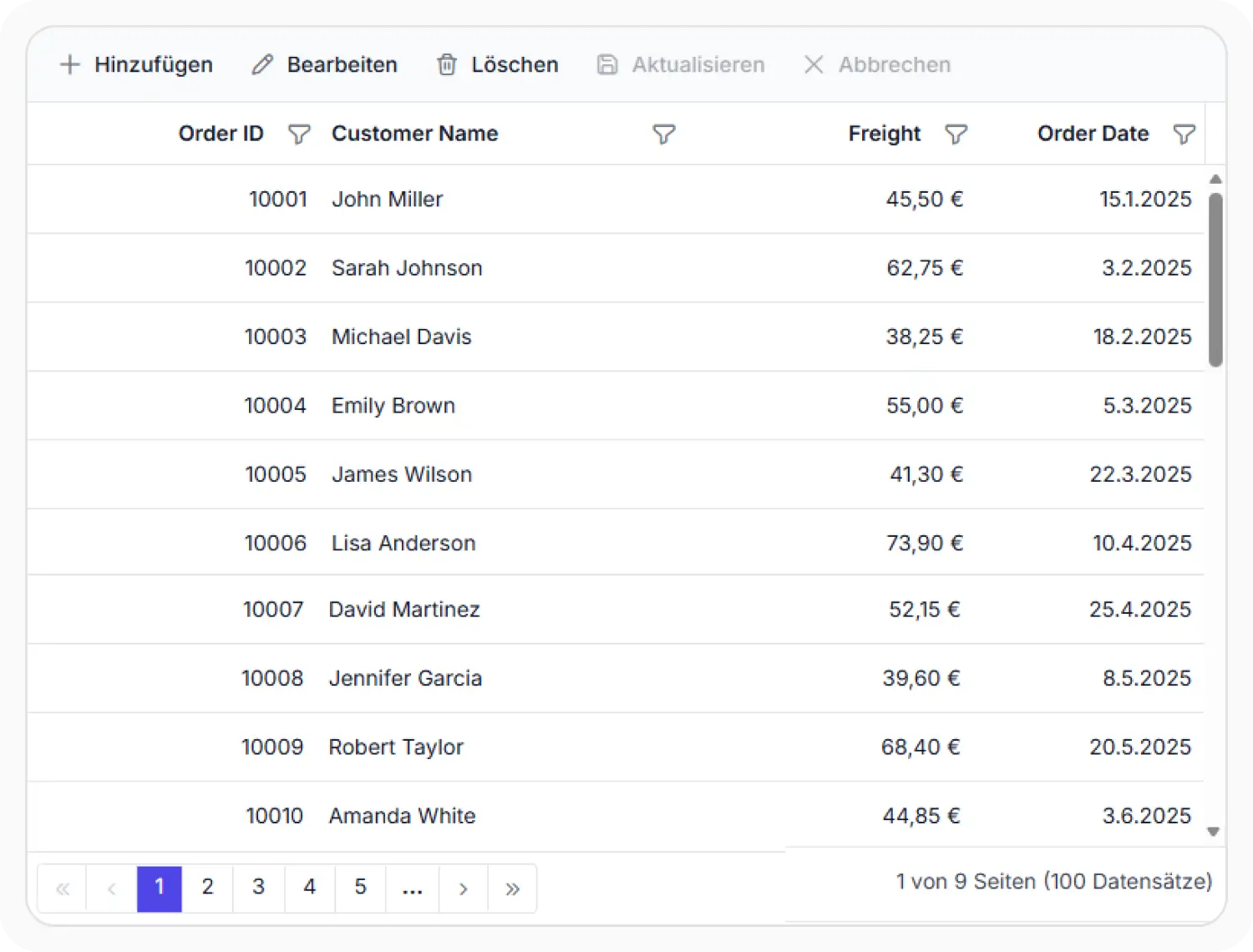
Adapt the Angular Data Grid for global audiences with built-in localization, globalization, and RTL support. Format dates, numbers, and currencies based on regional settings.
Web standards
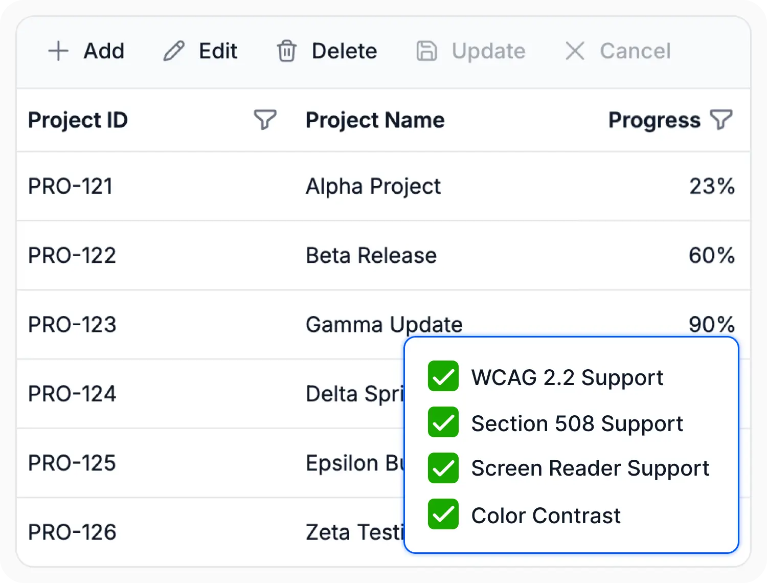
Deliver accessible and standards-compliant data experiences with keyboard navigation, screen reader support, RTL layouts, localization, and touch-friendly interactions. Built-in accessibility and globalization features help ensure a consistent and inclusive user experience across devices, languages, and regions.
Master-detail grid
An Angular master-detail grid is a use-case scenario in which a record’s details are viewed in a separate Data Grid by clicking a particular row.


State management
The state management in the Angular Data Grid component allows you to maintain the grid’s state even after a browser refresh or when navigating to a different page within the same browser session. This feature is especially beneficial for retaining the grid’s configuration and data following a page reload.
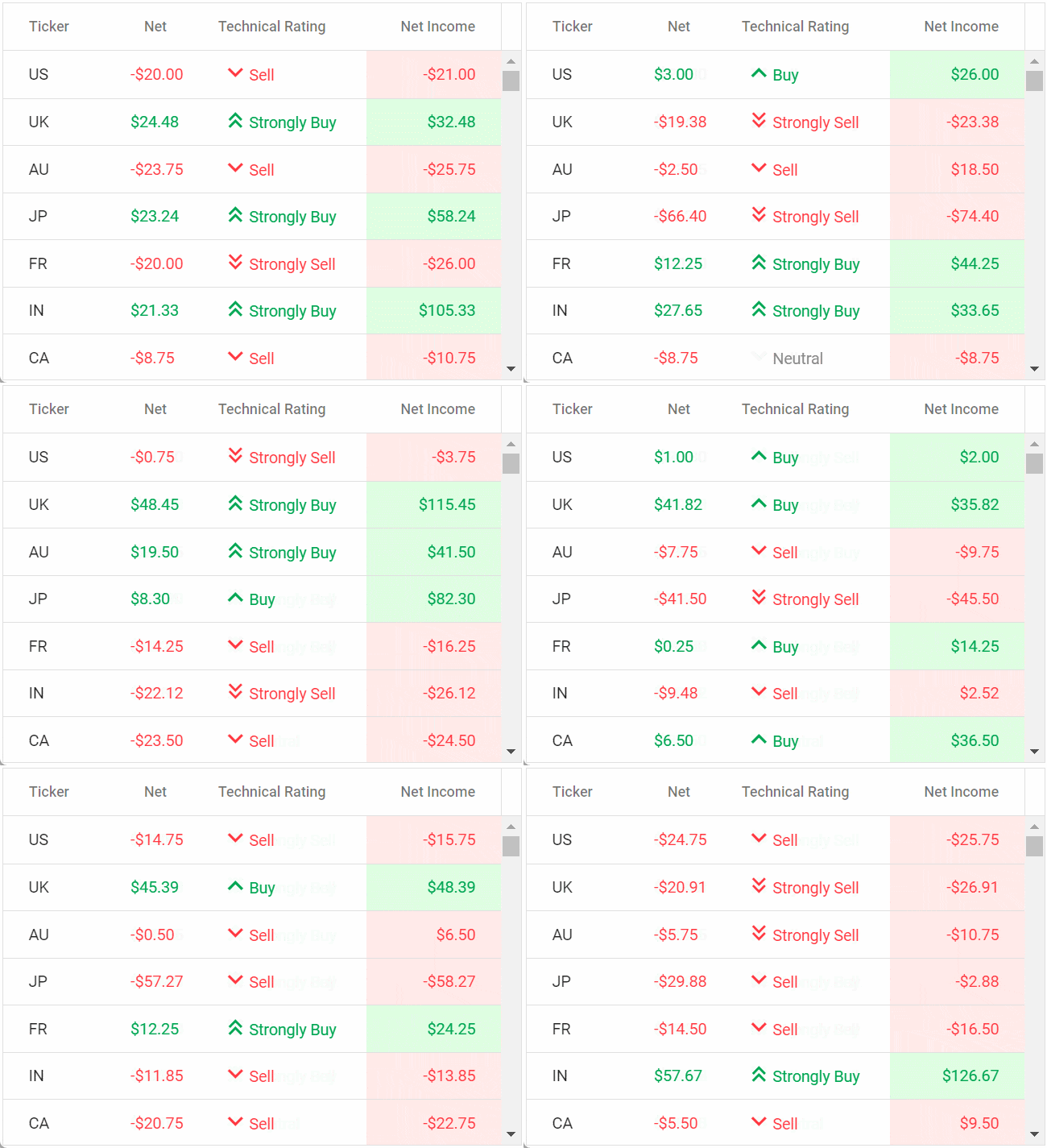
Live update
The Data Grid updates live data in its cells at specific time intervals. These updates occur without causing any lag or slowdown, ensuring that the system remains highly responsive and efficient.
Sticky header
The Angular Data Grid header has to be in a fixed position when scrolling the document vertically to visualize the grid content along with the column header.
Charts Integrated with Data Grid
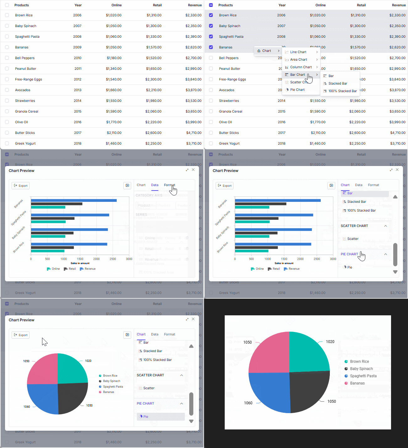
Visualize selected Angular Data Grid records as interactive charts directly from the Grid. Generate bar, line, pie, column, and other chart types through the context menu for faster data analysis without leaving the Grid experience.
Grid interaction & layout features

Row height
Row height is a major factor when displaying the number of records in the viewport. It is easily customizable and the row height can also be set conditionally.

Copy to clipboard
The clipboard allows users to copy data from selected rows or cells into it. The Ctrl+C and Ctrl+Shift+H key combinations copy data with and without headers, respectively.

Context menu
Perform various actions in a Data Grid using the pop-up menu that appears when the cell, header, or pager is right-clicked. In addition to built-in default menu items, custom context menu items can be added.

Width and height
Set the width and height properties to change the size of a Data Grid. When the content overflows the grid element, horizontal and vertical scrollbars will appear. To fill the Data Grid’s parent container, simply set the height and width to 100%.

Stacked headers
Stacked headers allow grouping and visualizing column headers in a stacked manner. The number of columns that can be stacked is unlimited. Perform all Data Grid actions even when the columns are stacked.
Mobile-optimized and touch-friendly
The Data Grid component improves usability and provides an optimized and responsive design for desktops, tablets, and phones across all operating systems, including iOS, Android, and Windows.

Touch support
User-friendly touch gestures and an interactive UI design provide the best user experience. All Data Grid features work on touch devices with zero configuration.

Responsive pager
The Data Grid pager acts intelligently and changes its complete UI responsively based on the dimension. Its optimized design provides the best UI interaction on different devices.
Angular version compatibility
The Angular Data Grid supports Angular 4 through Angular 22, with regular updates to maintain compatibility with the latest Angular releases.

Other supported frameworks
The Data Grid is available for the Blazor, React, JavaScript, and Vue frameworks. Explore its platform-specific options through the following links:


Supported browsers
The Angular Data Grid works well with all modern web browsers, including Chrome, Firefox, Edge, Safari, and Opera.

AI-assisted development
Build feature-rich Angular Data Grid experiences faster
Accelerate grid development with Syncfusion AI tools that turn requirements into fully configured Data Grid experiences with minimal manual setup.
Agentic UI Builder
Turn prompts into ready-to-use UI screens, layouts, and workflows with Syncfusion Angular components.
Example Prompt Create an order management dashboard with a datagrid, charts, filters, and export actions.
Agent Skills
Accelerate development with Syncfusion AI Agent Skills for faster implementation and integration.
Example Prompt Generate an Angular Data Grid with grouping, Excel-style filtering, toolbar actions, and PDF export.
MCP Server
Accelerate development with AI that generates, configures, and troubleshoots component code directly in your IDE.
Example Prompt Show how to bind remote data and enable virtualization in the Syncfusion Angular Data Grid.
Not sure how to create your first Angular Data Grid? Our tutorial videos and documentation can help.
I’d love to watch it now I’d love to read it nowFrequently Asked Questions
What is an Angular Data Grid?
An Angular Data Grid is a feature-rich data table component for displaying and managing tabular data in Angular applications. The Syncfusion Angular Data Grid supports local and remote data binding, sorting, filtering, editing, grouping, paging, virtualization, aggregation, and data export.
Is Angular Grid the same as Angular Data Grid?
How do I make an Angular Grid editable like Excel?
Use batch editing to provide an Excel-like cell editing experience in the Angular Data Grid. In batch mode, users can edit individual cells and make multiple additions, updates, or deletions before saving all changes together. Enable it by setting the Grid editing mode to Batch.
Does the Angular Data Grid support virtualization for large datasets?
Yes. The Angular Data Grid supports both row and column virtualization. Row virtualization renders only the rows required for the current viewport, while column virtualization renders only the visible columns, reducing the amount of content rendered when working with large or wide datasets.
Is the Syncfusion Angular Data Grid free?
The Syncfusion Angular Data Grid is a commercial component. However, eligible individual developers and small businesses can use it for free through the Syncfusion Community License, which provides access to Syncfusion products subject to the current eligibility requirements.
Where can I find an Angular Data Grid example or demo?
Does the Angular Data Grid support server-side paging?
What is the difference between an Angular Data Grid and an Angular data table?
An Angular data table is a general term for displaying tabular data in rows and columns. An Angular Data Grid provides richer data interaction features such as sorting, filtering, editing, grouping, paging, virtualization, aggregation, frozen rows and columns, and export. In Syncfusion, the product is the Angular Data Grid; Angular Data Table is not a separate Syncfusion component.
Trusted by the world’s leading companies

Our Customers Love Us




Syncfusion Angular Data Grid resources


 Figma download
140+ ANGULAR UI COMPONENTS
Standalone UI SDKs
Integrate the DataGrid, Chart, Scheduler, Gantt, Rich Text Editor, File Manager, and Diagram UI components into applications to enable rich interaction and visualization, delivering a seamless user experience.
Document Solutions
Integrate the PDF Viewer, DOCX Editor, Spreadsheet Editor, and document-processing libraries into the Angular applications to enable a smooth user experience.