Overview
The end user experience is greatly enhanced by including a set of user interaction features such as zooming and panning, crosshair, trackball, drill-down, events, and tooltip. You can configure these interactive chart features using the built-in APIs.
Zooming
Visualize data points in any region of the chart by zooming the region.
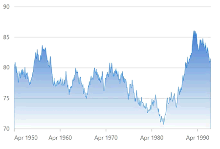
Zooming Mode
Zoom in and zoom out the chart through mouse wheel scrolling or through pinch gesture in touch enabled device or by using the rubber band selection.
Zoom Toolbar
Perform zoom in, zoom out, pan and reset actions quickly through zoom toolbar commands. The toolbar can be loaded initially along with the chart or on demand depending on preferences.
Scrollbar on zooming
Add scrollbars to the chart to pan or zoom it further. Customize the color, height, and border of the scrollbar using built-in APIs to make it visually unique.
Crosshair
Inspect or target any data point on mouse move with the help of crosshair. A thin horizontal line and a vertical line indicate the data point with the information displayed in an interactive tooltip.
Trackball
Track data points that are close to the mouse position or touch contact. Trackball displays information about pop-up data with more customizable options.
Tooltip
Use interactive chart tooltip to show information about the data points on mouse hover.
Synchronization
Allows users to synchronize tooltip, zooming and panning, crosshair, highlight, and selection features across multiple charts.
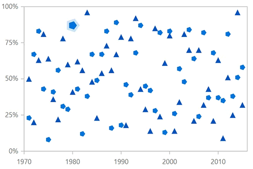
Selection
Select data points in a series for easy understanding of the selected data. Adding pattern and color to the selected data makes charts more interactive.
Point Selection
Allows you to select a point in a series. Adding pattern and color to the selected data makes charts more interactive.
Series Selection
Allows you to select a series from chart series collection. Adding pattern and color to the selected series makes charts more interactive.
Cluster Selection
Select a cluster of points from the series on mouse click.
Multiple Selection
Allows users to select multiple points and series in a chart. Adding patterns and colors to the selected data makes the charts more interactive.
Range Selection
Allows users to select a region with respect to both horizontal and vertical axes.

Lasso selection
Allows users to select a region by drawing freehand shapes.
Our Customers Love Us


See Real Success Stories
Developers around the world trust Syncfusion’s Essential Studio to simplify complex projects and speed up delivery. With a vast library of UI controls, powerful SDKs, and reliable support, Essential Studio helps teams build enterprise-ready applications with confidence.
Read Our Customer StoriesIndustry
Software development
75% Cost reduction
50% Faster development
Industry
Utilities (oil and gas)
450+ hours saved
Streamlined processes and hours of development effort saved.
Advanced, flexible features
Empowered users through robust and versatile functionality.
Industry
Software and technology
1000+ of hours saved
Accelerated development with enterprise-ready UI components.
Efficient file management
Streamlined workflows with document libraries without building them from scratch.
Industry
Software and technology
2 Years of delay avoided
Two years of delays prevented with proactive planning.
On-time delivery
Projects delivered on schedule using trusted controls.
Industry
IT services and IT consulting
Improved performance
Large datasets handled with easy customization and quick debugging.
Highly customizable
Plug-and-play controls with quick template integration.
Industry
Professional services
Instant access
Quick availability of features and resources.
Reduced dependencies
Fewer dependencies for faster development.
Discover Syncfusion’s Complete React Component Ecosystem
Explore over 140+ React UI components featuring established, production-ready controls and the latest pure React components built natively for modern web app development.
-
React Components
-
Pure React Components
-
SMART COMPONENTSGRIDSDATA VISUALIZATIONDROPDOWNSFILE VIEWERS & EDITORSBUTTONSINTERACTIVE CHATINPUTSNAVIGATIONFORMSNOTIFICATIONS
-
GRIDSDATA VISUALIZATIONNAVIGATION