Trusted by the world’s leading companies

Overview
The React Speed Dial component is an extension of the React Floating Action Button that displays a list of action buttons when clicked. It displays action buttons in linear and radial directions.

Display modes
The React Speed Dial component supports the display of action items in a linear or radial layout. This helps make actions more accessible and easy to use.
Linear
In the linear mode, the React Speed Dial component displays action items in a list-like format, either horizontally or vertically. Action items can be displayed at the top, bottom, left, or right side of the Speed Dial button. Auto positioning displays the action items based on the position of the Speed Dial.

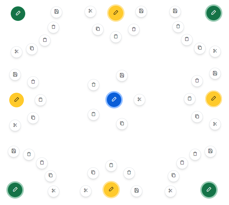
Radial
In the radial mode, the React Speed Dial component displays action items in a circular pattern similar to a radial menu. If start and end angles are not specified, they are automatically calculated based on the position of the component.
Predefined styles
Several predefined styles are available in React Speed Dial:
- Primary
- Secondary
- Outline
- Info
- Success
- Warning
- Danger


Positioning
Place the Speed Dial button in various built-in positions on the target element or page.
Icon with text
The React Speed Dial component enables customization of the Speed Dial button and action items, including the use of text only, icon with text, or icon only. This allows developers to create highly personalized buttons and action items that effectively communicate the actions they perform.
Templates
Customize the default appearance of the Speed Dial and its action items. By using item and popup templates, a highly personalized Speed Dial can be created, which enhances the user experience.
Modal popup mode
Modal popup mode enables an overlay to prevent background interaction when popup action items are opened.

Built-in themes
The React Speed Dial supports these built-in themes: Tailwind CSS, Bootstrap 5, Bootstrap 4, Bootstrap, Material, Fabric, Fluent, and high contrast. Users can customize one of these built-in themes or create new themes to achieve their desired look and feel by simply overriding SASS variables or using our Theme Studio application.
Accessibility
- Fully supports WAI-ARIA accessibility practices to work with screen readers and assistive devices.
- Fully supports WAI-ARIA accessibility that helps pop-up action items be accessed by on-screen readers and assistive devices.
- Follows WAI-ARIA best practices for implementing keyboard interaction.
- Based on WCAG 2.0 standards, UI visual elements such as foreground color, background color, line spacing, text, and images are designed.
- Follows WCAG 2.0 standards in the design of its UI visual elements such as foreground color, background color, line spacing, text, and images.
- Supports right-to-left (RTL) text direction for users working with RTL languages like Hebrew, Arabic, or Persian.
Developer-friendly APIs
The React Speed Dial component offers APIs for customizing its appearance and behavior, as well as templates for personalizing the look and feel of the Speed Dial and its action items. With these APIs, developers can create a unique and highly personalized Speed Dial that fits seamlessly into their applications.
React Speed Dial code example
Easily get started with the React Speed Dial using a few simple lines of TSX code example as demonstrated below. Also explore our React Speed Dial Example that shows you how to render and configure the React Speed Dial.
{ /* Import the Speed Dial */ }
import { SpeedDialComponent, SpeedDialItemModel } from '@syncfusion/ej2-react-buttons';
import * as React from 'react';
import './App.css';

public items: SpeedDialItemModel[] = [
    { iconCss:'e-icons e-cut' },
    { iconCss:'e-icons e-copy' },
    { iconCss:'e-icons e-paste' }
]

{ /* To render Speed Dial */ }
export default class App extends React.Component {
    render() {
        return (<SpeedDialComponent  openIconCss='e-icons e-edit' items={this.items}></SpeedDialComponent >);
    }
}


Not sure how to create your first React Speed Dial? Our documentation can help.
I’d love to read it nowDiscover Syncfusion’s Complete React Component Ecosystem
Explore over 140+ React UI components featuring established, production-ready controls and the latest pure React components built natively for modern web app development.
-
React Components
-
Pure React Components
-
SMART COMPONENTSGRIDSDATA VISUALIZATIONDROPDOWNSFILE VIEWERS & EDITORSBUTTONSINTERACTIVE CHATINPUTSNAVIGATIONFORMSNOTIFICATIONS
-
GRIDSDATA VISUALIZATIONNAVIGATION
Standalone UI SDKs
Integrate the DataGrid, Chart, Scheduler, Gantt, Rich Text Editor, File Manager, and Diagram UI components into applications to enable rich interaction and visualization, delivering a seamless user experience.
Document Solutions
Integrate the PDF Viewer, DOCX Editor, Spreadsheet Editor, and document-processing libraries into the React applications to enable a smooth user experience.
Frequently Asked Questions
Why should you choose Syncfusion React Speed Dial?
The Speed Dial in React Syncfusion provides the following features:
- The Speed Dial is a visual set of multiple primary screen action buttons.
- Place the Speed Dial button in various built-in positions on the target element or page.
- Built-in support for primary, success, warning, info, and danger button styles.
- Action buttons can be displayed in linear and radial directions.
- One of the best React Speed Dial component in the market that offers a feature-rich UI to interact with the software.
- Simple configuration and APIs.
- Supports all modern browsers.
- Mobile-touch friendly and responsive.
Expansive learning resources such as demos and documentation to let you get started quickly with React Speed Dial.
Where can I find the Syncfusion React Speed Dial demo?
You can find our React Speed Dial demo, which demonstrates how to render and configure the Speed Dial.
Can I download and utilize the Syncfusion React Speed Dial for free?
No, this is a commercial product and requires a paid license. However, a free community license is also available for companies and individuals whose organizations have less than $1 million USD in annual gross revenue, 5 or fewer developers, and 10 or fewer total employees.
How do I get started with Syncfusion React Speed Dial?
A good place to start would be our comprehensive getting started documentation.
Our Customers Love Us
Having an excellent set of tools and a great support team, Syncfusion® reduces customers’ development time.Here are some of their experiences.

Aweseome, enough said. really
Easy usability, solving real life problems. easy to implement. most of the cases has the operators and settings possibilities you right away need. never fails to impress

Oliver O,

Geschäftsführung Kreation/Artdirektion, Small-Business
A giant framework with great pricing options
I have loved the components and options that Syncfusion has, besides, its documentation, demos, and Support are excellent.

Alejandro Javier V,
CEO, Small-Business
See Real Success Stories
Developers around the world trust Syncfusion’s Essential Studio to simplify complex projects and speed up delivery. With a vast library of UI controls, powerful SDKs, and reliable support, Essential Studio helps teams build enterprise-ready applications with confidence.
Read Our Customer StoriesIndustry
Software development
75% Cost reduction
50% Faster development
Industry
Utilities (oil and gas)
450+ hours saved
Streamlined processes and hours of development effort saved.
Advanced, flexible features
Empowered users through robust and versatile functionality.
Industry
Software and technology
1000+ of hours saved
Accelerated development with enterprise-ready UI components.
Efficient file management
Streamlined workflows with document libraries without building them from scratch.
Industry
Software and technology
2 Years of delay avoided
Two years of delays prevented with proactive planning.
On-time delivery
Projects delivered on schedule using trusted controls.
Industry
IT services and IT consulting
Improved performance
Large datasets handled with easy customization and quick debugging.
Highly customizable
Plug-and-play controls with quick template integration.
Industry
Professional services
Instant access
Quick availability of features and resources.
Reduced dependencies
Fewer dependencies for faster development.
Rated by users across the globe
Syncfusion React Resources
Learning
 Documentation
 Documentation


Awards
Greatness—it’s one thing to say you have it, but it means more when others recognize it. Syncfusion® is proud to hold the following industry awards.

