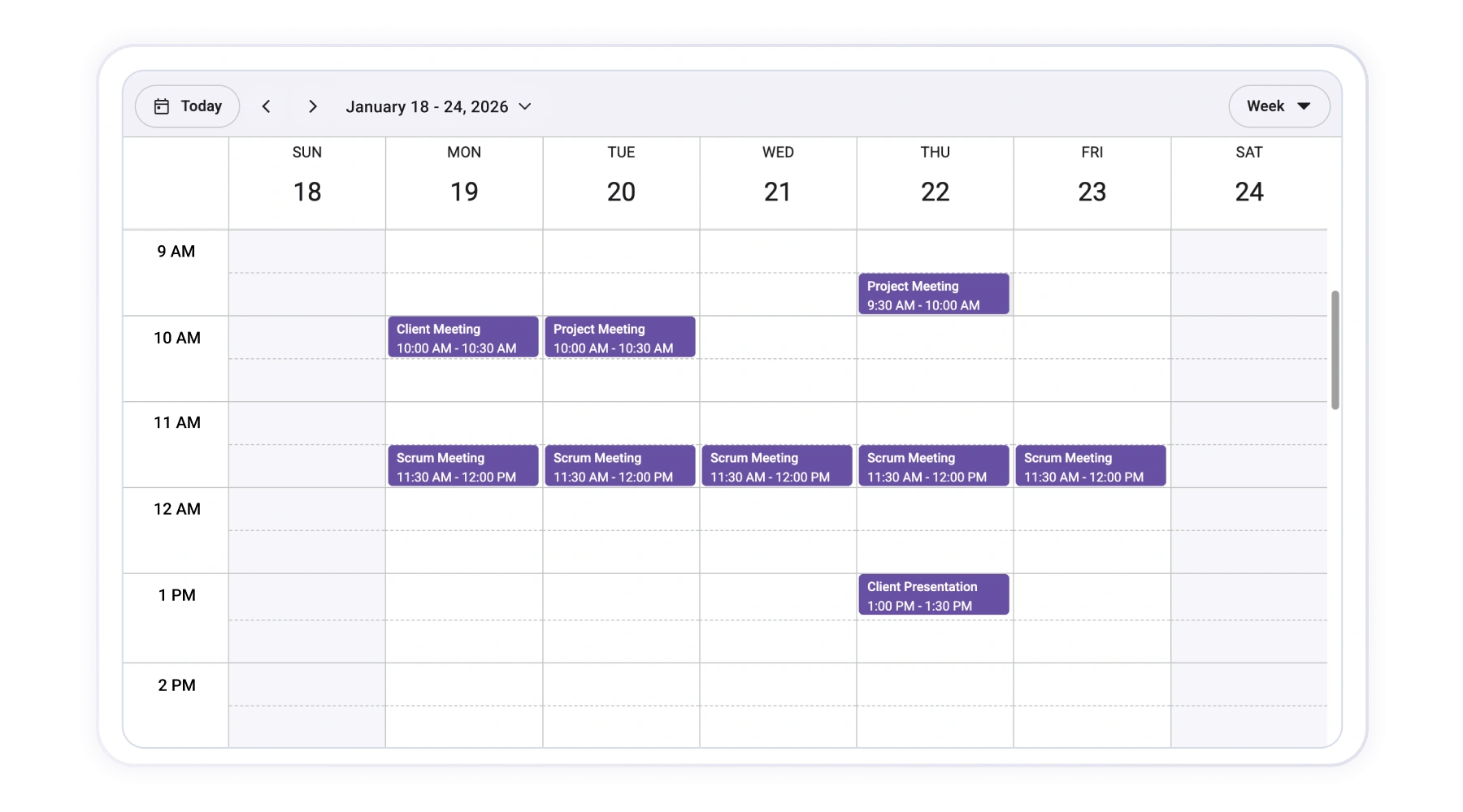
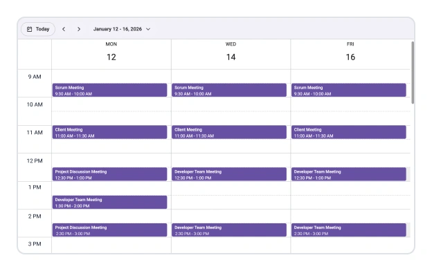
React Scheduler – High-Performance and Responsive Event Calendar
- Display appointments in day, week, month, and workweek views.
- Build a responsive calendar UI with a component-based API.
- Customize the entire look and feel with flexible templates.
Trusted by the world’s leading companies

Overview
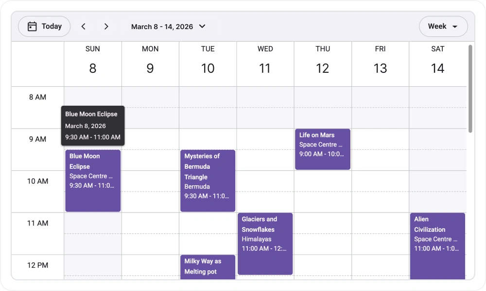
The Syncfusion React Scheduler is a high-performance calendar component designed for modern React applications. It provides a clean and intuitive interface for users to manage their appointments, supporting essential interactions like drag-and-drop editing, resizing, and quick-info pop-ups.
Core features of the React Scheduler
Optimized for speed
Events and data are loaded on demand to ensure your application remains fast and responsive, even with a large number of appointments.
Effortless data integration
Bind to local JavaScript object arrays or connect to remote RESTful services with a flexible data manager for easy CRUD operations.
Declarative views
Easily enable day, week, workweek, and month views using a natural, component-based syntax that fits perfectly in a React ecosystem.
Ready for a global audience
Deliver a localized experience with translations, locale-specific date formatting, and built-in right-to-left (RTL) support.
React Scheduler code example
Integrate the React Scheduler into your application with a simple, declarative API that feels right at home in a React project. The example below demonstrates how to configure the component and bind it to a local data source.
import { DayView, WeekView, WorkWeekView, MonthView, Scheduler, EventSettings } from '@syncfusion/react-scheduler';

export default function App() {
    const data = [
        {
            Id: 1,
            Subject: 'Weekly Team Status Meeting',
            StartTime: new Date(2025, 10, 17, 10, 0),
            EndTime: new Date(2025, 10, 17, 11, 30),
            Location: 'Conference Room A'
            Description: 'Regular team status meeting'
        }
    ];
    const eventSettings: EventSettings = { dataSource: data };
    return (
        <Scheduler eventSettings={eventSettings} defaultSelectedDate={new Date(2025, 10, 18)} defaultView='Month'>
            <DayView />
            <WeekView />
            <WorkWeekView />
            <MonthView />
        </Scheduler>
    );
}
Flexible calendar views
The Scheduler offers several built-in calendar layouts that can be configured to meet the needs of your application.
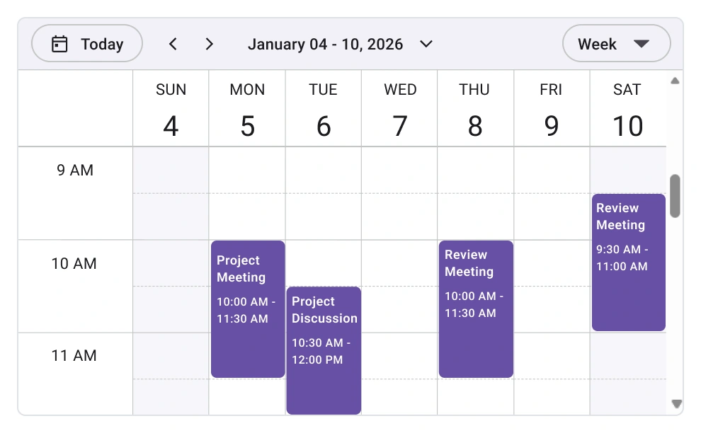
Day, week, and workweek layouts
Present appointments for a single day or across a full week. Customize the workweek to fit any schedule.
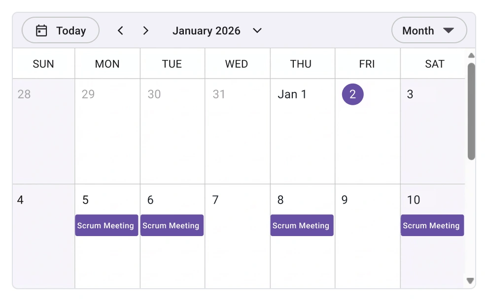
Full month calendar
Provide a high-level overview of events for an entire month, with clear indicators for days that have scheduled appointments.
Independent view settings
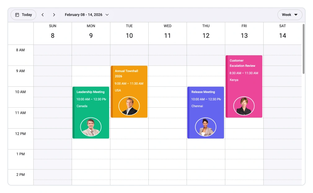
Configure each view with its own unique settings. For example, you can set a custom interval for the week view to show a 10-day schedule, or apply a unique cell template only to the month view.
Recurrence support
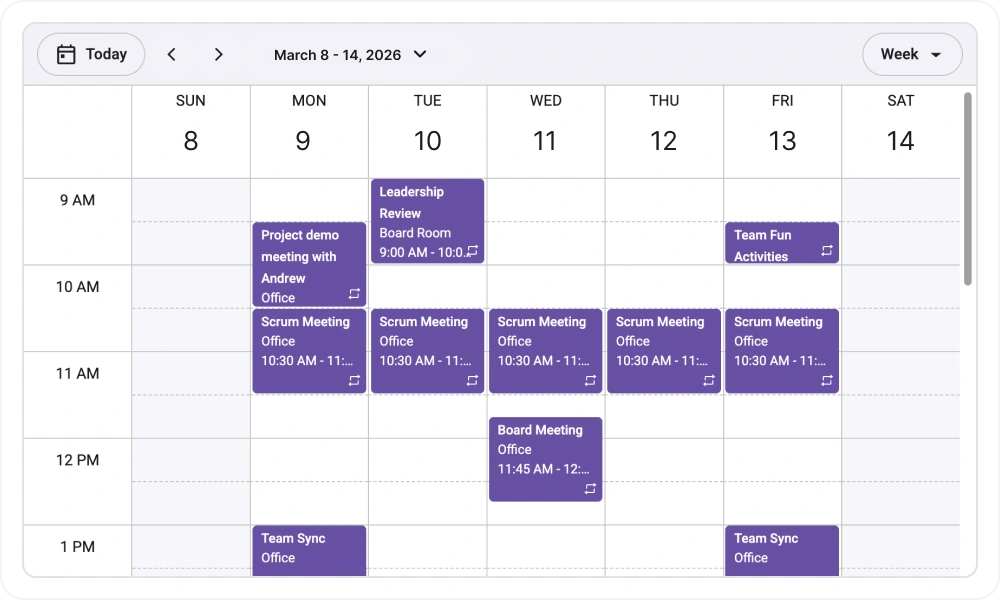
Define and manage recurring events with flexible repeat patterns such as daily, weekly, monthly, and yearly, including end conditions like end date and occurrence count, with options to edit or delete individual occurrences or the entire series.
Customizable date ranges
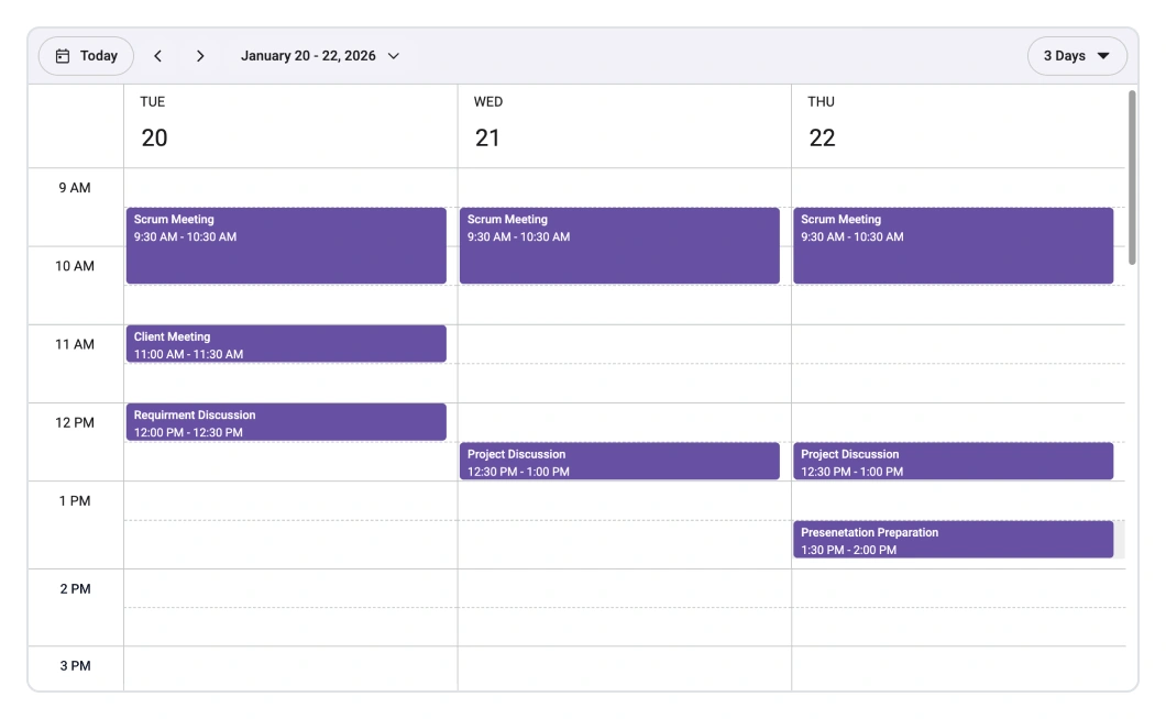
Go beyond standard views by setting a custom interval. Display a two-week calendar or a bimonthly view by adjusting a single property, giving you more control over the visible date range.
Block specific time slots
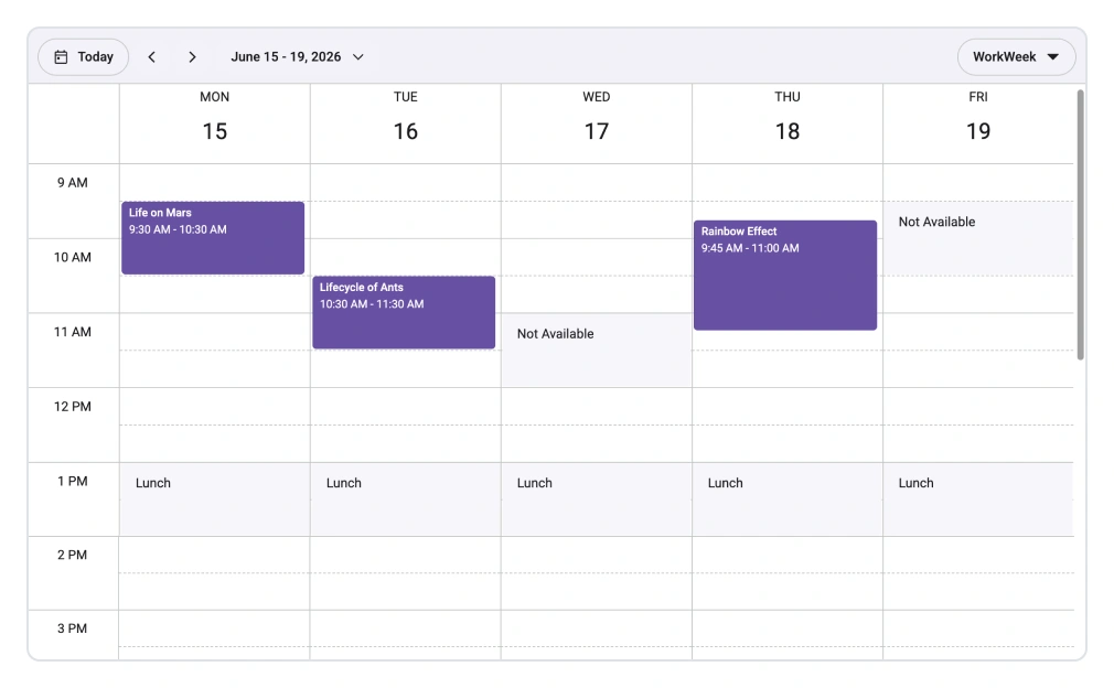
Mark certain time ranges as unavailable. This feature prevents users from creating or moving appointments into blocked-off periods like holidays or nonworking hours.
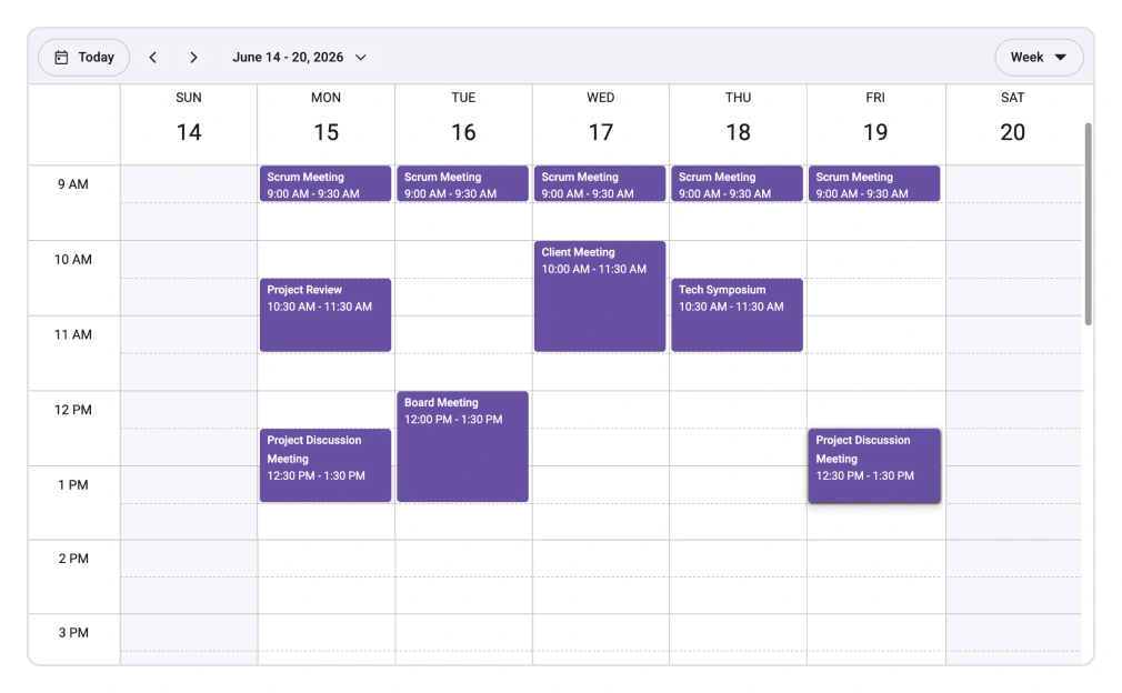
Avoid scheduling conflicts
Enable the overlap prevention feature to stop users from accidentally double-booking a time slot. This facilitates a conflict-free and well-organized schedule.
Dynamic row height
In the month view, row height can automatically expand to accommodate all appointments for a given day. This responsive behavior prevents UI clutter and keeps all events visible.

Feature-rich calendar options
Calendar-oriented features such as a customizable first day of the week and flexible timescales are supported for precise scheduling.
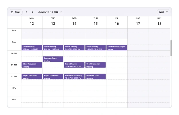
First day of the week
Pick the first day of the week per locale or per view when needed.
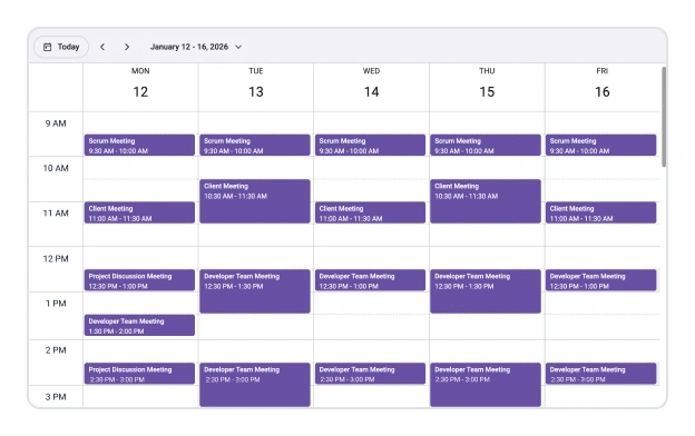
Custom start and end hours
Limit the visible schedule to business hours by hiding nonworking times.
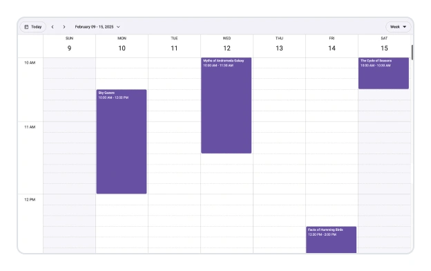
Flexible timescale
Choose slot duration and interval to display a clear time grid for events.
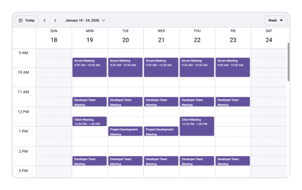
Working time
Highlight work days and working hours to focus attention on active periods.
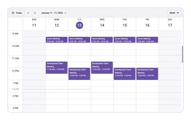
Current time indicator
Emphasize the current date and time across all relevant views.
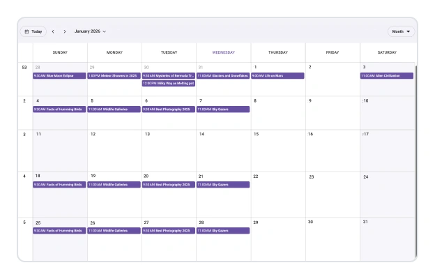
Week number display
Show week numbers beside headers in day, week, and workweek views, and as a column in the month view.

Time mode
Supports both 12-hour and 24-hour time formats.
Total UI control with templates
Use templates to replace any part of the Scheduler’s UI with your own custom React components. This gives you the power to match your exact design requirements and branding.
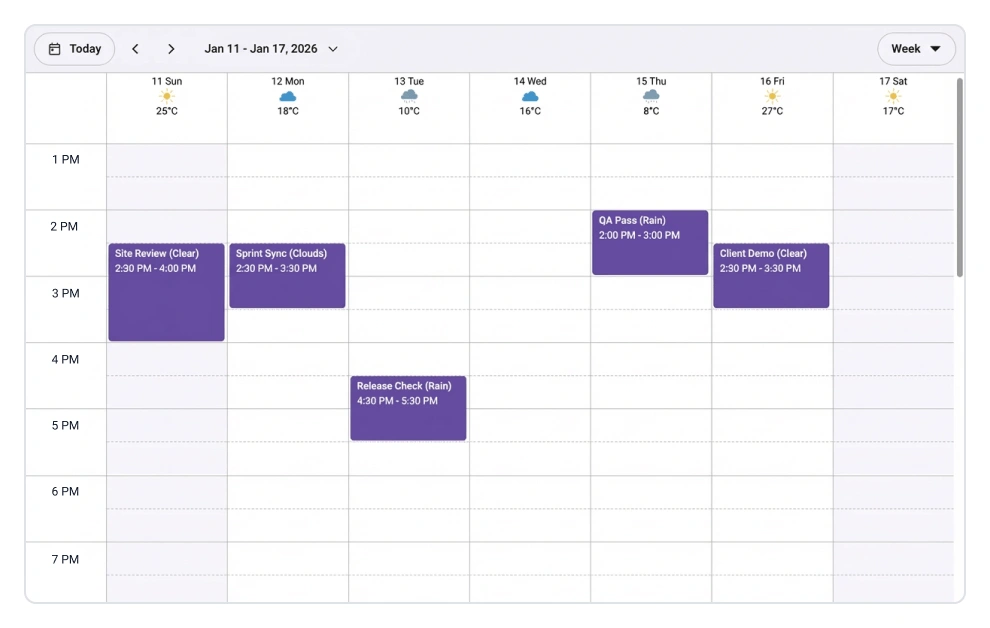
Custom date headers
Replace the default header content with custom text, styles, or icons to create a unique and informative calendar header.
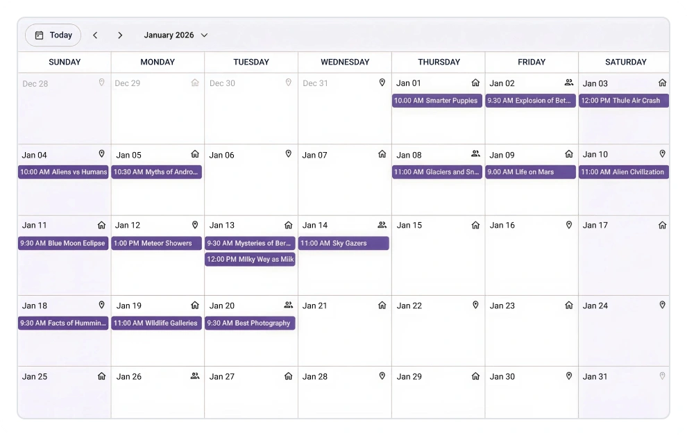
Custom cell content
Use templates to add custom content such as icons, images, or badges within each time slot or date cell.
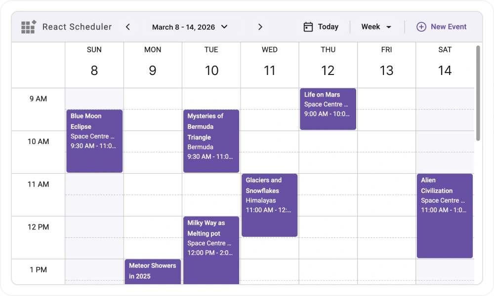
Header customization
Customize the Scheduler header area using custom templates. Modify or replace the default navigation bar, view buttons, and date range display with custom content and styles.
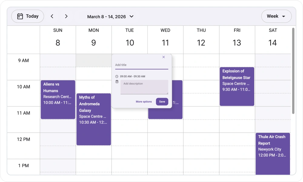
Quick pop-up customization
Customize the quick info pop-up that appears on cell click and event click. Override the default pop-up header, content, and footer sections with custom templates and actions.
User-friendly interactions
The modern and trendy UI design of the React Scheduler makes user interactions simpler and more efficient.
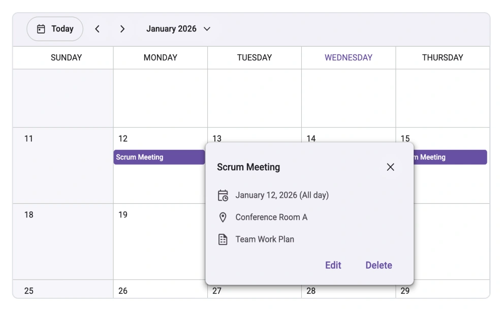
Quick event overview
Clicking or tapping on events displays important details, such as subject and time, along with edit and delete options.
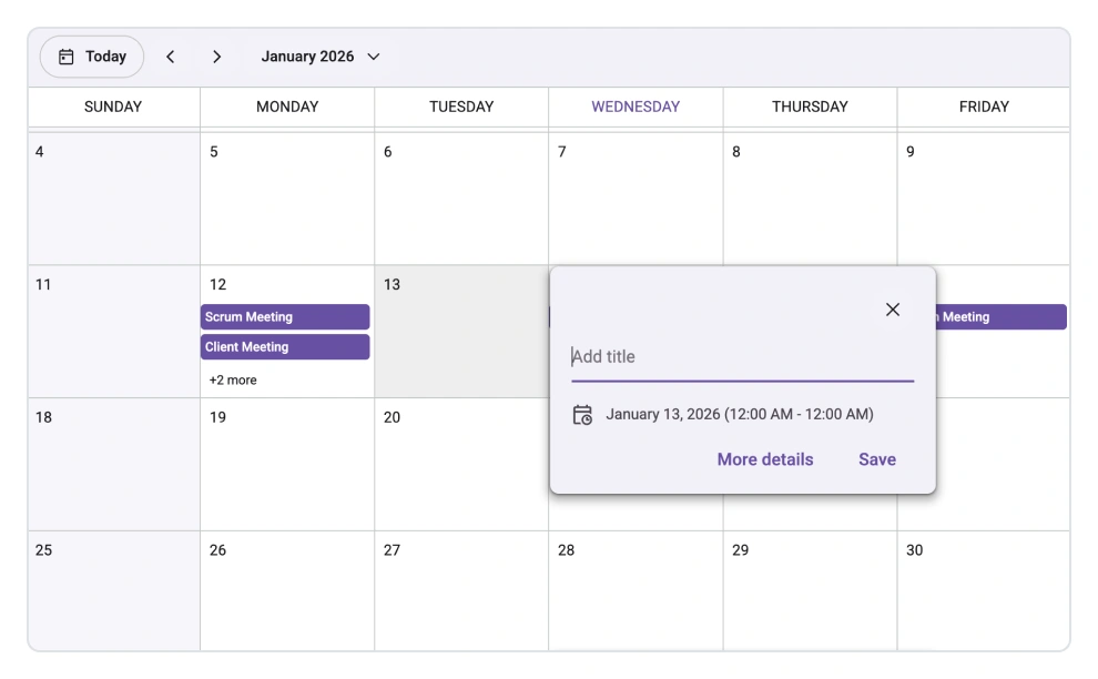
Quick event creation
Clicking or tapping on cells displays a pop-up for creating a new event.
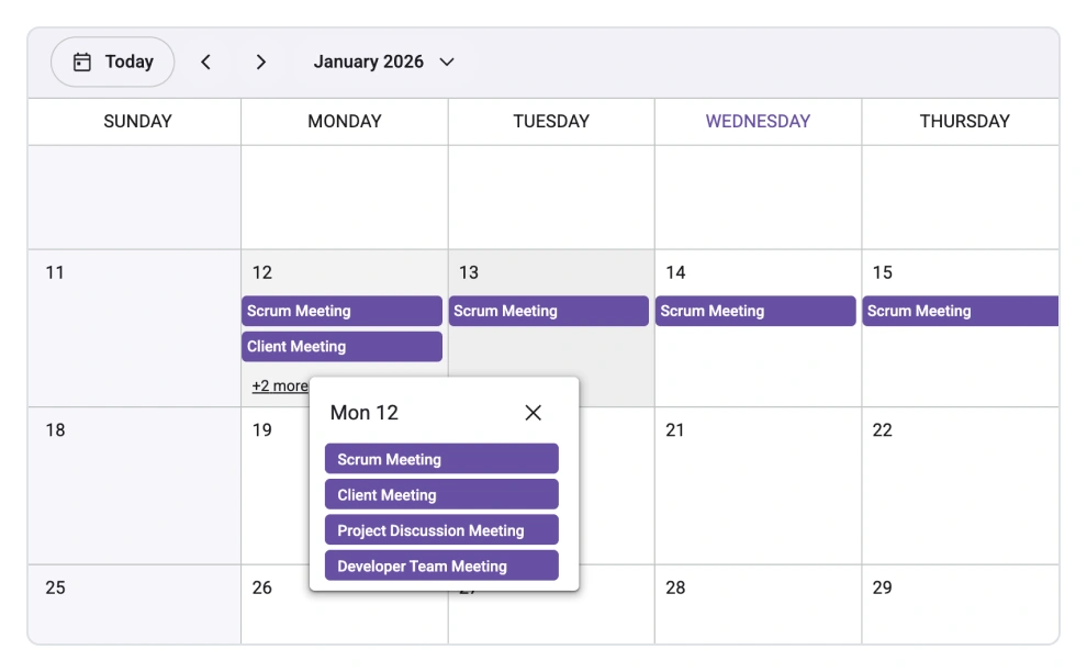
Event container
Clicking on the text indicator (+n more) in the month and timeline views will open an event container listing all of a day’s hidden event and appointment details.
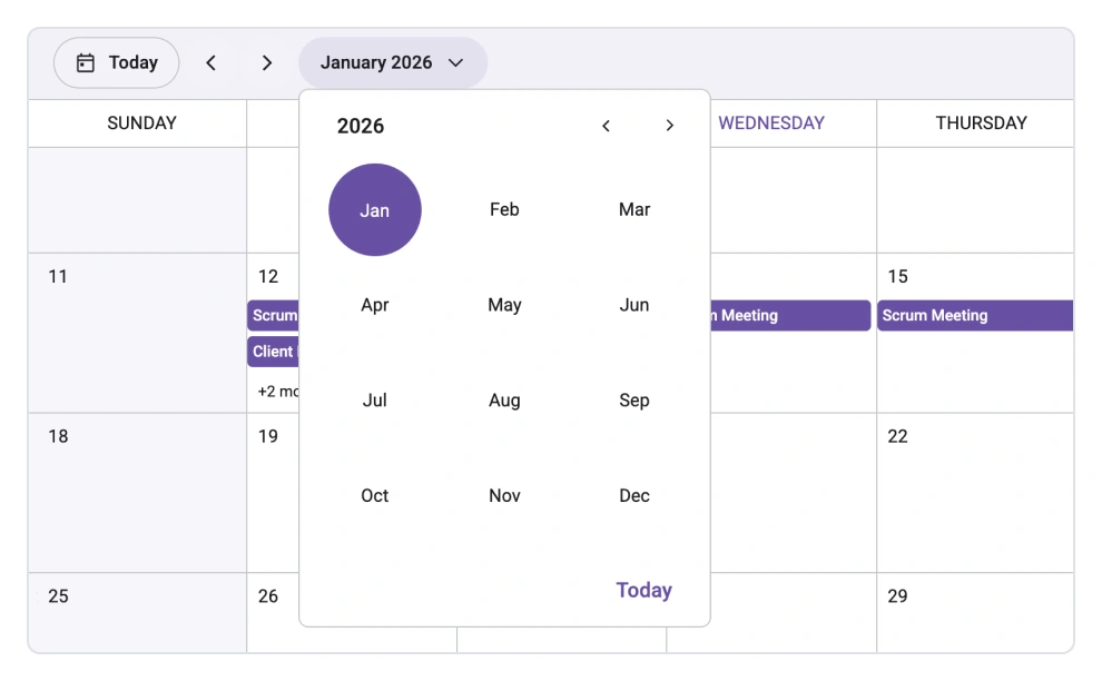
Quick navigation
The React Scheduler provides an intuitive way to navigate back and forth among the date ranges using an inline calendar, and also to navigate between different view modes.
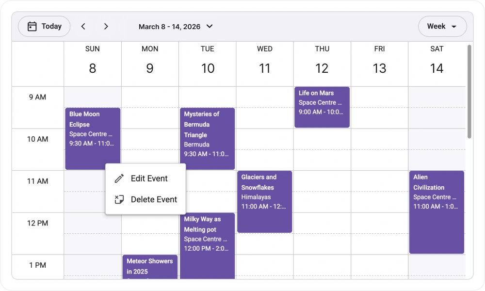
Context menu integration
A right-click menu in Scheduler cells and events offers quick access actions such as add, edit, and delete, with full support for custom menu items and action handling
Tooltip integration
Built-in tooltip support for events enables the display of additional event details on hovering through default or fully customizable tooltip templates.
Accessible by design
The component is built in accordance with WAI-ARIA standards to be accessible to all users, including those who rely on screen readers and keyboard navigation.
WAI-ARIA compliance
Adheres to WAI-ARIA attributes and best practices to provide an inclusive experience for all users.
Full keyboard support
Users can perform all major actions, including navigation, selection, and event creation, using only the keyboard.
RTL rendering
Render the entire scheduler in a right-to-left layout for languages such as Arabic and Hebrew by modifying a single property.
Ready to build your first React Scheduler? Our documentation can help.
Read the getting started guidePure React Components
Developed using React’s core principles, this library employs functional components and hooks without any external dependencies.
Frequently Asked Questions
Why choose Syncfusion’s React Scheduler?
Syncfusion React Scheduler is a lightweight, high-performance solution with a declarative, component-based API that’s perfect for modern React development. It provides essential scheduling features without the overhead of more complex systems.
Where can I find the React Scheduler demo?
You can find our React Scheduler demo here. It demonstrates how to render and configure the Scheduler.
What is the difference between the Scheduler and Calendar components?
The React Calendar is for picking dates and navigating months and years. The React Scheduler is a complete appointment system that manages events, provides multiple views, supports drag and drop, and integrates with external calendars such as Google and Outlook.
Can the React Scheduler component be purchased separately?
No, our 1,600+ components and frameworks for web, mobile, and desktop, including our React Scheduler, are not sold individually. However, we have competitively priced the product, so it only costs a little bit more than what some other vendors charge for their React Scheduler component alone. We have also found that, in our experience, our customers usually start off using one of our products and then expand to several products quickly, so we felt it was best to offer all 1,600+ components and frameworks for a subscription fee. Additionally, we might be able to offer discounts based on currently active promotions. Please contact our product specialists to see if you qualify for any additional discounts.
Is a free option available for the React Scheduler?
No, this is a commercial product and requires a paid license. However, a free community license is available for companies and individuals whose organizations have less than $1 million USD in annual gross revenue, 5 or fewer developers, and 10 or fewer total employees.
How do I get started with the React Scheduler?
Refer to the getting started guide for instructions on setup, view configuration, data binding, and event settings.
Awards
Greatness—it’s one thing to say you have it, but it means more when others recognize it. Syncfusion® is proud to hold the following industry awards.
