Trusted by the world’s leading companies

Overview
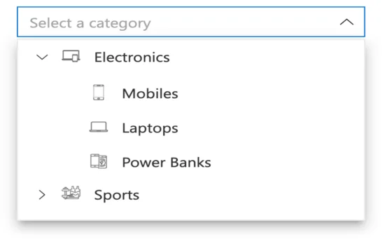
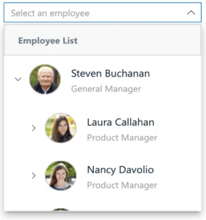
The Dropdown Tree control is a text-box control that allows users to select a single value or multiple values from hierarchical data in a tree-like structure. It has several out-of-the-box features, such as data binding, checkboxes, templates, UI customization, accessibility, and preselected values.
Data binding
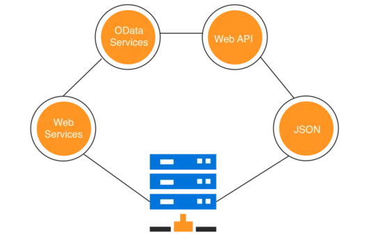
Bind data to the Dropdown Tree control from different data sources. Data can be local or in any remote service and fetched using different kinds of adapters like OData, OData V4, URL, JSON, and web API.
Render modes
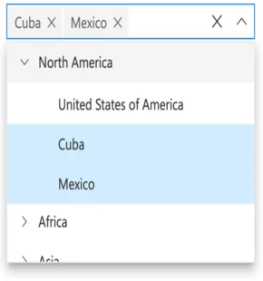
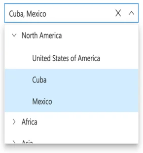
The Dropdown Tree component has different render modes to visualize selected items.
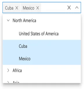
Box mode
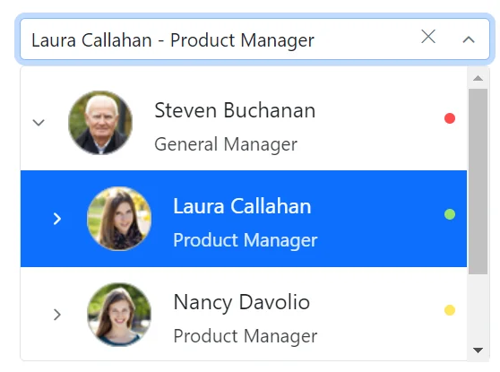
The selected items are displayed as a chip (box) in the Dropdown Tree input box.
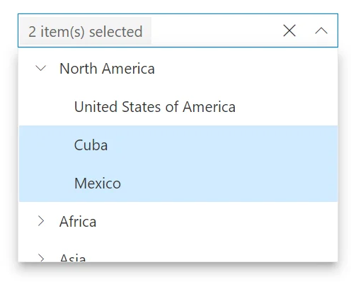
Delimiter mode
The selected items are displayed with the delimiter character in the Dropdown Tree input box.
Default mode
The default mode is a combination of both the box and delimiter modes. When the control is in focus, selected items will be displayed as chips similar to the box mode. Otherwise, they will be displayed with a delimiter character as in the delimiter mode.
Template mode
The selected items are displayed with the given custom template value instead of the selected item text in the input box.
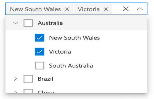
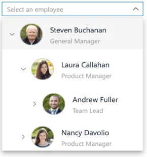
Checkboxes
The React Dropdown Tree control provides built-in support for checkboxes, allowing users to select more than one item. Enabling the checkboxes and auto check functionality makes the parent and child items dependent on each other. This control also provides a Select All option in the pop-up.
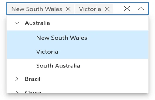
Multiple selection
The Dropdown Tree control allows users to select more than one item in the pop-up using the multiselection functionality.
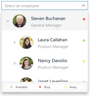
UI customization with templates
Use templates to change the appearance of the selection pop-up for tree items, plus the header and footer of the pop-up tree.
Header template
Design your own header for the pop-up tree using the header template.
Item template
Define the custom appearance of each tree item using the item template.
Value template
Define the custom appearance of selected values in the Dropdown Tree input using the value template. Control the presentation of the selected items, such as adding custom HTML, text formatting, or icons to match your application’s design.
Footer template
Design your own custom footer for the pop-up tree using the footer template.This allows you to fully customize the footer content according to your requirements, offering flexibility in design and functionality.
Built-in and customizable themes
Several built-in, Sass-based themes are available: Fluent, Tailwind CSS, Bootstrap 5, Bootstrap, Material, and high contrast. Users can customize these themes by either overriding the existing Sass styles or creating custom themes using the Theme Studio application.

Web accessibility
- Fully supports WAI-ARIA accessibility to make the Dropdown Tree accessible to screen readers and assistive devices.
- Follows WAI-ARIA best practices for implementing keyboard interaction.
- Uses WCAG 2.0-based design for UI visual elements such as foreground color, background color, line spacing, text, and images.
- Supports right-to-left (RTL) direction for users working with RTL languages like Hebrew and Arabic.
Developer-friendly APIs
Developers can customize all UI elements and control their behaviors according to the end user’s requirements through the component’s rich set of client-side APIs.
React Dropdown Tree code example
Easily get started with the React Dropdown Tree using a few simple lines of TSX code example as demonstrated below. Also explore our React Dropdown Tree Example that shows you how to render and configure a Dropdown Tree in React.
import { DropDownTreeComponent } from '@syncfusion/ej2-react-dropdowns';
import * as React from 'react';
import * as ReactDOM from "react-dom";

function App() {
  return (
      // specifies the tag for render the DropDownTree component
    <DropDownTreeComponent id='dropdowntree'/>
  );
}
const root = ReactDOM.createRoot(document.getElementById('sample'));
root.render(<App />);


Not sure how to create your first React Dropdown Tree? Our tutorial videos and documentation can help.
I’d love to watch it now I’d love to read it nowDiscover Syncfusion’s Complete React Component Ecosystem
Explore over 140+ React UI components featuring established, production-ready controls and the latest pure React components built natively for modern web app development.
-
React Components
-
Pure React Components
-
SMART COMPONENTSGRIDSDATA VISUALIZATIONDROPDOWNSFILE VIEWERS & EDITORSBUTTONSINTERACTIVE CHATINPUTSNAVIGATIONFORMSNOTIFICATIONS
-
GRIDSDATA VISUALIZATIONNAVIGATION
Standalone UI SDKs
Integrate the DataGrid, Chart, Scheduler, Gantt, Rich Text Editor, File Manager, and Diagram UI components into applications to enable rich interaction and visualization, delivering a seamless user experience.
Document Solutions
Integrate the PDF Viewer, DOCX Editor, Spreadsheet Editor, and document-processing libraries into the React applications to enable a smooth user experience.
Our Customers Love Us
Having an excellent set of tools and a great support team, Syncfusion® reduces customers’ development time.Here are some of their experiences.

Aweseome, enough said. really
Easy usability, solving real life problems. easy to implement. most of the cases has the operators and settings possibilities you right away need. never fails to impress

Oliver O,

Geschäftsführung Kreation/Artdirektion, Small-Business
A giant framework with great pricing options
I have loved the components and options that Syncfusion has, besides, its documentation, demos, and Support are excellent.

Alejandro Javier V,
CEO, Small-Business
See Real Success Stories
Developers around the world trust Syncfusion’s Essential Studio to simplify complex projects and speed up delivery. With a vast library of UI controls, powerful SDKs, and reliable support, Essential Studio helps teams build enterprise-ready applications with confidence.
Read Our Customer StoriesIndustry
Software development
75% Cost reduction
50% Faster development
Industry
Utilities (oil and gas)
450+ hours saved
Streamlined processes and hours of development effort saved.
Advanced, flexible features
Empowered users through robust and versatile functionality.
Industry
Software and technology
1000+ of hours saved
Accelerated development with enterprise-ready UI components.
Efficient file management
Streamlined workflows with document libraries without building them from scratch.
Industry
Software and technology
2 Years of delay avoided
Two years of delays prevented with proactive planning.
On-time delivery
Projects delivered on schedule using trusted controls.
Industry
IT services and IT consulting
Improved performance
Large datasets handled with easy customization and quick debugging.
Highly customizable
Plug-and-play controls with quick template integration.
Industry
Professional services
Instant access
Quick availability of features and resources.
Reduced dependencies
Fewer dependencies for faster development.
Rated by users across the globe
Syncfusion React Resources
Learning
 Documentation
 Documentation


Awards
Greatness—it’s one thing to say you have it, but it means more when others recognize it. Syncfusion® is proud to hold the following industry awards.

