React Dialog – Configurable Modal & Modeless Dialogs
- Action button configurations (single or multiple buttons).
- Flexible drag-and-drop positioning.
- Customizable positioning (center, edge-specific, absolute).
- Smooth animations (fade, slide, zoom transitions).
- Advanced templating for dynamic content.
Trusted by the world’s leading companies

Overview
The React Dialog is a UI component designed to present important messages, such as alerts, errors, warnings, or prompts for user input and confirmation. It offers a comprehensive set of built-in features including action buttons, customizable positioning, animations, drag-and-resize capabilities, templating options, and mobile-friendly dialog support. The component supports both modal and modeless (non-modal) dialogs, adapting to various interaction needs.
React Dialog code example
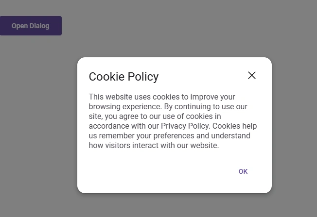
Get started with the React Dialog using a few simple lines of code, as demonstrated below. Also, explore our React Dialog example, which shows you how to render and configure the Dialog component in React.
import { Dialog } from '@syncfusion/react-popups';
import { Button, Variant } from '@syncfusion/react-buttons';
import { useState } from 'react';

export default function App() {
    const [visible, setVisible] = useState(false);

    return (
        <div className="component-section">
            <Button onClick={() => setVisible(true)}>Open Dialog</Button>
            <Dialog
                header="Cookie Policy"
                open={visible}
                onClose={() => setVisible(false)}
                style=
                footer={<Button onClick={() => setVisible(false)} variant={Variant.Standard}>OK</Button>}
            >
                <div>
                    This website uses cookies to improve your browsing experience.
                    By continuing to use our site, you agree to our use of cookies in accordance
                    with our Privacy Policy.
                </div>
            </Dialog>
        </div>
    );
}
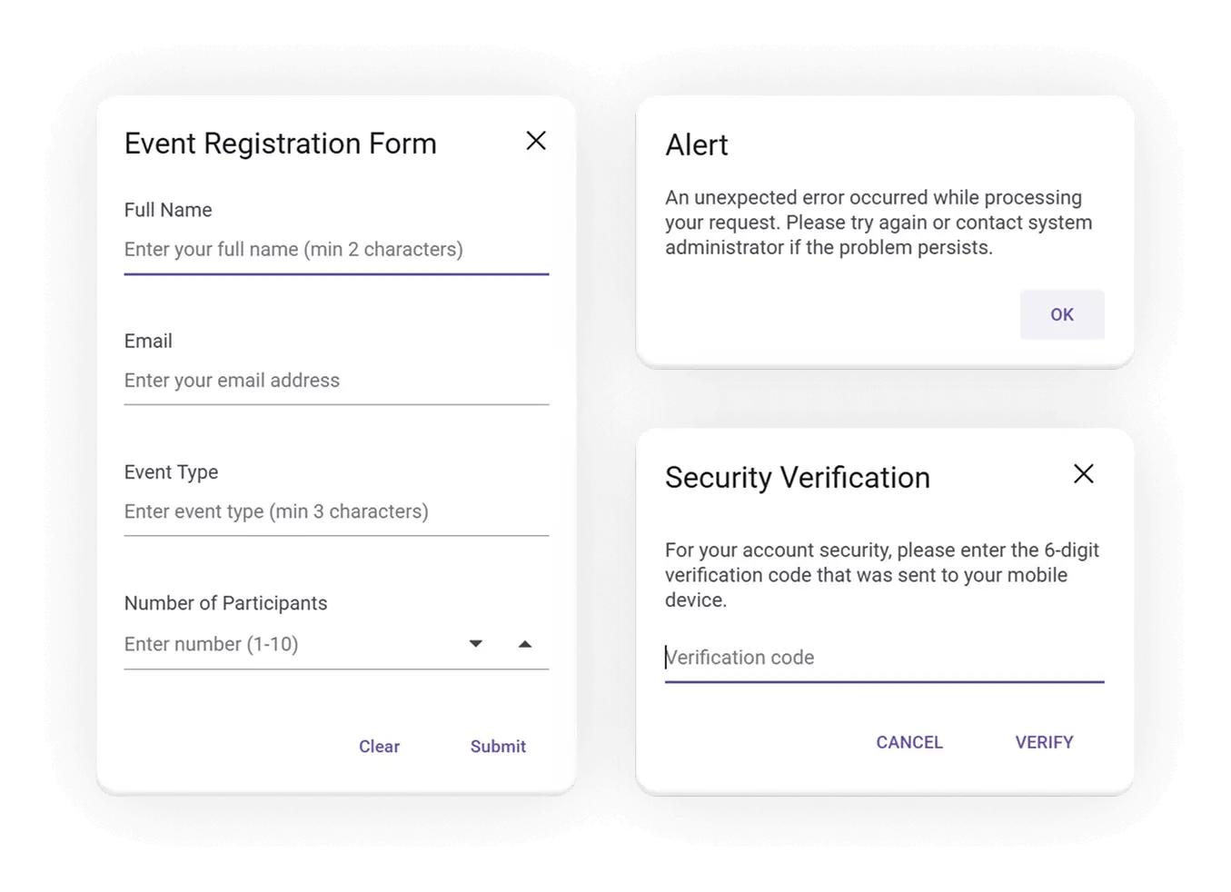
Create modal dialogs with React
The React Dialog component supports two distinct types, modal and non-modal, to suit different user interaction needs:
-
Modal dialogs require users to interact with the dialog before continuing with other tasks. They are ideal for presenting critical information or guiding users through focused processes, such as sign-up forms, login prompts, or confirmation messages.
-
Non-modal dialogs allow users to continue interacting with the rest of the application even when the dialog is active. These are best suited for non-blocking interactions like find-and-replace tools, tooltips, or quick-settings panels.
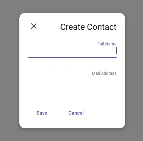
Built-in UI elements
The React Dialog component provides header (title), body (content), and footer action buttons for better customization. Users can pass custom HTML elements as children to the dialog’s header, content, and footer sections.
Action buttons
The React Dialog component provides built-in support to include custom action buttons in the footer area to perform necessary actions.
Flexible positioning
The flexible positioning options allow users to place dialogs anywhere on the page to suit their layout and design needs. A dialog’s position can be easily configured using built-in presets or custom axis values.
Built-in positions: Quickly align dialogs to common screen locations such as top-left, top-right, bottom-left, or bottom-right.
Custom coordinates: Define exact placement using custom x-axis and y-axis values (e.g., 100 75) for precise control over dialog layout.
Draggable dialog
The draggable functionality allows users to reposition the dialog anywhere on the page by simply dragging its header. This feature is powered by the draggable library, making it easy to implement and customize.
Full-screen dialog
Dialogs can be expanded to occupy the entire viewport, creating a distraction-free and immersive experience. This is especially useful for tasks that require all of the user’s attention, such as form submissions, media previews, or detailed workflows.
Multiple dialogs
The React Dialog component supports launching multiple dialogs simultaneously, including stacked or nested dialogs, by managing their z-index (z-depth). This allows developers to display dialogs one above the other, enabling complex workflows such as multistep forms, confirmation prompts over modals, or layered interactions.
Smooth animation
The React Dialog component supports a variety of smooth, built-in animations for both opening and closing transitions. These animations are powered by CSS3 and integrated through the Animation library, allowing developers to deliver polished, responsive, and visually engaging modal dialogs.
Resizable dialog
The resizable functionality allows users to adjust dialog dimensions by dragging from any edge or corner. This is enabled through interactive resize handles, which can be configured to control the resize direction as horizontal, vertical, or both.
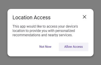
Close options
The modal Dialog component offers the following ways for users to close a dialog, enhancing usability and accessibility:
- Close icon: A clickable icon typically placed in the header.
- Overlay click: Clicking outside the dialog (on the overlay).
- Esc key: Pressing the Escape key on a keyboard.
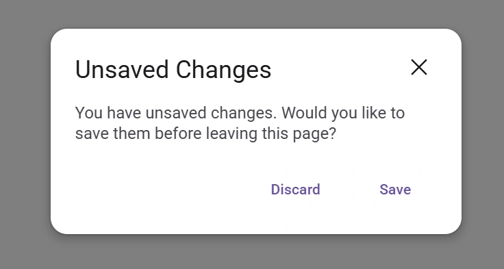
Alert and confirmation dialogs
The React Dialog component makes it easy to create alert and confirmation dialogs using built-in functions. These dialogs are ideal for delivering quick feedback, prompting user decisions, or confirming actions such as deletions, submissions, or exits.
- Alert dialogs: Display important messages that require acknowledgment.
- Confirmation dialogs: Ask users to confirm or cancel an action.
Right-to-left (RTL)
The React Dialog component supports right-to-left (RTL) rendering. Users can change the text direction and layout of the Dialog component to RTL. This improves the user experience and accessibility for those who use RTL languages.
Accessibility
-
Fully supports WAI-ARIA accessibility, which allows dialogs to be accessed by screen readers and assistive devices.
-
Follows WAI-ARIA best practices for implementing keyboard interaction.
-
Follows the WCAG 2.0 standard in the design of UI visual elements such as foreground color, background color, line spacing, text, and images.
Responsiveness
The React Dialog component is designed to deliver a smooth, responsive experience across all device types, including phones, tablets, and desktops. It automatically adapts to different screen sizes and orientations, ensuring optimal usability and accessibility.
Developer-friendly APIs
Developers can control the appearance and behaviors of a dialog, including its positioning, content, and animation, using a rich set of APIs.


Not sure how to create your first React Dialog? Our documentation can help.
I’d love to read it nowPure React Components
Developed using React’s core principles, this library employs functional components and hooks without any external dependencies.
GRIDS
DATA VISUALIZATION
NAVIGATION
Frequently Asked Questions
Why should you choose the Syncfusion React Dialog?
- Highly customizable and configurable user interface (UI) dialog box. Easily tailor the dialog box to match your application’s branding and layout requirements.
- Simple way to display critical information, errors, warnings, confirmations, alerts, questions, and message boxes.
Built-in features such as action buttons, drag and drop, positioning, and animations.
Simple configuration and APIs.
- Support for all modern browsers.
- Mobile-friendly and responsive UI.
Expansive learning resources such as demos help you get started quickly with the React Dialog component.
Where can I find the Syncfusion React Dialog demo?
You can find our React Dialog demo here. It demonstrates how to render and configure the modal Dialog.
Can I download and utilize the Syncfusion React Dialog for free?
No, this is a commercial product and requires a paid license. However, a free Community License is also available for companies and individuals whose organizations have less than $1 million USD in annual gross revenue, 5 or fewer developers, and 10 or fewer total employees.
How do I get started with the Syncfusion React Dialog?
A good place to start would be our comprehensive getting started documentation.
See Real Success Stories
Developers around the world trust Syncfusion’s Essential Studio to simplify complex projects and speed up delivery. With a vast library of UI controls, powerful SDKs, and reliable support, Essential Studio helps teams build enterprise-ready applications with confidence.
Read Our Customer StoriesIndustry
Software development
75% Cost reduction
50% Faster development
Industry
Utilities (oil and gas)
450+ hours saved
Streamlined processes and hours of development effort saved.
Advanced, flexible features
Empowered users through robust and versatile functionality.
Industry
Software and technology
1000+ of hours saved
Accelerated development with enterprise-ready UI components.
Efficient file management
Streamlined workflows with document libraries without building them from scratch.
Industry
Software and technology
2 Years of delay avoided
Two years of delays prevented with proactive planning.
On-time delivery
Projects delivered on schedule using trusted controls.
Industry
IT services and IT consulting
Improved performance
Large datasets handled with easy customization and quick debugging.
Highly customizable
Plug-and-play controls with quick template integration.
Industry
Professional services
Instant access
Quick availability of features and resources.
Reduced dependencies
Fewer dependencies for faster development.
Rated by users across the globe
Syncfusion React Dialog resources


Awards
Greatness—it’s one thing to say you have it, but it means more when others recognize it. Syncfusion® is proud to hold the following industry awards.

